
Designed by
Xiangyu Han
Advisor
Adam Smith, Mike Strobert
Problem Statement
There are many different cultures in the world. Cultural differences will inevitably affect the communication between people with varying backgrounds of culture. Sometimes it is hard for people with diverse cultural experiences to understand each other because of the cultural distinction. How to reduce the gap of understanding caused by this is essential for improving communications. Language is one of the representations that most reflects culture. The typefaces in different periods usually reflect the art and advertisement style and technological development. Some people think that fonts can use as a tool to seak the culture. How can we create a system about various languages to help people know more about different cultures.
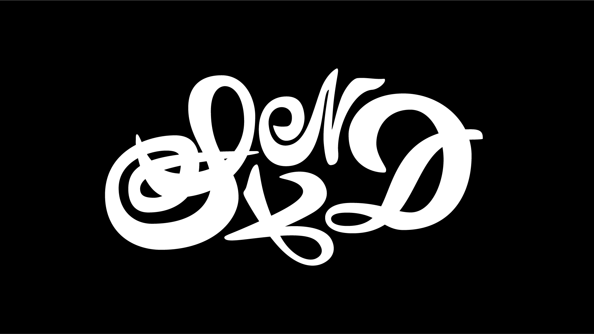
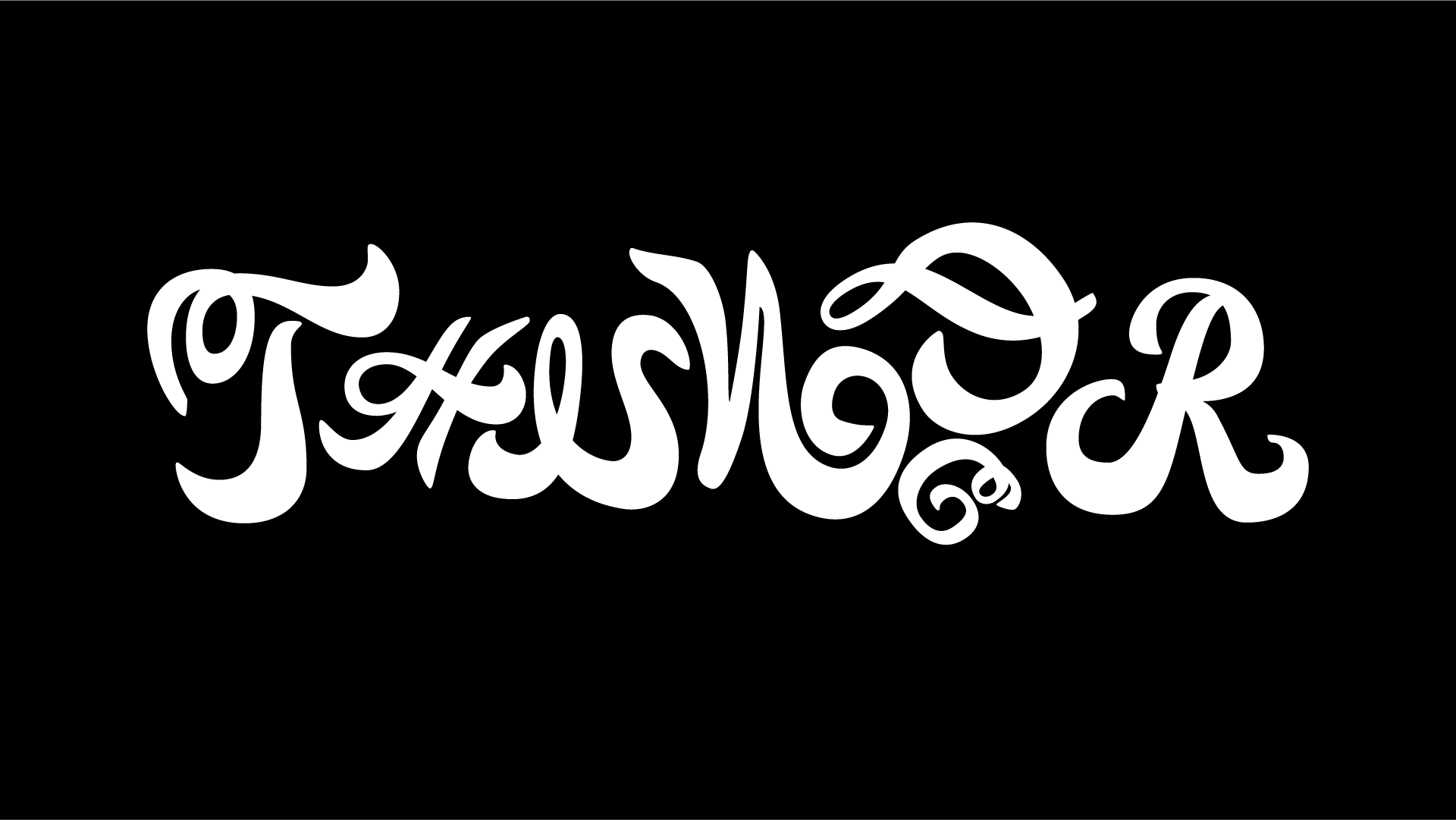
This is the font I designed that looks handwriting and has Chinese characters' personalities.
I used that font to make words like "water" "sand," which are specific things around our daily lives because these things have no barriers to understanding people from different cultural backgrounds.
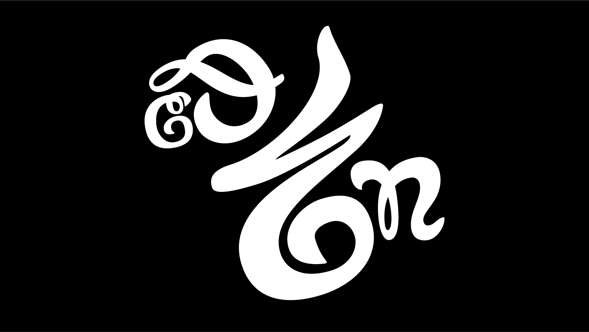
The following is an attempt to try to spell Chinese and English words (like "water" "sand" "cloud" "thunderstorm") with this font, some of which refer to some ancient hieroglyphic graphics.
water
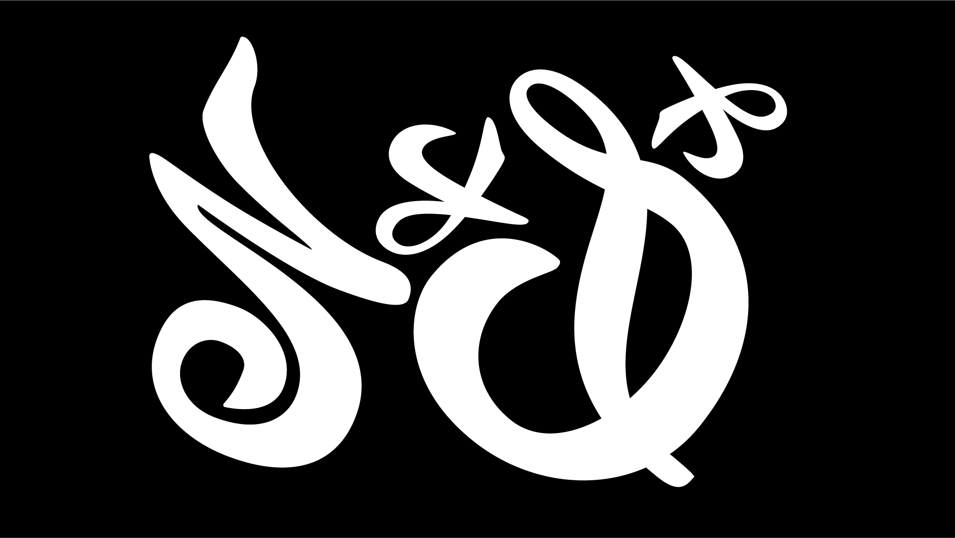
sand
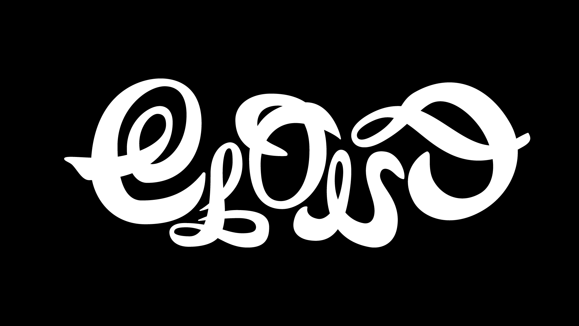
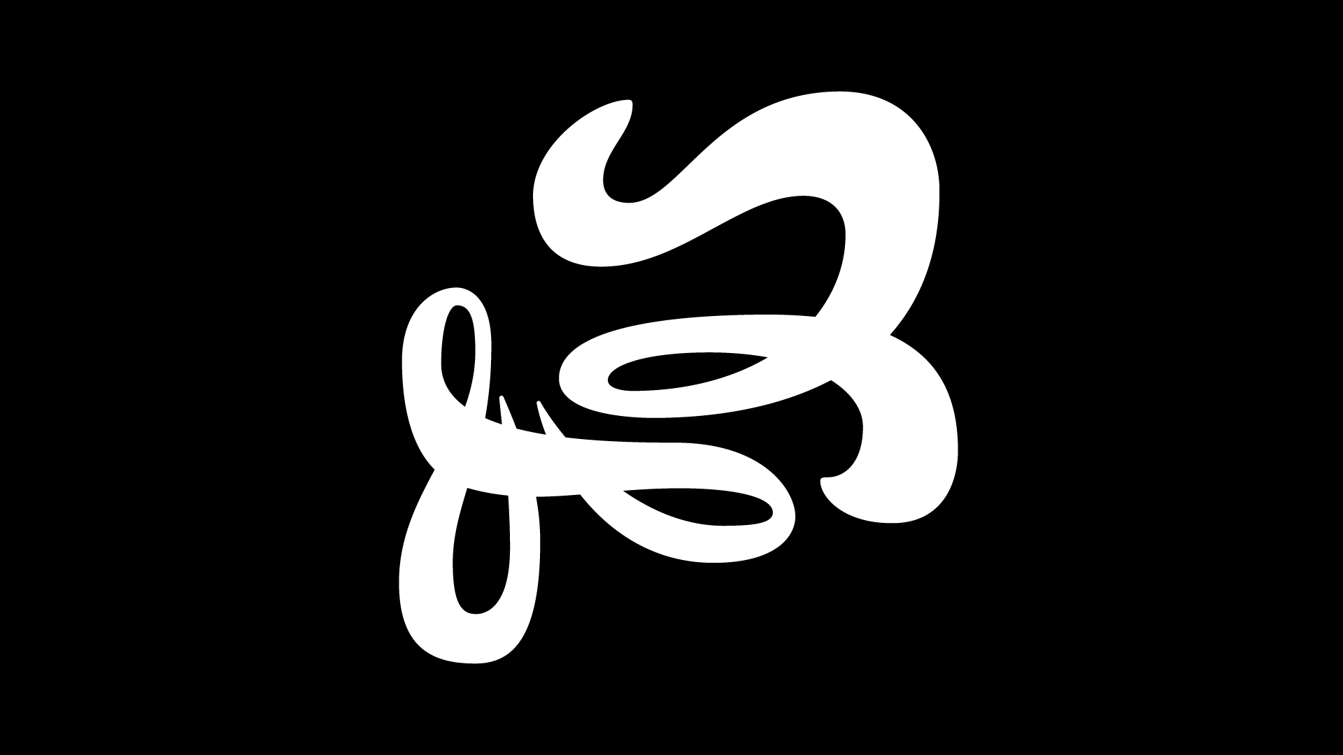
cloud
thunderstorm
Design Concepts & Process
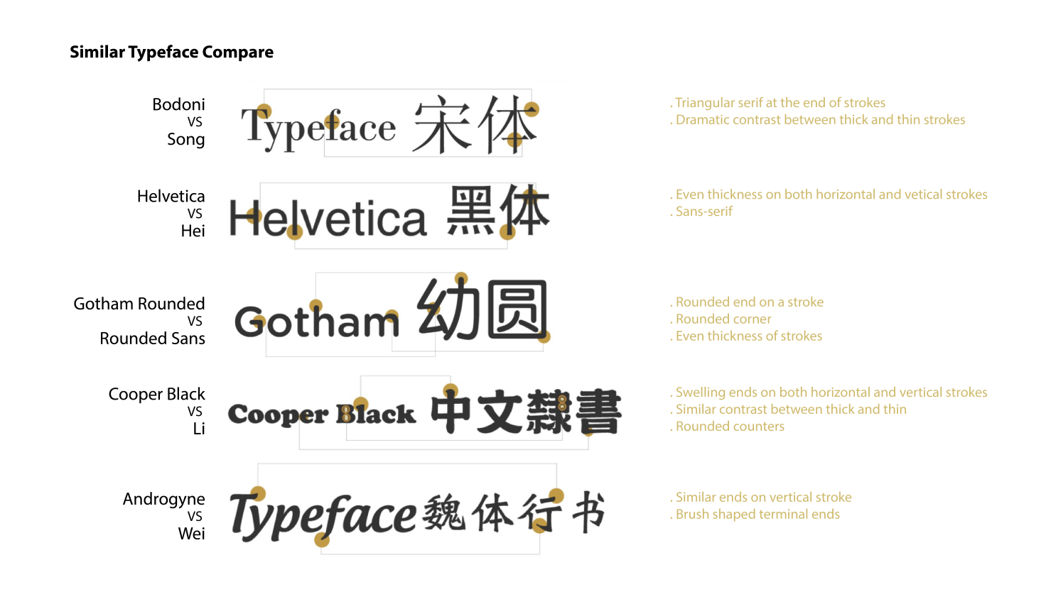
To solve the problem, what I think out is to build a bridge between the two cultures. English and Chinese are used as a key to reflect the cultural background. I compared different Chinese and English typefaces and want to find the similarity and differences among them.
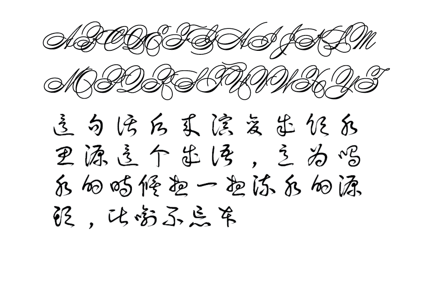
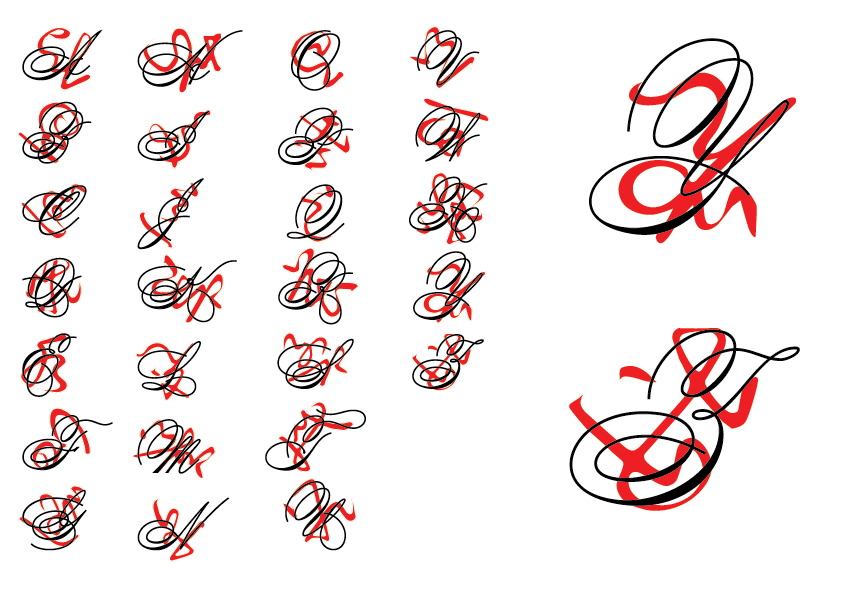
I found two sets of unique fonts in Chinese and English, respectively, and found glyphs similar to the 26 letters in Chinese. Try to incorporate the style of Chinese fonts into the English letters. I chose Compendium (English) and Tensentype BoDang Caoshu (Chinese) for comparison. To my surprise, I found highly overlapping text on the graphics in these two poorly recognizable fonts.
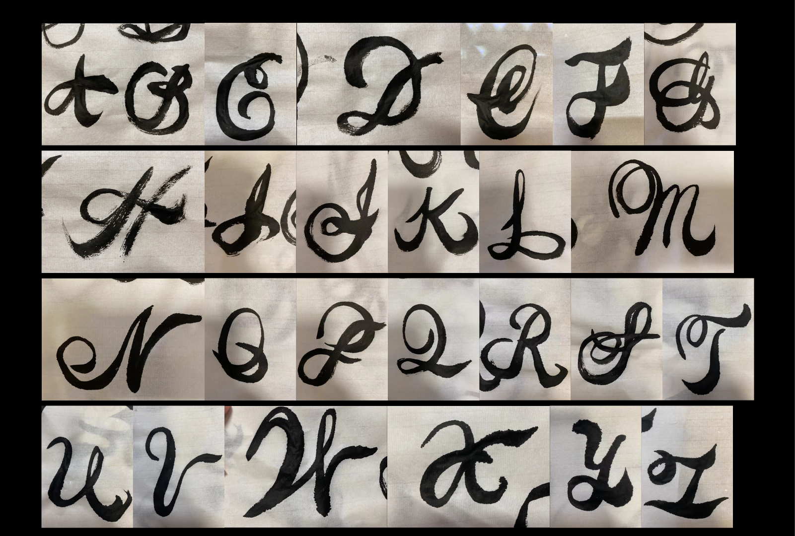
I used calligraphy to write English letters. According to those sketches, I designed a font that looks handwriting and has Chinese characters' personalities.
According to those sketches, I designed a font that looks handwriting and has Chinese characters' personalities.
Conclusion
It is an experimental idea to use the combination of motion graphics and typography to help with the problem. The two poorly recognizable typefaces weaken the function of letters/characters as a language. Therefore, I try to narrow down the meaning of language and visually look at these two fonts. In this way, I look for the visual similarities and differences between language and culture. After discovering some surprisingly similar graphics, I think culture's personality can be conveyed through abstract text symbols. According to the typography trends, motion graphics combine with typography become a way of communication. And it has appeared in the design of posters, websites, etc. So, I tried to use this set of fonts to spell English and Chinese separately and make them into a motion graphic piece. In English, the placement of letters has been adjusted to make them look more like an image, while in Chinese, the letters are disassembled and combined with the shapes of Chinese characters(some of them refer to Oracle) into an image. Try to use the transition between the two to narrow down the cultural gap.
THANKS FOR WATCHING!