What Is Depression?
Is a book that investigates how simple graphical forms can be used to communicate a complex idea. It explores the principles and elements of design and how they can be abstracted to illustrate emotions, and experiments with pushing the boundaries of what educational book pages can look like.
Designed By
Megan Wade
Project
Visual Communication Design Thesis Project
Duration
August 2020 - May 2021
Prompt
Mental health is a complex subject matter that is frequently overlooked or misunderstood within our society.

Problem
How do you explain depression to someone who has never experienced it before or does not know what it is?

Solution
The creation of a book that utilizes simple graphics and typography to help the reader better understand depression.
Selecting A Topic
The intention is that the design solution explored within this thesis project could be applied to any complicated topic. I chose to focus on depression because it is such a complex disorder filled with feeling and emotion. It is an extremely important and relevant subject matter that needs to be educated on, so it was the perfect subject to represent within my design.
Objective
By communicating with individuals at an earlier age and educating them on depression they will be able to recognize it within their own life and seek help if they are ever affected. With a clearer understanding of the disorder readers will have more empathy towards people who have depression.

It is estimated that more than
264 Million people
around the world suffer from depression.
Solution
Depression is often misunderstood because it is an invisible illness. Someone affected by depression could appear perfectly fine on the outside while they suffer greatly on the inside. The book reflects this idea in that although the designs may appear simple, the forms on the page possess a deeper significance within. Each page in the book contains simple visuals and typography that translate those deeper meaning associated with depression.
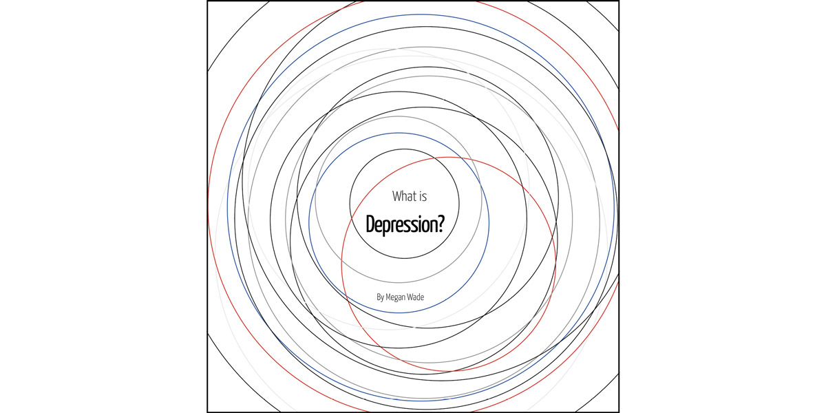
Book Cover
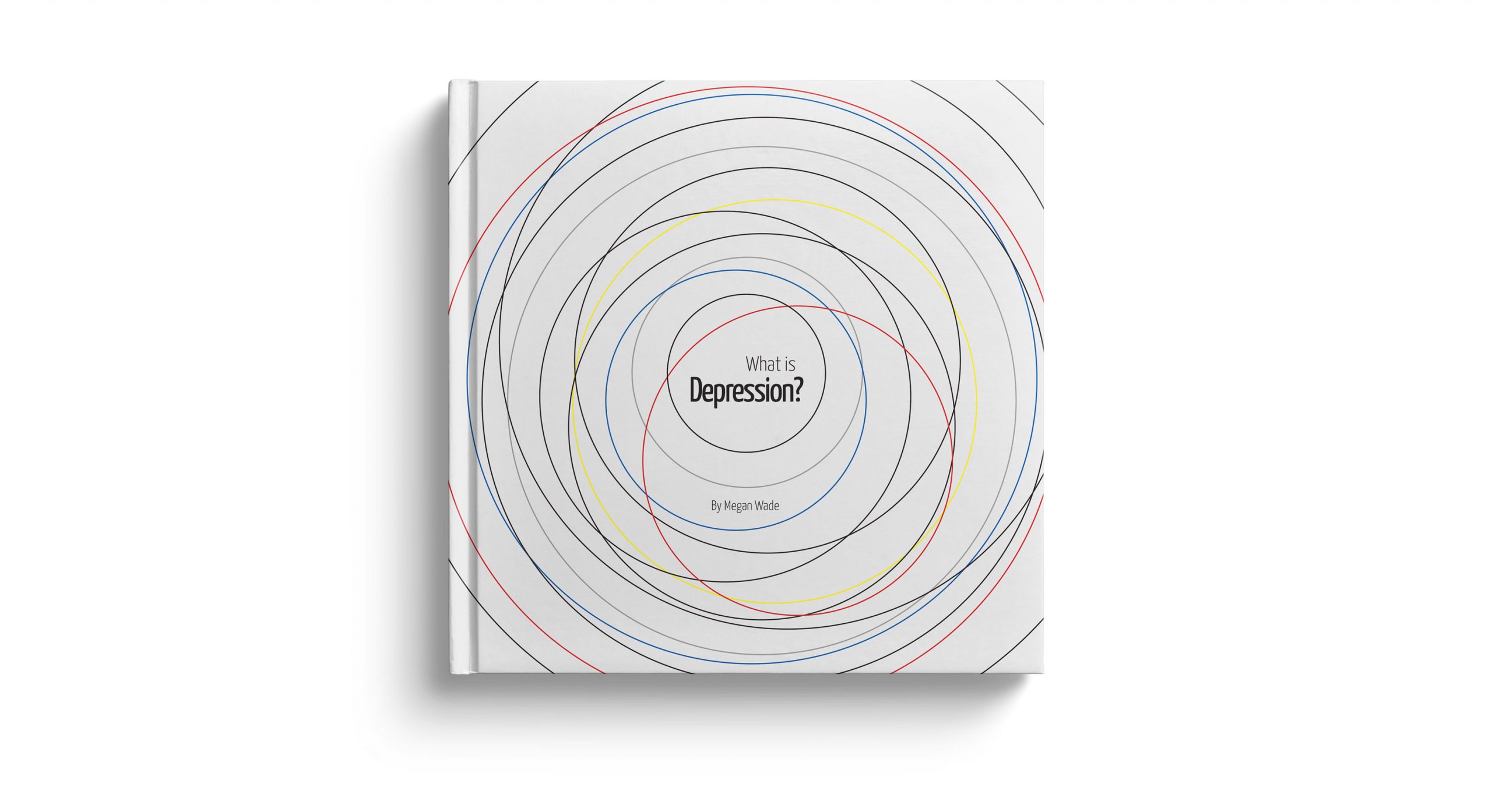
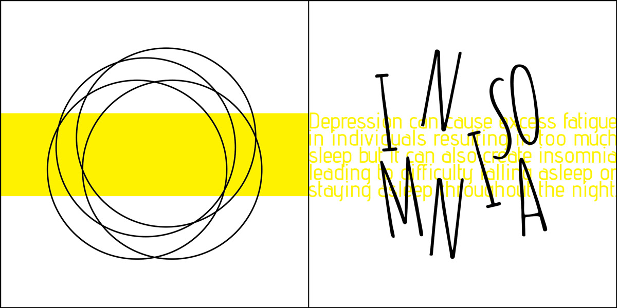
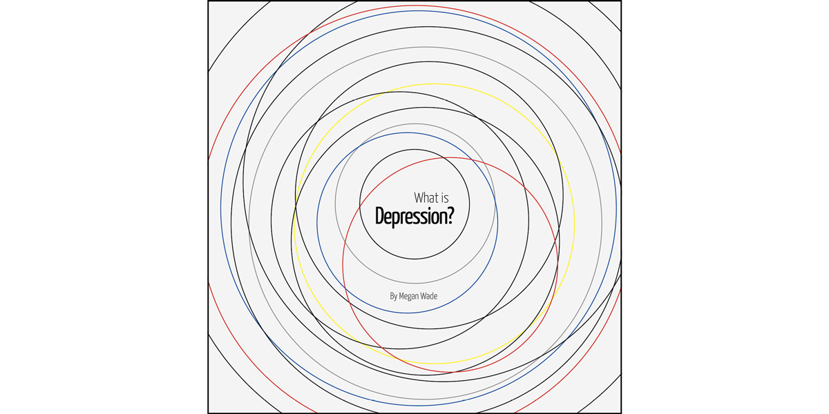
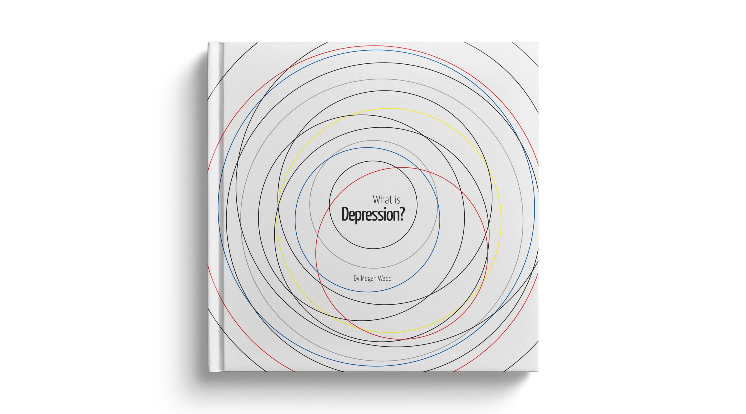
The cover is a culmination of all of the symptoms and feelings that are embodied within the book. It brings together the individual colors from each page into one cohesive design to symbolize depression as a whole. The circles form a swirling void with the type trapped inside to personify the negative state of mind of depression.
Anxiety
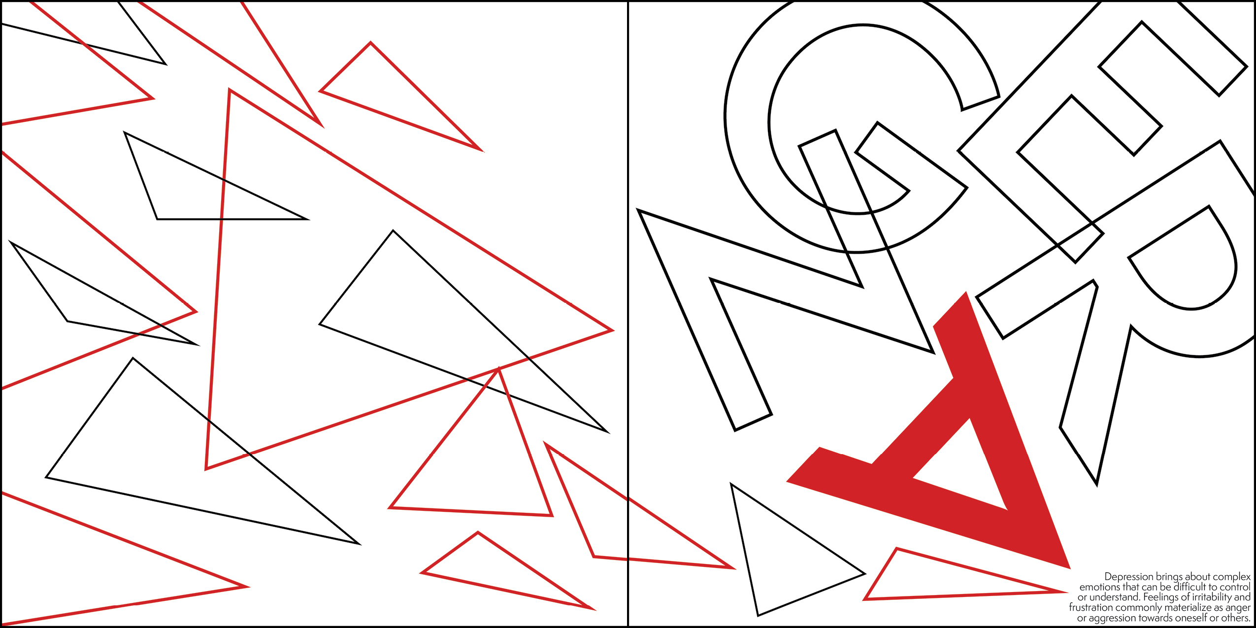
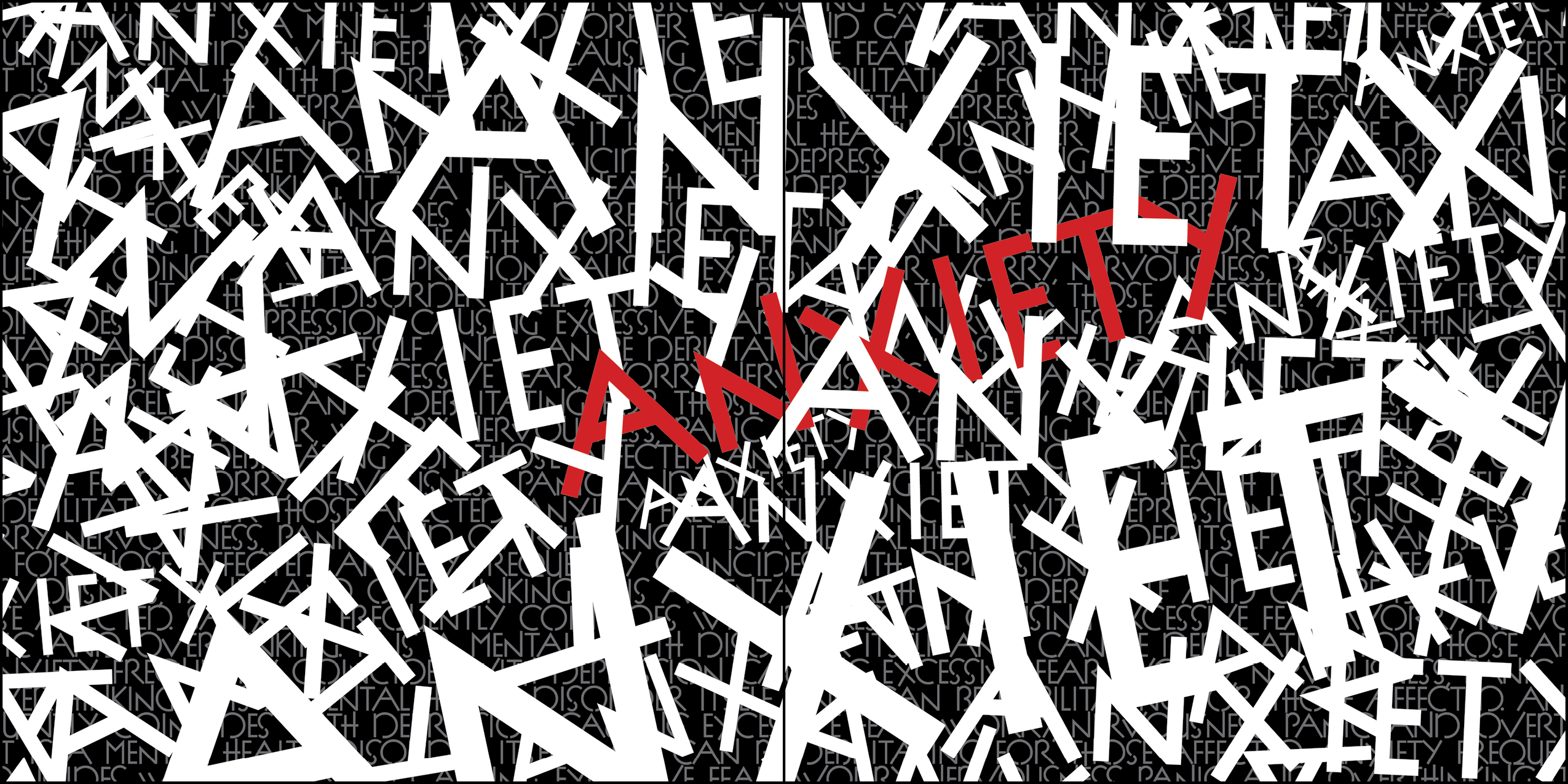
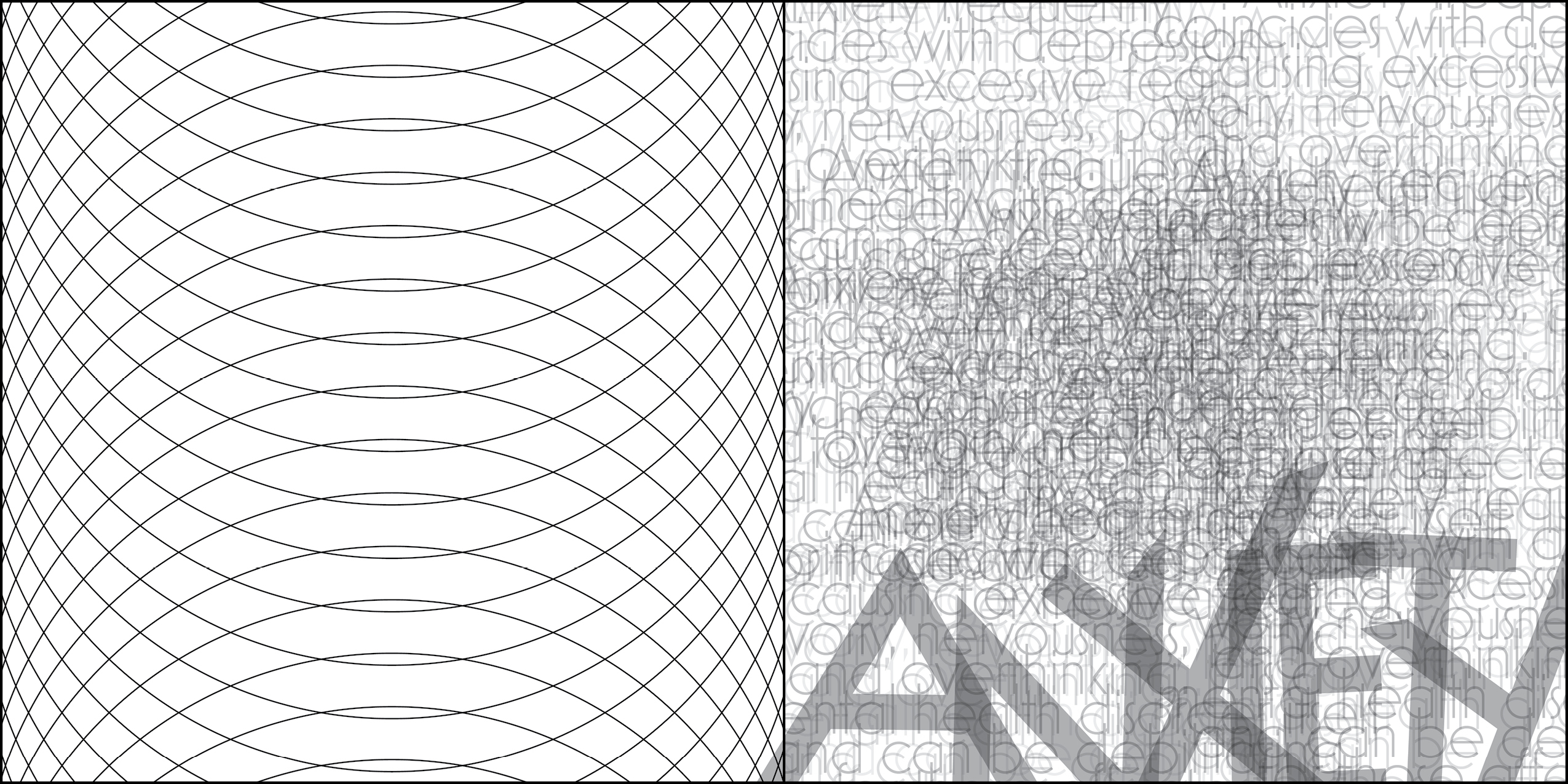
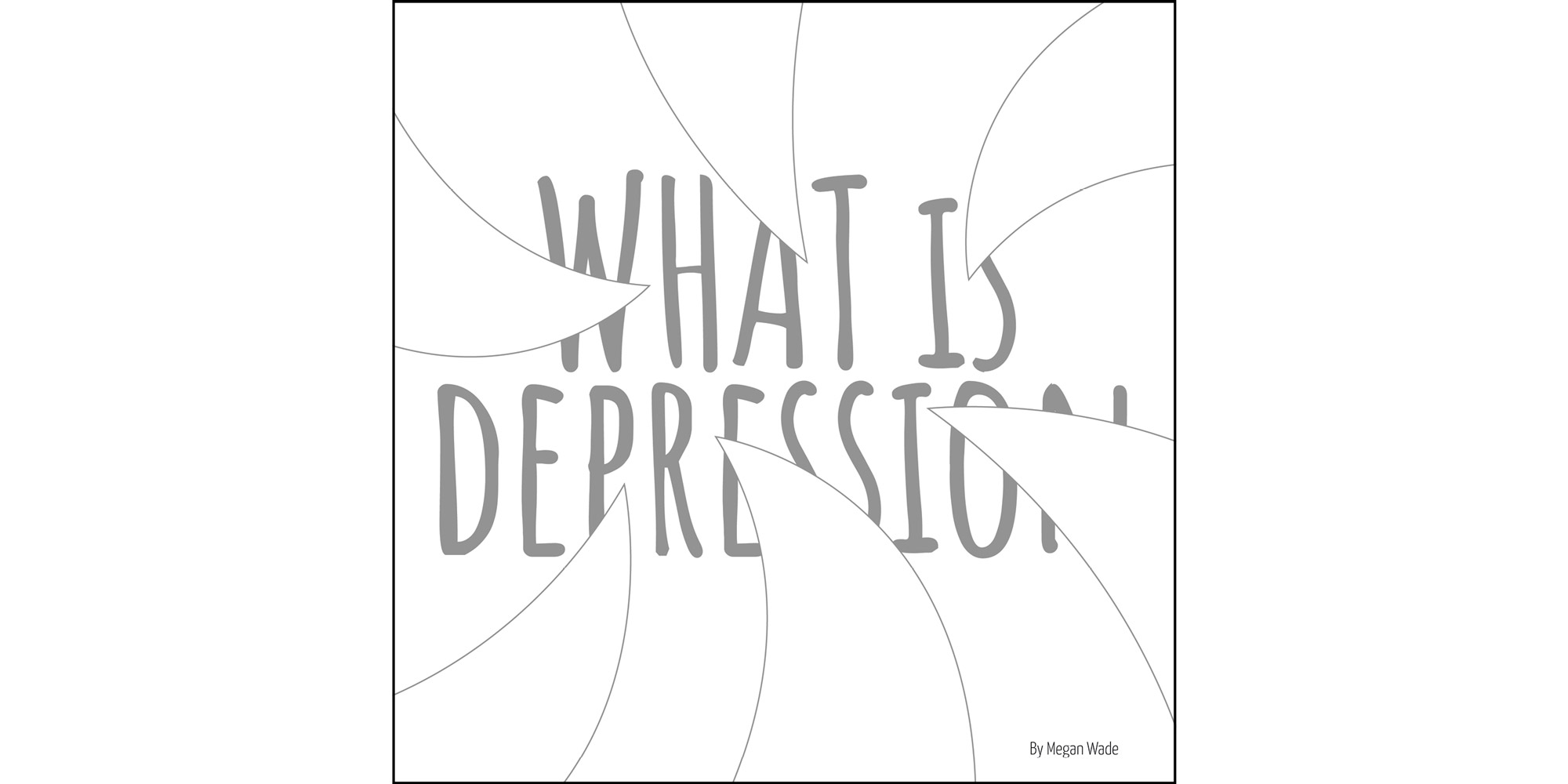
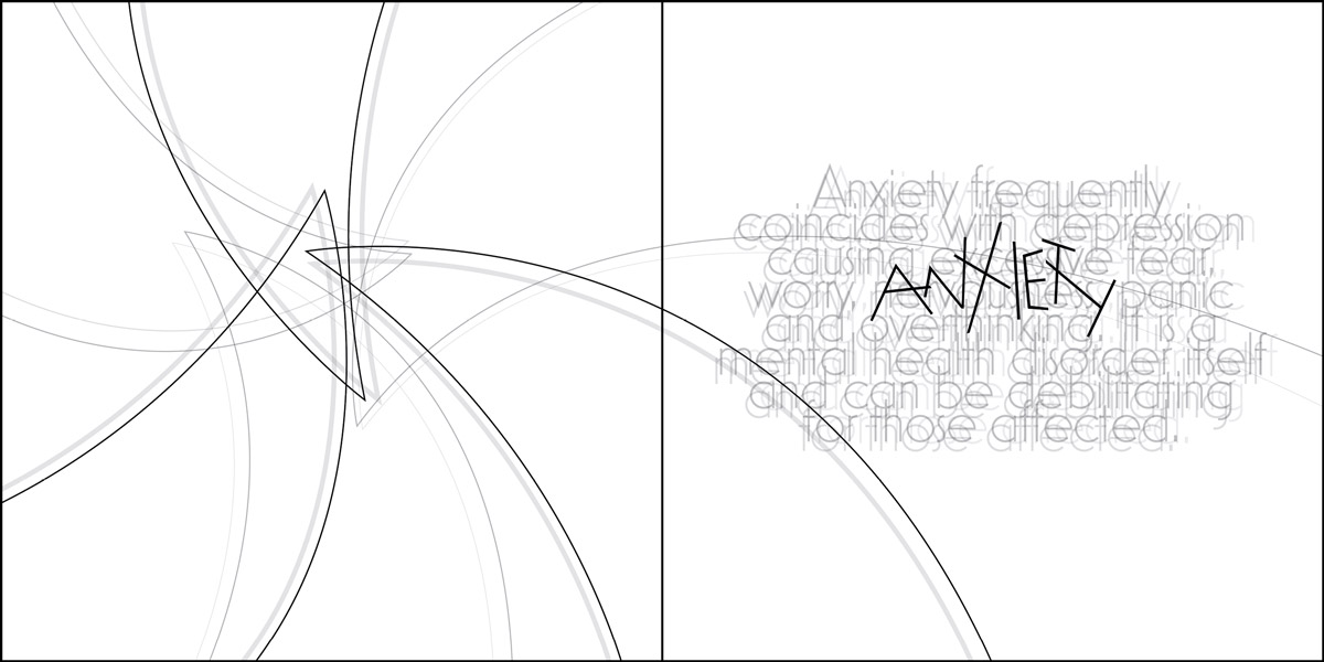
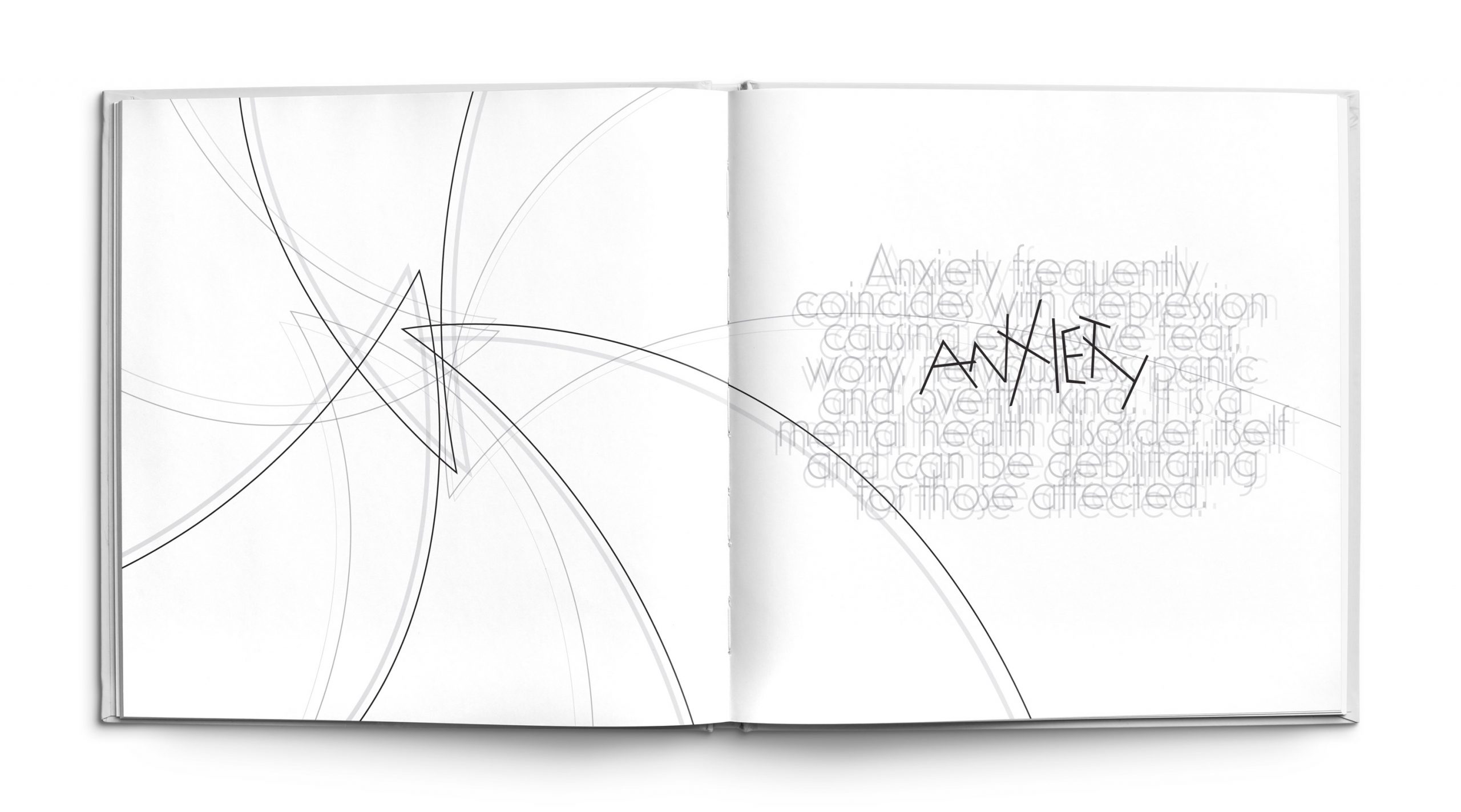
Anxiety is a common symptom of depression that causes an induvial to feel restless, uncomfortable and tense. In addition it often comes with feelings of worry, fear, dread and unease that cause major distress to the afflicted. The design is meant to reflect those feelings of worry through the placement of form as well as the use of repetition to create a blurred effect. The sharp ends of the triangles all overlap and converge in the center to exude the feelings of danger and agitation. The letterforms within the word “Anxiety” are strangely spaced and are off kilter to give off an uncomfortable feeling. All of these elements combine to encapsulate the mindset of discomfort and uneasiness that are felt with anxiety.
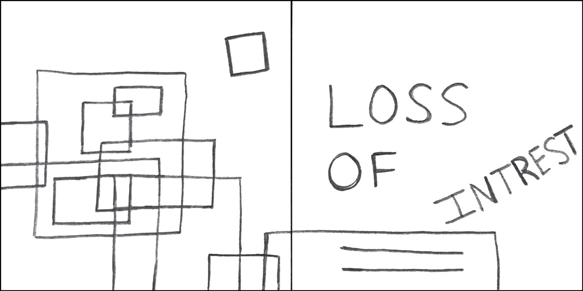
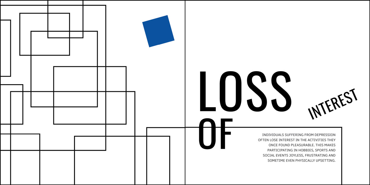
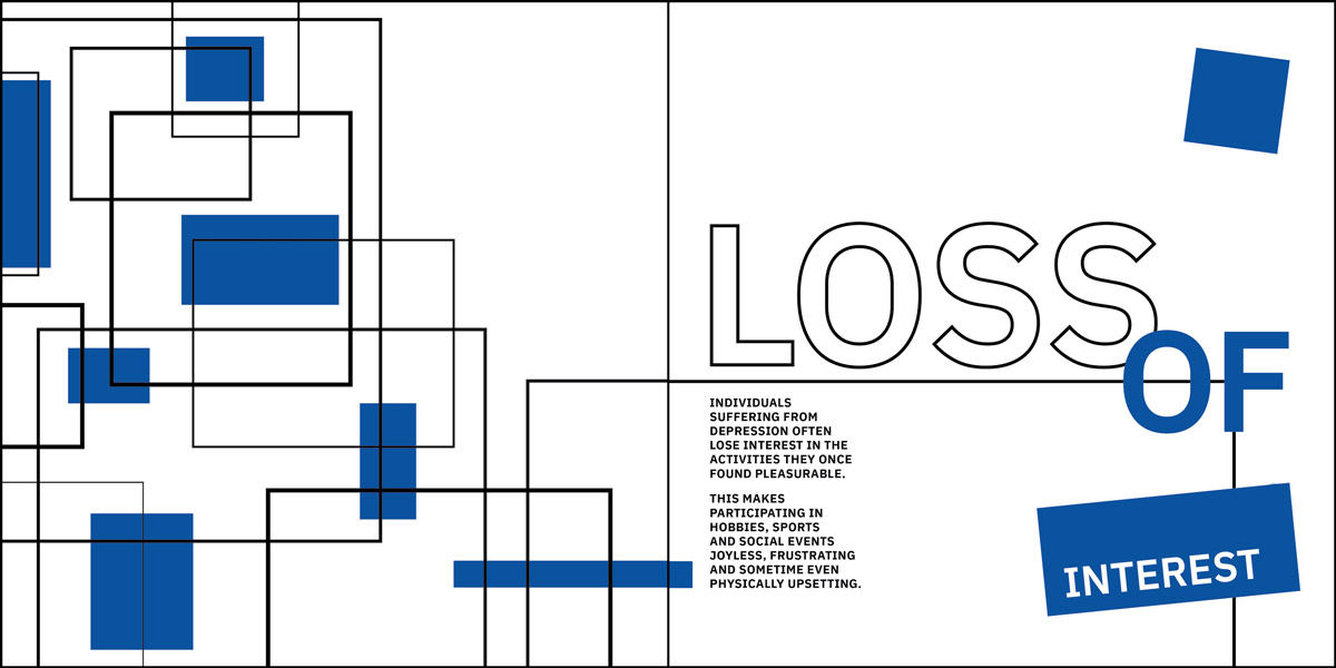
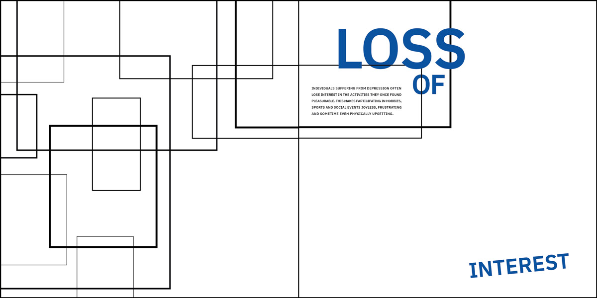
Loss of Interest
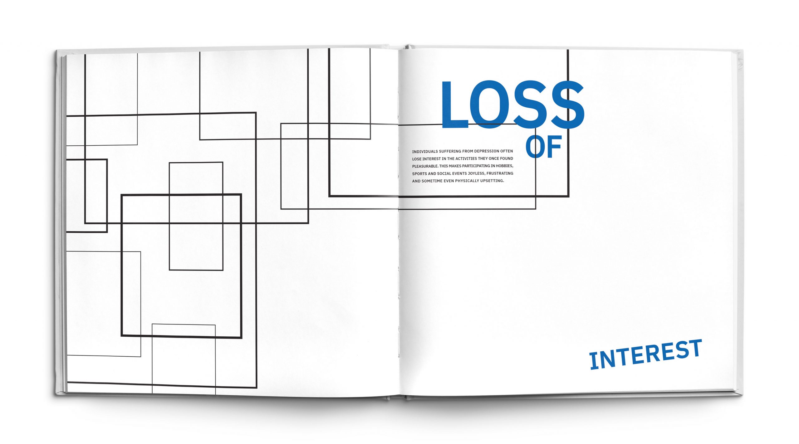
Individuals with depression often lose interest in activities that they once found pleasurable. The sensation of no longer finding joy in the things you used to love can inadvertently push individuals further into a state of depression. The colors blue and black represents these feelings of frustration and lack of joy that result from no longer finding pleasure in the activities you once enjoyed. The remaining part of the page is left as open white space to express feelings of emptiness that can also occur. The boxes and the text within the design are all clustered together and connected, representing that they are still intact or apart of the person. The word “Interest” is falling away and disconnected from everything else in the composition to literally illustrate the losing of interests that an individual with depression can experience.
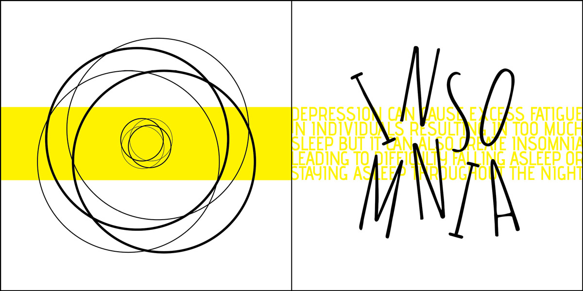
Insomnia
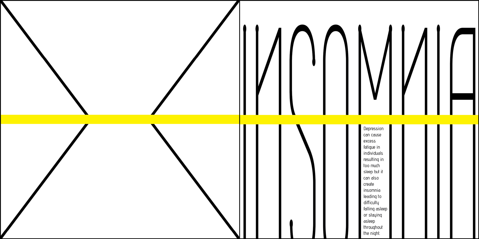
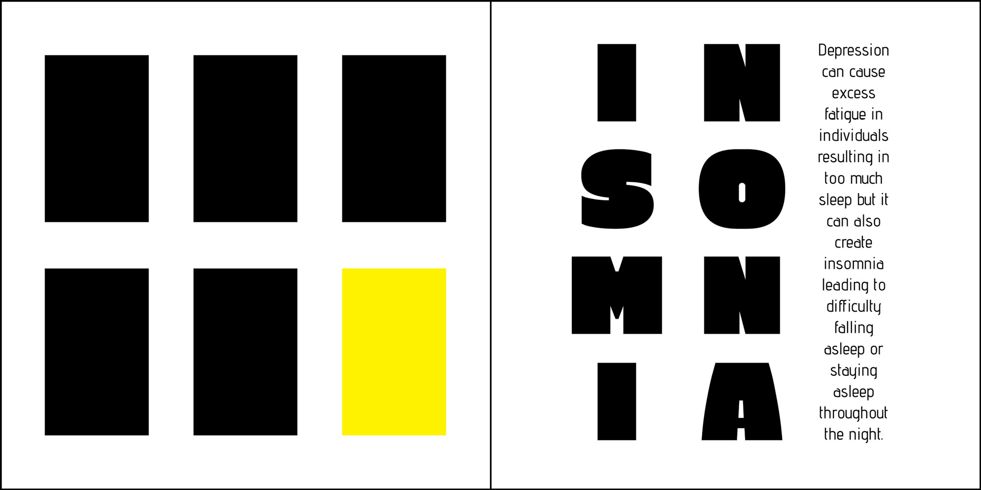
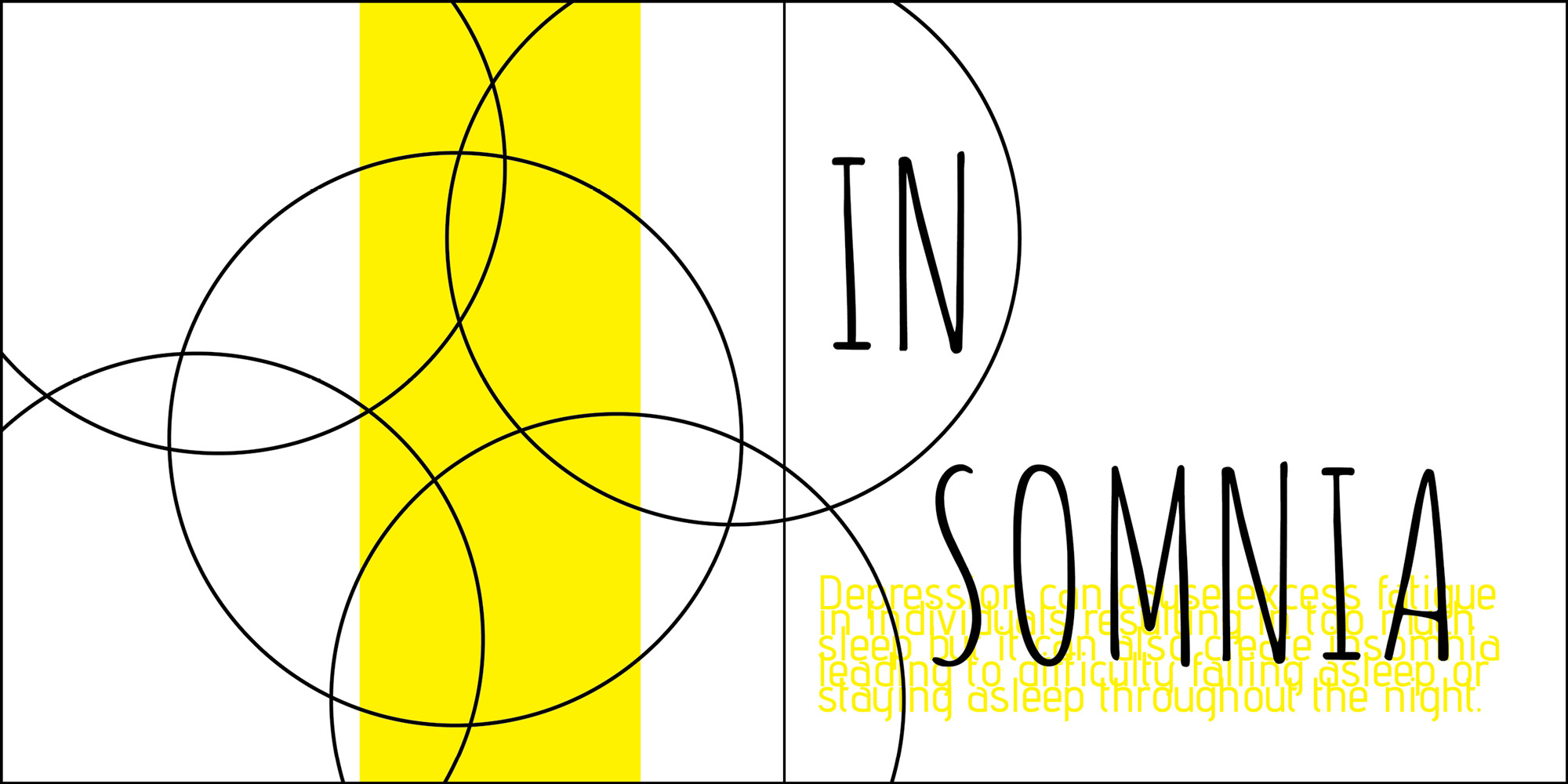
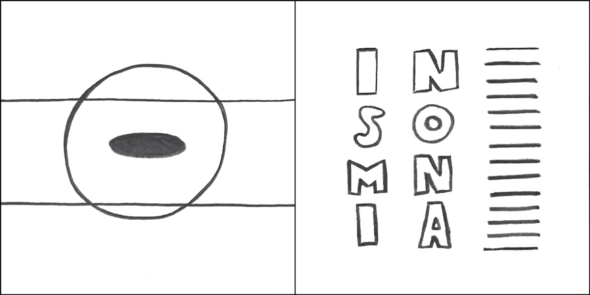
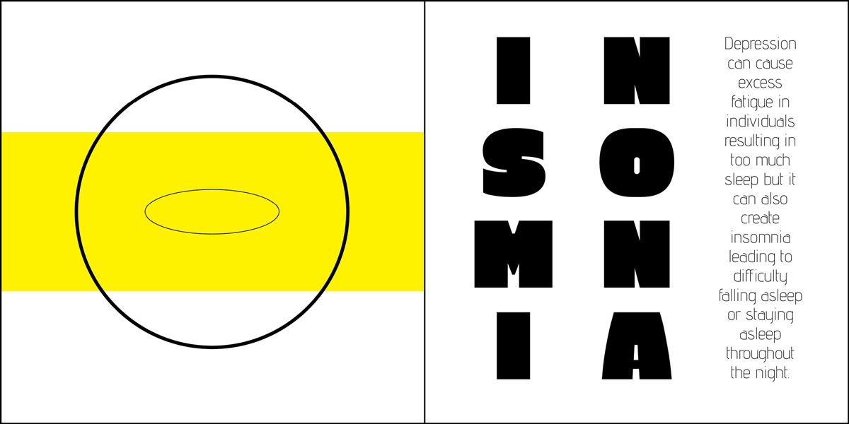
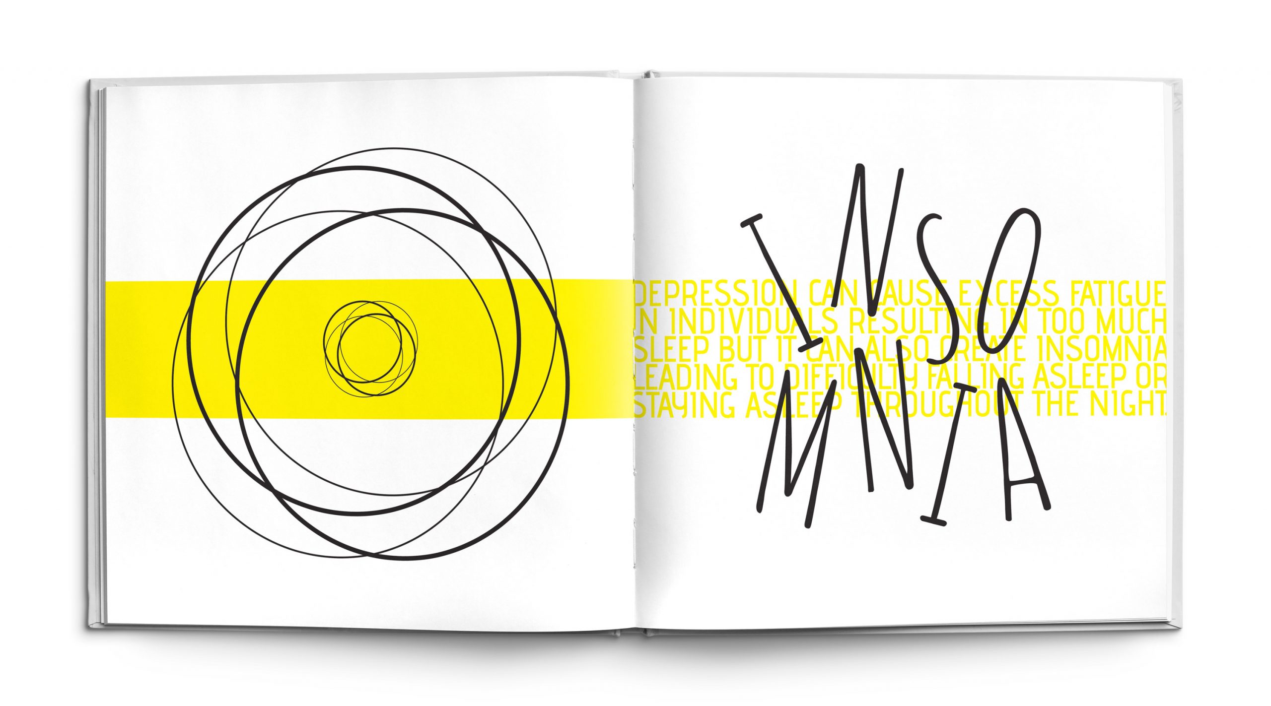
The Insomnia page explores the feelings of restlessness that come when an individual has difficulty falling asleep or staying asleep. The design utilizes repetition of forms with similar mass, size, shape, placement and color on both sides of the spread. The black circles and the text are meant to look jumbled suggesting the idea of disturbed sleep as well as the concept of unorganized racing thoughts within the mind that are preventing someone from falling asleep. Movement is created through the placement of objects to illustrate the tossing and turning that happens while trying to fall asleep. The color yellow is also significant and purposefully used within the spread because it psychologically represents frustration, energy and strain which all encapsulate the intention of the forms within the pages.
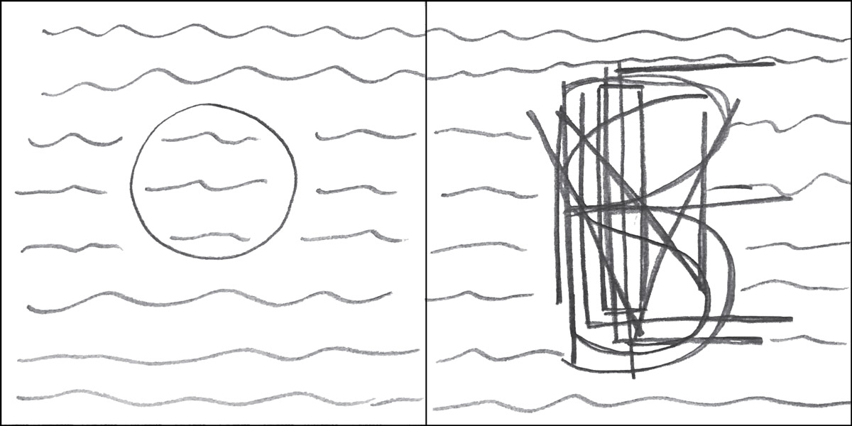
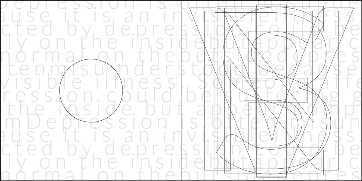
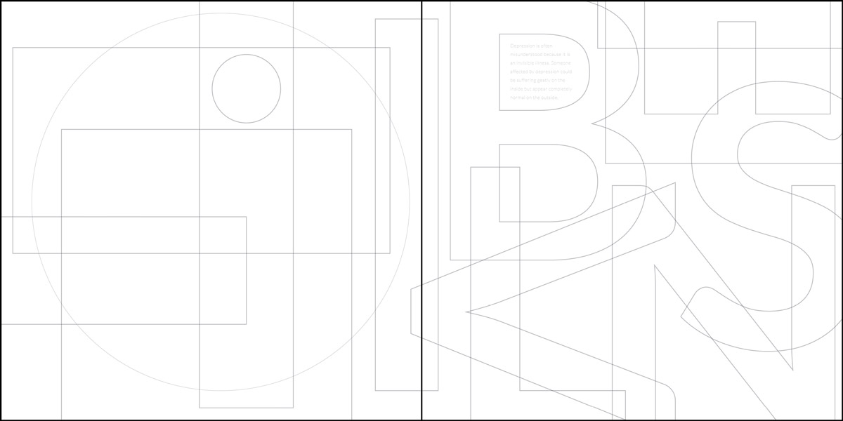
Invisible
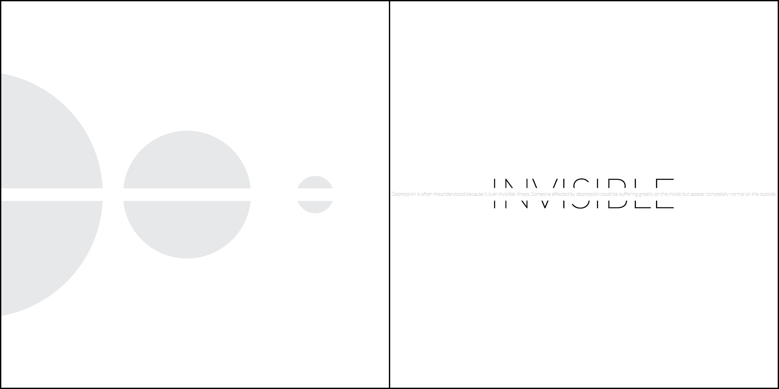
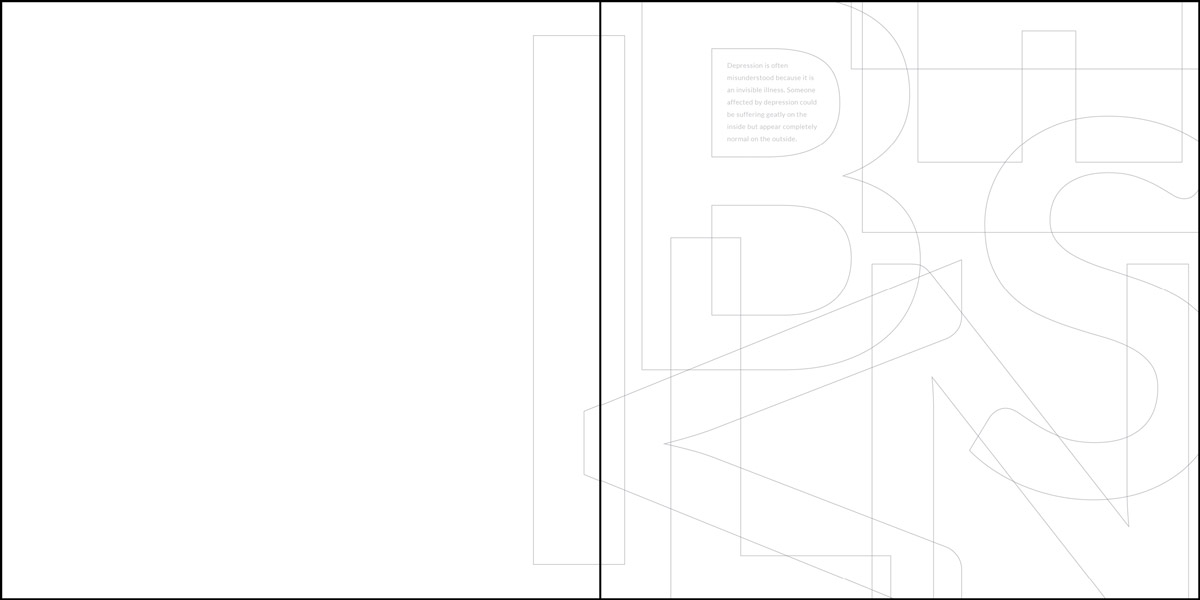
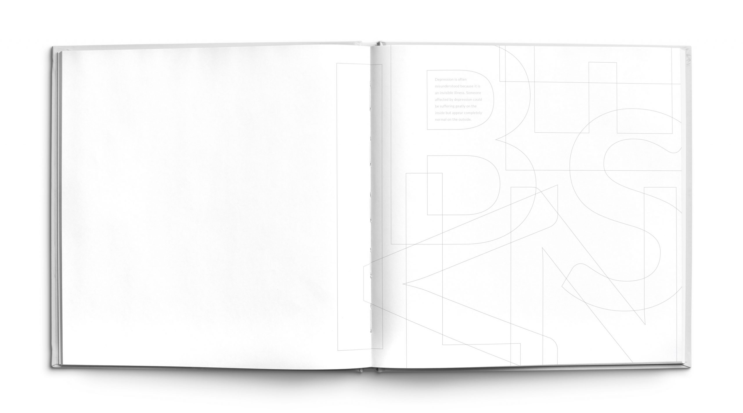
Depression is an invisible illness which means that it does not exhibit visible signs or symptoms that others can noticeably see. It is an affliction within the mind and body that can cause great suffering even though everything appears normal on the outside. The typography within the design is extremely thin and light to create a feeling of emptiness and the small secondary text blends into the larger letters to communicate a sense of being unseen. The smaller text is also contained inside the larger letters which conveys the idea of being trapped. The unfilled white space on the left page is a literal representation of the concept of invisibility.
Anger
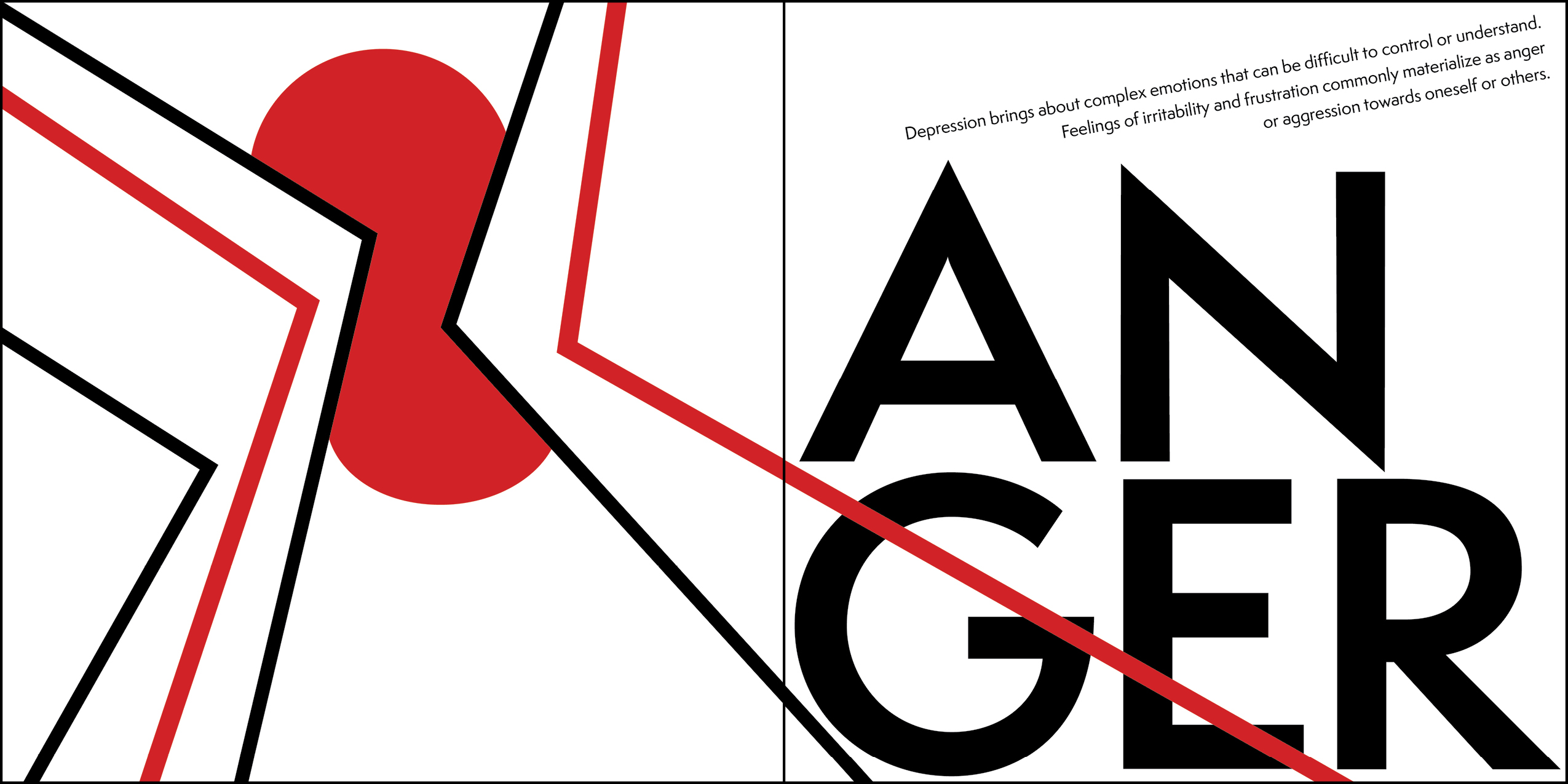
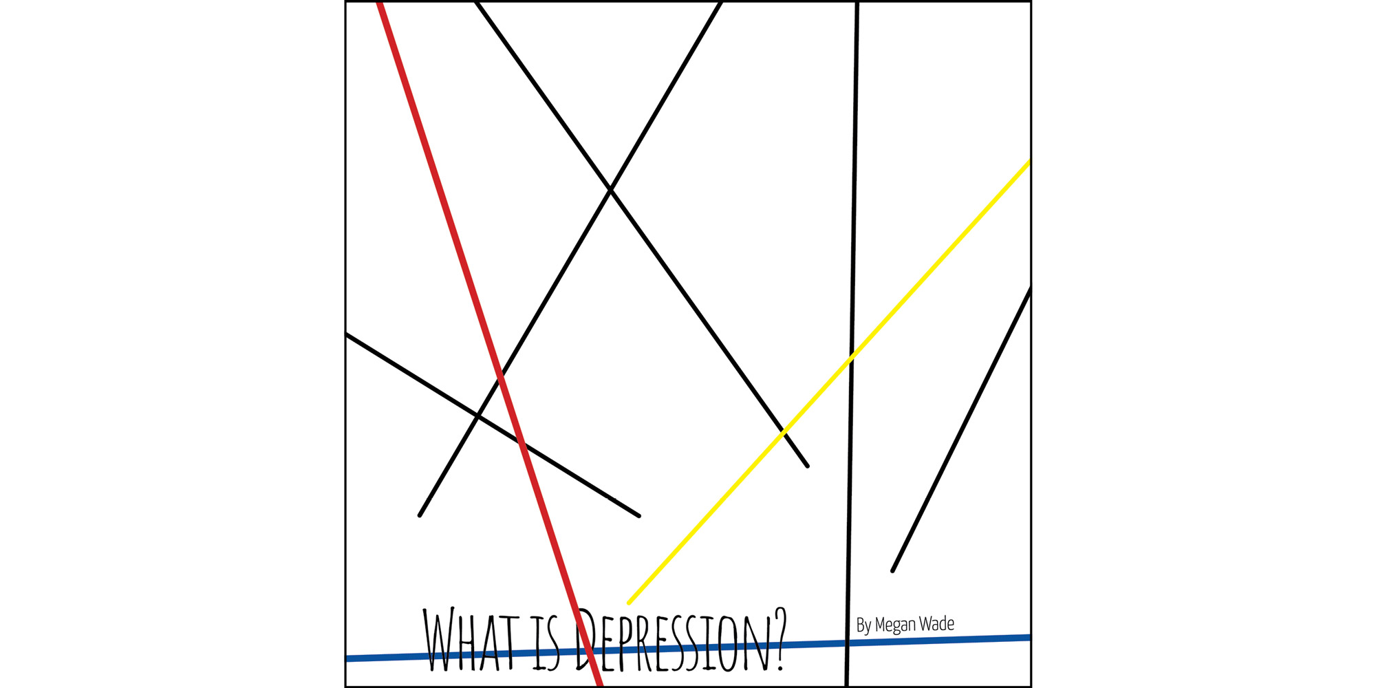
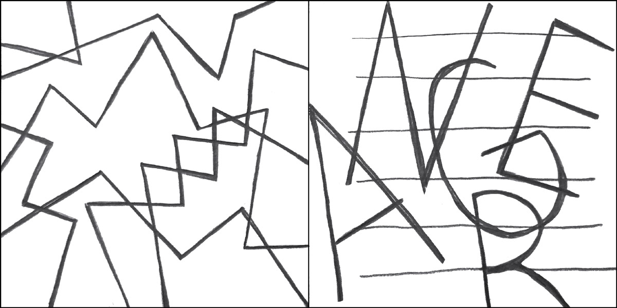
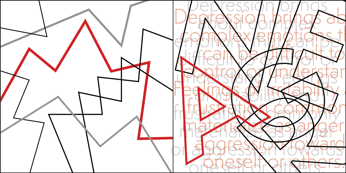
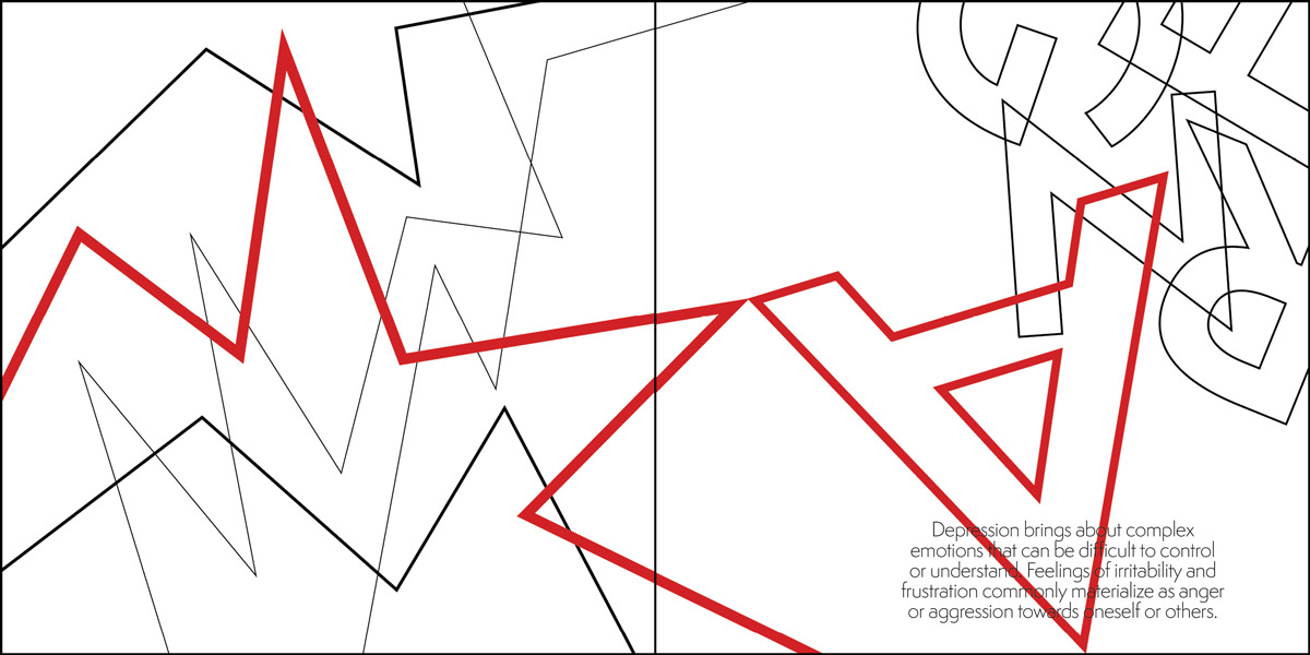
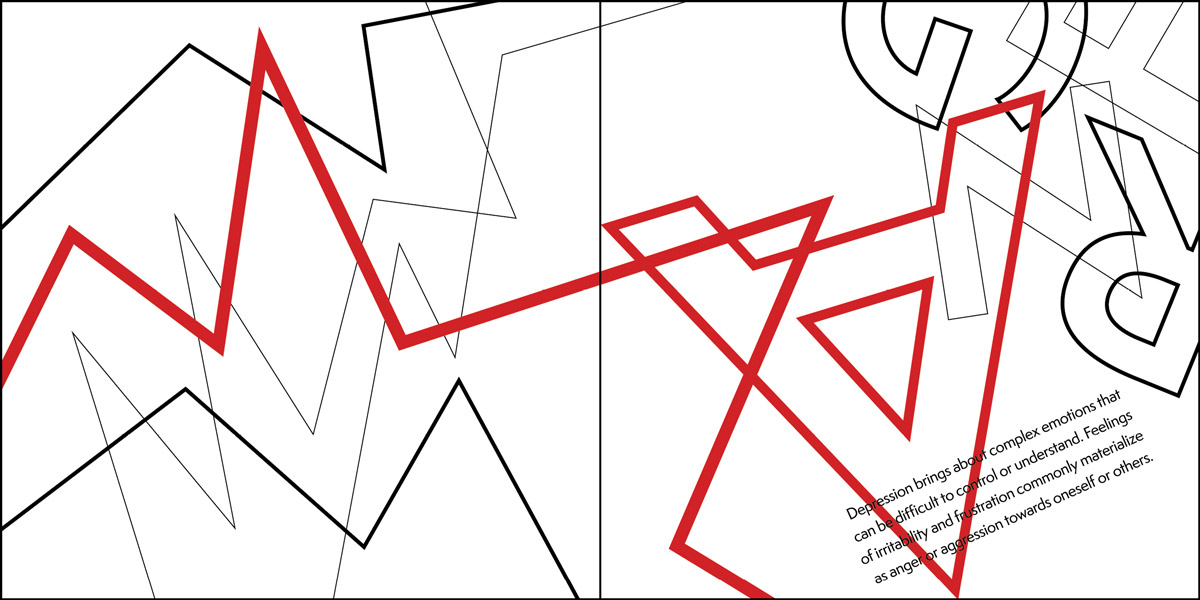
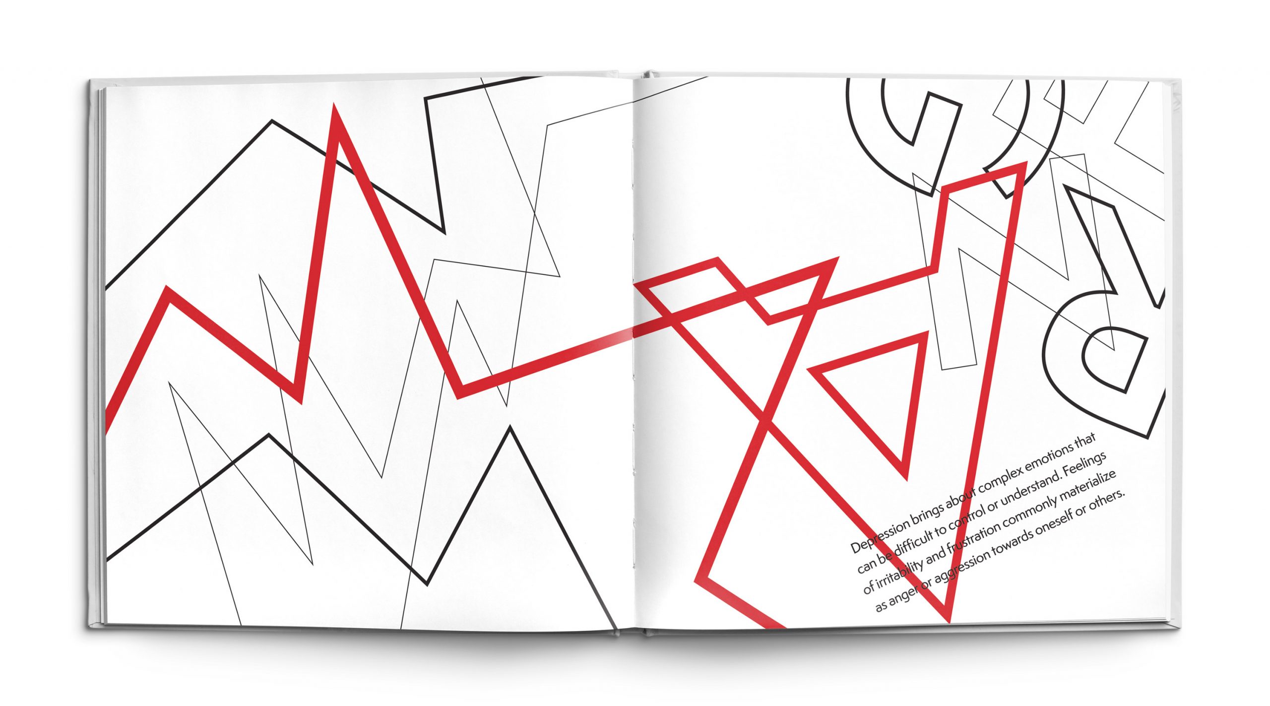
The Anger spread demonstrates the violent side of depression that can happen when an individual lashes out at themselves or others. All of the complex feelings and emotions that come with the illness are difficult to understand and deal with, which can manifest into aggression. The lines on the page are meant to represent this notion by illustrating the highs and lows within the jagged lines. The points within the design are spikey and sharp to emphasize the idea of hostility towards oneself or others. The forms are all overlapping and tangled up to demonstrate the chaotic feelings that can makes an individual with depression act irrationally and lash out. The color red signifies anger and aggression which further accentuates the feelings of the forms within the piece.
Memory Loss
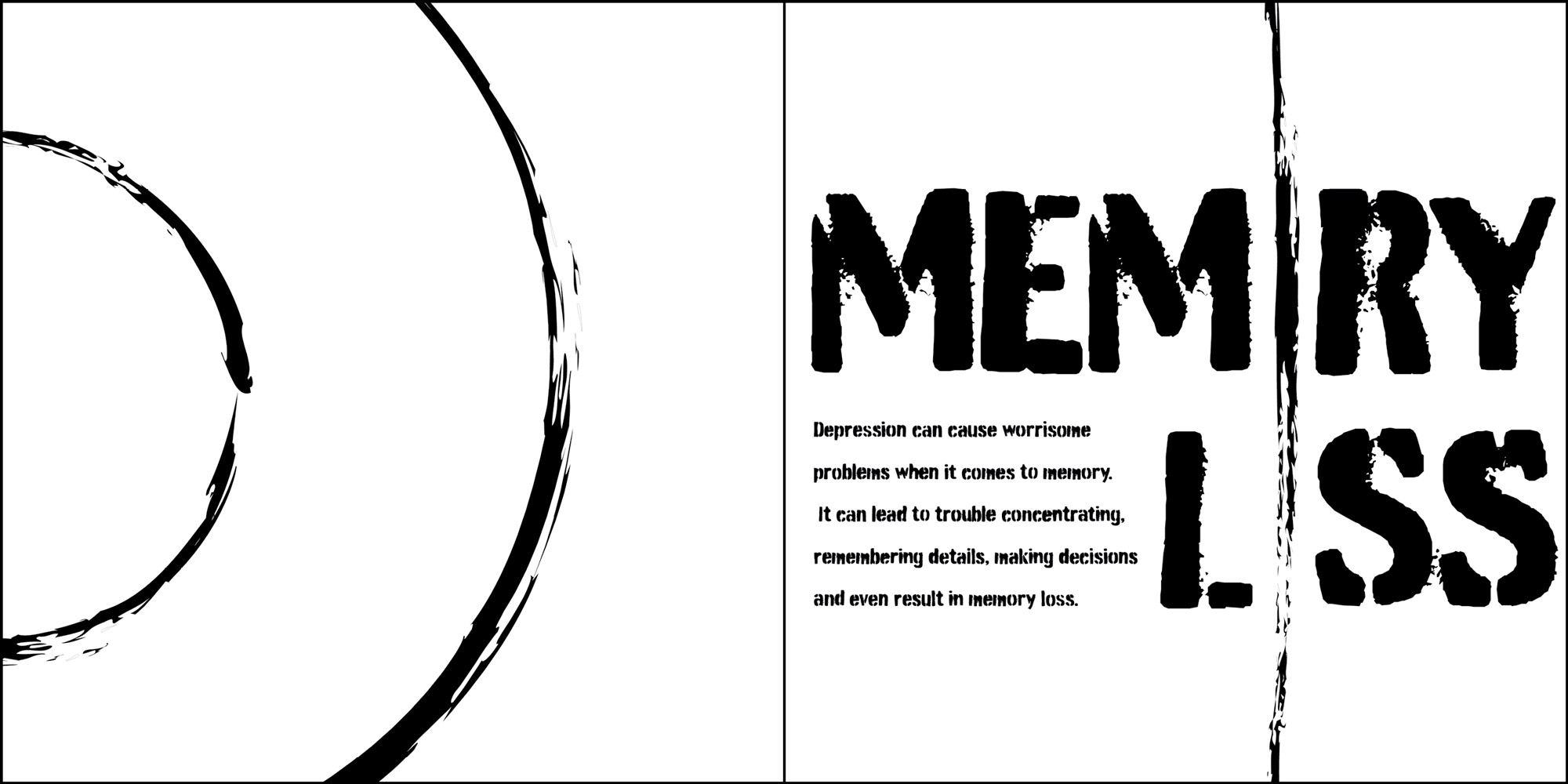
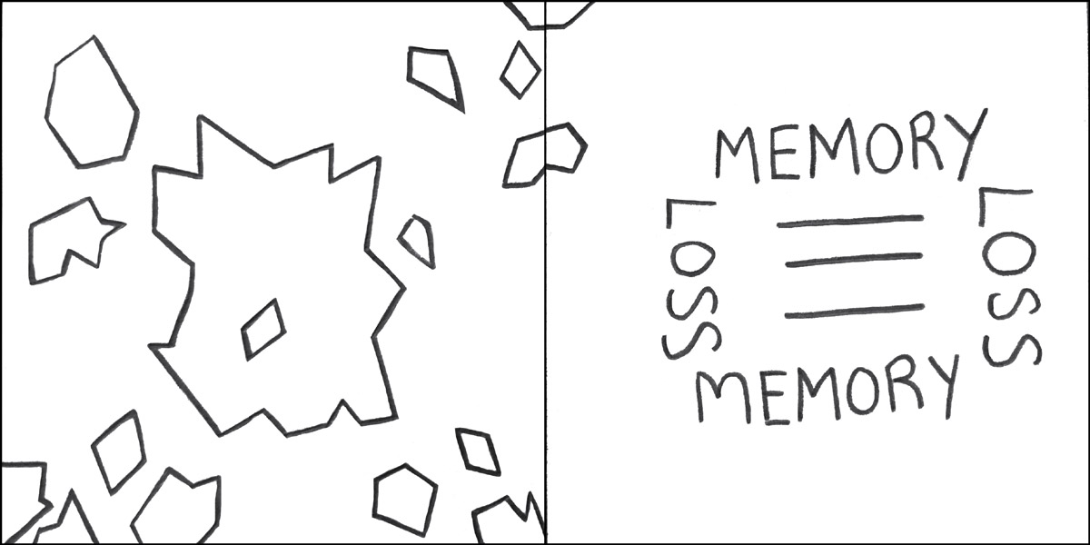
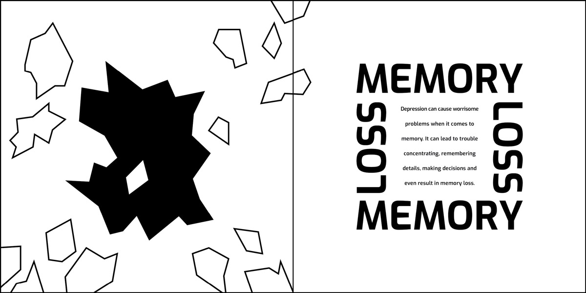
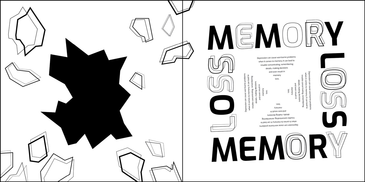
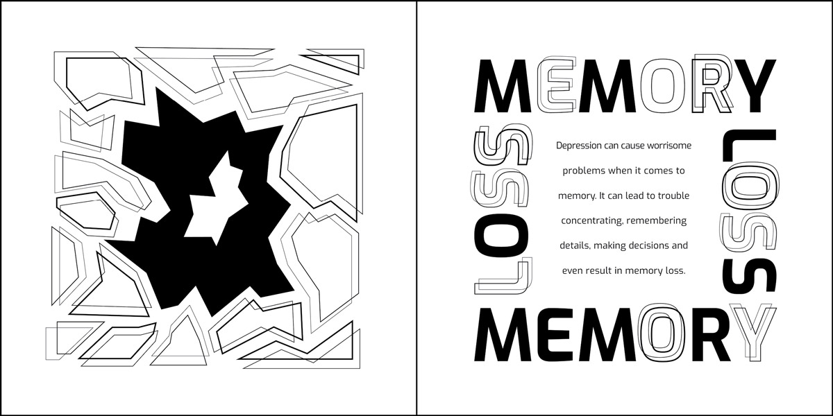
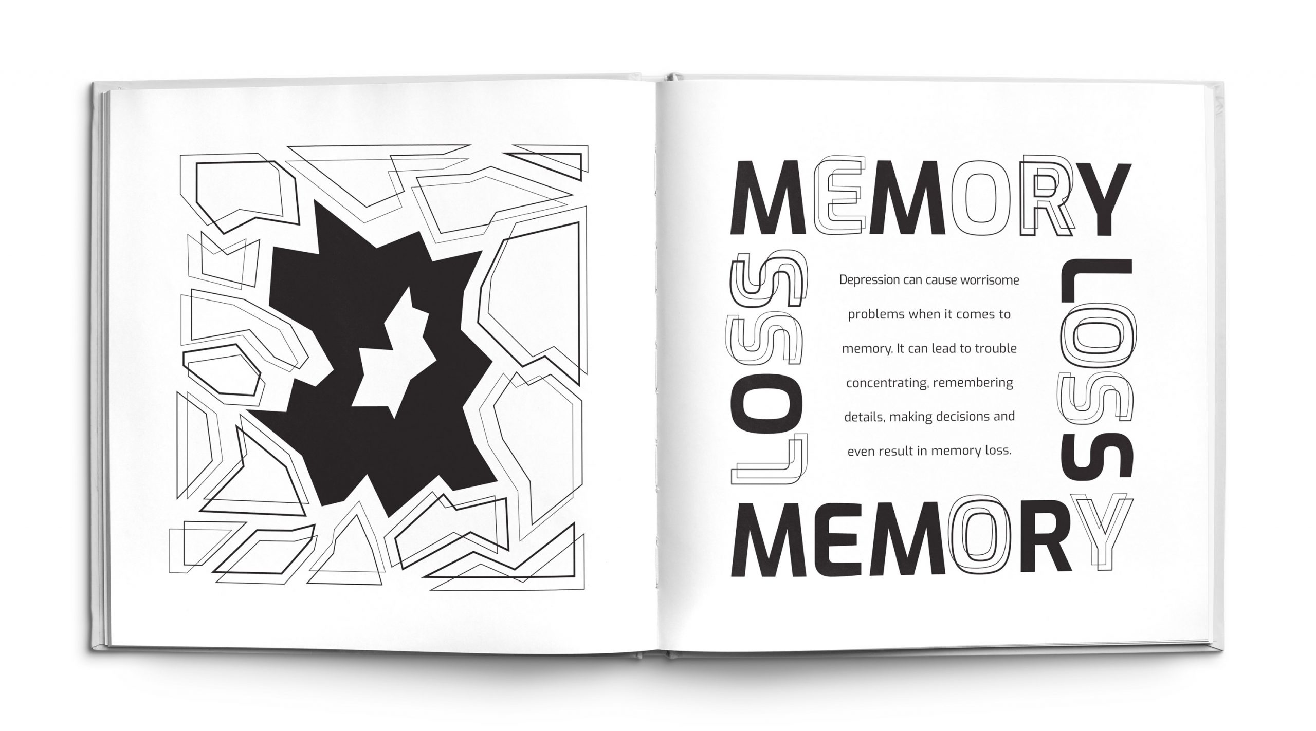
The Memory Loss page illustrates the problems individuals can have within the mind when affected by depression. The puzzle like structure with detached pieces communicates the feelings of someone who is having trouble concentrating, making decisions or having difficulty remembering information. The outside pieces are breaking apart and detaching from the mind while the middle section has a hole in it expressing forgetfulness or gaps in memory. The forms are repeated with different line weights to create a blurred vision feeling which illustrates brain fog and confusion within the mind. The typography consists of some filled shapes and some empty shapes and are repeated to further illustrate the concept of intact versus lost memories.
Sadness
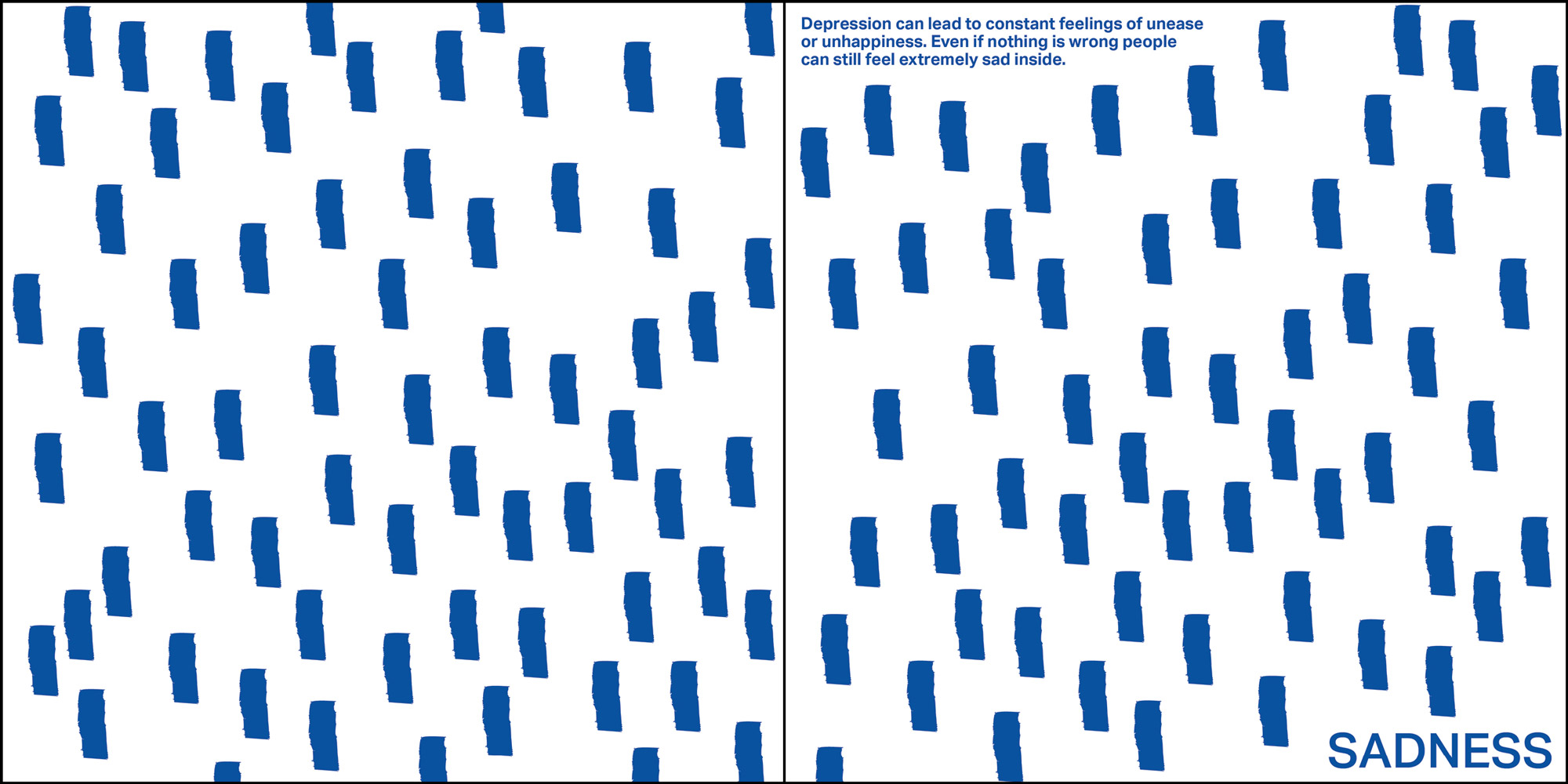
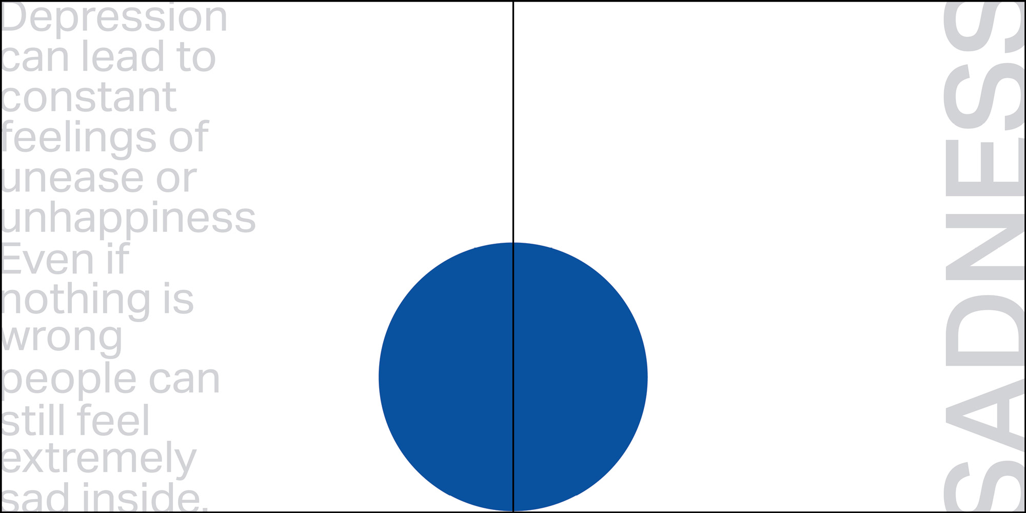
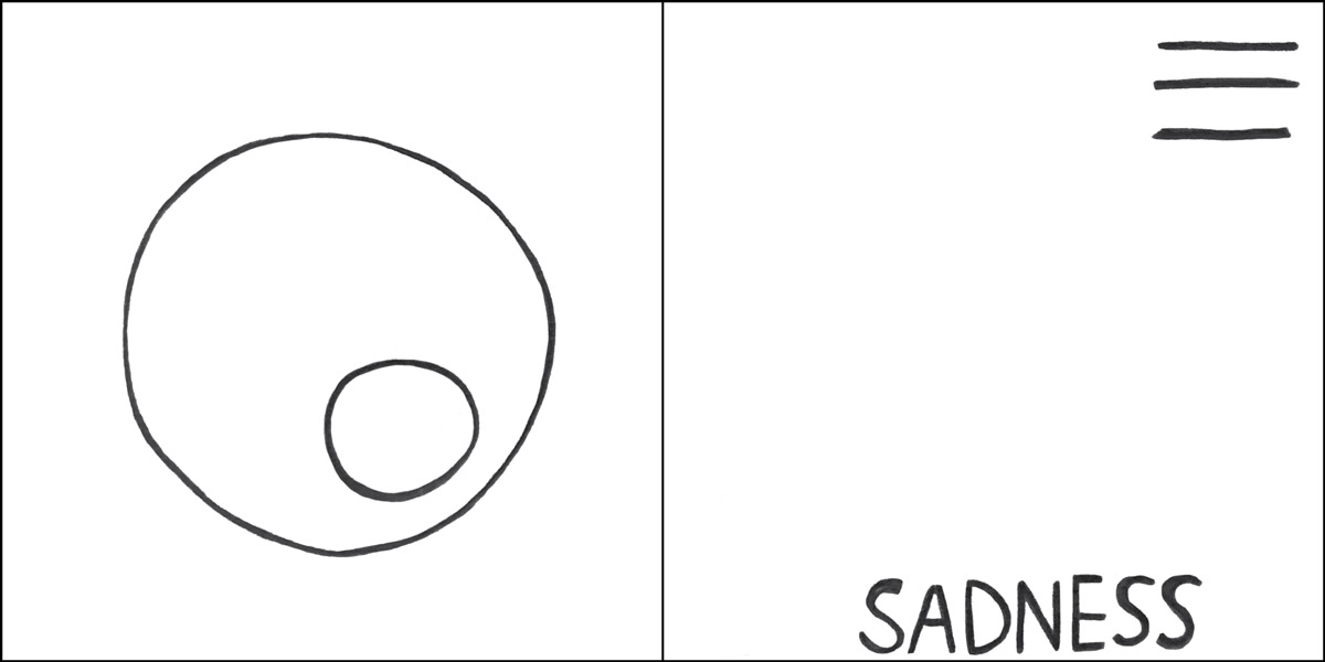
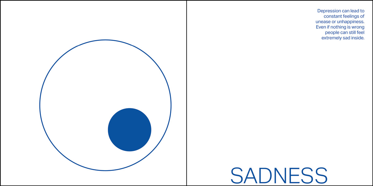
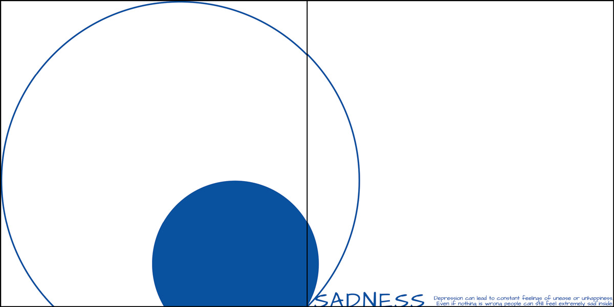
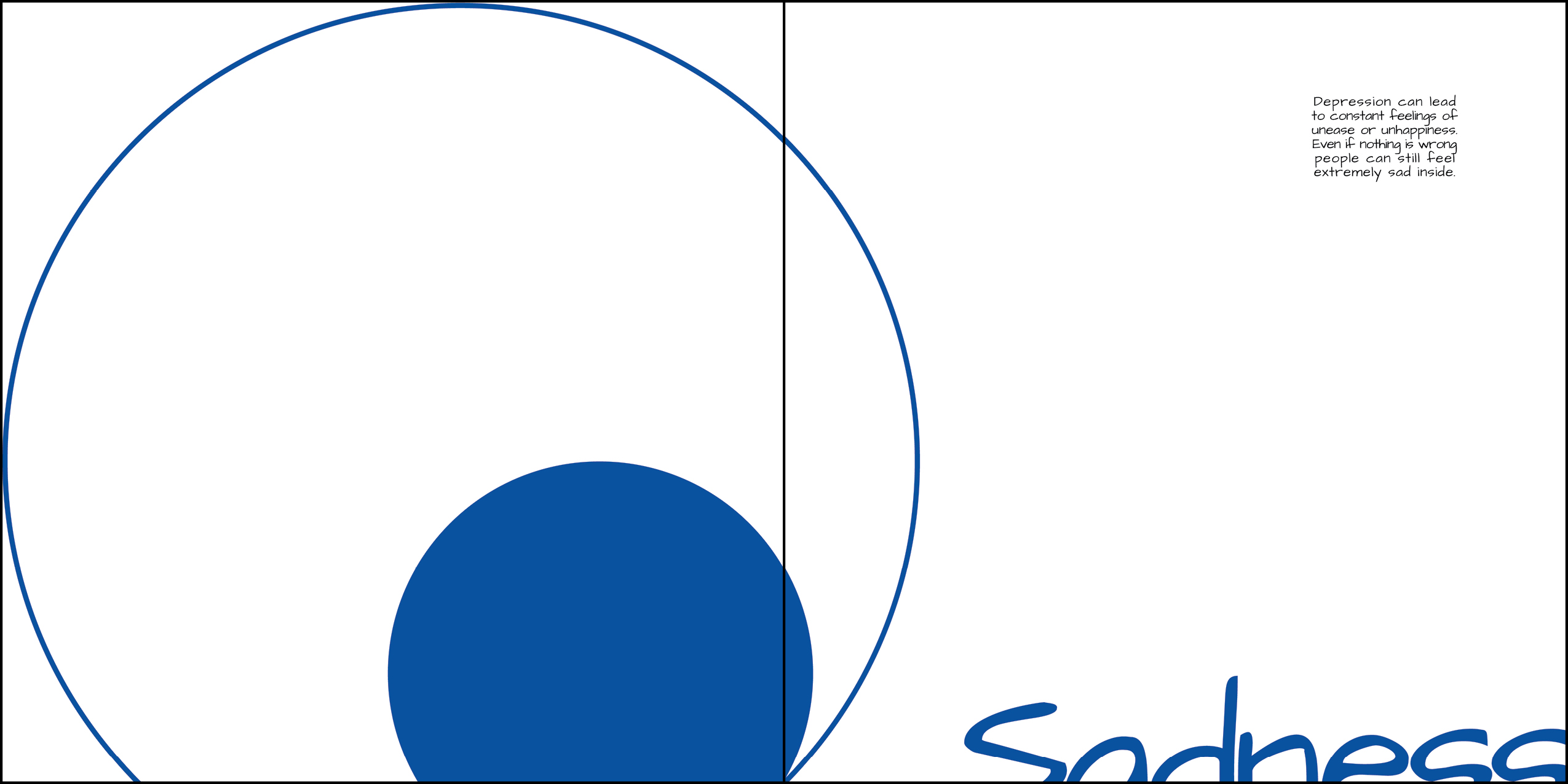
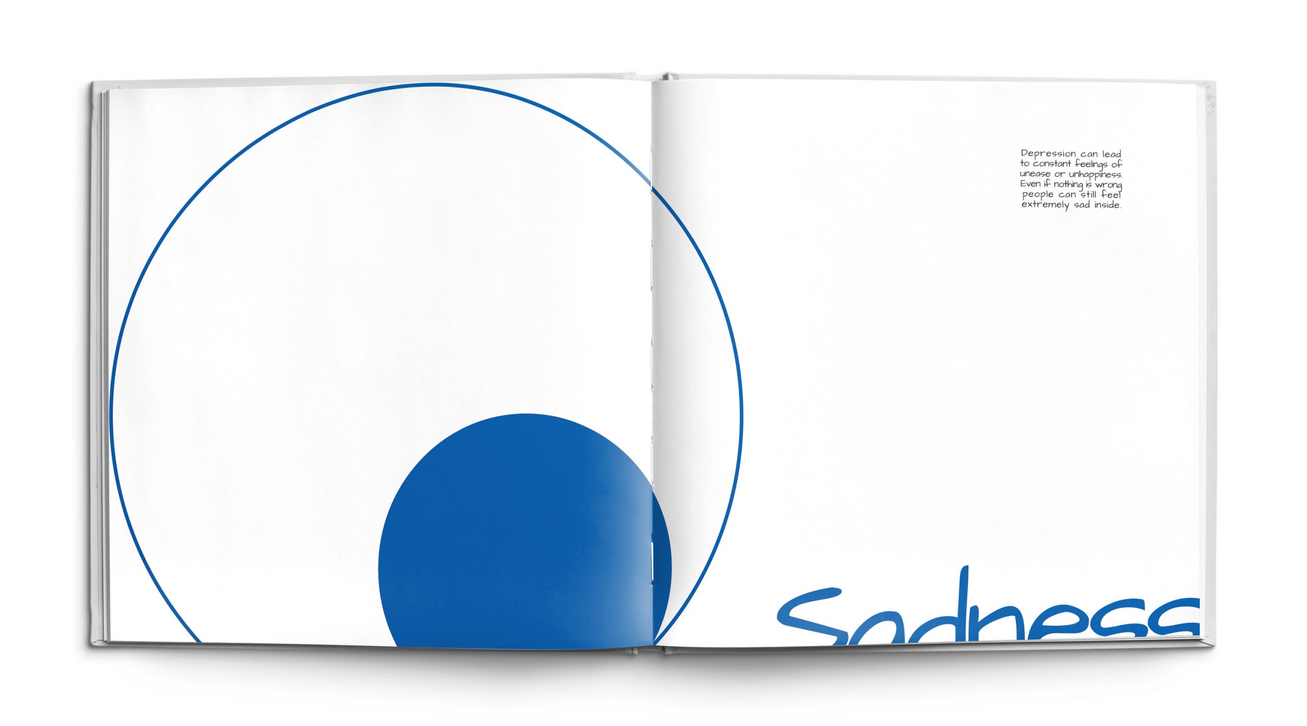
Sadness is an overwhelming emotion that can impact individuals with depression, even when nothing is seemingly wrong. The small blue circle within the larger empty circle on the left page is symbolic of sadness filling up inside someone. The circles are also suggestive of the shape of an eye looking down and tearing up. The blue forms are positioned at the bottom of the page and cut off to further underscore the sentiment of feeling down. The text block in the upper right corner is small and off by itself to represent the loneliness and isolation that comes with depression which is a major cause of the sadness that individuals feel. The color blue also holds a deep significant meaning in the piece because within color psychology it represents sadness, coldness and loneliness.
Physical Pain
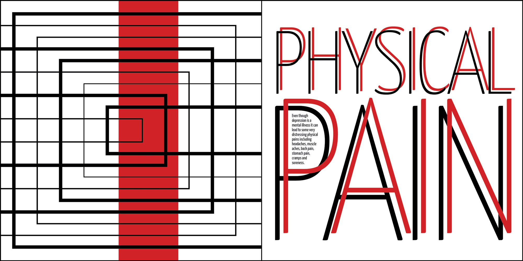
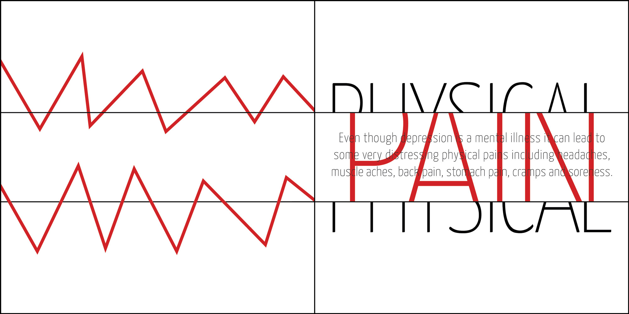
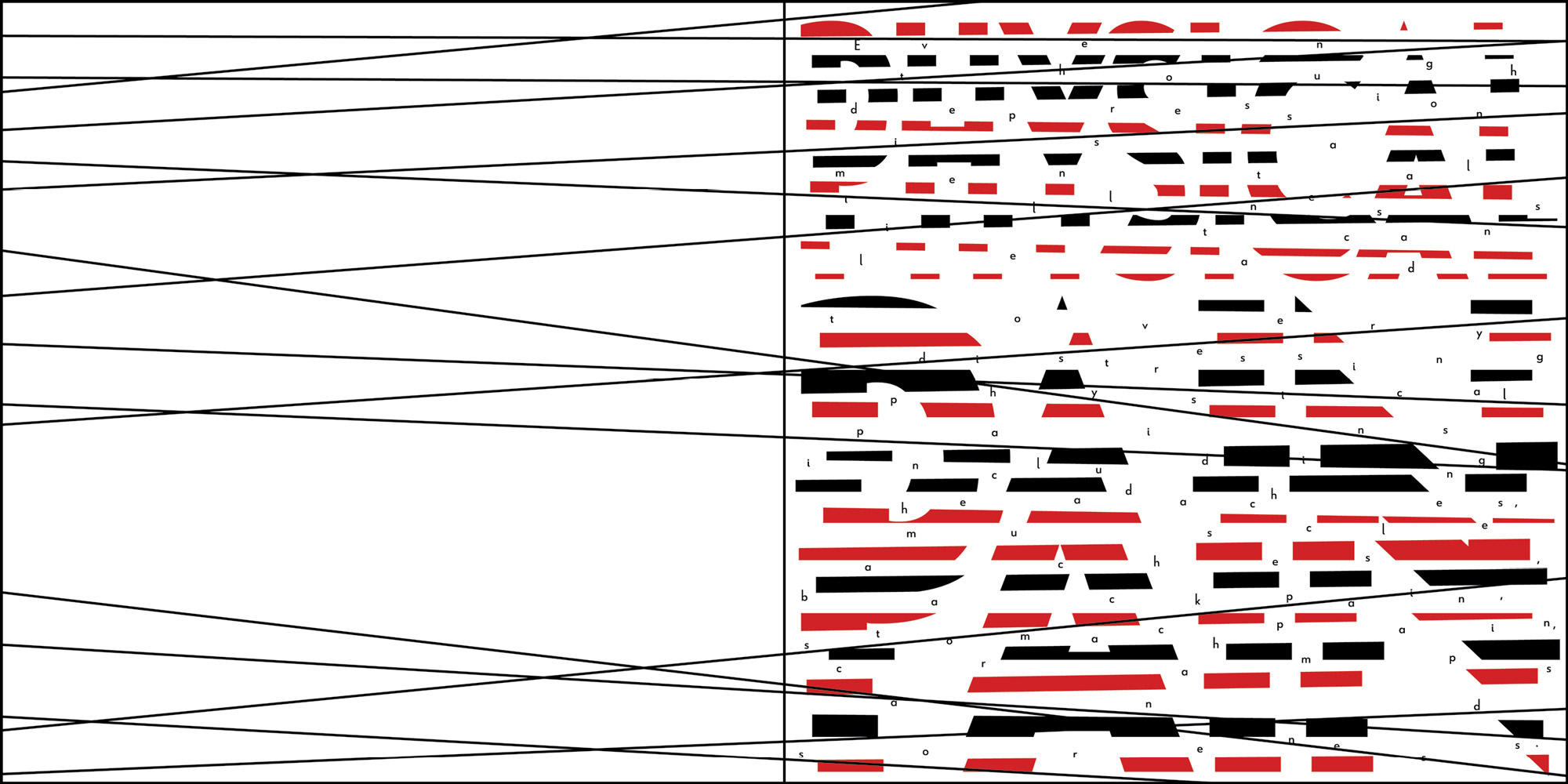
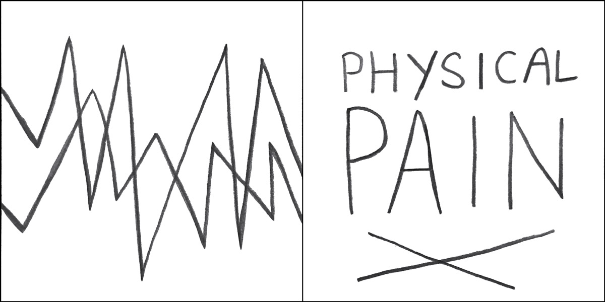
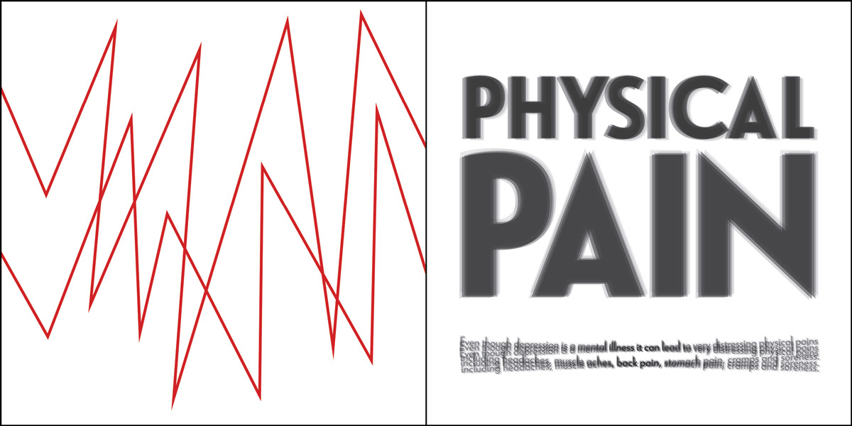
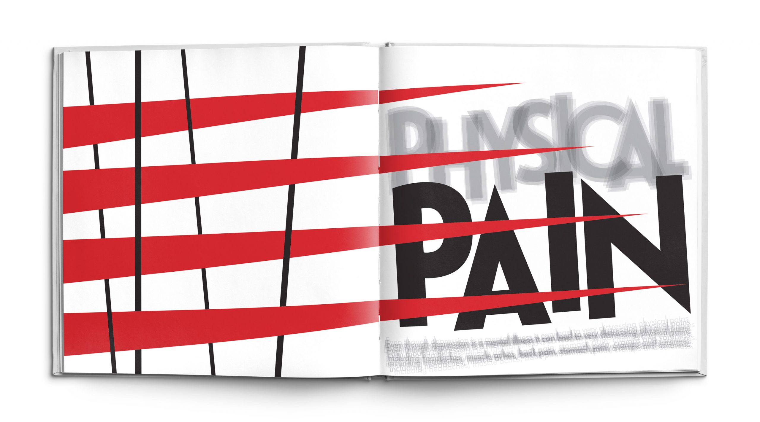
The Physical Pain spread is straight forward in that it represents the pain endured by individuals suffering from depression. People with depression frequently have chronic aches and pains that are linked to the emotional distress within their lives. Headaches, back pain, stomach pain, cramps and general soreness are the most common physical complaints. The large red triangles represent depression within the piece. They are spiky, sharp and stabbing into the text on the right to symbolize depression causing pain. The lines on the left create an uncomfortable feeling as the triangle shapes are meant to look like as if they are moving through them, which creates the essence of scrapping like nails on a chalkboard. The grey text is blurred to embody the idea of radiating pain within the body, and the word “Pain” is bold and large to symbolize the idea of chronic pain taking over your life.
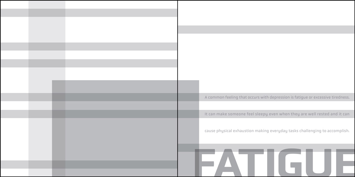
Fatigue
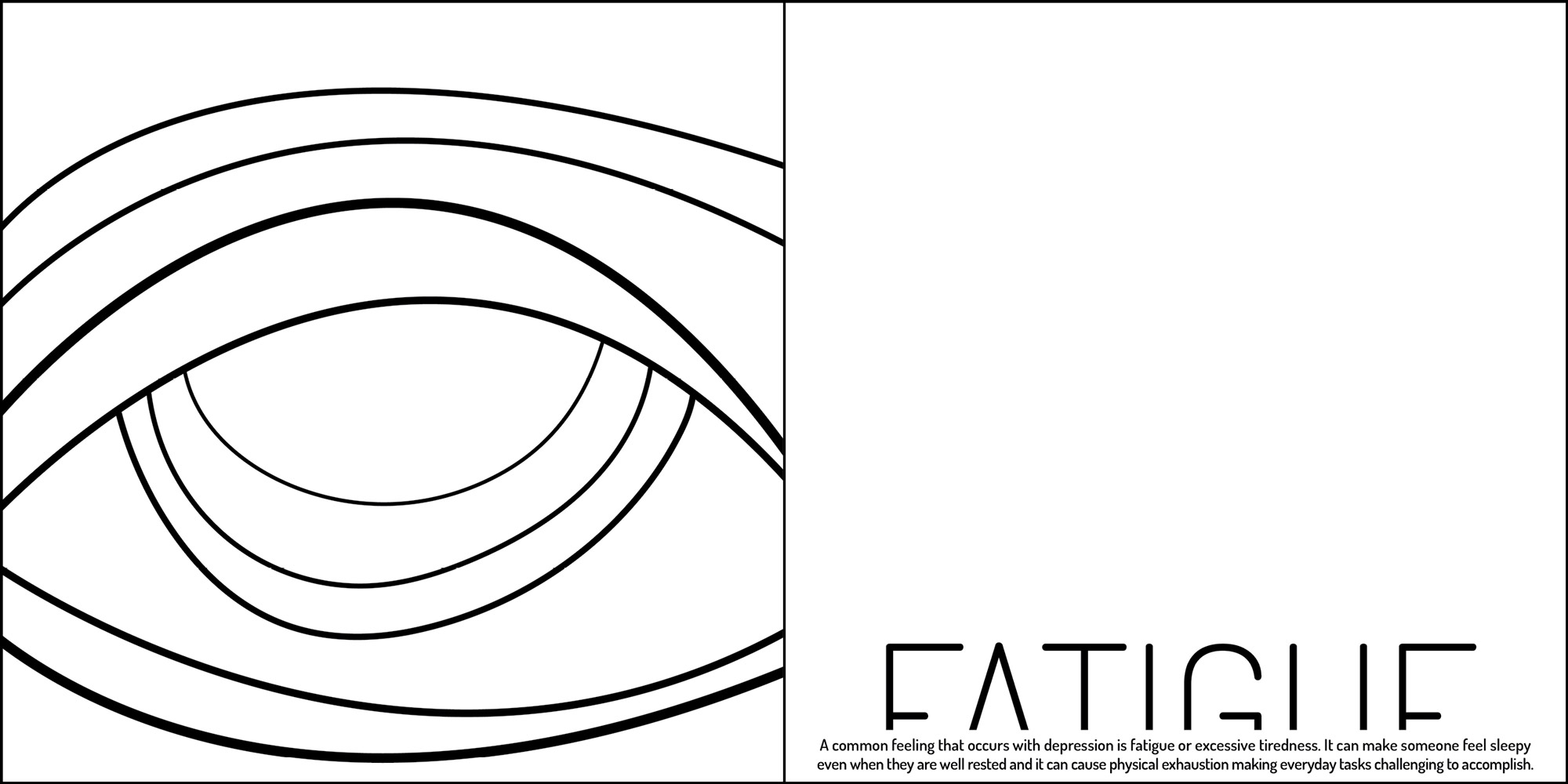
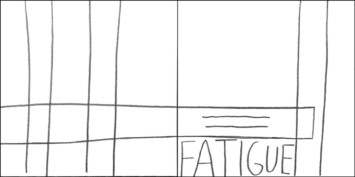
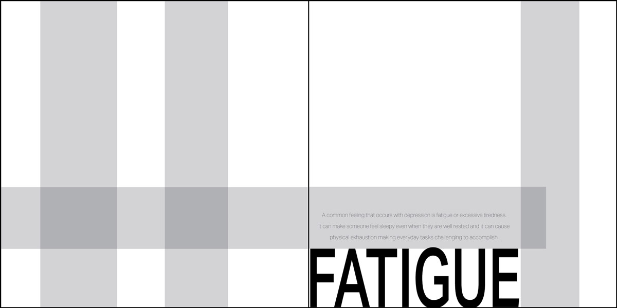
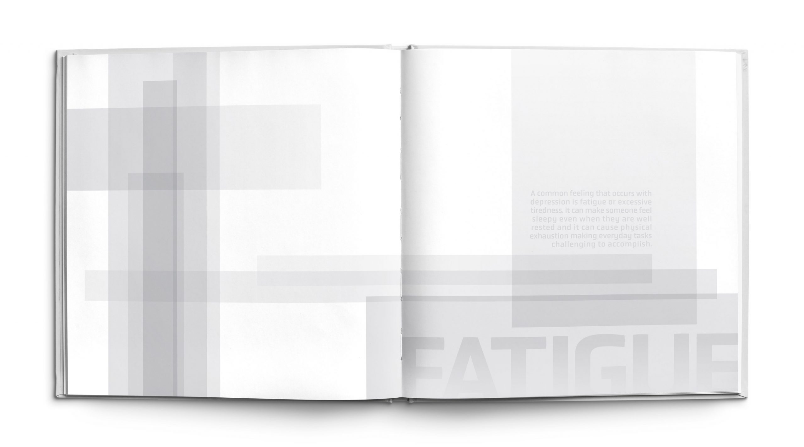
Many of the underlying symptoms of depression result in a persistent feeling of fatigue. Individuals suffering from the illness can feel tired even when they get adequate amounts of sleep. The Fatigue spread captures this feeling of exhaustion through the use of simple square forms that are meant to feel static and heavy. The use of overlap and different opacities yields a blurred effect that represents the blurred vision of tired eyes. The design is bottom heavy and made to look dull to reiterate the notion of low energy. The use of the color grey was imperative for this design to communicate the lack of emotions and weakness that one feels due to feelings of fatigue.
Hopeless
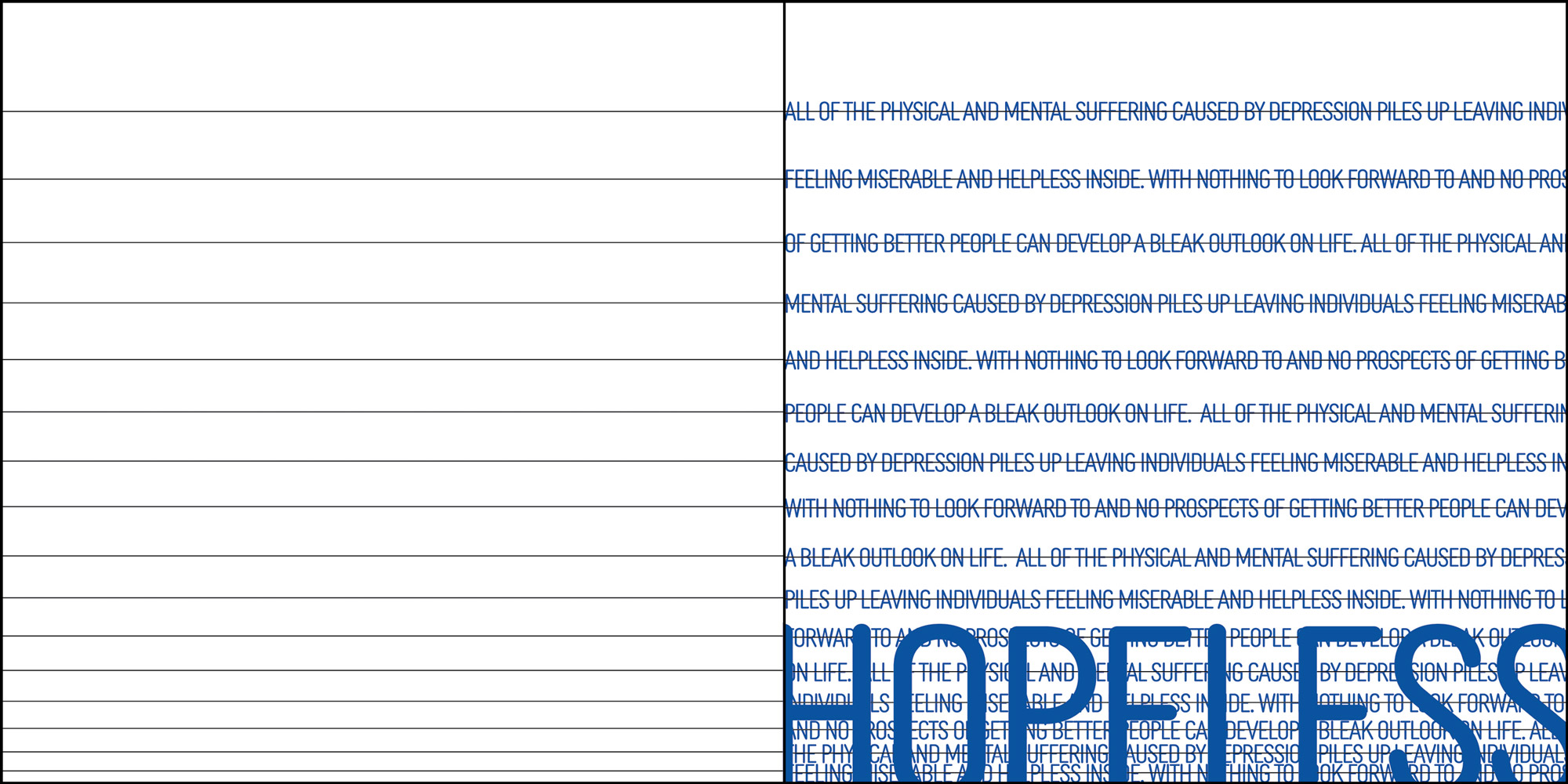
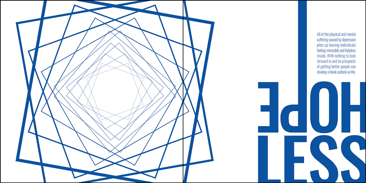
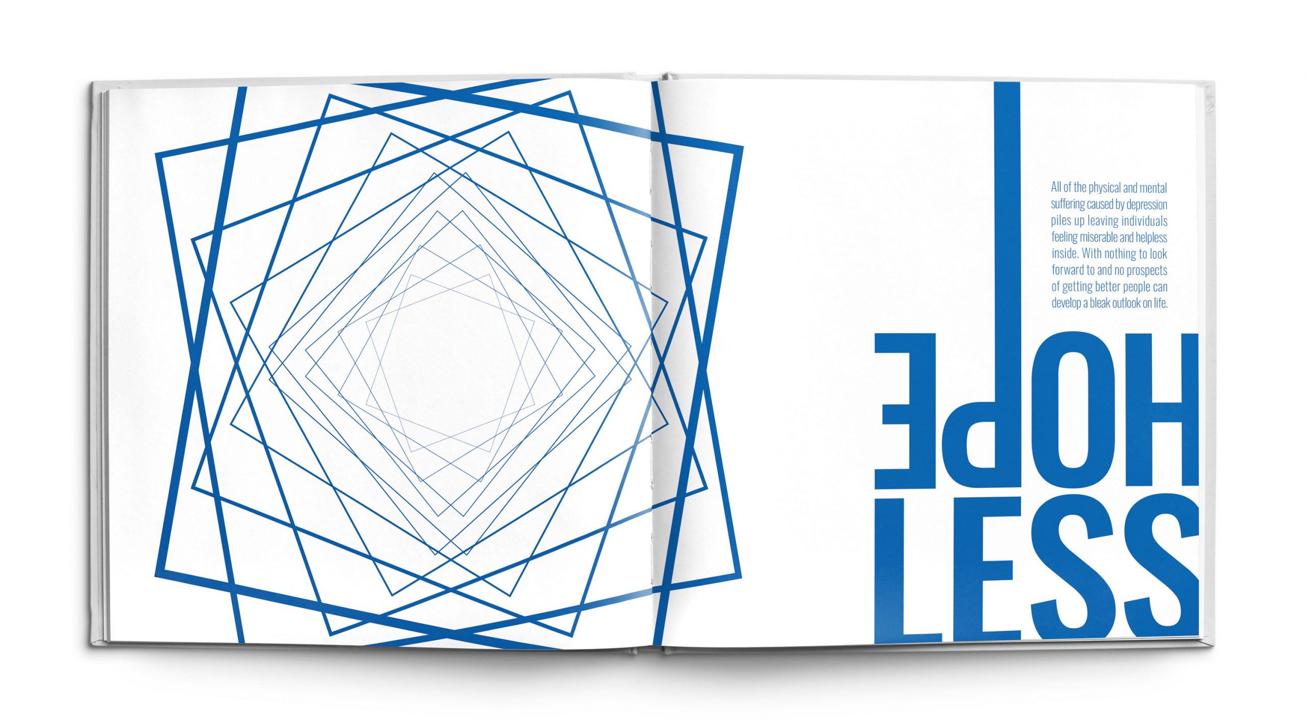
The hopeless page embodies the idea of feeling trapped within depression. Individuals with depression often feel hopeless because they can’t escape the relentless physical and mental suffering that comes with the illness. The squares on the left of the page rotate and decrease in size as they get closer to the center of the spread which creates the illusion of depth. This arrangement is meant to express the notion of a swirling abyss to represent those never-ending feelings of despair that come with depression. The text on the right is heavy and stacked in the corner to signify being weighed down and the line on the letter P continues off the page to further emphasizes the notion of falling into space that is illustrated within the forms on the left.
Appetite Issues
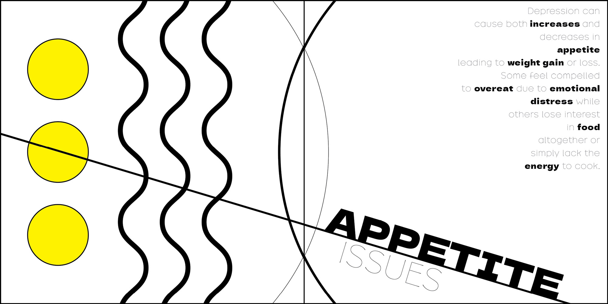
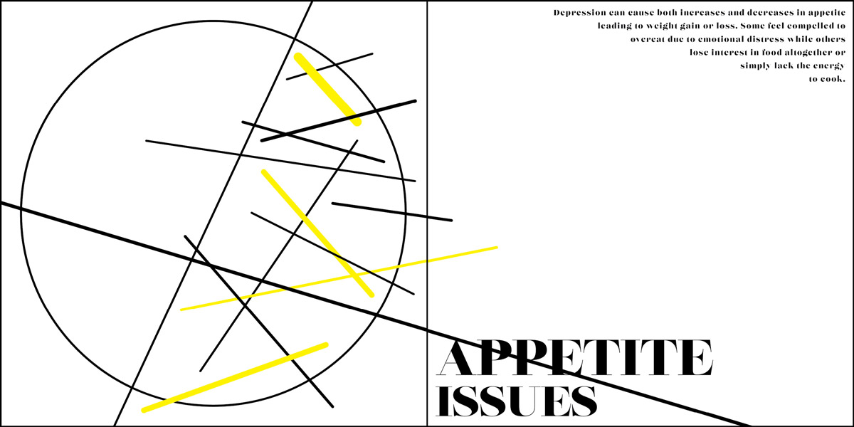
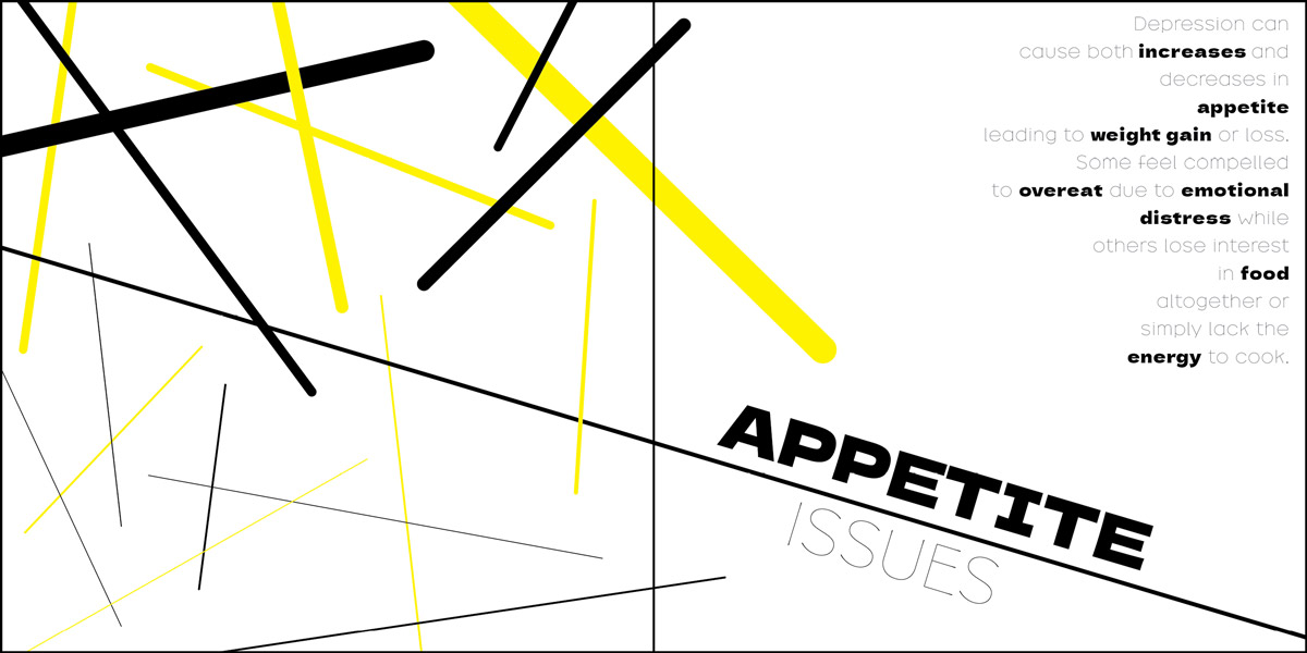
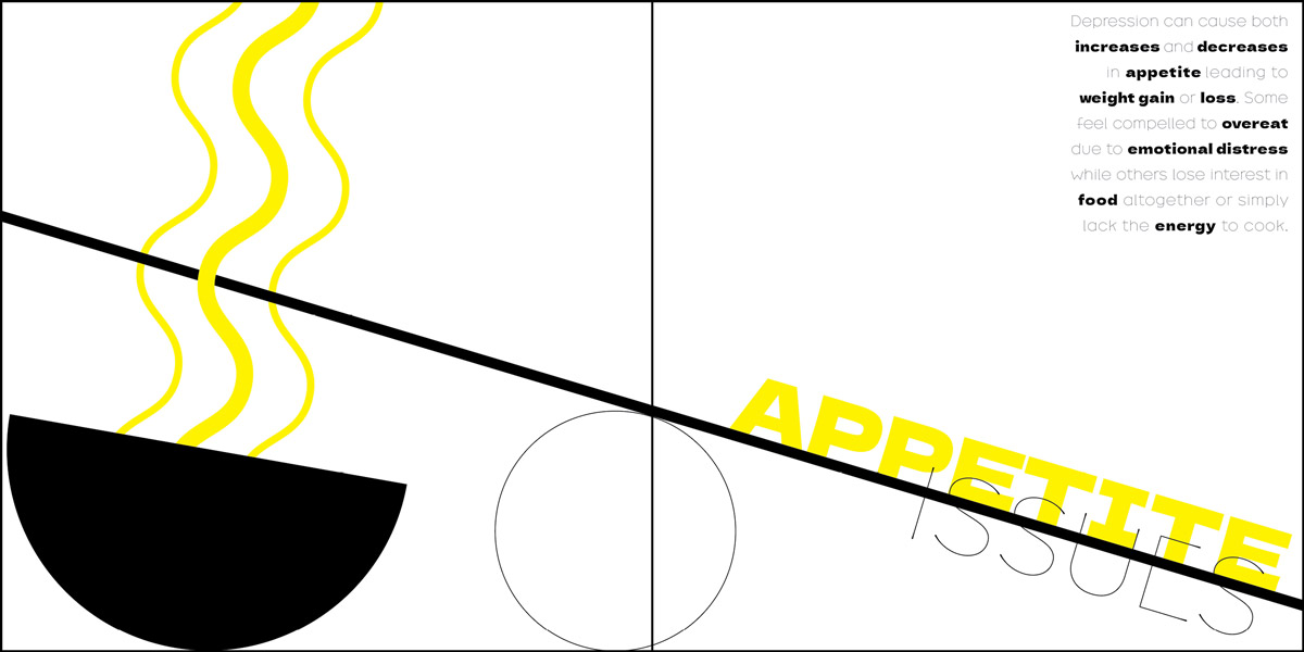
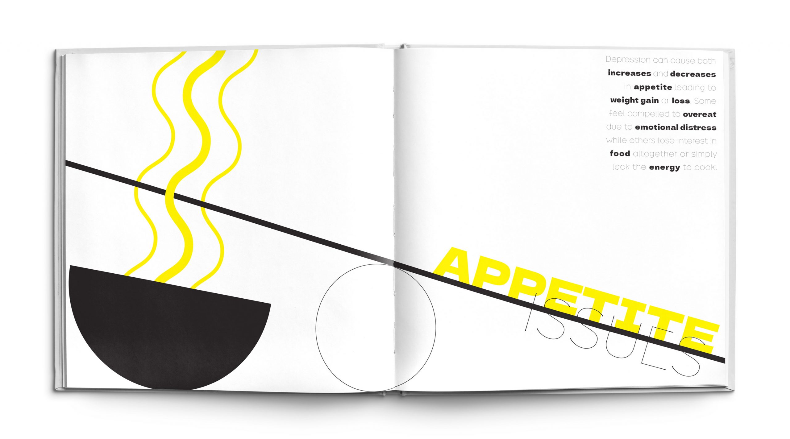
The Appetite Issues page plays with the idea of opposing scale and weight through the use of contrasting heavy and light line and form. The filled shapes and text represent the idea of weight gain or overeating while the thin empty forms signify weight loss or a lack of appetite. The center circle and the diagonal line create the likeness of a scale with the words “appetite issues” on the scale weighing it down. The filled black half circle is reminiscent of a bowl and the yellow lines could be interpreted as either steam rising from the bowl or abstract noodles. The secondary text in the upper corner also uses contrasting heavy and thin typefaces to further illustrate the two side of the appetite spectrum that can affect individuals with depression.
Communicating Through Form
Before beginning the book designing process I researched the elements and principles of design and how they could be utilized to evoke the complex feelings I was looking to portray. These elements and principles were greatly considered during the page development process and can be seen in use throughout design iterations.
Principles of Design
Balance, Emphasis, Movement, Pattern, Repetition, Proportion, Rhythm, Variety, Unity
Elements of Design
Color, Line, Mass, Motion, Space, Texture, Type, Value

How can simple
graphical forms
be used to communicate a complex idea?
Design Process
The book page designs were developed through a process of creation and exploration. Each spread began by sketching a variety of ideas which were then made digitally. Those design concepts were taken and pushed further to test how the layout and forms could express the emotions within the page. The final designs chosen for the book were the best representations for each symptom.
Design Evolutions
Design Evolutions
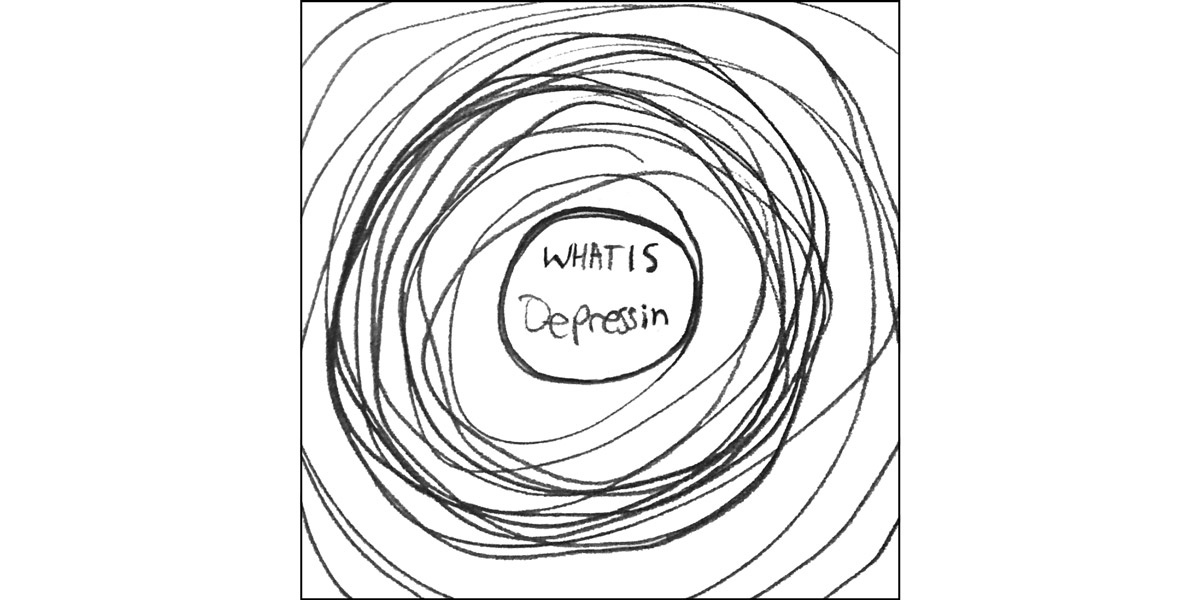
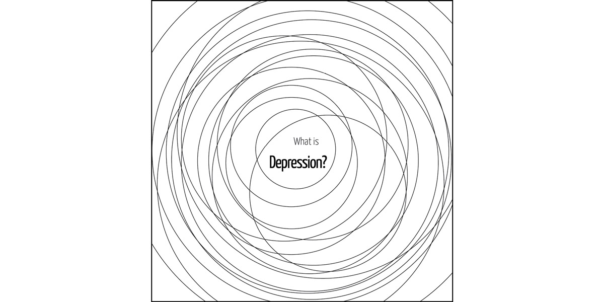
The design evolutions below showcase the beginning sketch, the original digital design, one design iteration from the development process and the final design of the selected page spreads. As you can see some of the designs changed drastically throughout the development stage of creating while others stayed similar to their original sketch.

Anger
In order to improve this design I experimented a lot with line thicknesses. Rearranging the typography also really helped clean up the look of the design.
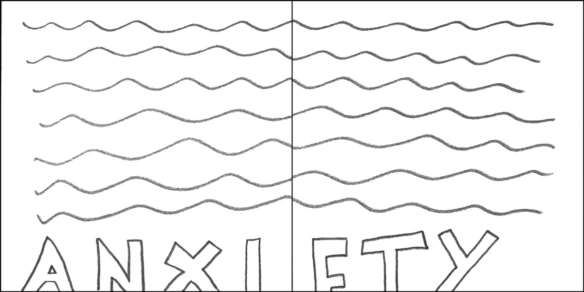
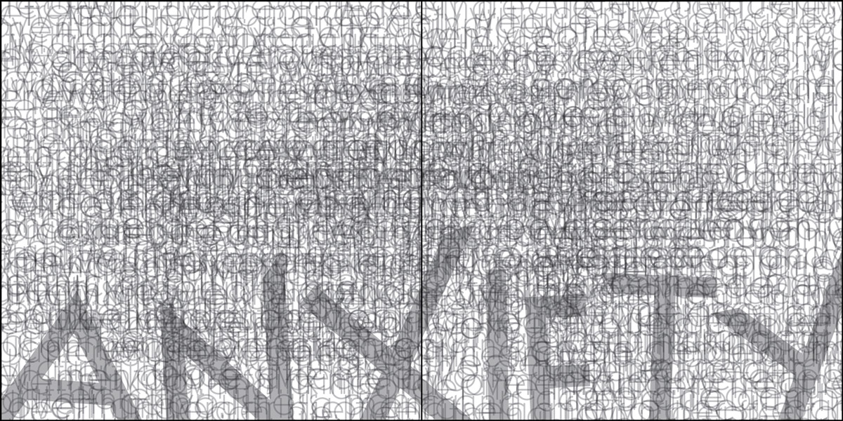
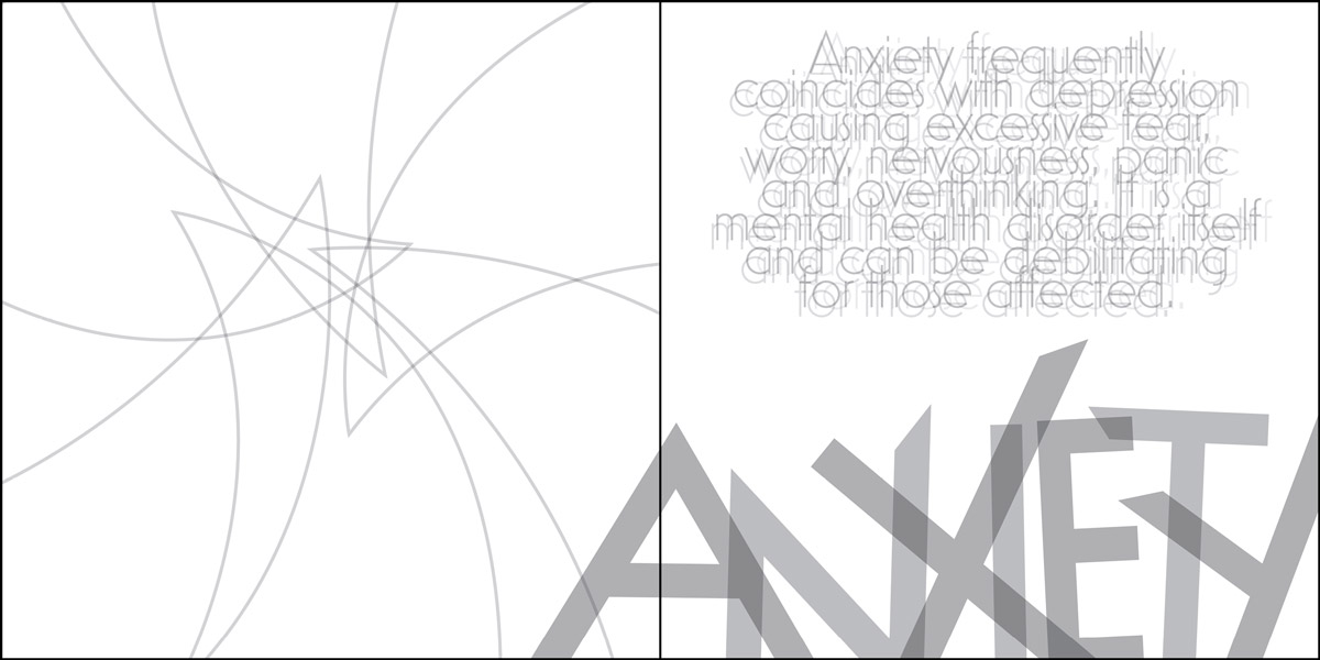
Anxiety
This design started out super heavy and did not match the other designs within the book. I continued to shrink and adjust elements within the design until they fit with the overall look.
Sadness
I played a lot with the placement and size of the typography within this design but ended up picking something similar to my original idea to better express the emotion.
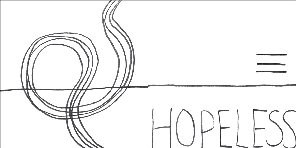
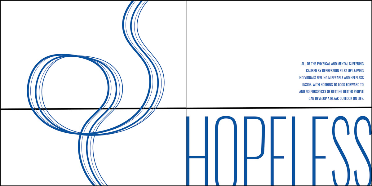
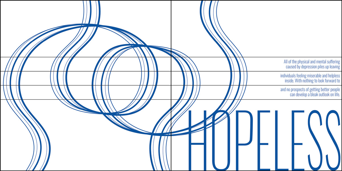
Hopeless
As this page progressed I utilized more overlapping shapes to create the illusion of distance and I switch to a bolder font to signify the idea of being weighed down.
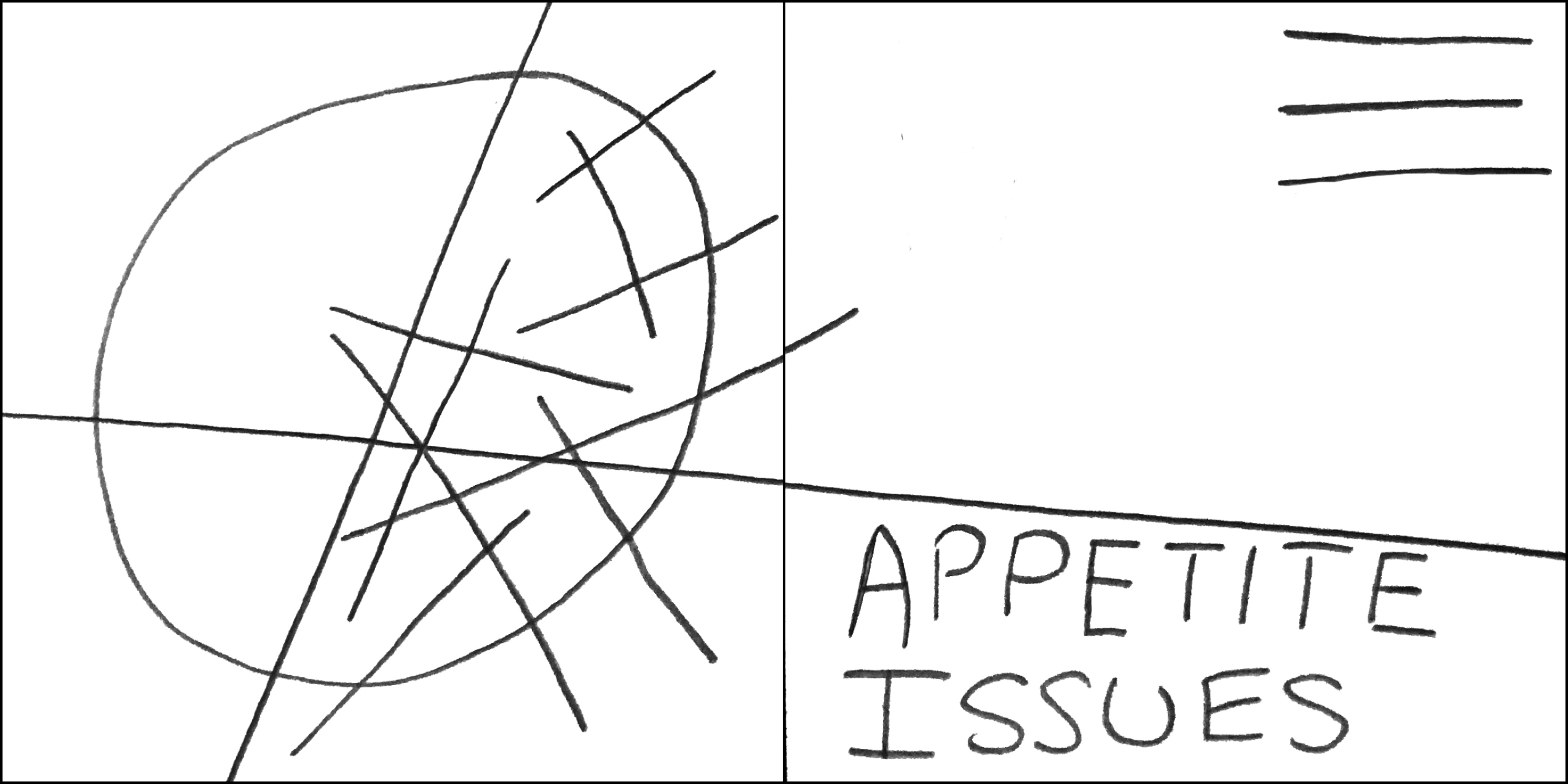
Appetite Issues
Appetite Issues
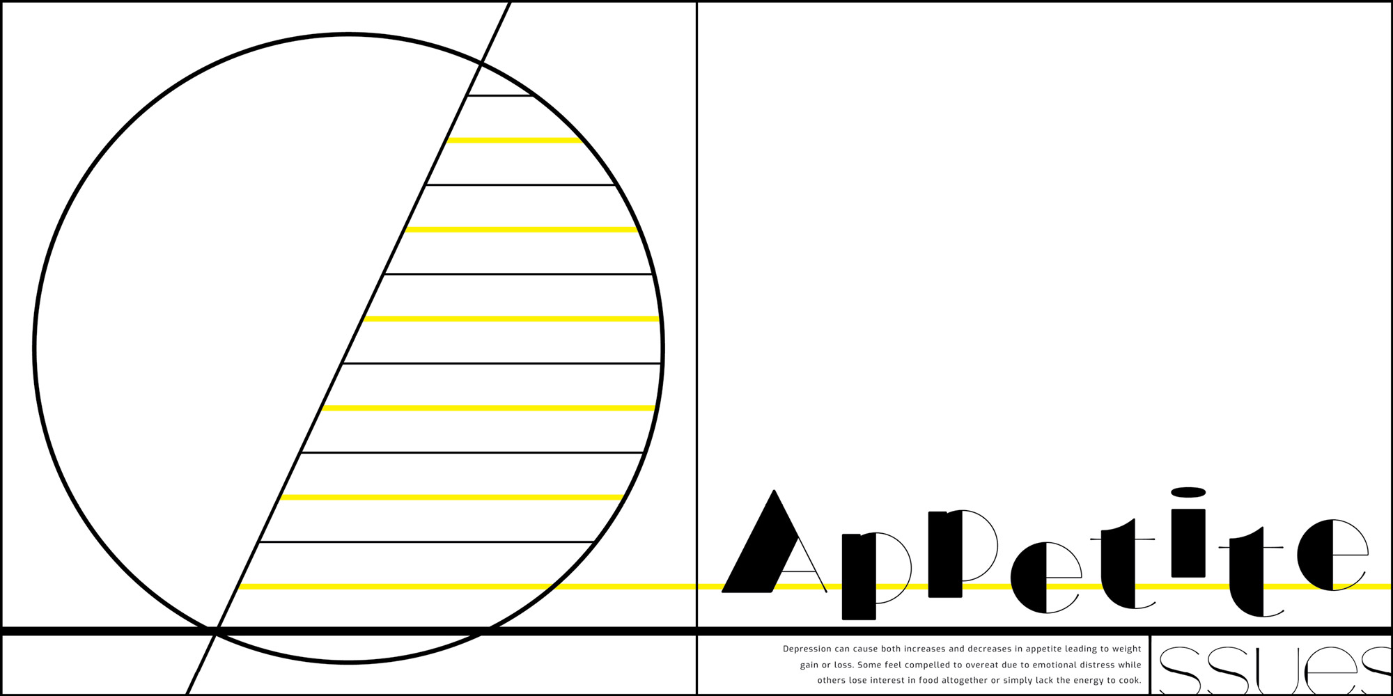
As this design developed I experimented more with using heavier weights within the forms to really highlight the idea of contrasting thick verses thin.
Memory Loss
Memory Loss
Within the iteration process I recreated the pieces on the left page to appear more broken or detached to better express the idea of a struggling mind.
Physical Pain
Within my design process I realized that the lines in the physical pain page were to similar to the Anger page. Switching to triangle forms made the spread much more dynamic.


Fatigue
This design stayed similar throughout the design evolutions. Later in the process I was able to utilize gradients and opacity changes to create more depth within the piece.

Loss of Interest
This design evolution experimented a lot with adding and subtracting elements from the page and moving elements around to better show the disconnect felt from loss of interest.
Invisible
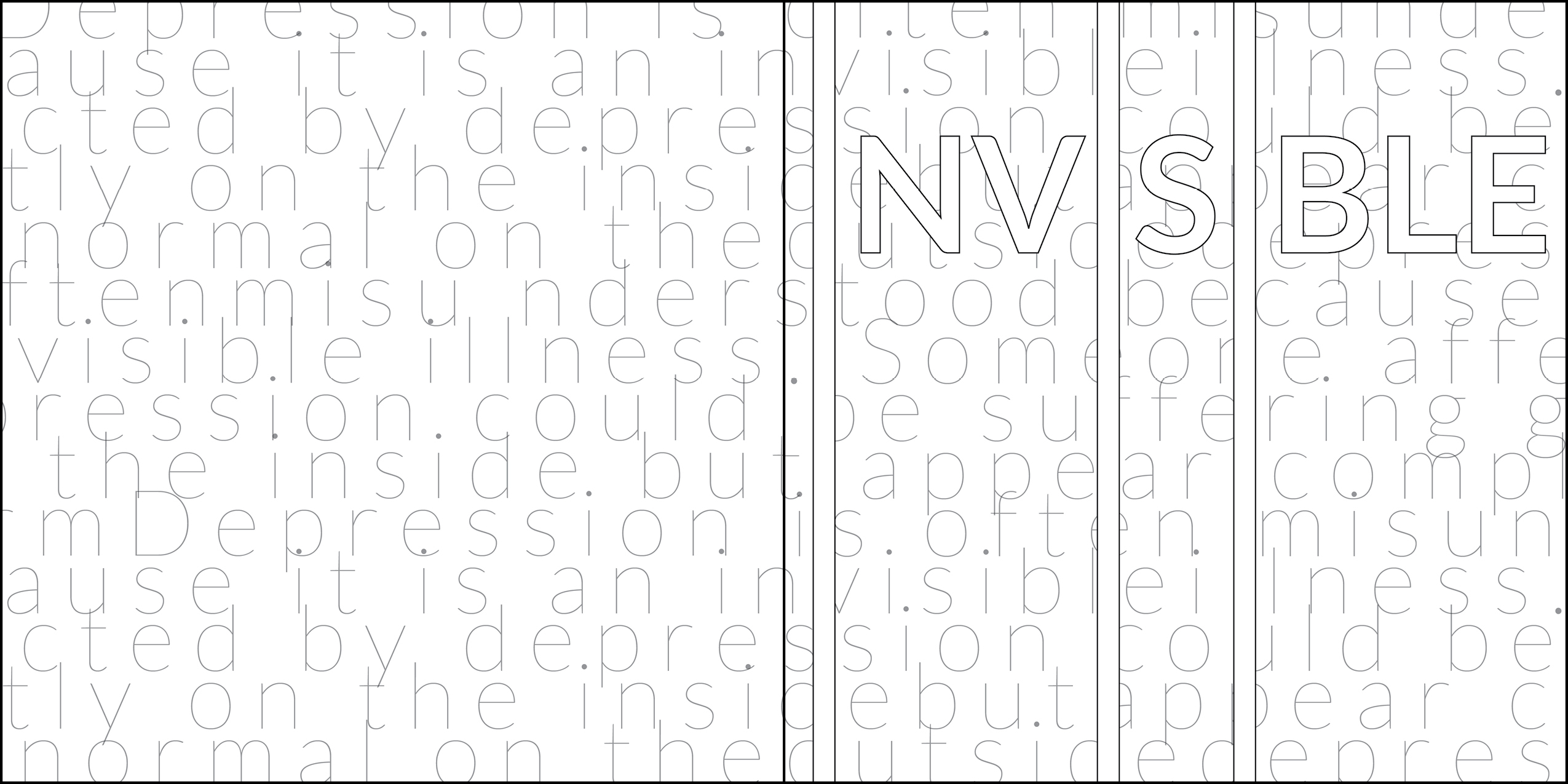
Throughout the design iteration process I continued to remove and lighten elements within the invisible page to better express the literal idea of invisibility.
Insomnia
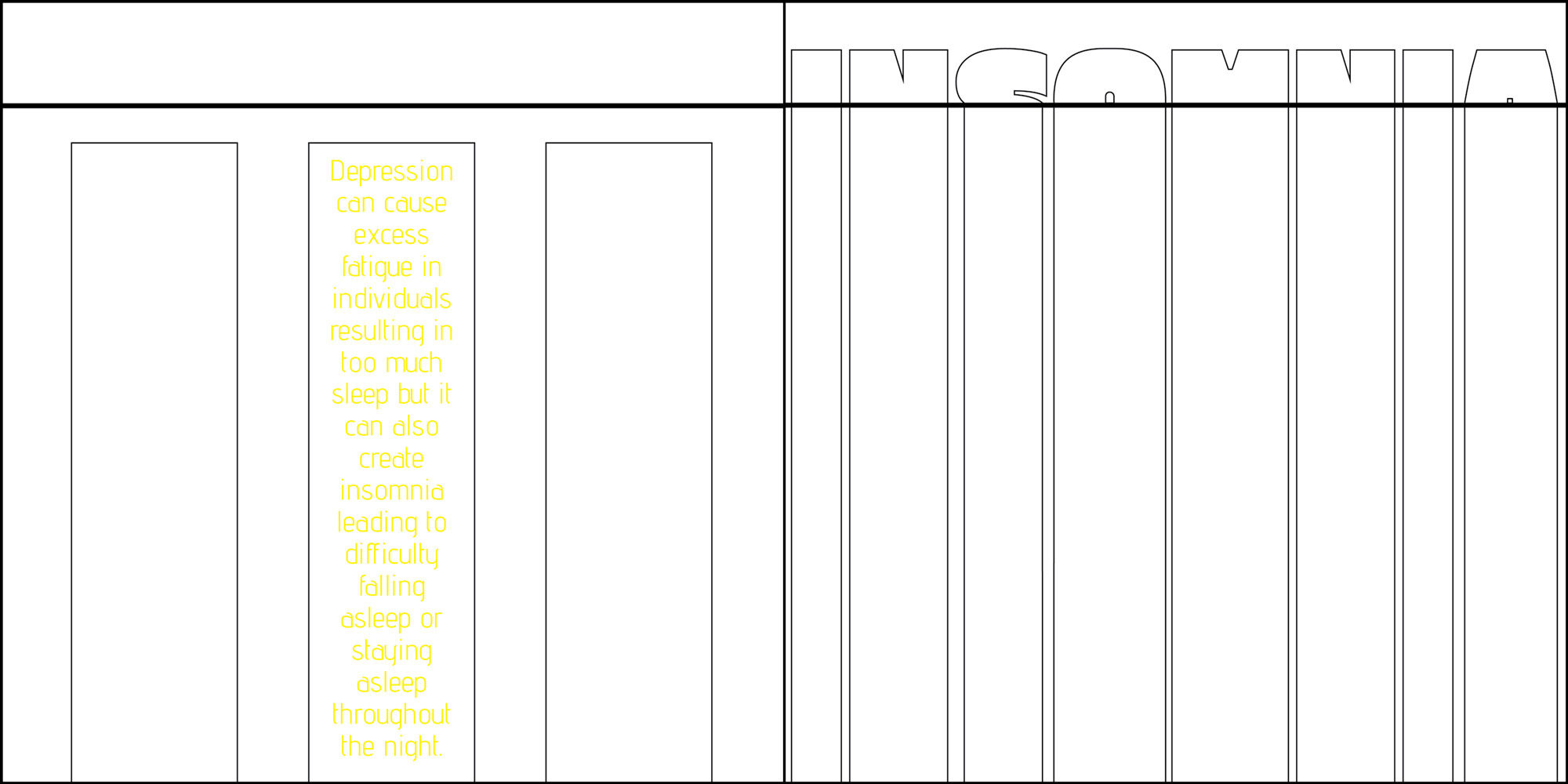
This design took shape through the use of repetition of forms with similar size, placement and color on both sides of the spread to create a unified connection.
Book Cover
For the cover design line thickness, placement and color were fine-tuned to better represent the culmination of all of the symptoms that are embodied within the book.
Color Scheme
In order to better understand how color could be employed within my designs I did research into color psychology. I found that there were a few specific colors that repeated when examining the feelings that are commonly associated with depression. These are the colors that I selected for my color scheme to help represent the symptoms of depression depicted within the book.

Black
Fear
Menace
Heaviness
Coldness

White
Isolation
Emptiness
Loneliness
Spacious

Grey
Anxious
Uncaring
Lack of Emotion
Weakness

Blue
Sadness
Coldness
Loneliness
Unfriendly

Red
Pain
Anger
Aggression
Intensity

Yellow
Energy
Frustration
Overwhelmed
Strain
Design Iterations
Numerous design iterations were conceived before deciding on the final one that best embodied the emotions of the text within each spread. These are just a few examples of other designs created that were not chosen for use within the book.
Animation Experiments
After completion of the printed book design I experimented with how the pages could be presented digitally. I took a few of the pages and played with animation to see how the designs could be further enhanced with motion. This quick animation style brings the forms within the design to life and helps further express the feeling embodied within the page.
Final Designs
The final solution showcases the book pages that were the result of my investigations and design iteration process. Each spread takes on a life of its own to embody the symptoms and emotions of depression that the book represents.
Conclusion
The project outcome is successful in that it fulfills the goals I set out to achieve within my design explorations. Through the use of line and form the book design expresses the complex feelings and emotions the one might feel when suffering from depression. The text within the pages educates the reader on the subject while the forms illustrate the feelings in a simple way that the reader can understand. This allows the viewer to recognize the disease within their own life if they are ever affected. It also creates more empathy towards people who have depression because they can better comprehend what those individuals are going through.
The styles and techniques used within the pages could also be applied to any complicated subject in order to communicate emotions and information.
Sources
Allison S. Gremillion, “Colors and Emotions: How Colors Make You Feel,” 99designs, 2019, https://99designs.com/blog/tips/how-color-impacts-emotions-and-behaviors/.
Annamarya Scaccia, “Can Depression Cause Memory Loss,” Healthline, September 13, 2019, https://www.healthline.com/health/depression/depression-and-memory-loss.
Arlin Cuncic, “The Connection Between Depression and Anger,” Verywellmind, February 20, 2021, https://www.verywellmind.com/connection-between-depression-and-anger-5085725.
Cameron Chapman, “Exploring the Gestalt Principles of Design,” Designers, https://www.toptal.com/designers/ui/gestalt-principles-of-design.
Chris Iliades, “Depression’s Effect on Your Appetite,” Everyday Health, September 10, 2012, https://www.everydayhealth.com/hs/major-depression/depressions-effect-on-appetite/.
“Color Psychology: The Emotional Effects of Colors,” Art Therapy, 2021, http://www.arttherapyblog.com/online/color-psychology-psychologica-effects-of-colors/#.YIeJBC2ZPFx.
“Gestalt Principles,” Interaction Design Foundation, https://www.interaction-design.org/literature/topics/gestalt-principles.
Kendra Cherry, “Color Psychology: Does It Affect How You Feel,” Verywellmind, May 28, 2020, https://www.verywellmind.com/color-psychology-2795824.
“How to Support Those with Invisible Illness,” Northwest Primary Care, 2020, https://www.nwpc.com/supporting-people-with-invisible-illness/.
Jennifer Casarella, “Symptoms of Depression,” WebMD, September 17, 2019, https://www.webmd.com/depression/guide/detecting-depression.
Mayo Clinic Staff, “Depression (major depressive disorder),” Mayo Clinic, February 3, 2018, https://www.mayoclinic.org/diseases-conditions/depression/symptoms-causes/syc-20356007?utm_source=Google&utm_medium=abstract&utm_content=Major-depression&utm_campaign=Knowledge-panel.
Melinda Smith, Lawrence Robinson and Jeanne Segal, “Depression Symptoms and Warning Signs,” HelpGuide, April, 2021, https://www.helpguide.org/articles/depression/depression-symptoms-and-warning-signs.htm.
“Principles of Design,” The J. Paul Getty Museum, 2011, https://www.getty.edu/education/teachers/building_lessons/principles_design.pdf.
“Psychological Properties of Colours,” Colour Affects, 2021, http://www.colour-affects.co.uk/psychological-properties-of-colours.
Ranna Parekh, “What Is Mental Illness,” American Psychiatric Association, August, 2018, https://www.psychiatry.org/patients-families/what-is-mental-illness.
Rob Newsom, “Depression and Sleep,” Sleep Foundation, September 18, 2020, https://www.sleepfoundation.org/mental-health/depression-and-sleep.

