Project Title: Personality Type Posters
Designer: Sabrina Awdi
Project Info: My project is about the importance of visual design being a form of communication to interpreting information with the goal of evoking an emotional response from the user while successfully using design principles. My subject matter of information being interpreted to visual is personality types.
Committee Members: Adam Smith, Mike Strobert
The Prompt
A visualization that combines the use of graphic design and digital art to evoke an emotional response from the user. This shows the importance of using visual design and art to interpret an idea and information.
The Problem
Information and knowledge are usually put out in the form of text giving the reader a lot to read to try and comprehend the idea behind it. Humans are visual creatures and, therefore, can process information more easily through visuals. However, the visuals need to be eye-capturing and intriguing to be able to look at and grasp the idea and feeling of a message without a lot of text. How do we show information through visuals in an interesting and appealing manner?
Solution
Using design principles and color to create four different posters with the subject matter of personality types and their traits, I will be showing the importance of using these elements to create beautiful and interesting visuals that can allow the viewer to understand and interpret each poster individually and together as a collection. Using what I know about these personality types, I am interpreting that information into visual graphics and art.
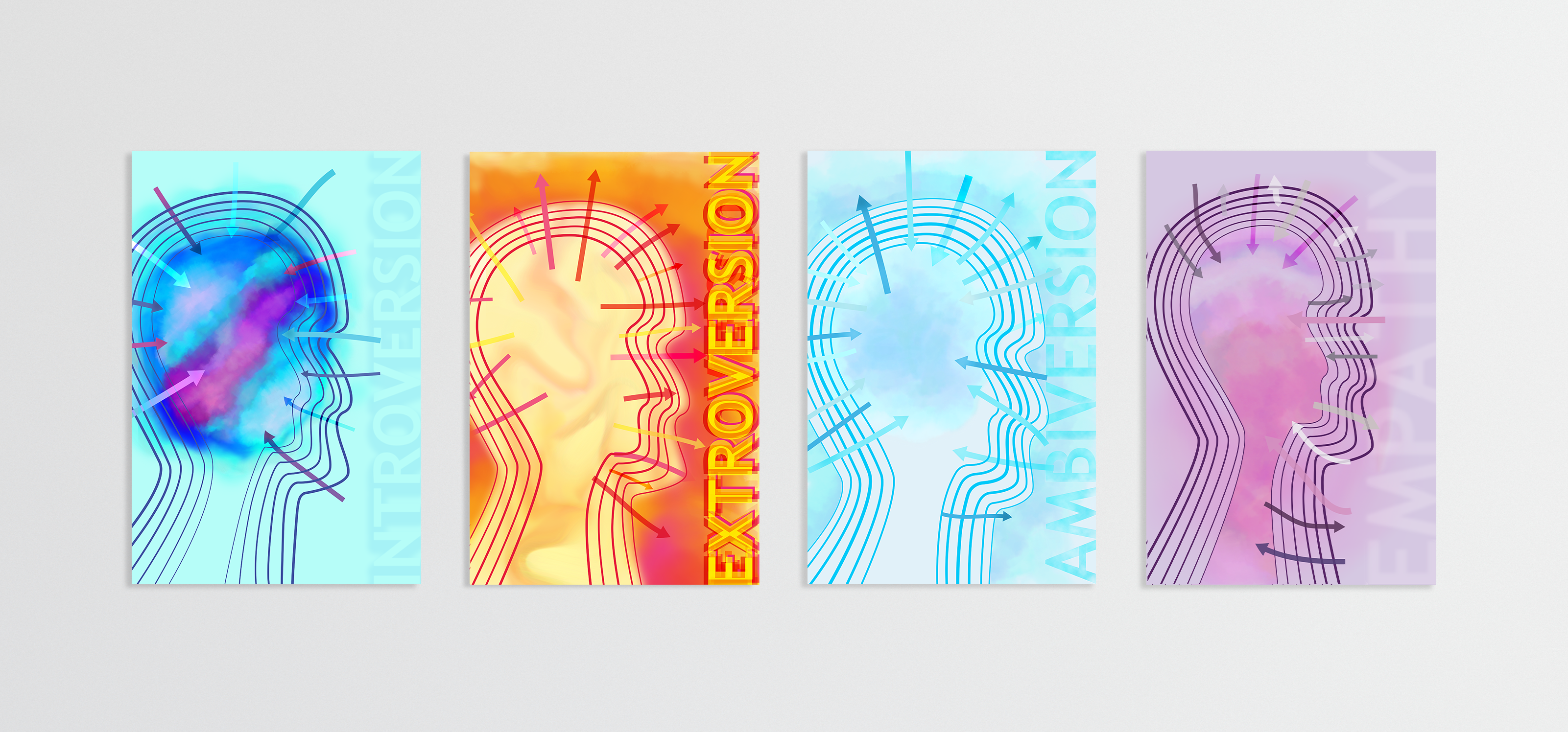
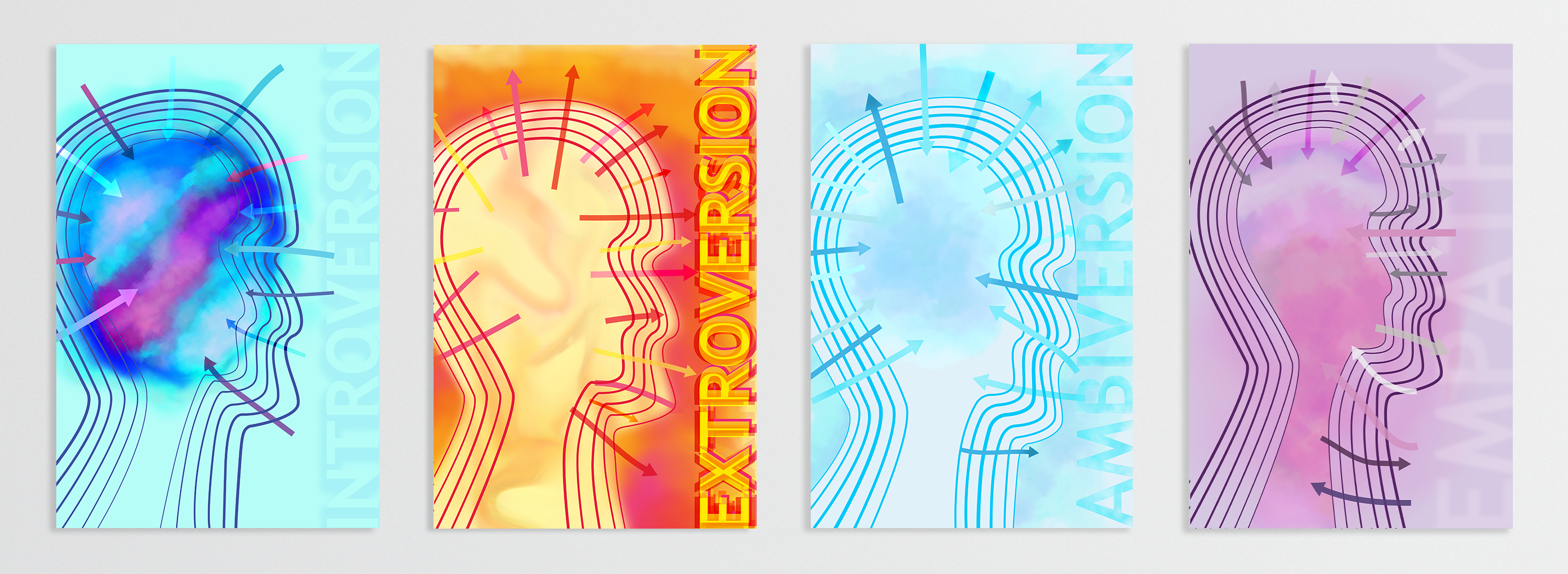
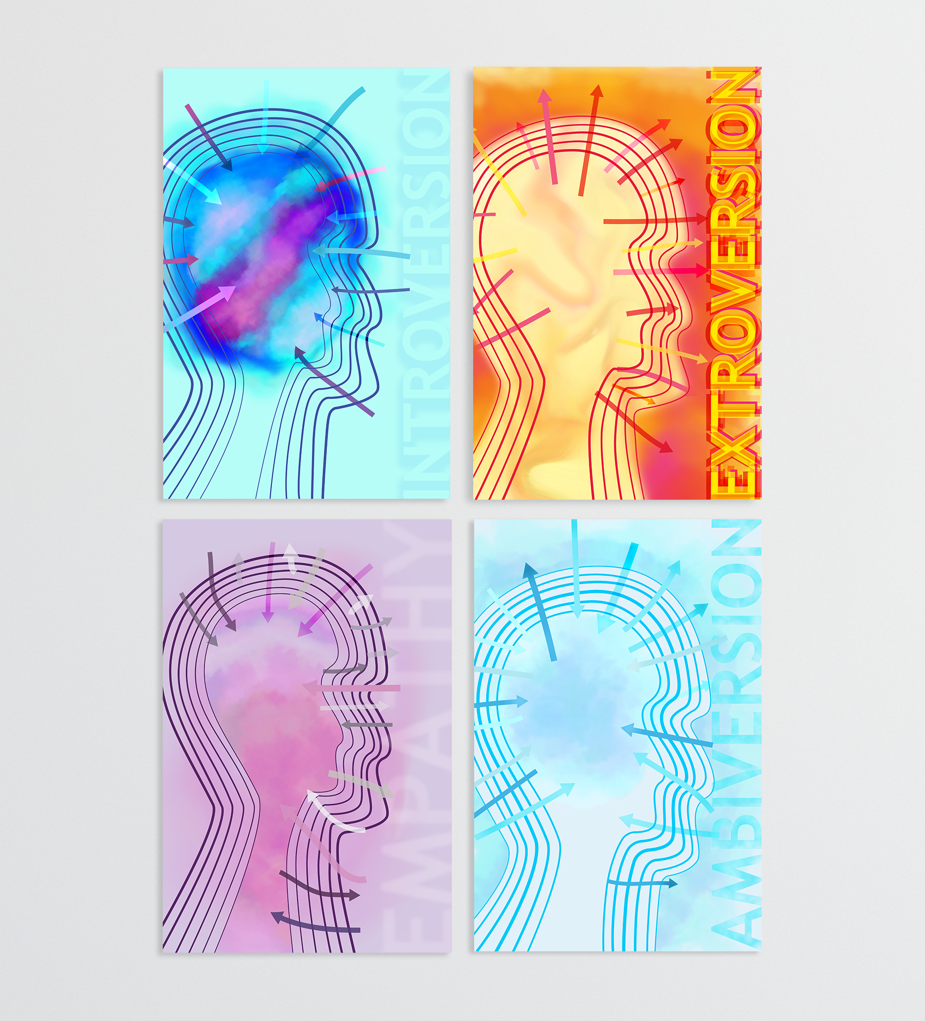
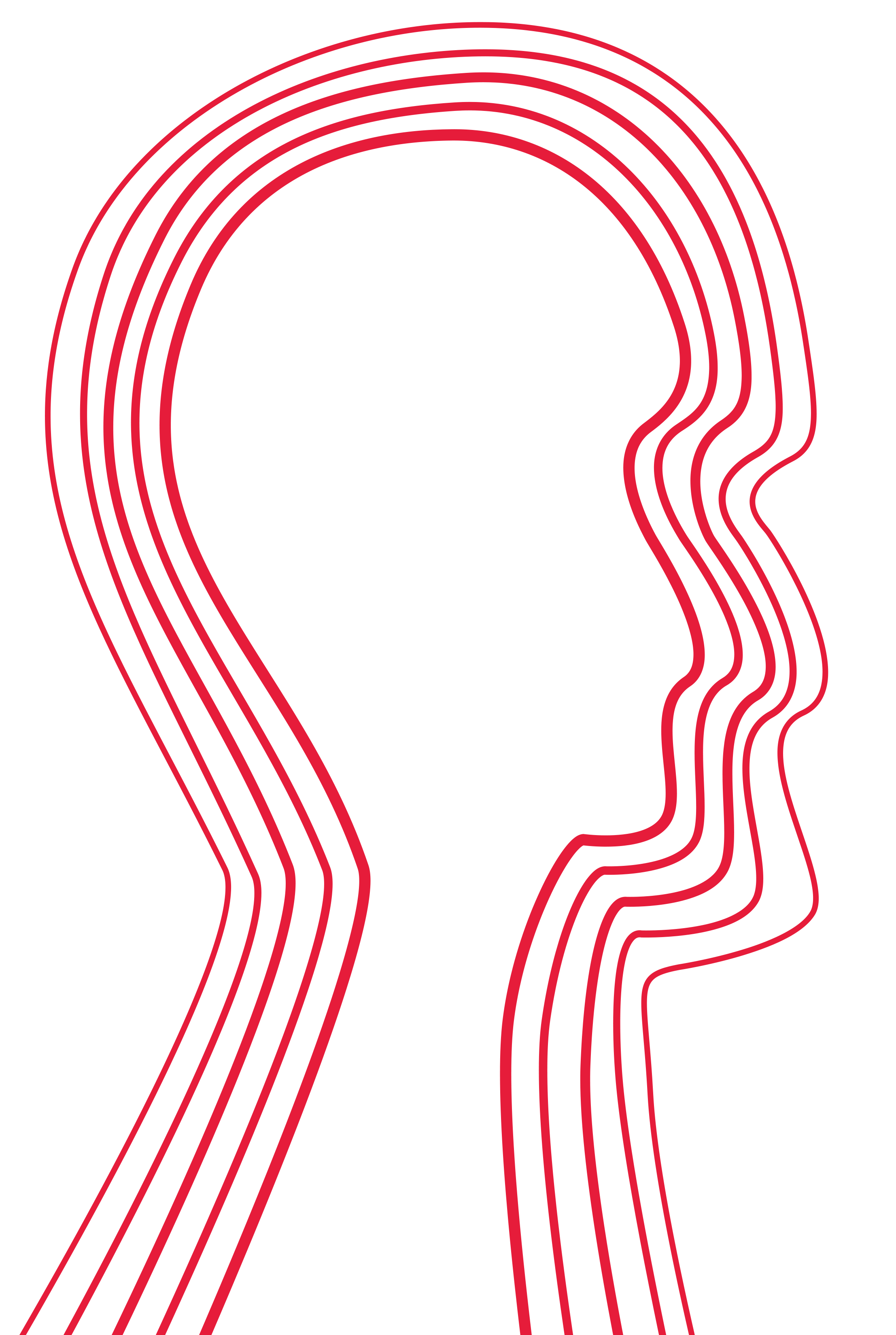
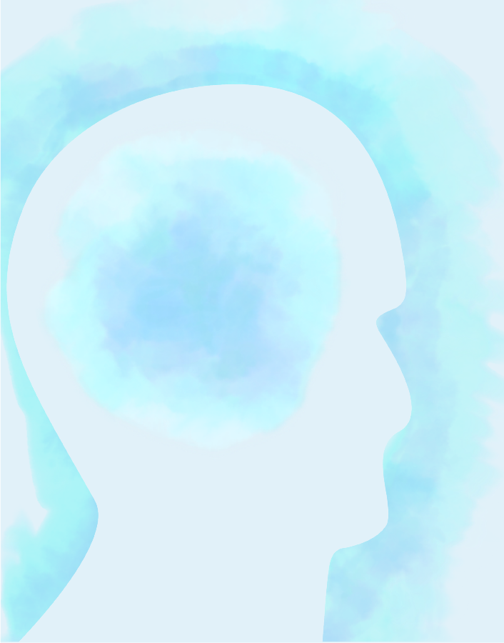
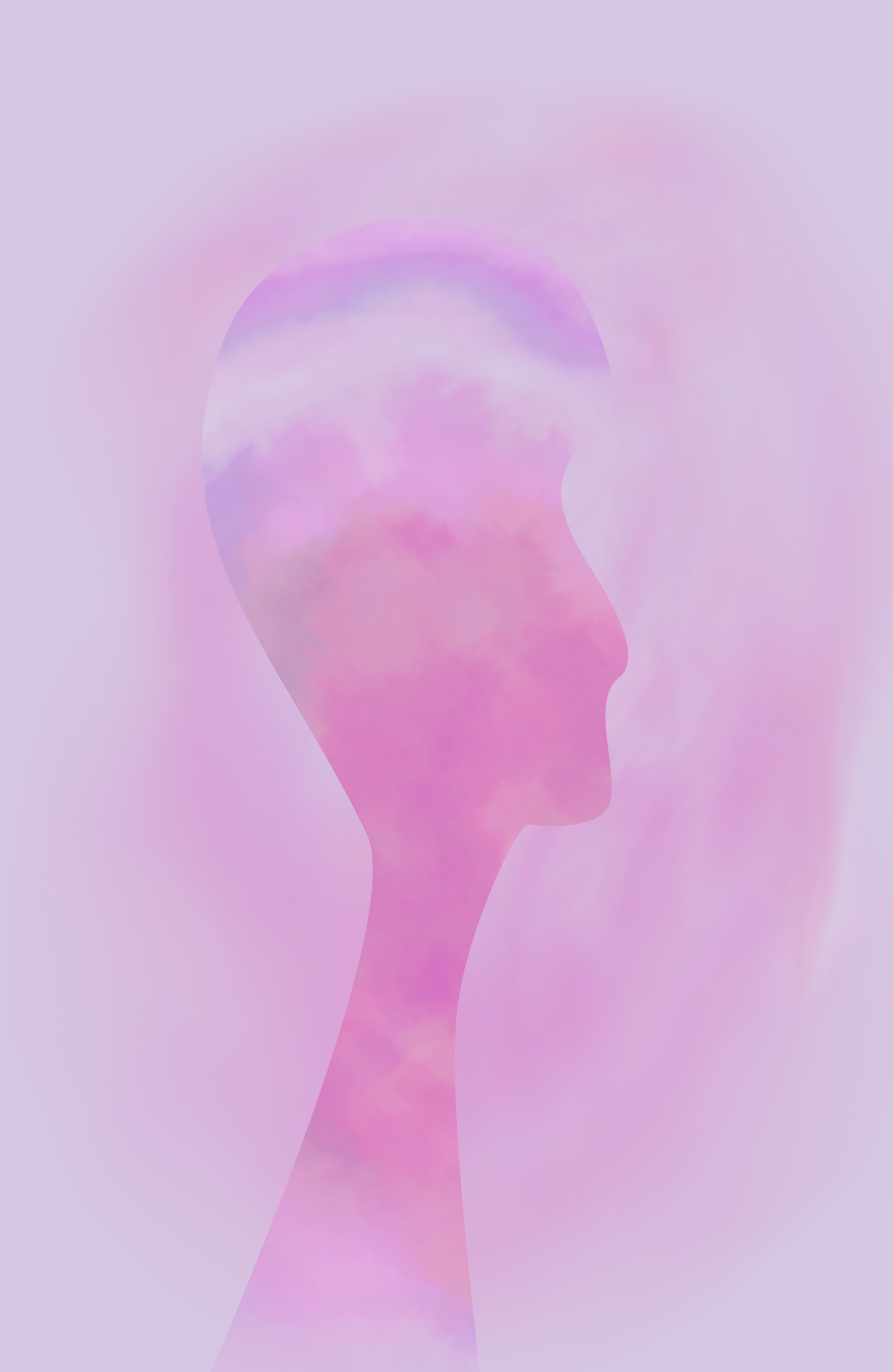
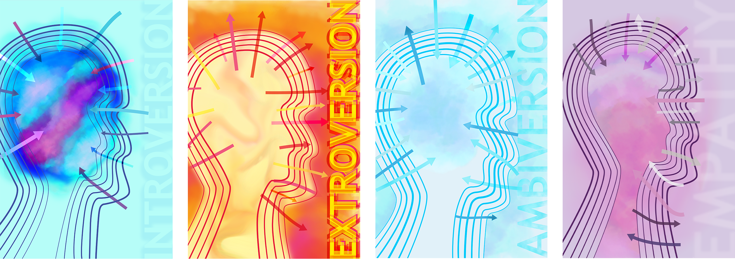
Introversion
Introverts are often the most misconceived types of people. They prefer to spend a lot of their time alone and need it to "recharge" since they have a low social battery. They also appear to be super quiet and get thought of as shy individuals, but in reality, they just choose to refrain from engaging from everyone and are very selective in who they want to engage and spend time with. They prefer one-on-one interactions and spending more time indoors. Just because on the surface they seem silent, doesn't mean it's bland or not much goes on the inside. Introverts are people who focus on their inner world primarily as opposed to the what's going on in the external world. They are predominantly concerned with their own thoughts and feelings rather than what's going on outside in their surroundings.
Design Breakdown
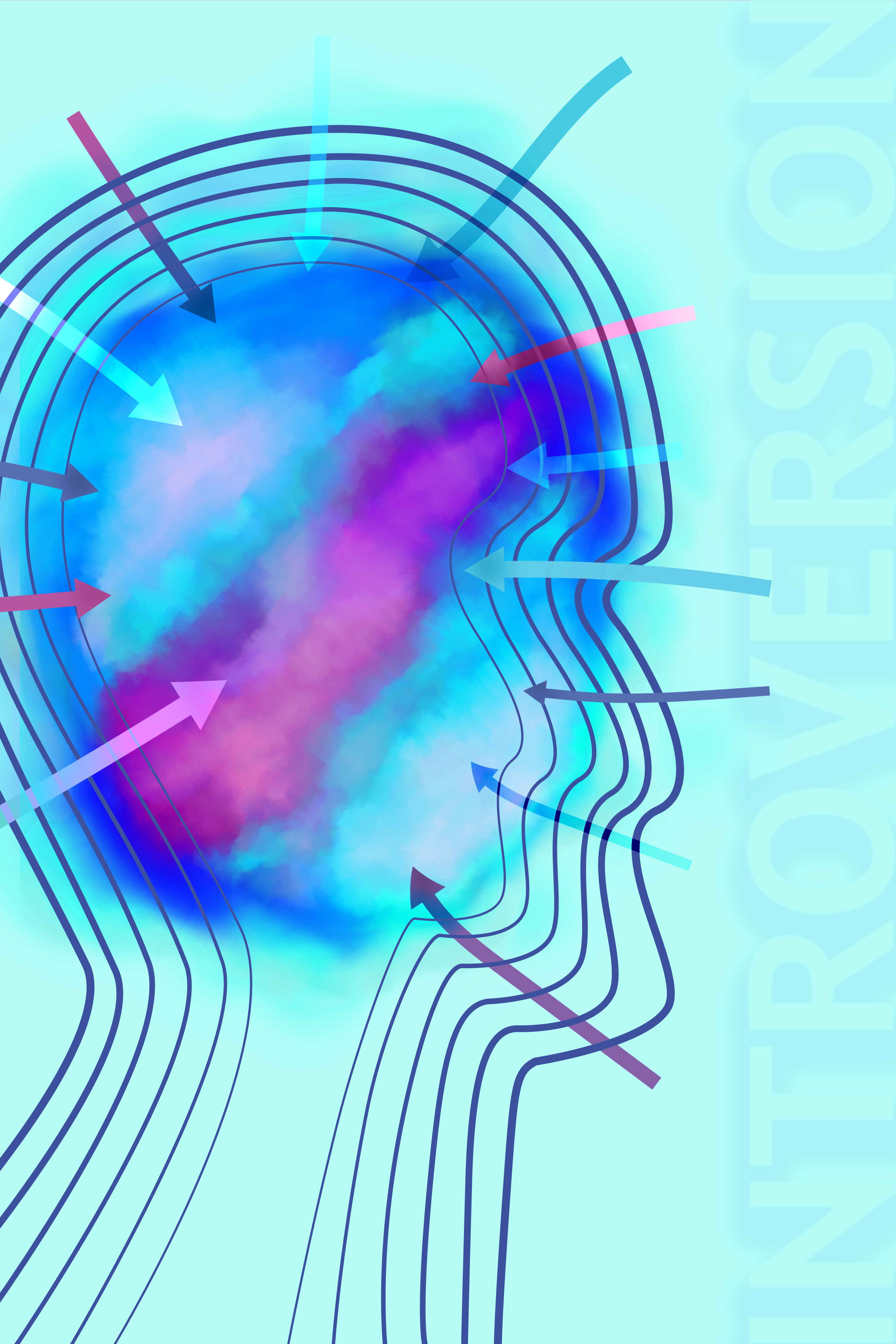
In this poster, I use different colors to show the arrows going in since they absorb and observe alot when surrounded by people and their world goes inward with their own thoughts and feelings.
The way the poster’s elements are laid out in terms of size, color, position and opacity creates a sense of hierarchy. Hierarchy is important to create a dynamic visual that the viewer can pay attention to leading the eye from one thing to the next. In this instance the head is the biggest component in terms of scale and size in because of both it’s height and width. At the same time, the colors of the aura are vibrant with the pink at the center that grabs attention before or at the same time as the head.
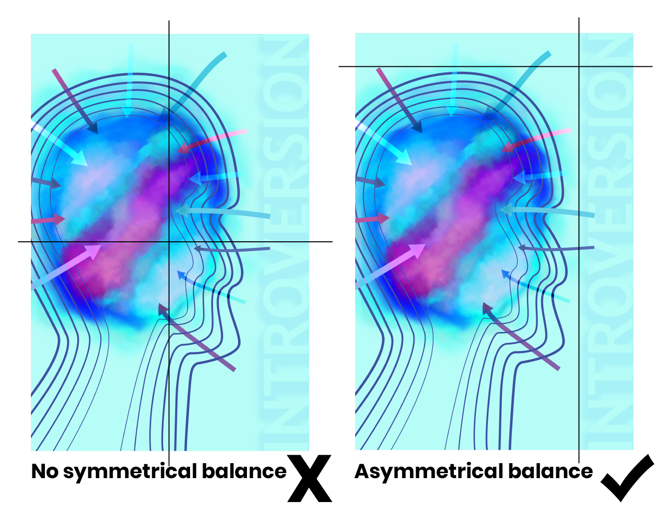
The poster is laid out with the head of a person to one side towards the center of the frame filling out most of the frame but is mainly right-heavy filling up more than two-thirds of the page while the typography on the left with less than a third of the page to fill. This creates asymmetrical balance. The layout it not symmetrical, nor is the silhouette, or the arrows on both sides so the entire poster is intentionally designed asymmetrically to energize the page and allow the viewer’s eye to move organically around the page from one element to the next.
The way the colors are diagonally flowing lead the eyes in a certain direction into the arrows while the direction of the arrows is going in making the eye go back into the aura. So there’s a vibrational movement going inwards.
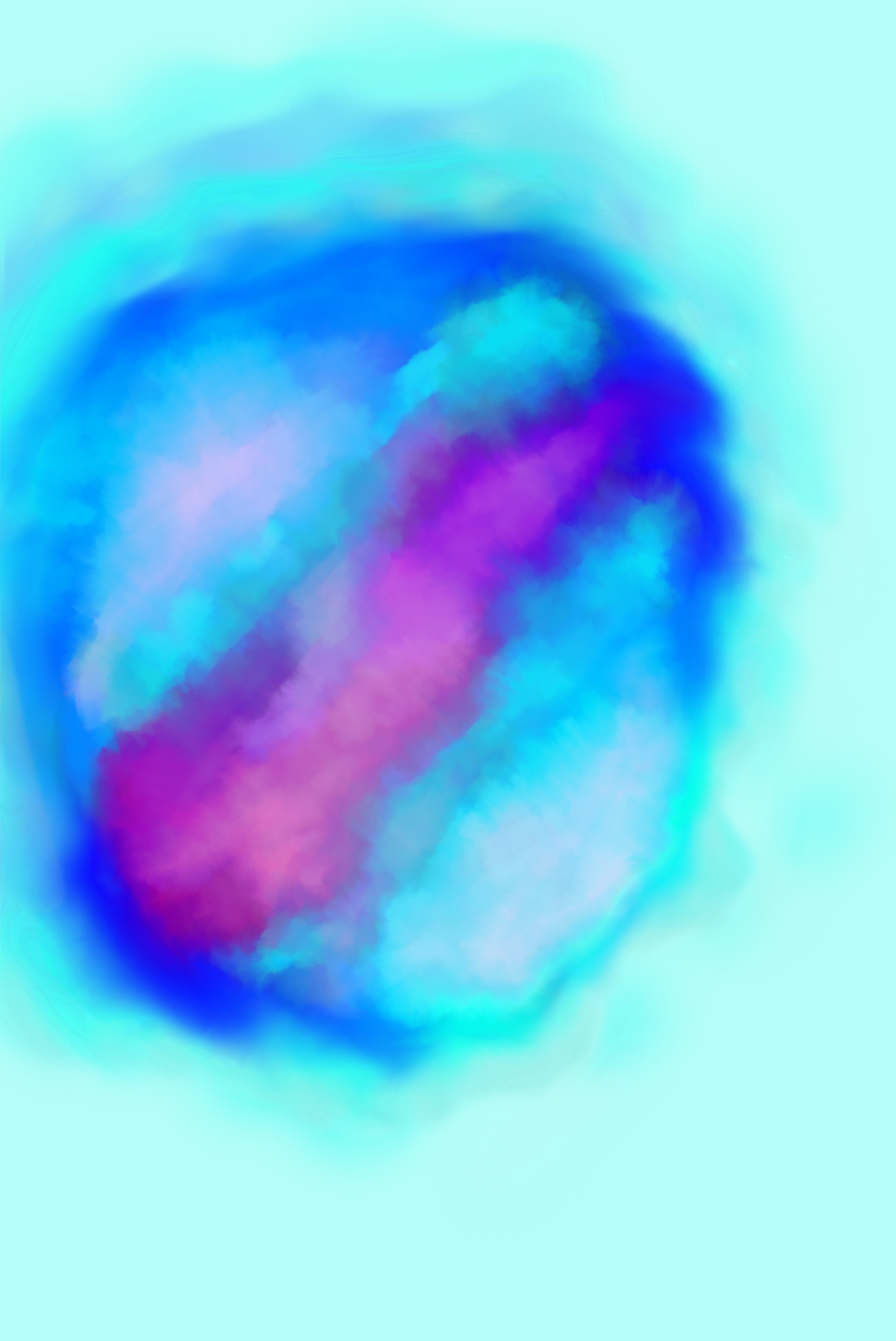
The aura here is the most attention-grabbing focal point in the poster and that is the emphasis design principle. There’s a huge contrast in its shape and noticeable variety in colors inside the aura and how vibrant they are as opposed to the rest of the composition including the background and typography which are very subtle and simple.
The typography is scaled the largest in height on the page, however, since it has a low opacity and most of it blends into the background with the same color aside from the shadow, it’s last in the hierarchy to pay attention to.
Cool colors are considered more relaxing and calming. The addition of a vibrant, warmer pink creates some action and energy.
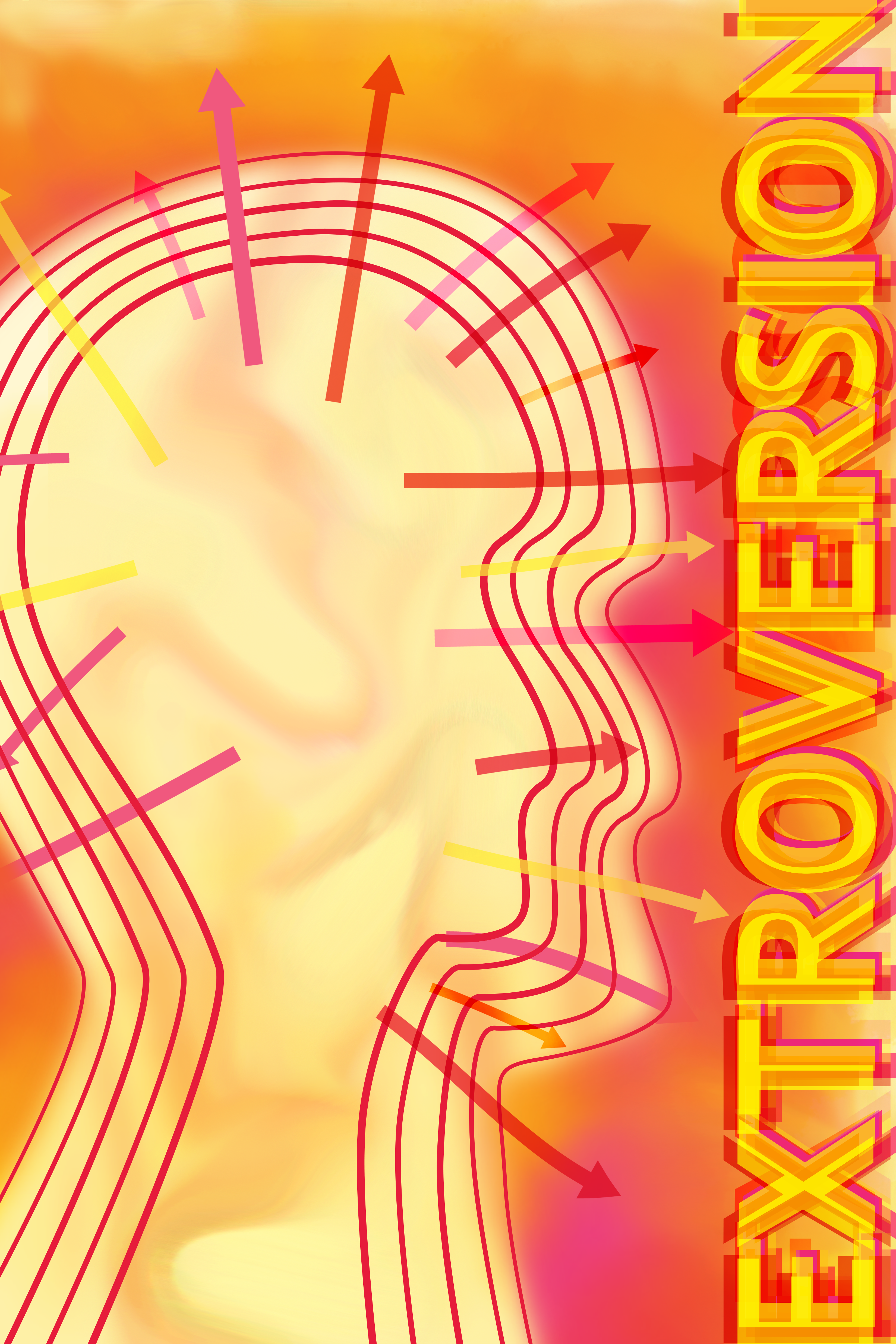
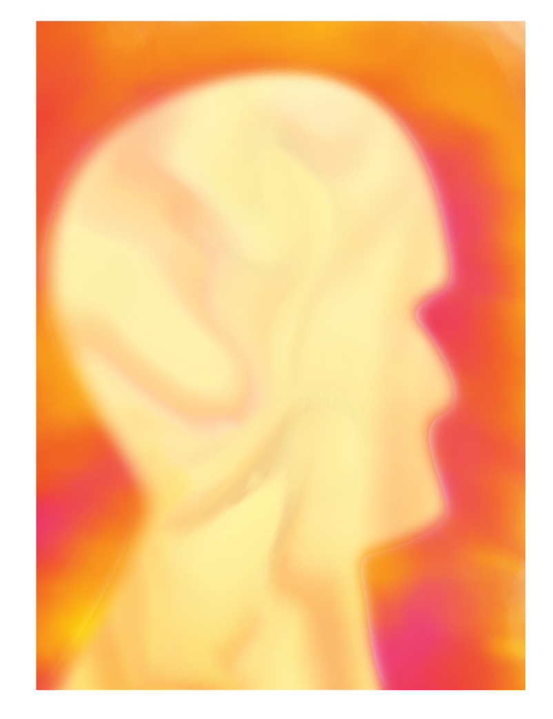
Extroversion
Extroverts are typically people that are known to be super outgoing, talkative, and energetic and they get their energy from by socializing with others and being a part of a bigger group of people. They prefer interactions with many people and having a larger social network. These kind of people tend to enjoy being outdoors more often, find adventure and be more active. They are more concerned with what's going on around them in their surroundings and the outer world in general.
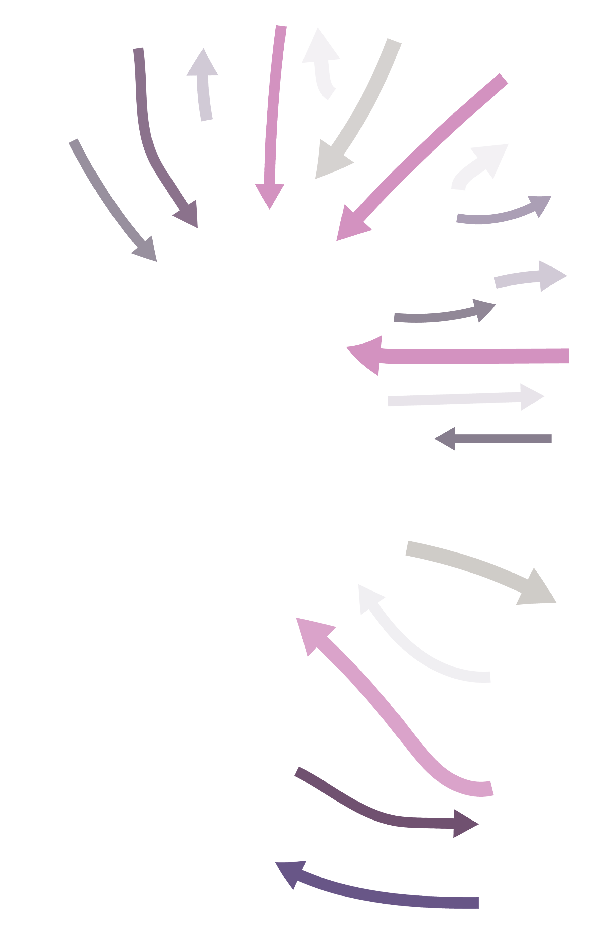
In this poster, I use warmer colors with visuals and typography to show the vibrancy and energy extroverts draw from their surroundings with the arrows going outwards to show how they express everything they think or feel or want to communicate.
Repetition is used here as lines creating the form of the human head to reinforce the idea of a vibrational effect where the line weight varies slightly going from thinnest on the outer most line to the thickest line weight on the inner most line to show that extroverts energy flows outwards.
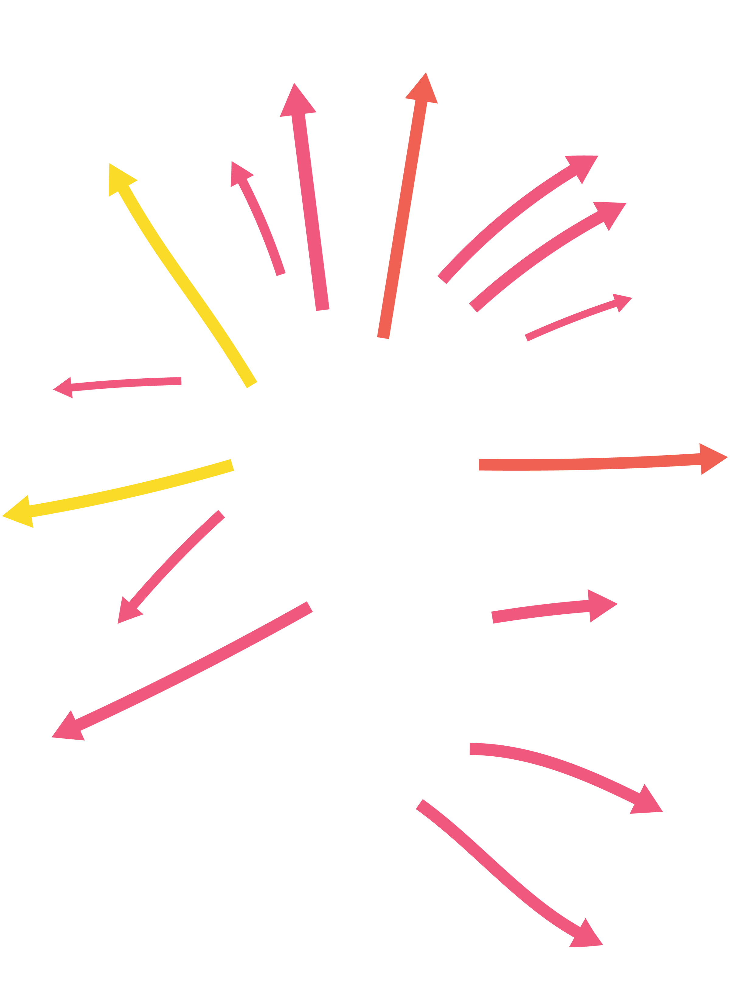
The arrows are another element that are repeated in different colors with them pointing into the silhouette's head to clearly identify that this person’s energy also goes inwards and absorbs from its surroundings.
Repetition of swirls in the background as a pattern is also present for a subtle contrast from what’s going on outside the head that’s very dramatic, keeping the inside a bit quieter but not completely empty or bland.
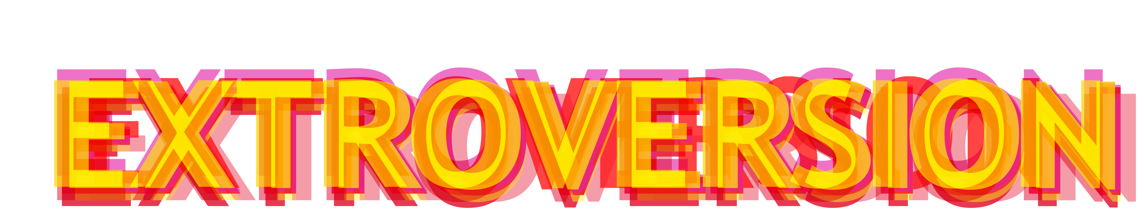
Extroversion’s typography has repetition as well with the overlapping of the same word in different layers, colors, and opacities to add dimension and a more dramatic effect that gives the feeling of what the descriptor’s meaning entails.
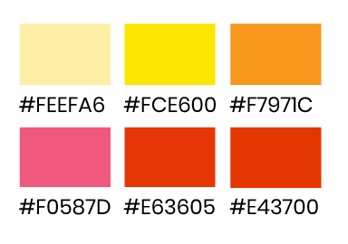
Color is repeated throughout the poster with varying reds, pinks, yellows, and oranges to keep a consistent palette and keep the idea of what the colors represent for this personality type’s characteristics. Warm colors are typically considered energetic and active.
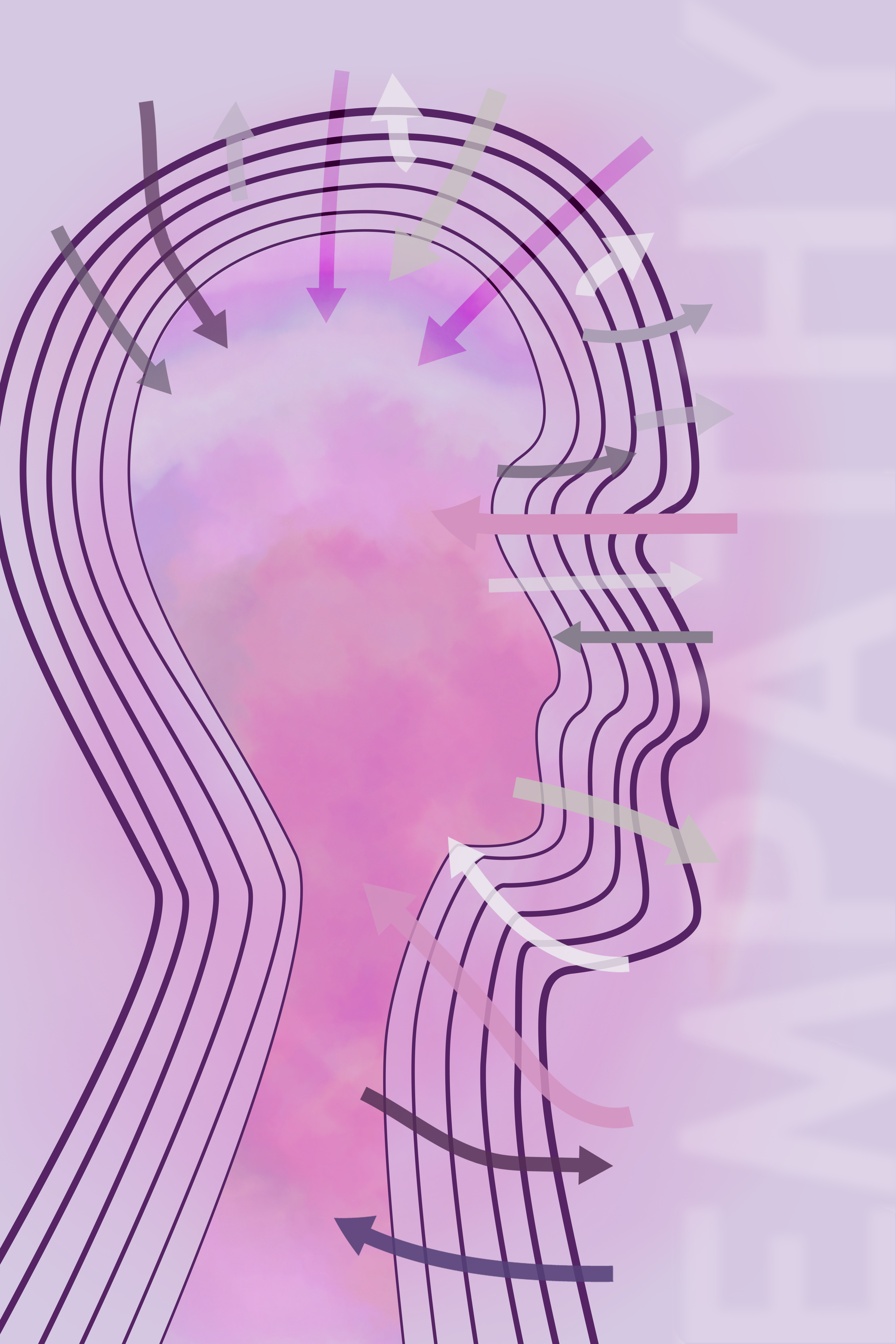
Ambiversion
In most cases, people are neither fully introverts or fully extroverts - they could share characteristics from both personality types making them ambiverts. Ambiverts fall somewhere in the middle of the spectrum and the percentage of extroversion versus introversion in each ambivert varies. They are socially comfortable and interactive people who also relish down time on their own more than extroverts but less than introverts.
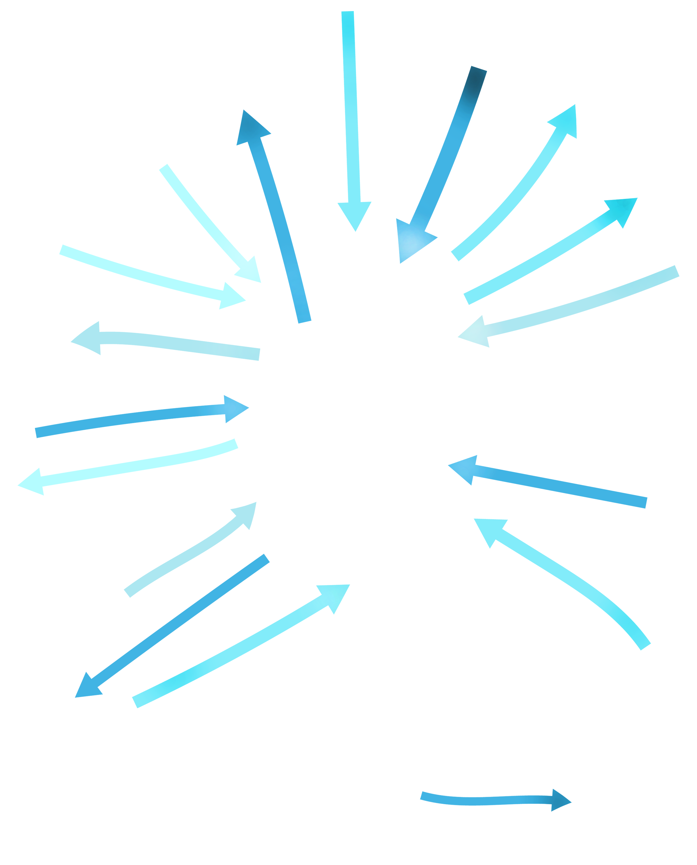
This poster indicates a balance of drawing in energy from surroundings as well as giving energy out to it. There is a balance between in the inner and outer world of an ambivert and how they interact with their own thoughts and feelings and those around them.
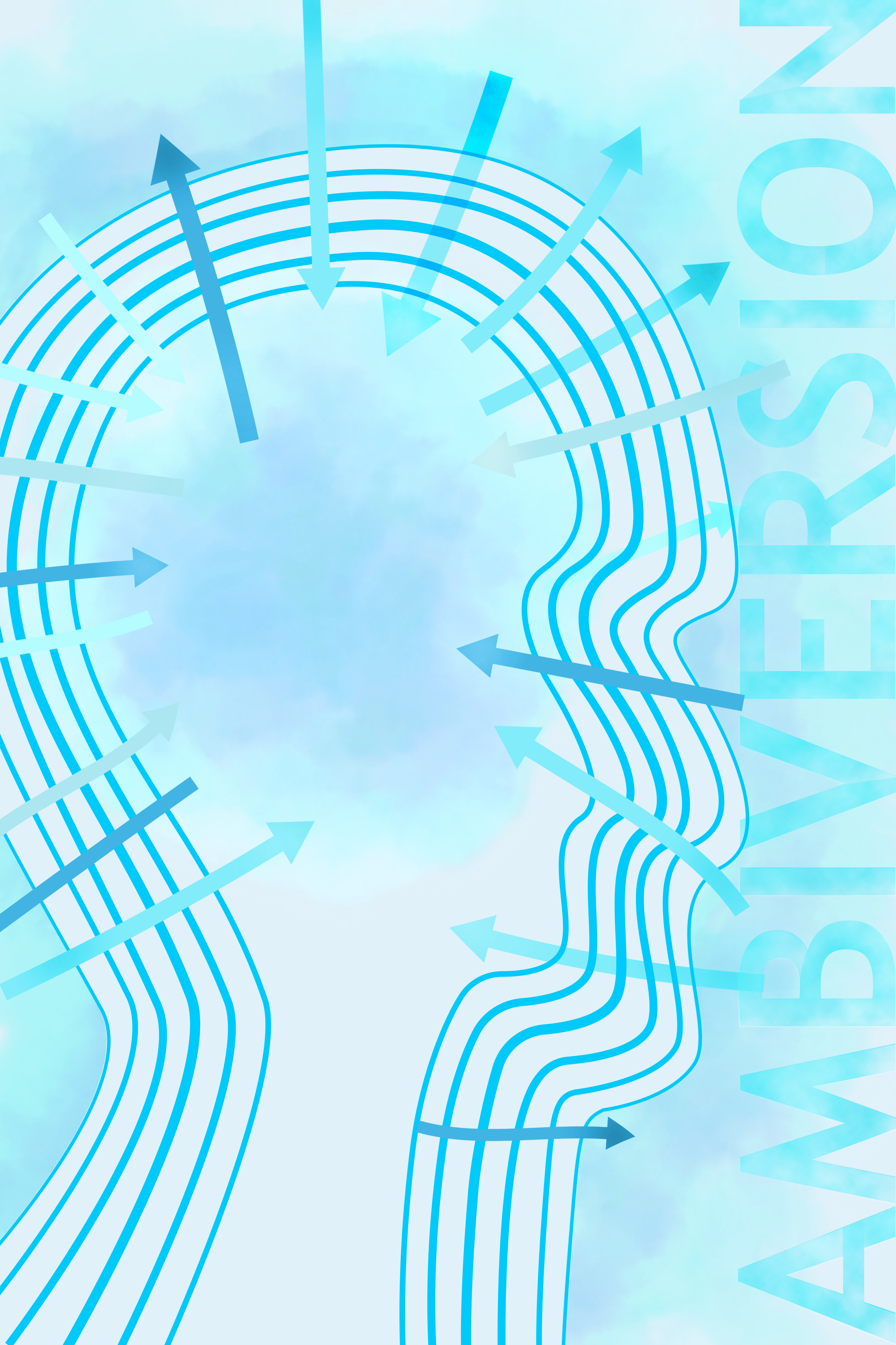
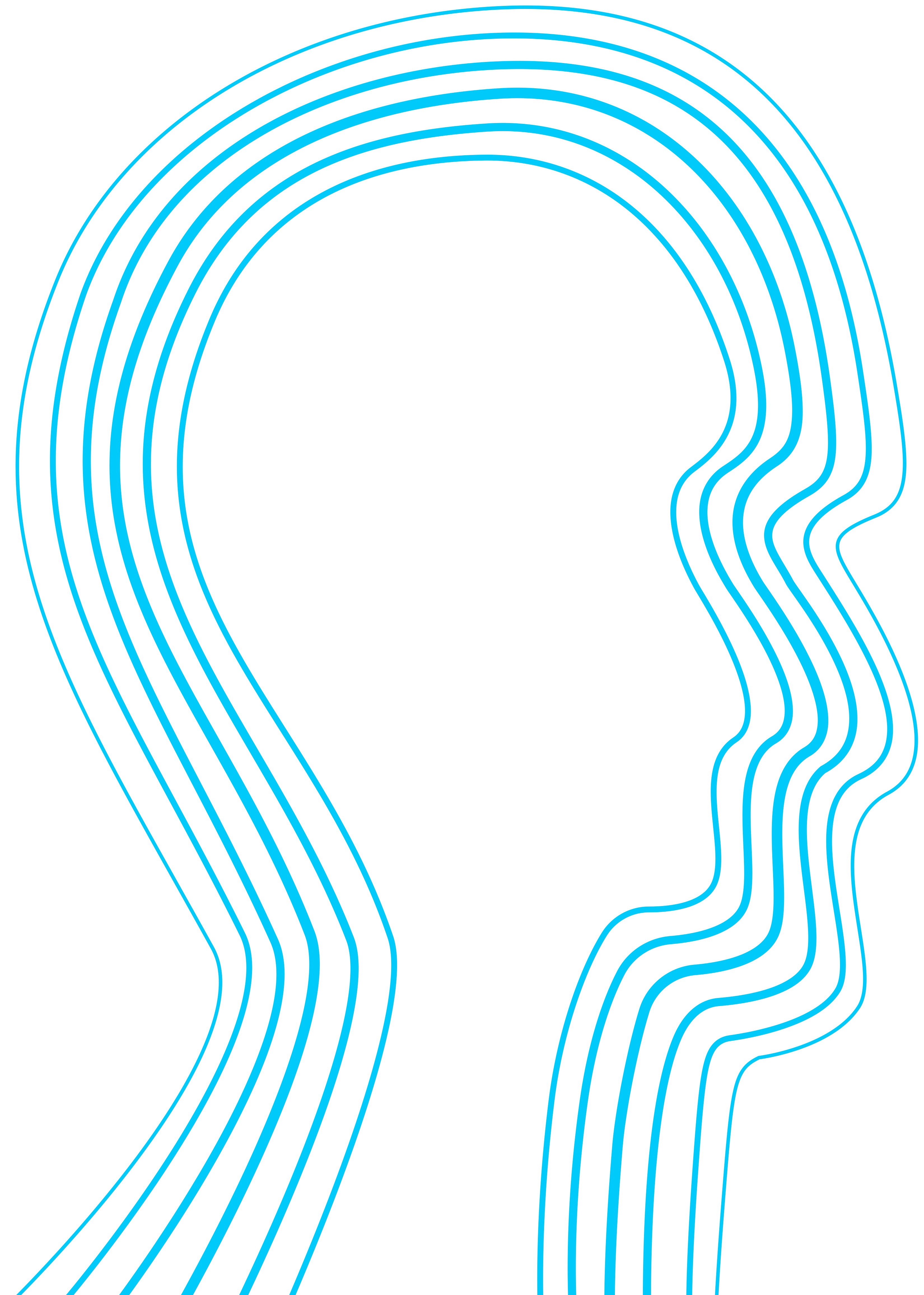
Gestalt principle of figure/ground is present in the use of the lines to create a human head silhouette. The several lines on top of each other create the outline of the head without it being filled in. That figure/ground principle shows the relationship between those lines and the negative space inside.
The negative space presented inside the head and outside it surrounding the aura makes it clear that this poster’s meaning is more balanced and distinguishably different from the other ones.
The negative space presented inside the head and outside it surrounding the aura makes it clear that this poster’s meaning is more balanced and distinguishably different from the other ones.
The auras that were made with digital watercolor brushes create a fluid texture as a pattern. Their artistic quality distinguishes them apart as elements from the other vector and pixel-based graphics.
The typography also has a texture that could be seen as a pattern made with cloud texture to match the aura’s aesthetic. This unifies them together.
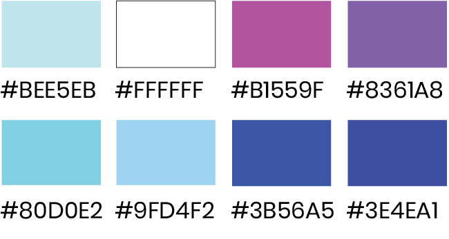
The colors of this poster are all blues in different shades. Cool colors are considered more relaxing and calming. Using different tones of blue in one design creates a sense of unity where all the elements are unified together. Additionally, because of the similarity in colors (through Gestalt principle) and overall feeling and tone they bring they create a sense of harmony.
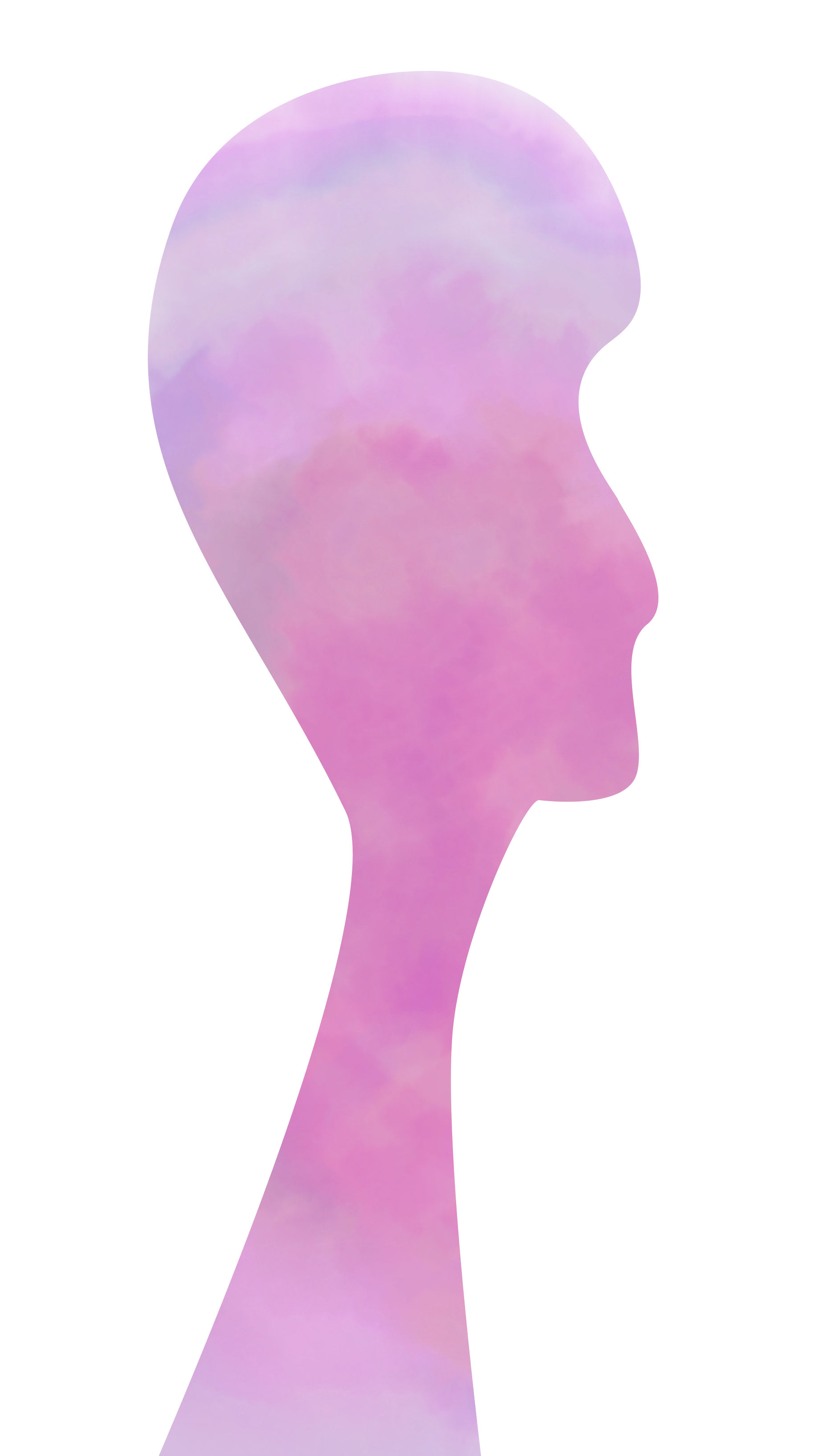
Empathy
Empathy is the ability to understand another's feelings and thoughts. An empath is a person who feels more empathy than the average person. They're usually more accurate at understanding a person's emotions and thoughts at a much deeper level just by sensing another's energy and vibes they give off. They also feel those emotions at a much higher intensity than a regular person just empathizing with another.
Empaths are highly sensitive people and get mistaken that they're too sensitive or emotional with a negative connotation. Being an empath has great benefits to humanity in being more understanding and caring human beings to one another.
In this poster, the colors are warm yet nurturing to evoke the feelings of an empath with the energies they take in and how they try to give out their help and sense of empathy.
The scale of the head is big taking up most of the page.
There’s still a pleasant contrast happening between the outside of the head and the inside where the aura is because of the variety cool and warm toned shades of colors. The background also has pink aura to unify the entire poster with the aura. The brush strokes create a watercolor texture which adds dimension.
The arrows of this poster have a variety of colors and different opacity levels. They are also scaled at different sizes with most of the arrows going in being large and the few ones going out much smaller.
The aura without the background.

The typography’s size is also big scaled up the entire height of the page yet only part of the page since it is aligned to the right and rotated vertically.
Apart from that, the typography is extremely subtle blending in with the background because of its low opacity and blurriness. It’s scale is super big since it has lesser word characters than the other posters’ and that’s what grabs the viewer’s attention despite how subtle it is to read.
The colors create a sense of harmony together because of the similar color palette with different hues of purple, lavender, and pink.
Beginning Exploration:
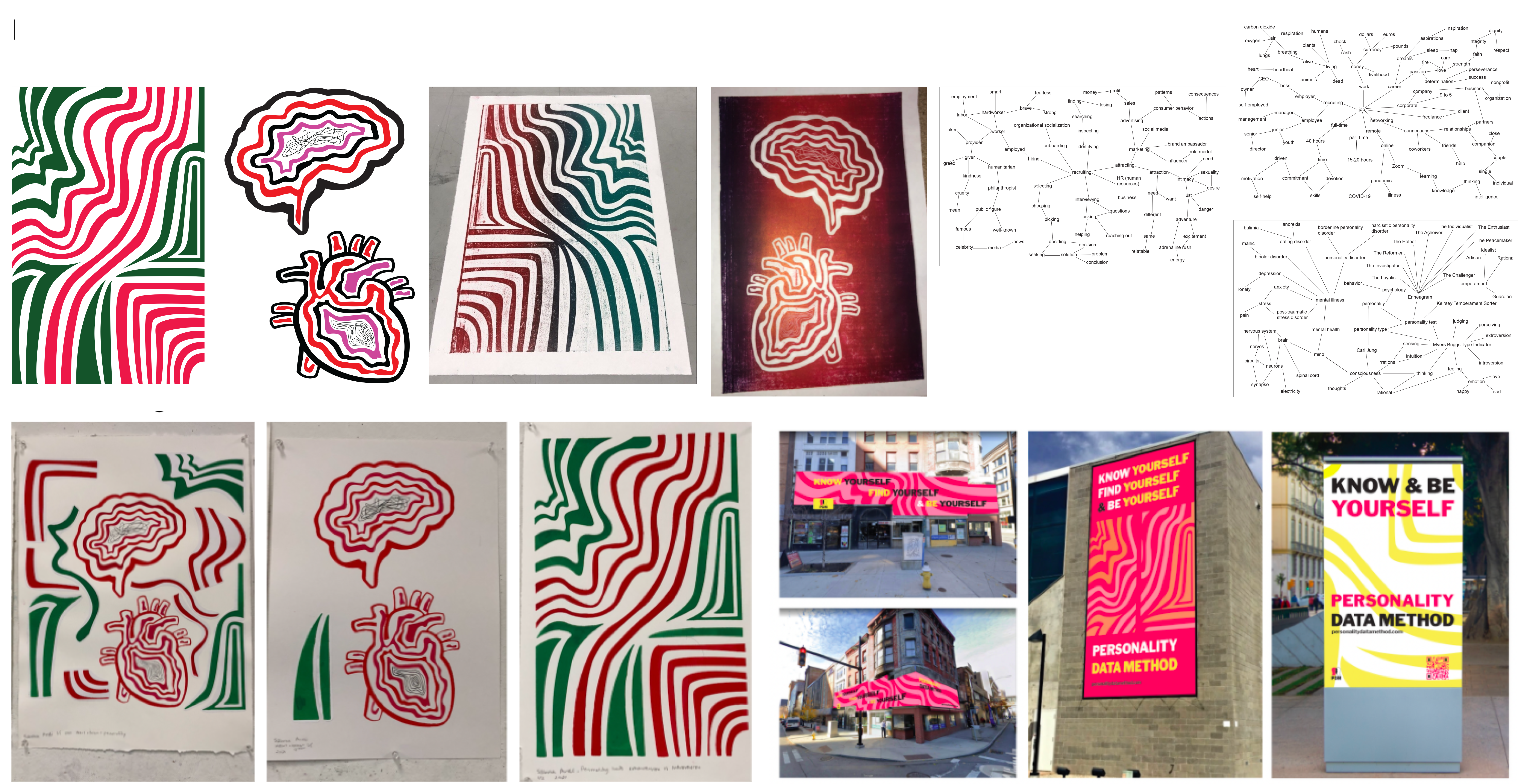
Initially, the idea I had was to create a personality type data visualization with a job overlay. I wanted to create a matchmaking system that allowed a person to be matched to certain company or employer through a personality type quiz and the final result would be a representation of a person's silhouette that let you feel that that's who you are. Which did end up being my final product of visuals, but without any specific data points or matchmaking to jobs. To start with, I took inspiration from my printmaking work and digital vector graphics with the line work. In my printmaking work, I am using repetition of abstract lines to express an interesting visual that I intrepeted as personality for one piece and then the others use the shapes of the heart and brain with lines repeated to emphasize them and create an interesting look.
Notes: I did some research for the different aspects of personality and different ways data visualizations could work aesthetically.
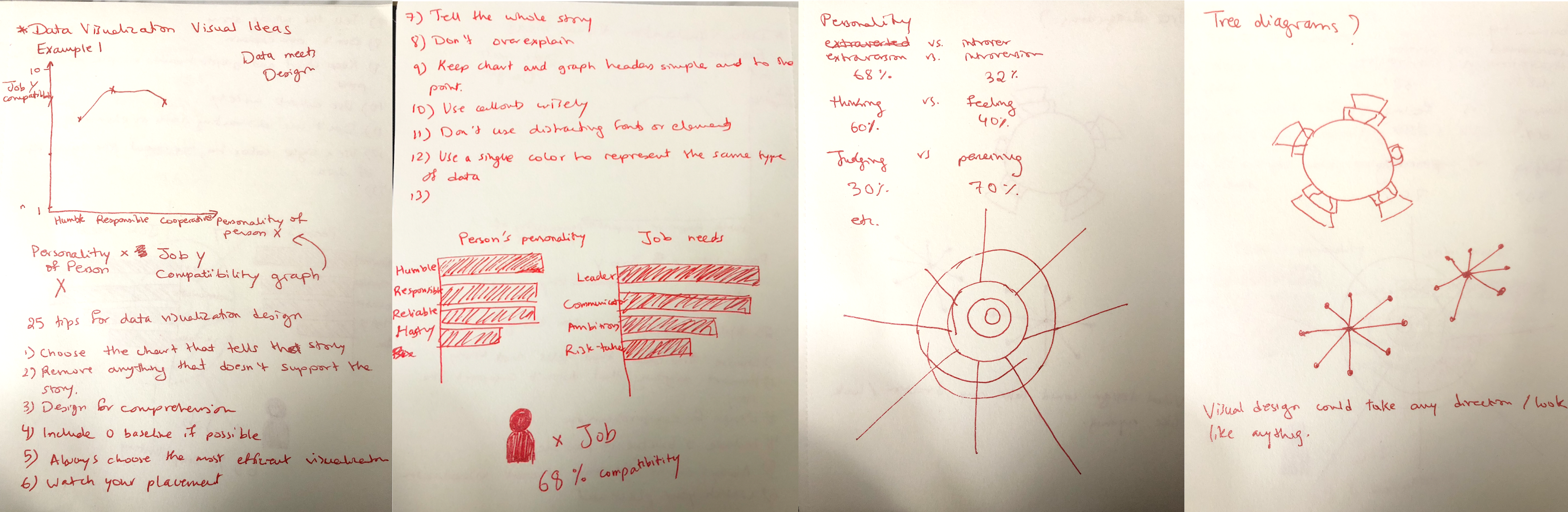
I did different iterations of digital line work with different color combinations.
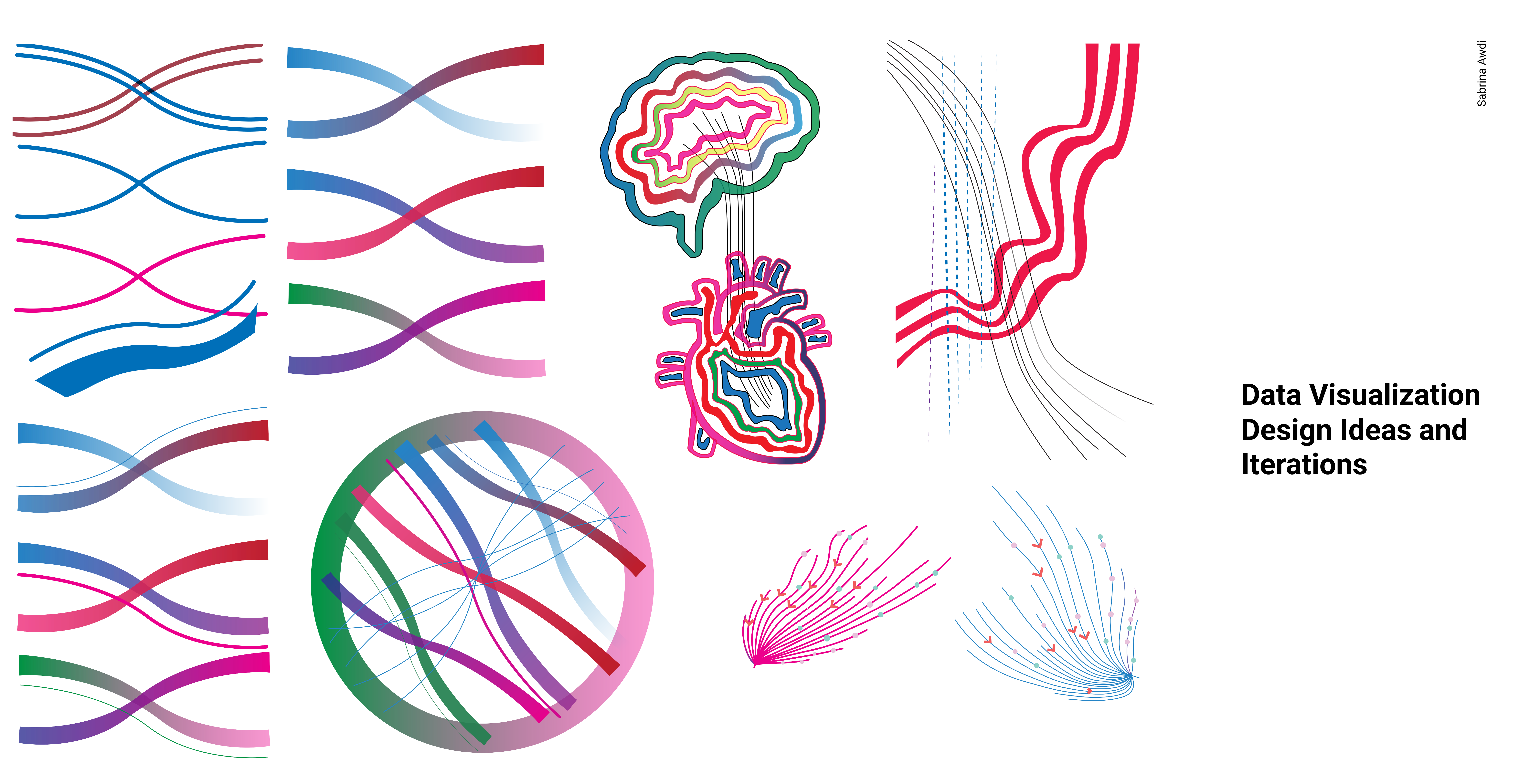
Here I tried more variations of lines with gradients and I started conceptualizing the silhouette.
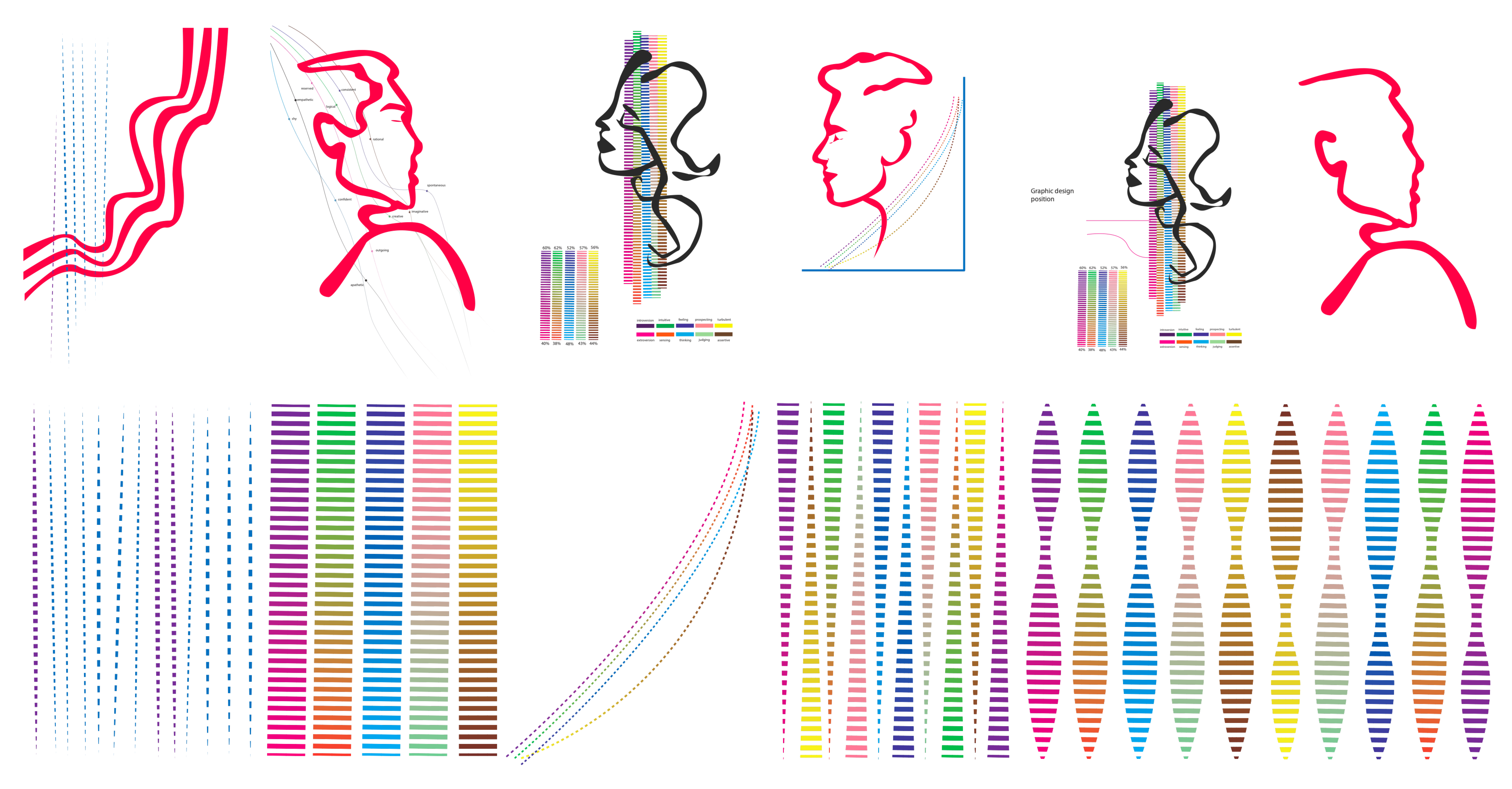
The first silhouette outlines I sketched out digitally were too concrete and recognizable. I outlined different variations of silhouettes to create abstract ones that worked. The human face is meant to represent to face of a real human who took the personality quiz but in a more abstracted manner.
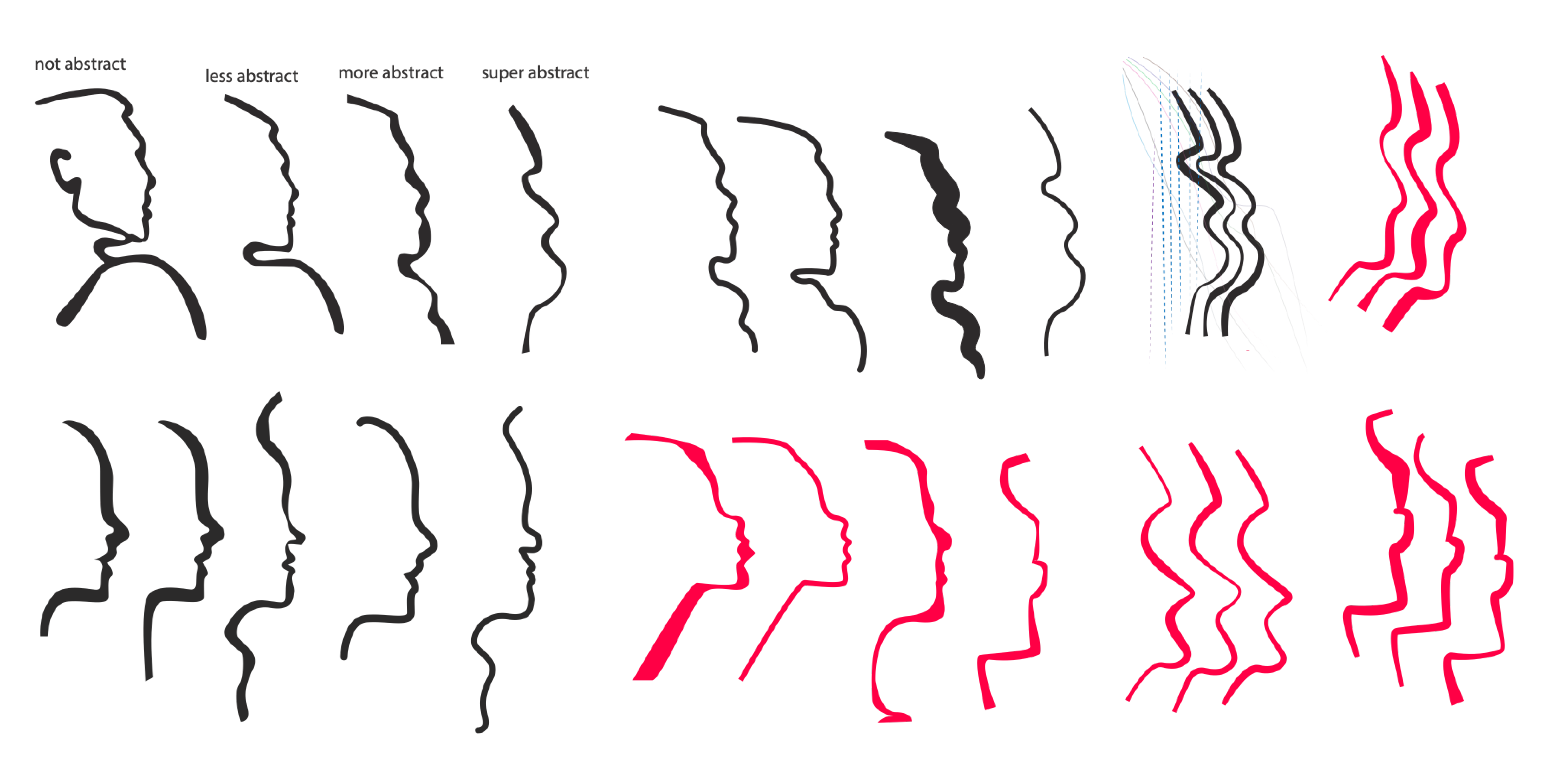
I tried different opacities using gradients and different colors. I only used 2 lines in while testing out different styles which didn't give the type of interesting visual effect I was looking for.
The next step was figuring out the style I wanted and how dramatic I wanted the silhoutte and background to be. I tried out many different styles and while the many lines filling up the entire frame were an interesting look, I wanted there to be vibrant colors that weren't overwhelming and the visual of a person and their aura to still be clear and clean.
In most of my iterations here, repetition is used again for the lines to emphasize the human face that is meant to be an abstract interpretation of a real human that takes a personality test. The ones where the lines make up the entire frame were interesting to look at but they became the focal point that created a pattern in the entire layout which I didn't want. It felt too simple to me and I wanted to break it up more. I wanted more contrast to occur in the elements on the page. The two faces confronting each other using Gestalt principle was also an interesting look but the idea of controntation and tension didn't pertain to my subject matter so I didn't go with that either. That's why I did some more iterations and added shapes in the background with fewer lines to create contrast from the foreground to the background. However, the shapes and style were too retro and distracted from the topic of the subject matter to other things. So, I continued to make iterations to refine the work.
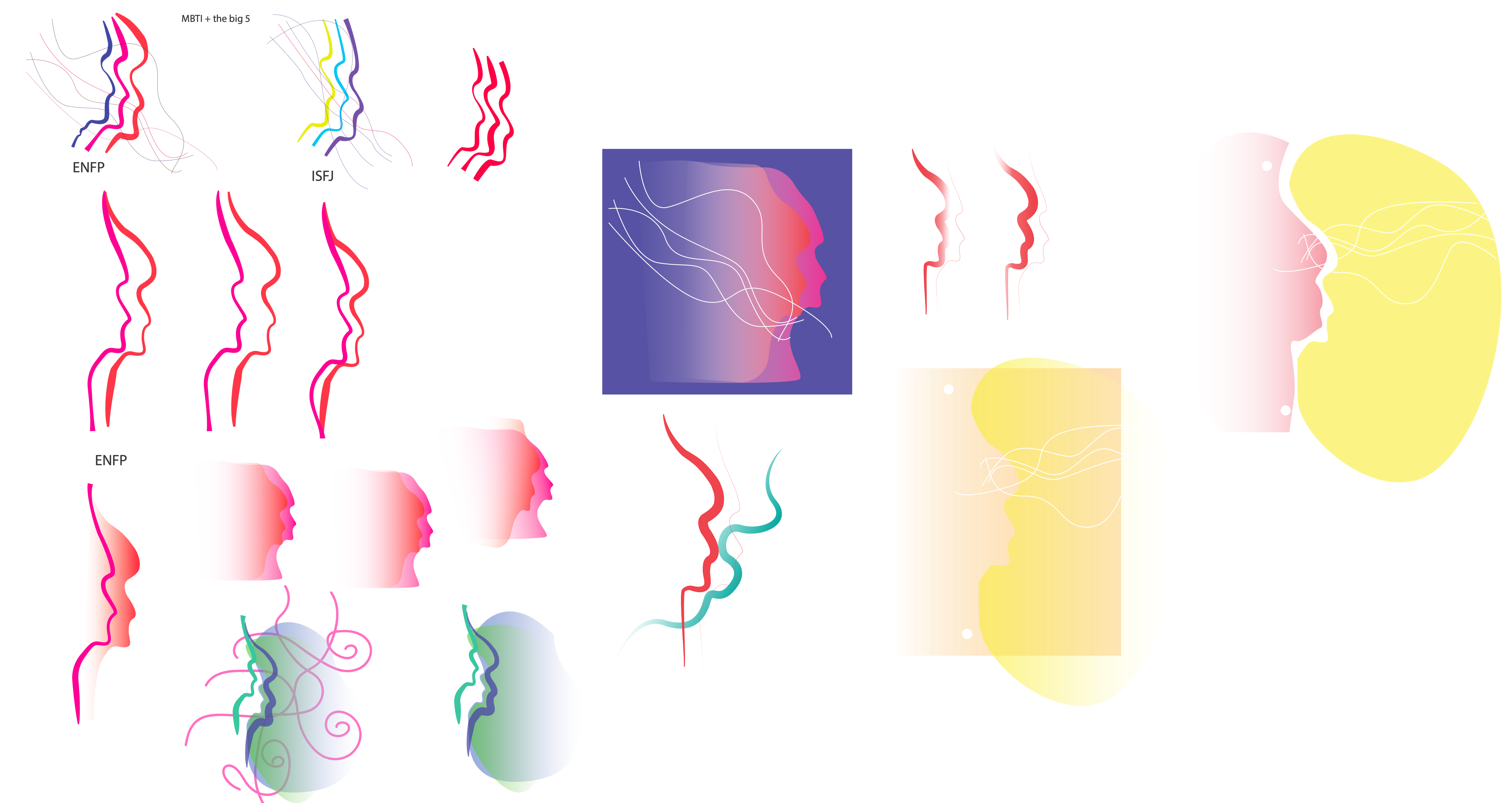
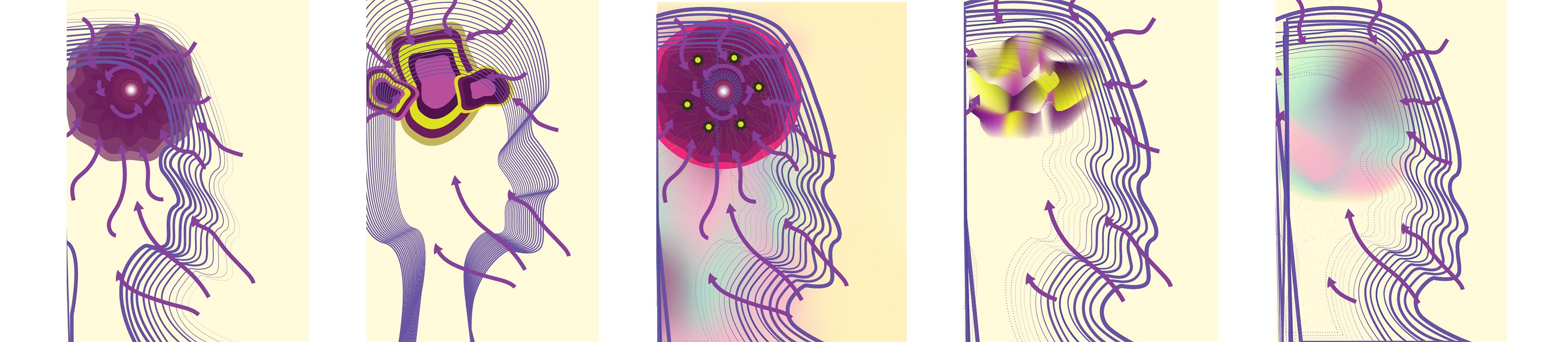
And so, I tried out another approach where the lines show a clearer, less abstract, version of a face with a shapes that convey what's going on inside the mind and spirit of an introvert. Some of the shapes seemed to look like brains on psychedelics, so I ditched them and turned to improving the last visual and working on top of it of a gradient showing a person's aura. In this case, it's the aura of an introvert. The arrows going inward are meant to show that introverts take in from their surroundings and focus on their inner world.
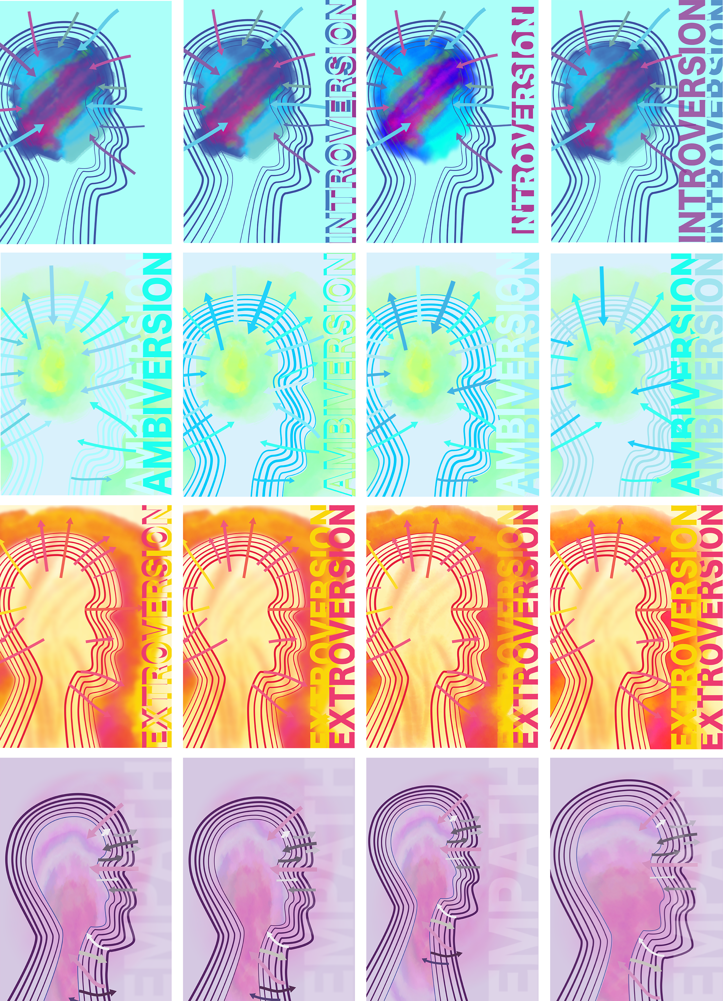
The shape of the silhouette didn't look very appealing as the lines continued outwards, so I finessed it's appearance. Instead of a regular gradient for the aura, I used a watercolor brushes to add a digital artistic appearance to my design. Here are ten different iterations of each personality type that I laid out with different arrows, typography, shape sizes, and aura variations. I used a lot of repetition of lines and arrows. I tried to create contrast between the outside and inside of each personality type poster based off their specific characteristics. I made line weights different for each personality type in the silhouettes going from thickest to thinnest, thinnest to thickest, or thin to thick then thin again to create a vibration of a wave and the illusion of movement. The arrows are also headed in specific directions to lead the eye.
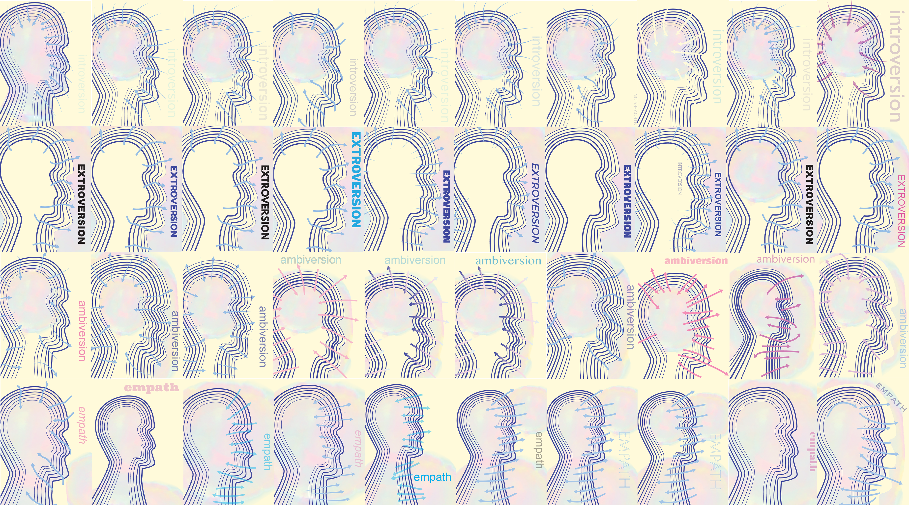
The posters variations were looking too similar and stil needed variety to tell apart the different personalities. So, I went for lots of vibrant and dramatic colors that are supposed to represnt the auras and energies of each type: introversion, extroversion, ambiversion, and empath. I tried more dramatic approaches to the typography as well to see how each poster could work seperately as well as together as a whole. However, the everything still needed work since the auras and colors looked a little muddy and the typography didn't closely represent each personality respectively yet. The top row shows the posters without the arrows and the bottom with them.
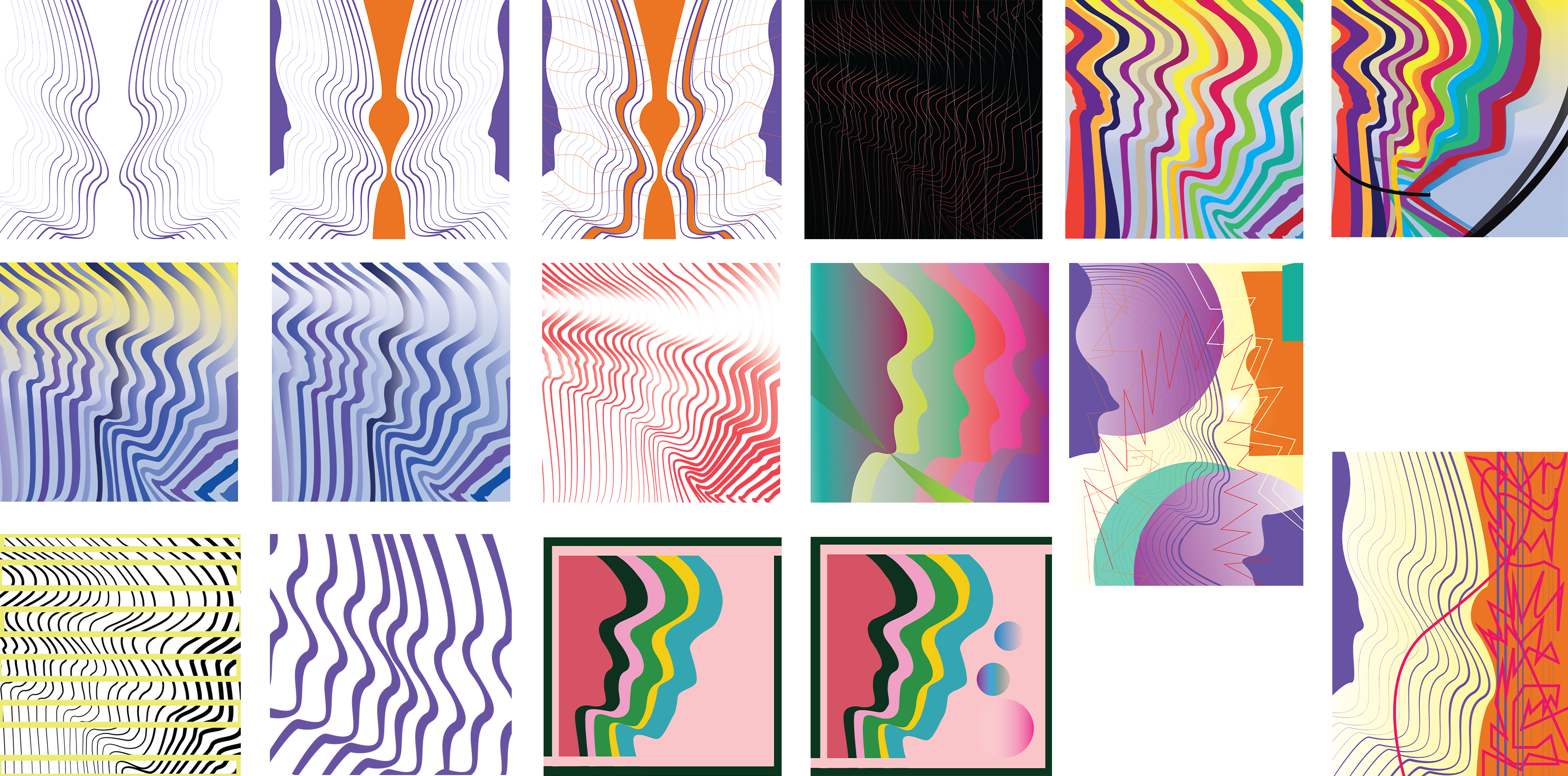
Introversion poster has more negative space surrounding it inside and out of it while empath has mainly outside of it and where the lines are. Amvibersion has a bit of negative space inside and some outside. Extroversion is loud on the outside but the eye can relax inside where there's mostly negative space. The colors are very highly contrasting in ambiversion and empath here but not in a pleasant way. Ambiversion is too vibrant and colorful with too much variety in color making it a lot to look at at once. It also feel bolder than extroversion is some aspects. Empath's color palette is dark and not blended well at the aura making it look a little muddy. The hierarchy isn't working well in ambiversion and most of them don't feel unified both individually and as a collection together yet.
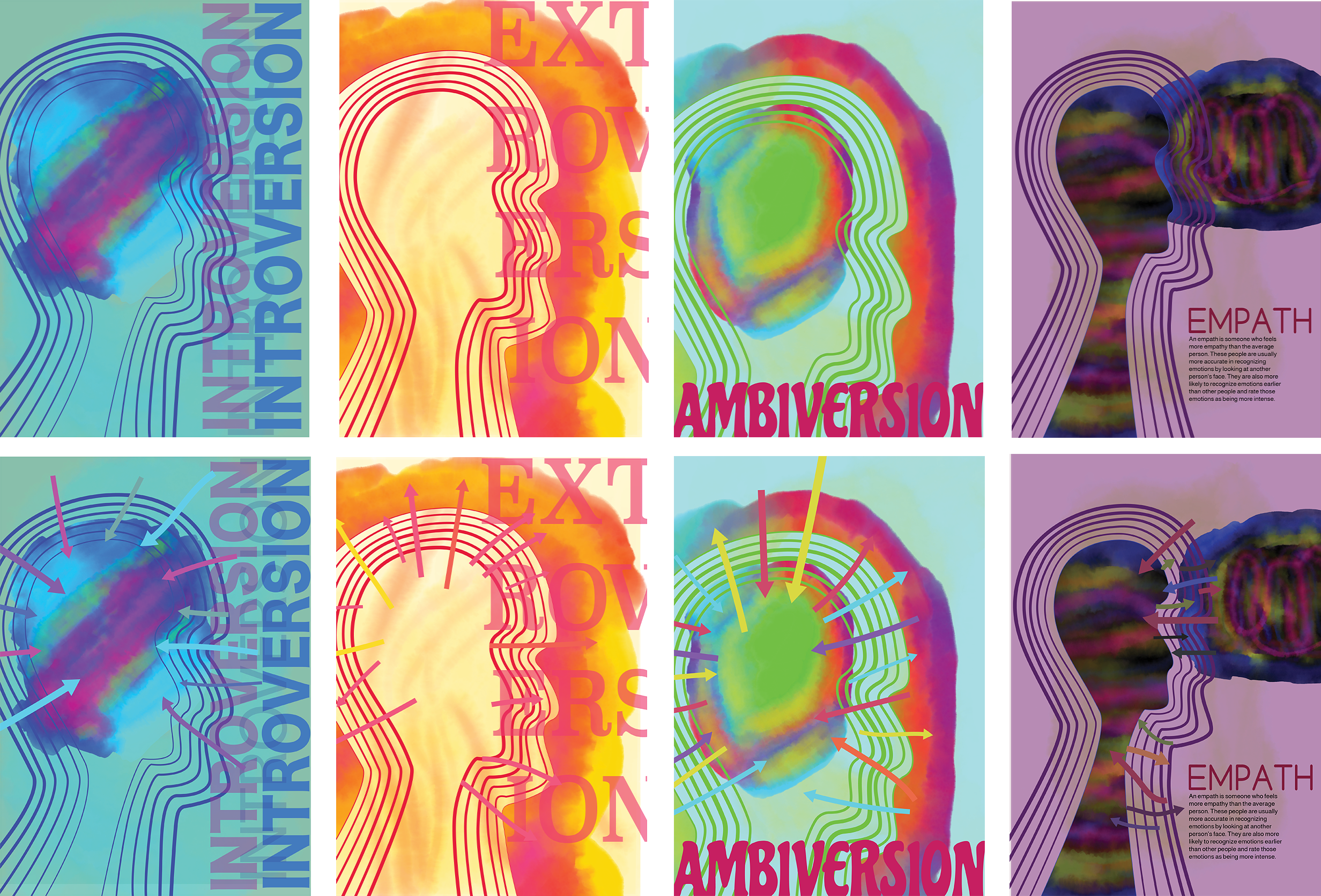
I opted for lighter colors after further working on them for introversion, ambiversion, and empath that worked better with their other components for introversion and empath. Ambiversion's color palette was too vibrant neon-y making it a little much for the viewer to look at all at once and the text wasn't legible so I continued to work on it's color palette. Extroversion is closer here to the final but the typography needs to be more dramatic. In all of them, the auras need to be blended better and with the colors inside them into their backgrounds.
Introversion's typography stands out too much for the subject matter to make sense after making these iterations, so subduing them would help. Ambiversion doesn't have enough visual hierarchy in terms of color yet. There is too myuch visual contrast between the colors and they are hard o the eyes to look at. In extroversion, the aura is the focal point mainly emphasized leaving the typography a little behind. The typography also needs to be amped up and emphasized more to make the visual look more interesting and keep that distinct contrast stronger between the inside of the head that has negative space to the outside space which is filled up. The colors are already a lot more unified and in harmony. Empathy's proportion sizes in relation to the head in the foreground and the background with the typography are still being tested here in terms of how it feels right for each element to be scaled to make it feel unified.
Here the color palette is a lot more unified for each poster. However, in order for them all to be more balanced together and individually there needs to be more effects added to the typography and some of the other elements surrounding it. Refining the projects to get to the final step is the key now here. Making sure there is more emphasis, contrast, hierarchy and harmony where there needs to be.
Final Four Iteration/Solution:
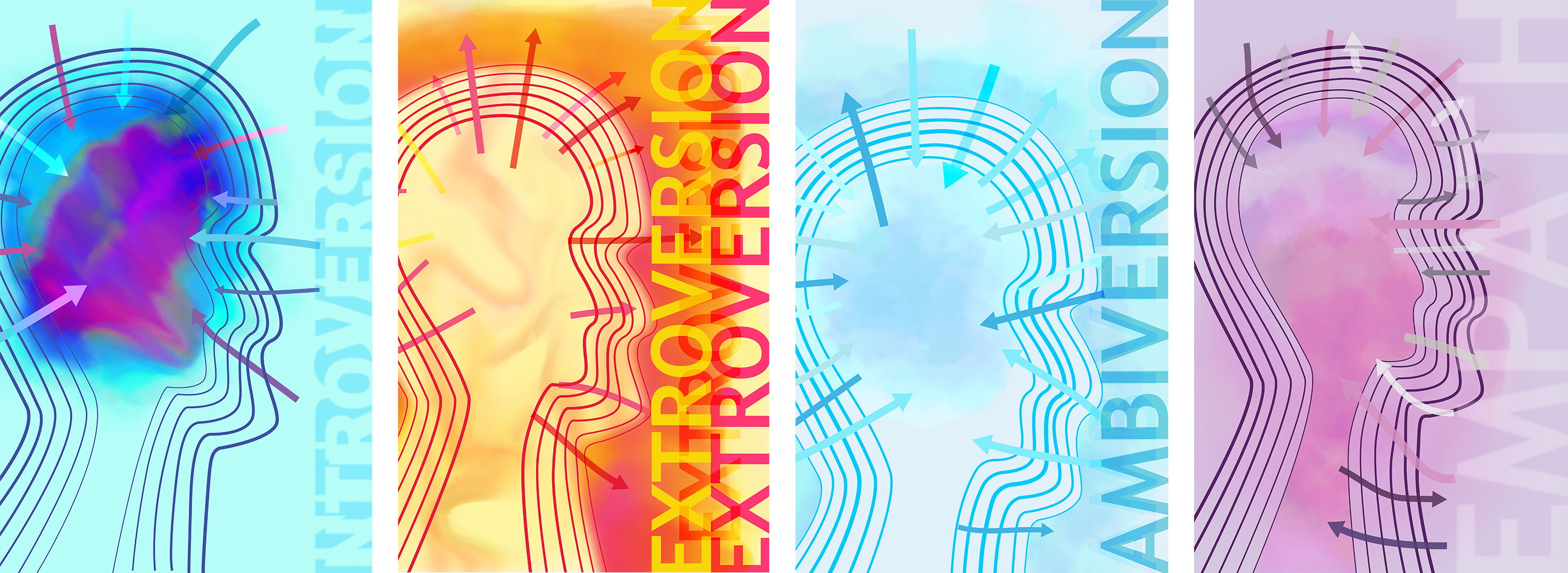
In the final solution, the colors for the auras are blended better inside, in the background, and together with the typography they supposed to evoke the feelings of what each personality types' traits convey. Each poster feels a lot more unified harmoniously individually and together as a collection. The use of repetition in each one emphasizes the visual of the human head that also uses the Gestalt principle of figure/ground with the negative space on the inside and outside of the lines. The different line weights create a vibrational movement going inwards and outwards for each one accordingly. The arrows do the same depending on which directions they're headed. The pattern and textures of the auras are blended well and create an appealing sight and flow making it a nice visual contrast and a break to the eyes from the solid and rigid vector graphics. Introversion has typography that uses the Gestalt principle of negative space on the inside and the outline shadow defines the word's shape. Extroversion's typography uses repetition to emphasize the outgoing nature of the term's meaning. Ambiversion has a cloudy pattern/texture that unifies with the rest of the poster and creates the feeling of going in and out as the movement of the posters other elements suggest. And last but not least, empathy is blending into the background witha blurry effect and low opacity but what make it stand out a little bit to see is the scale and proportion of it in size since it has fewer characters. All posters are asymmetrically balanced with the typography aligned vertically to the right side and the head and its elements aligned to the left to center taking up more than two-thirds of the page. Color theory has been used for each poster to convey the feelings and meanings of what each personality type stands for.
Personality Type Posters Mockup: