The 9
Dot Problem
Alances Vargas
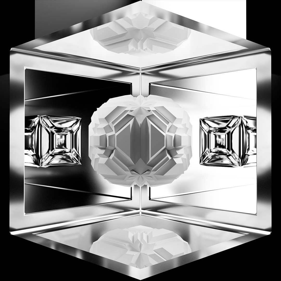
This installation motion graphics piece tells a story about the emotional journey of the creative process. It does this by abstracting the ideas of how to think outside the box, a concept many creative problem solvers are tasked with regularly. This piece features large scale projections and uses forced perspective to create anamorphic illusions that appear 3D to the naked eye.
Purpose
There is a growing movement to blend reality with the virtual world. Digital spaces and applications have been integrated into every facet of our lives and the distinction between the two has become less and less defined. As technology continues to blur this line, my project seeks to explore one possibility where we might use digital design to create an immersive experience where these two worlds meet.
Concept
The nine dot problem is a logic puzzle that requires a person to connect a grid of dots with only four straight lines. The person must never lift their writing instrument, and they are not allowed to retrace any lines. The phrase "Think outside the box," seems to be derived from, or at least hints to, the solution of the puzzle.
This puzzle is an exercize in lateral thinking and serves as the unifying concept behind this work. The piece is split into four sections that represent each line a person has to draw to solve the riddle. Each section has a rule, one that matches a step a person must take in order to come up with creative solutions to any given problem.
Rules
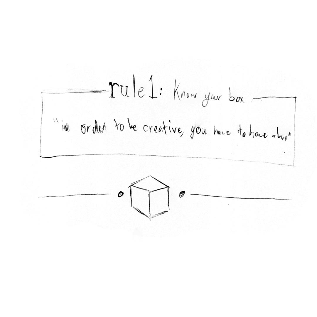
rule 1: Know
rule 2: Embrace
rule 3: Break
rule 4: Repeat
Defining a Box
Defining a Box
The concept for the nine dot problem was derived from Michael Bahr's talk at TEDxSUU titled "Thinking outside the box requires a box," in which he argues that creativity comes when constraints or parameters are placed upon an individual. In other words:
"You can't think outside the box, unless you have a box."
In more ways than one this quote served as the starting point of this project. In his talk Bahr argues that in general we often focus too much on what is outside of the box than on the box itself. That in order to think outside the box, you must first know everything about the box you exist in.
rule 1/
Know
New Beginnings
The start of every project has an interesting mix of emotions. An overwhelming curiosity, an excitement for something new and fresh, and a hint of apprehension. The first rule "Know" is meant to capture this mixture, drawing in the viewer by creating an air of mystery through a soundscape and dramatic visuals.
Scenes
Scenes
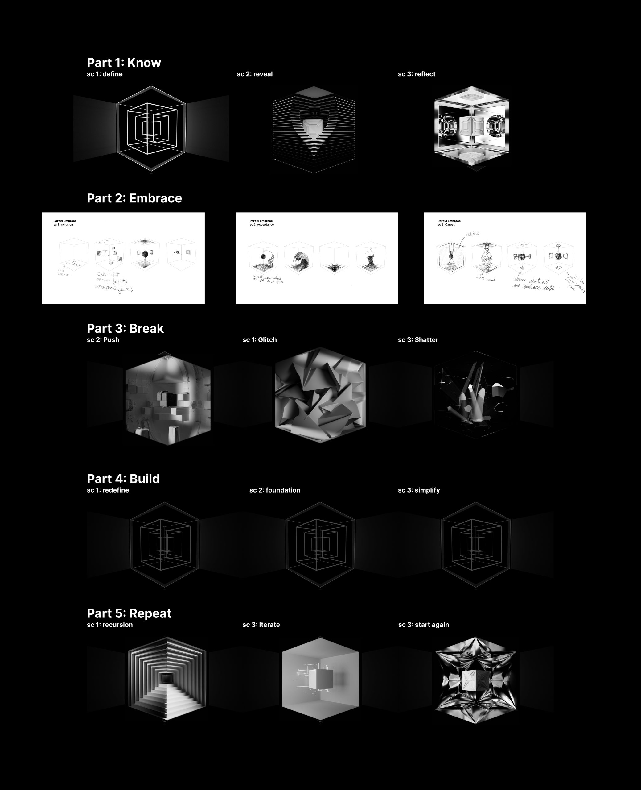
Each rule can be broken down into consecutive 20-30 second scenes. Each scene is based on a word that can be an interpretation of the rule it is trying to describe. The idea was to come up with words that would serve as a guide for more concrete visuals. By doing this I was able to create visual displays that when summed together gives the essence of each abstract rule.
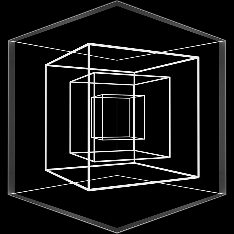
DEFINE
DEFINE
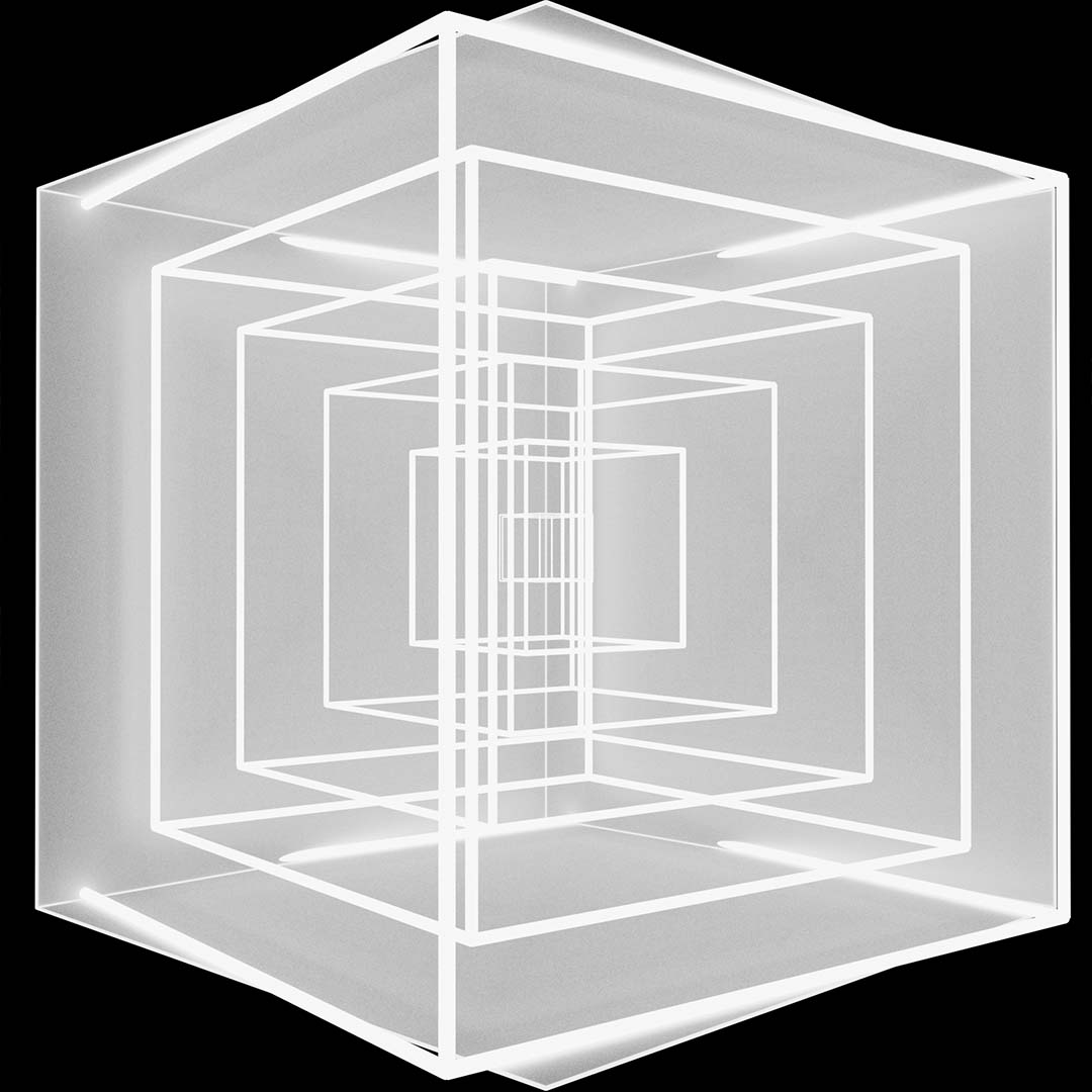
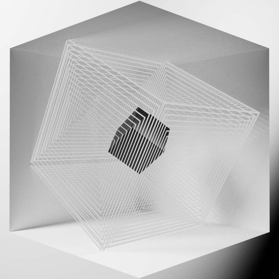
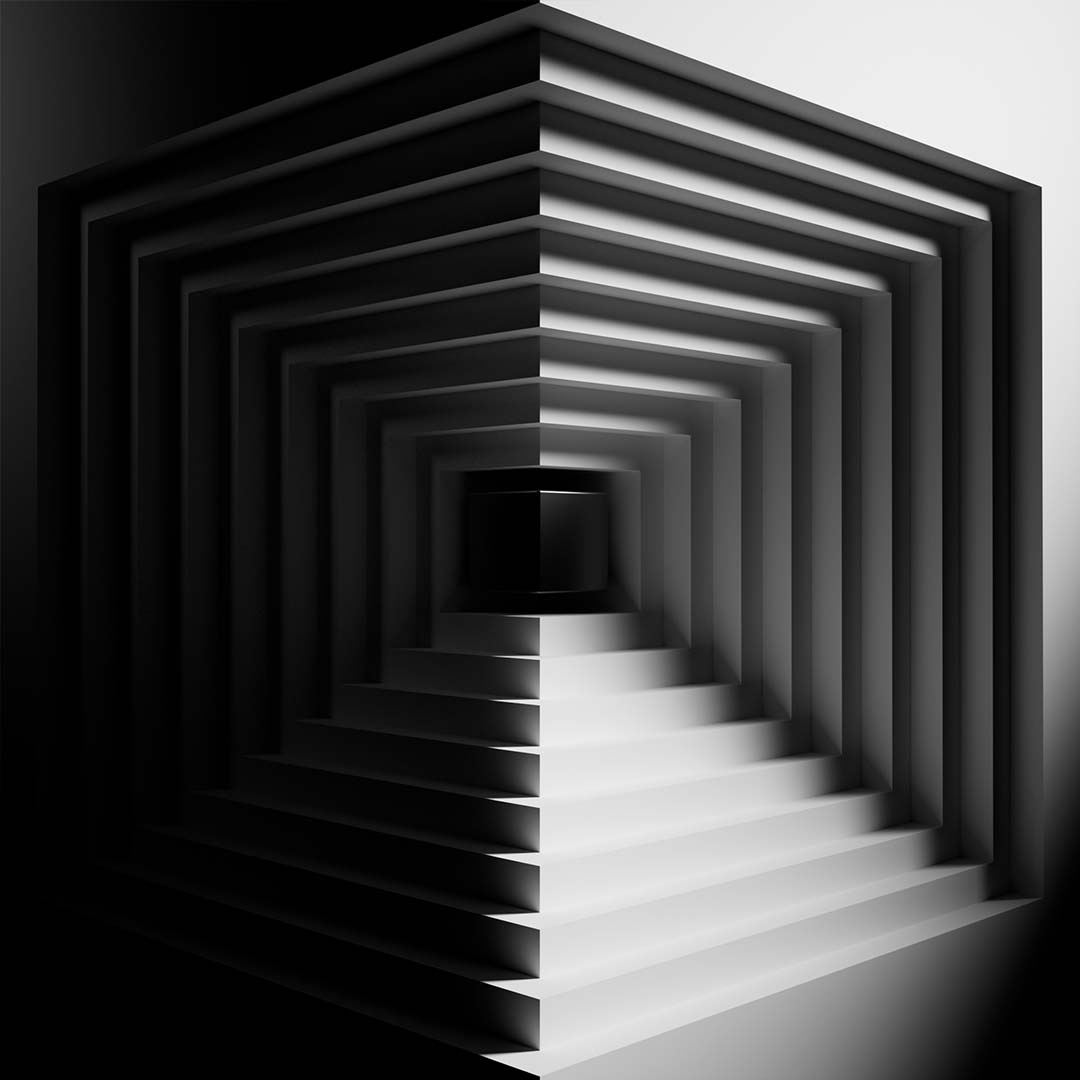
Without a clear definition, everything one might do is a stab into the dark without any real direction. The visuals use thin lines that trace the edges of the box, giving a definition to the space we are about to exist in for the next six minutes.
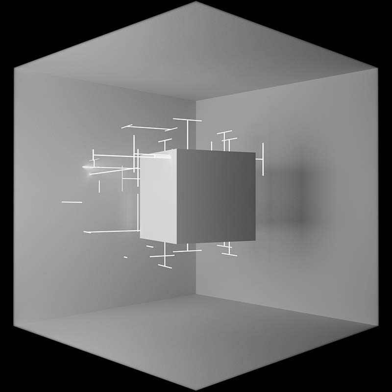
ANALYZE
To analyze is to understand. As we analyze the space, we understand more of how it works and the rules of box. Dimension symbols move around the cube as if taking measurements of our box, while lights move around as if scanning every nook and cranny
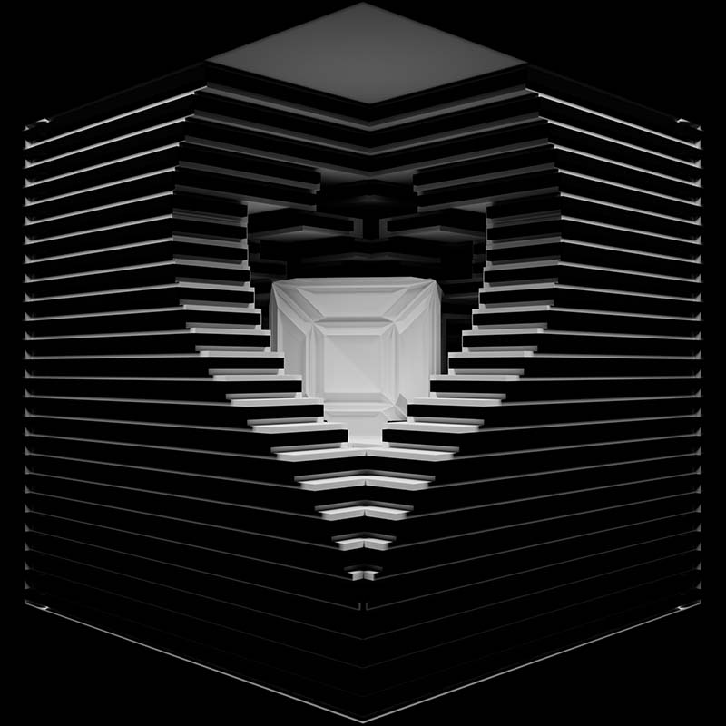
REVEAL
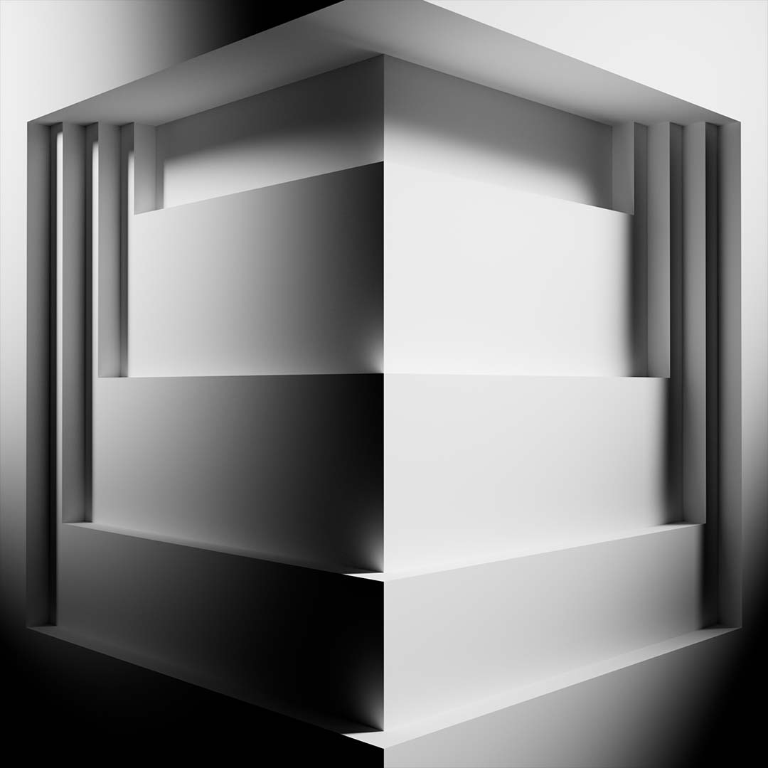
Black and white panels shift around to reveal the box in a new light. Once we've defined and analyzed the box, we can see it with a new understanding. New details have been revealed to us and we can confidently say we know our box.
rule 2/
Embrace
Comfort and Satisfaction
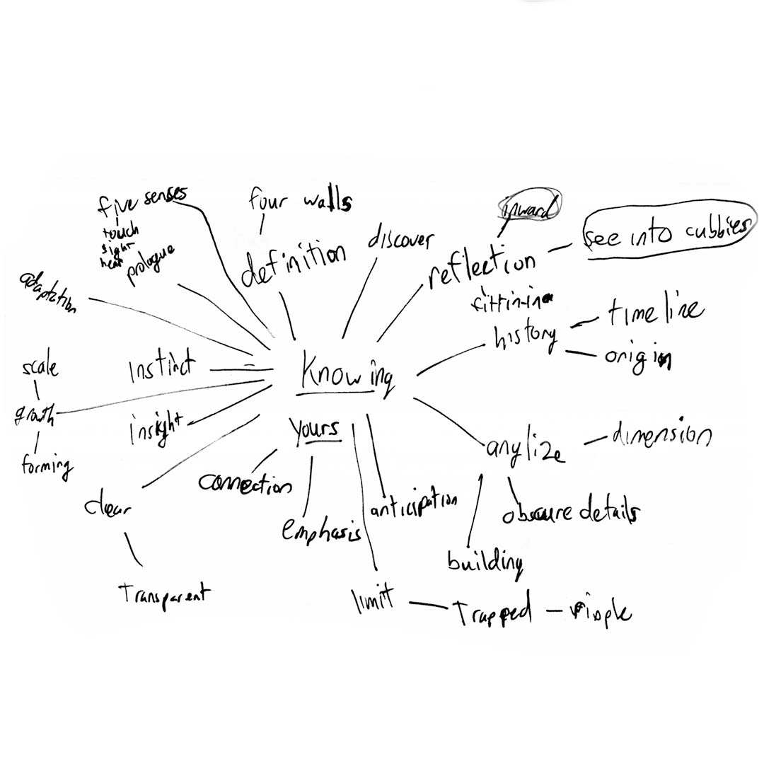
Rule 2 "Embrace" embodies the point when you begin to be comfortable in the creative process. It represents the period in which everything seems to work, in which you are comfortable within the constraints, the tools you are using, and entering a state of flow seems easy. The visuals and music serve to reinforce this with every element seeming to flow smoothly or fit wherever it needs.
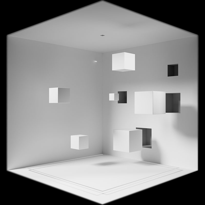
INCLUSION
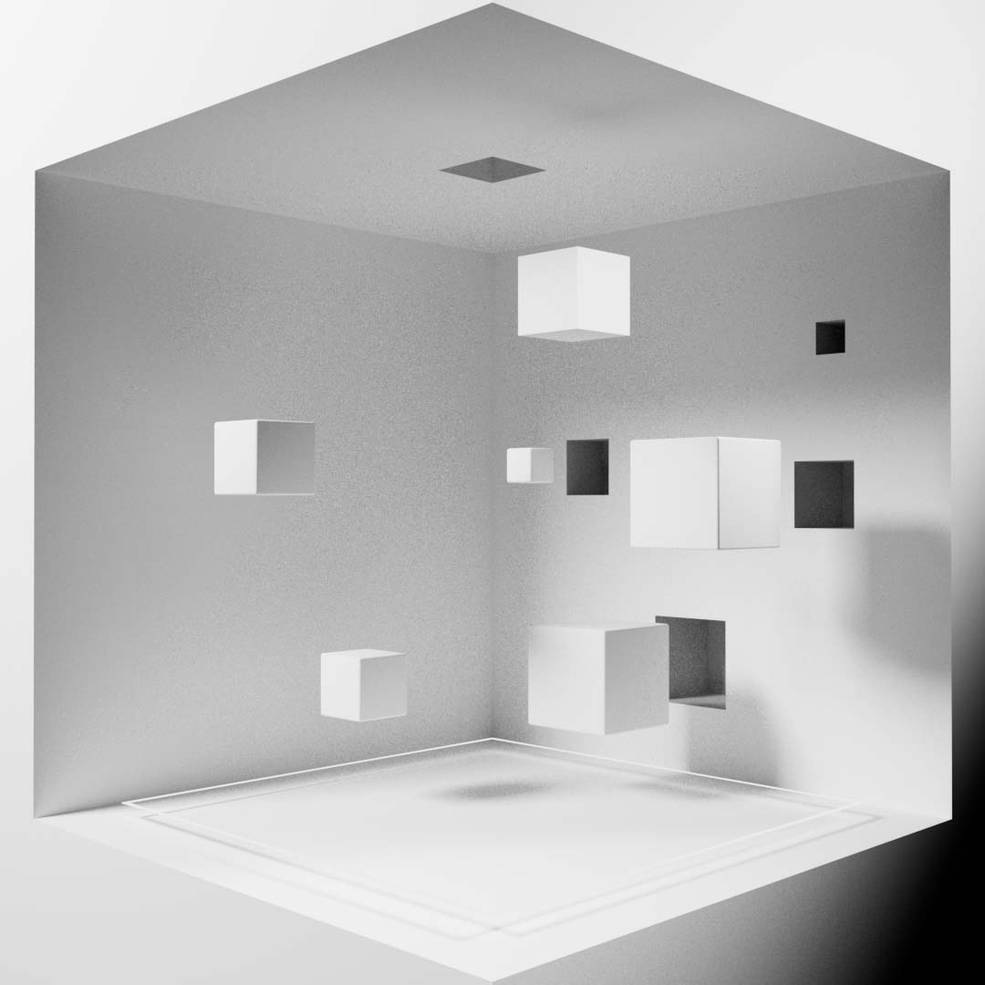
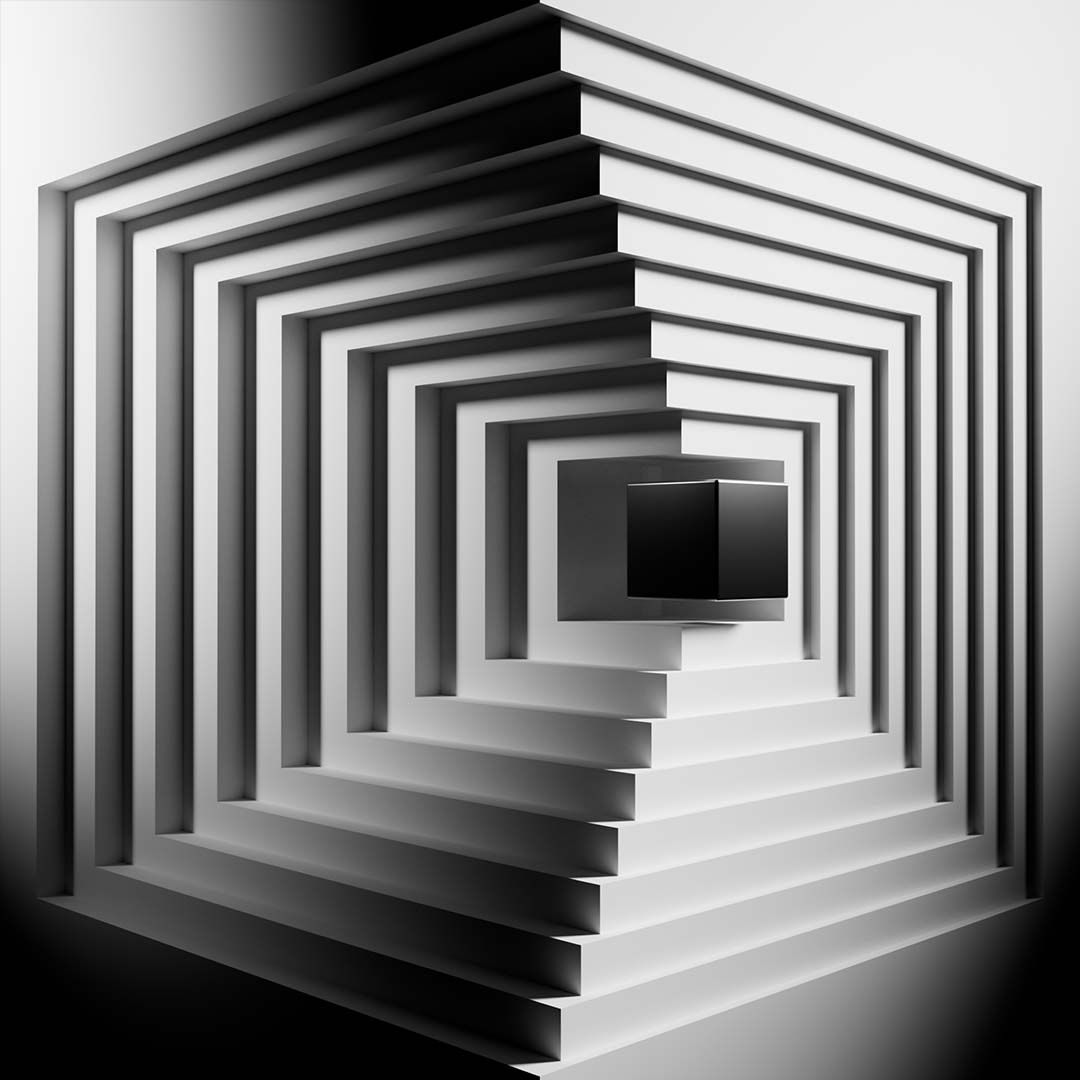
A box can come in all forms. To embrace your box is to recognize and include every constraint no matter how large or small. The cubes presented in this scene all seem to find the perfect place for themselves sliding into the appropriately sized hole. Not one seems to be excluded from fitting in.
ACCEPTANCE
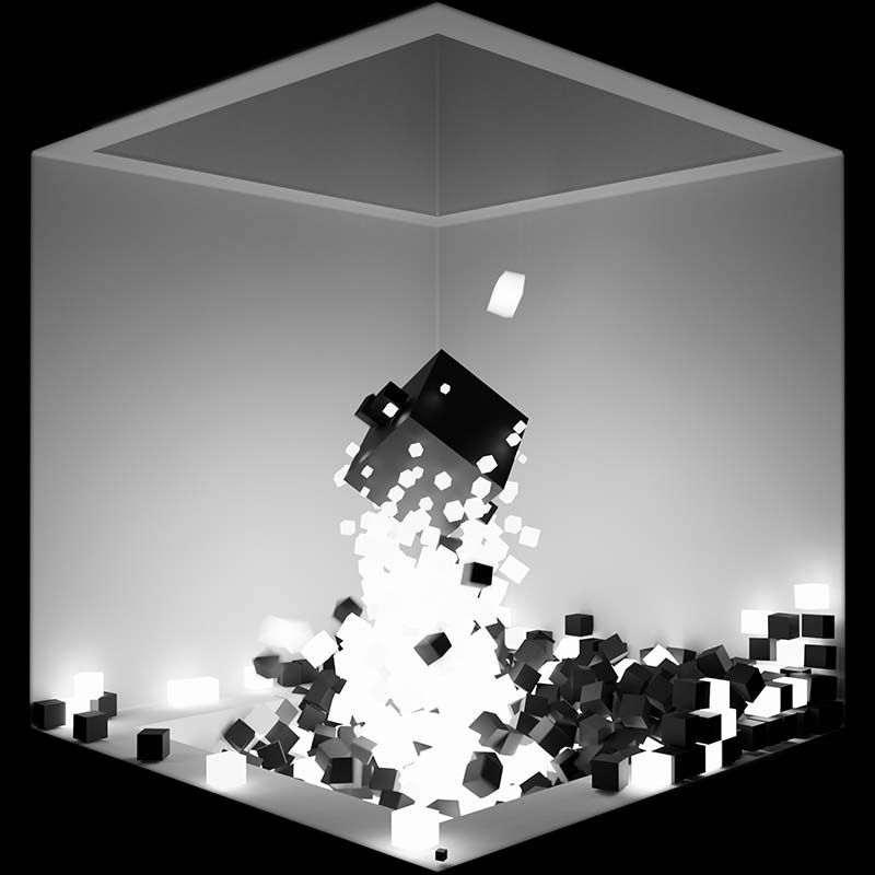
It's not often that you get to choose the box that you exist within. It can be a source of turmoil and a constant push and pull to accept the box you're dealt. The wave of cubes represents this turmoil as it swallows up the box in the center. They then illuminate as they begin to accept and uplift the black box in the center.
CARESS
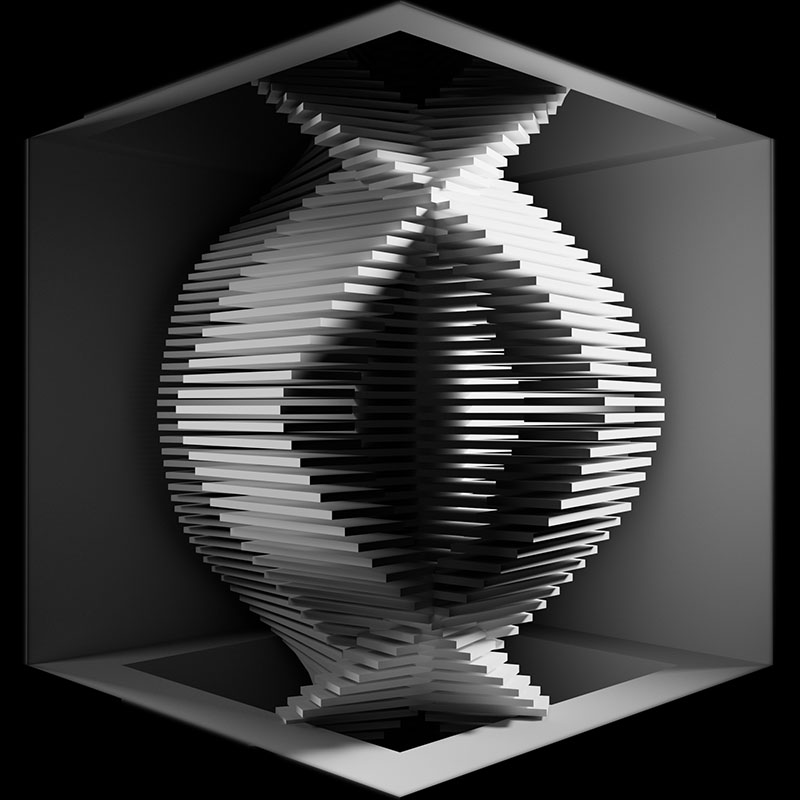
The main cube is caressed by a series of objects resembling that of a kinetic sculpture. The meditative movement elicits feelings of flow as the cube fades in and out of view.
rule 3/
Break
Frustration and Perseverance
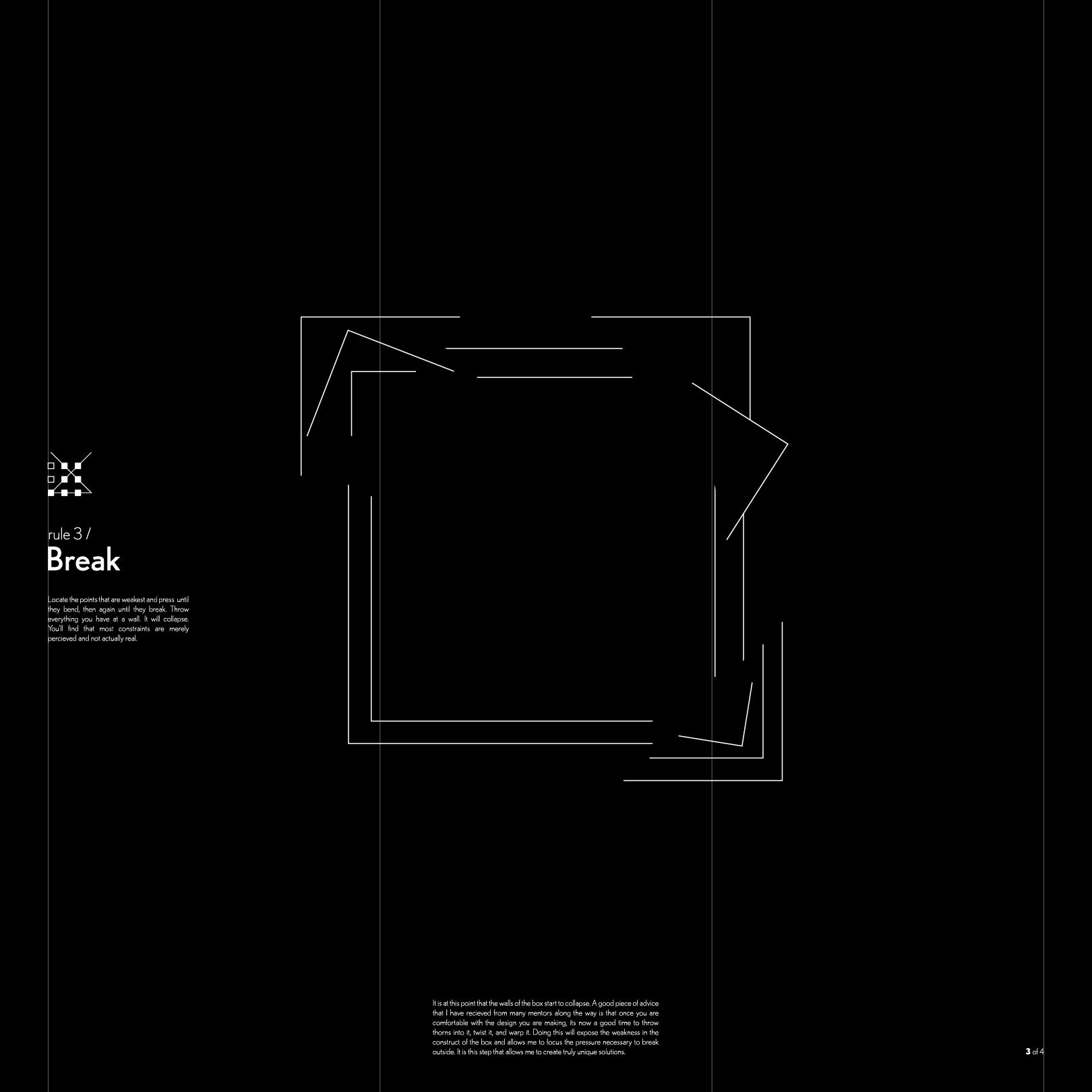
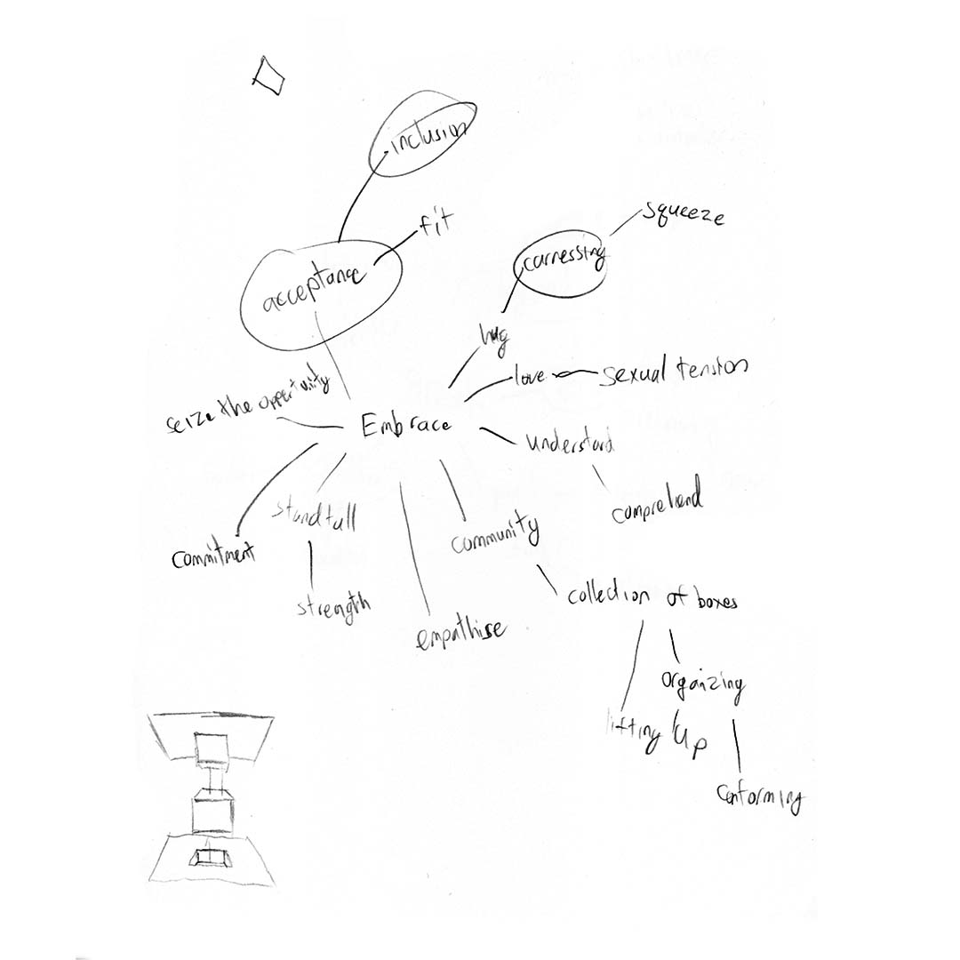
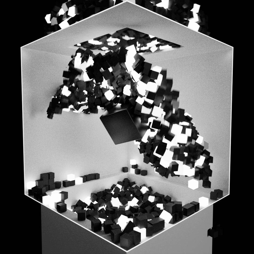
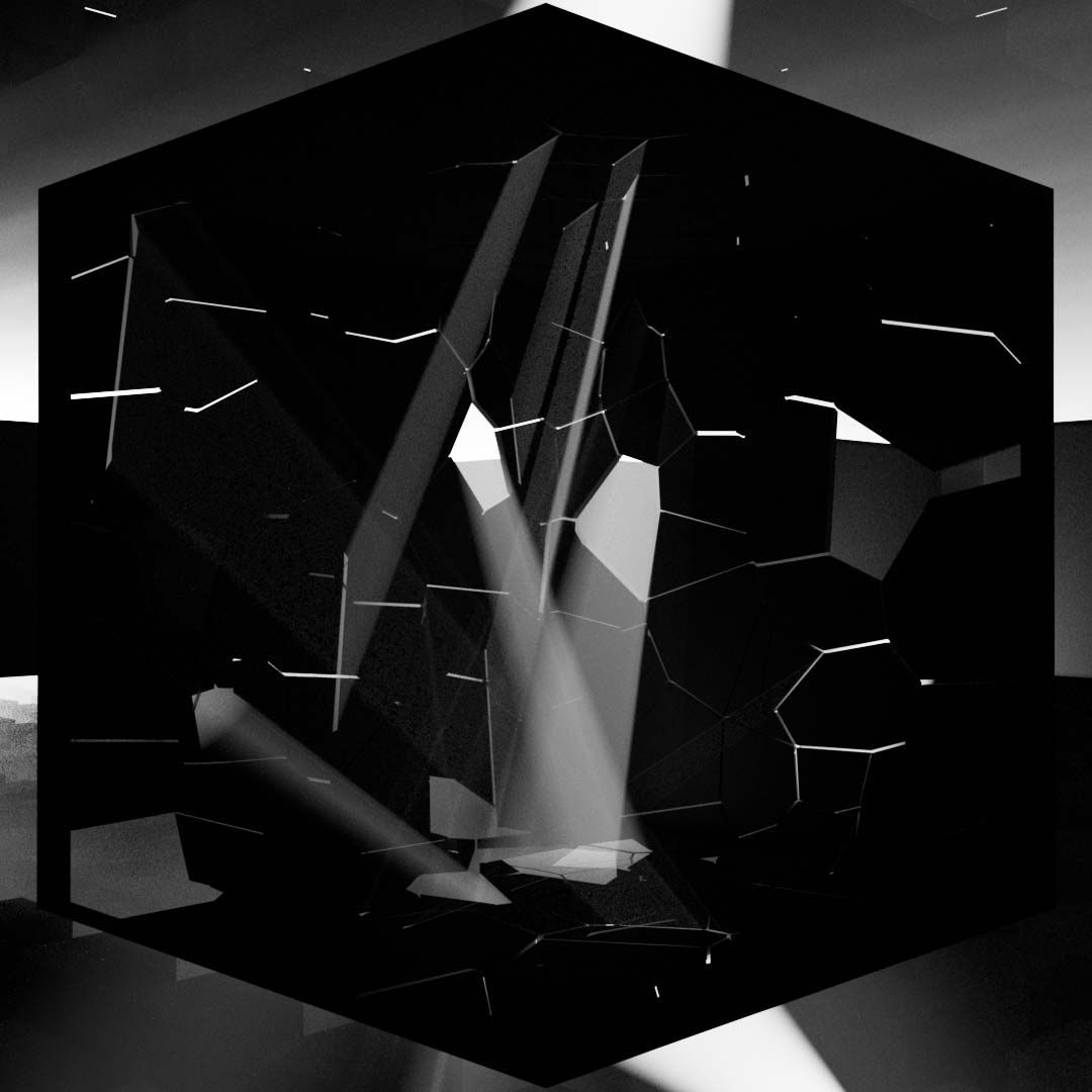
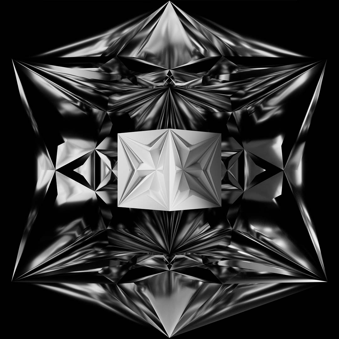
There is a moment in every project where it feels like there is no point to any of it. There is a feeling of dread as confidence is lost in the current state and future of the work. However, it is at this point where things start to bend and break. The visuals of Rule 3 "Break" start to morph the box and twist it beyond what it is capable of withstanding until eventually it crumbles. This represents the tension and frustration felt, and the hardship necessary to escape the box.
There is a point in every project where it feels like there is no point to any of it. There is a feeling of dread as confidence is lost in the current state and future ot the work. However, it is at this point where things start to bend and break. The visuals of Rule 3 "Break" start to morph the box and twist it beyond what its capable of withstanding until eventually it crumbles. This represents the tension and frustration felt and the hardship necessary to escape the box.
CORRODE
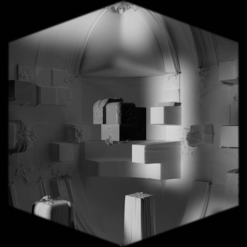
Corrosion erodes the box, exposing the weakness in the construct. The feeling of dread is evoked by the disruption to the space that the viewer has become comfortable with. The walls start to collapse and morph into something unsettling and unfamiliar.
TURMOIL
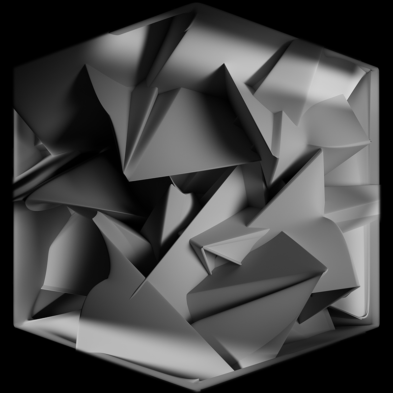
Twisting and contorting. This scene depicts the turmoil of indecision and the frustration of rapidly trying new things with nothing seeming to make a difference. This part of the creative process is often the messiest, but it only takes one moment to give that crucial break through.
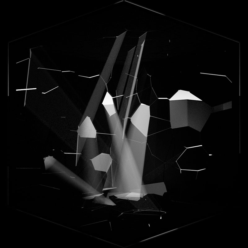
SHATTER
The inevitible escape from the box. A moment of relief as the box crumbles and the struggle ceases. The sea of boxes exposed may seem overwhelming and create a sense of insignificance, but ultimately the fight is worth it.
rule 4/
Repeat
Relief and Introspection
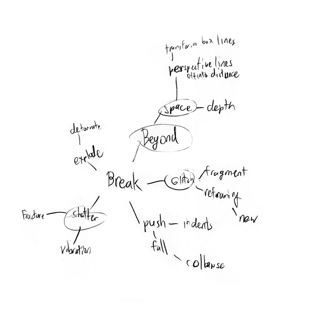
The eventual completion of a project yields no greater feeling of relief and satisfaction. There is a sense of calm and peace as the mind relives the memories of the process. The delicate soundscape soothes the viewers as the visuals of rule 4 "Repeat" remind them of the previous rules and shows the reflections of what once was and now is.
The eventual completion of a project yields no greater feeling of relief and satisfaction. There is a sense of calm and peace as the mind relives the memories of the process. The delicate soundscape soothes the viewers as the visuals of rule 4 "Repeat" remind them of the previous rules and shows the reflections of what once was and now is.
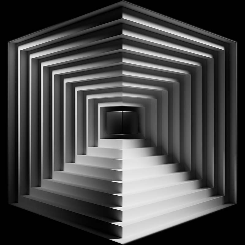
RECURSION
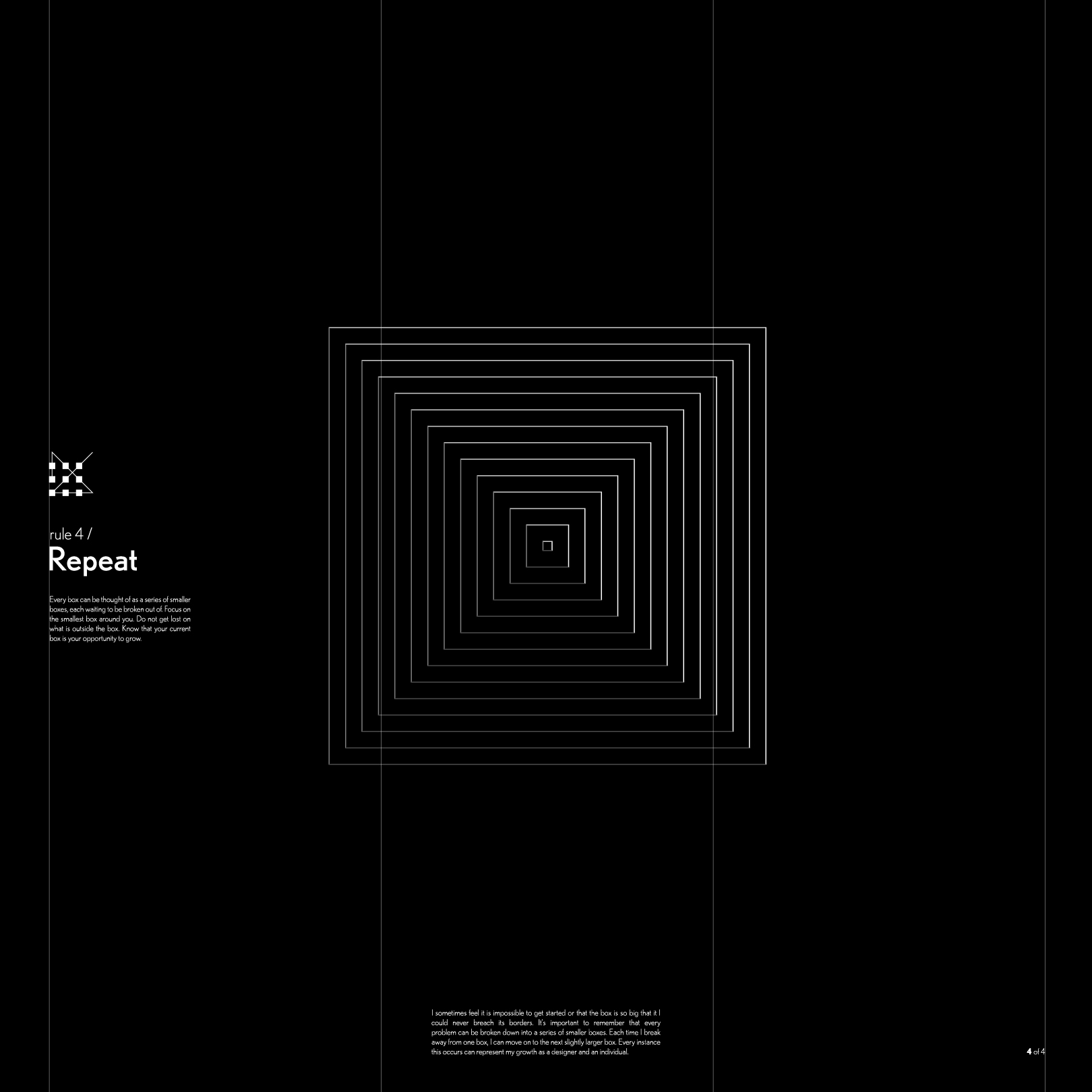
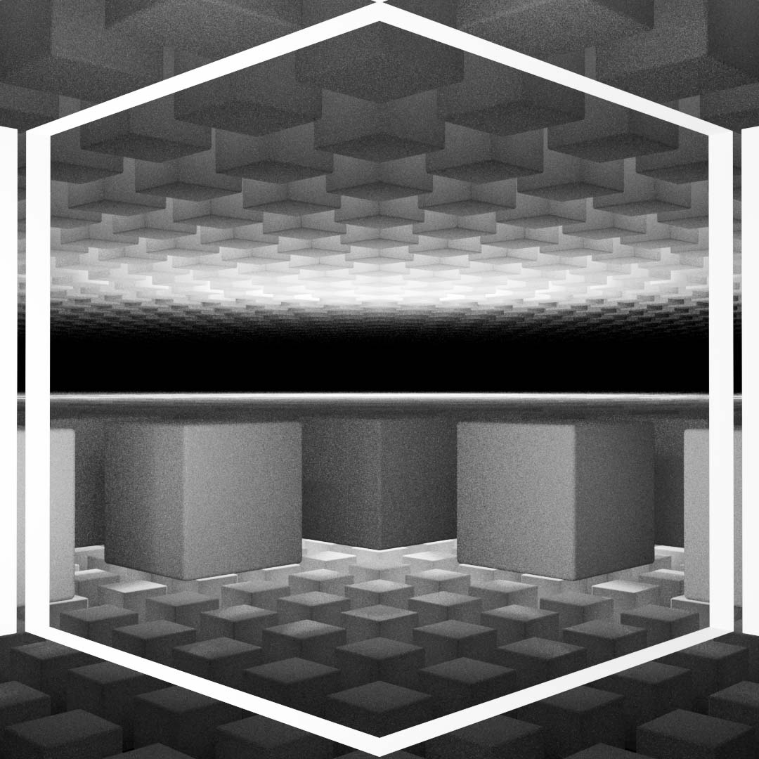
Recursion, a word taken from the sciences, shows the main box broken down into smaller and smaller boxes. Every problem can be thought of as a series of smaller problems.
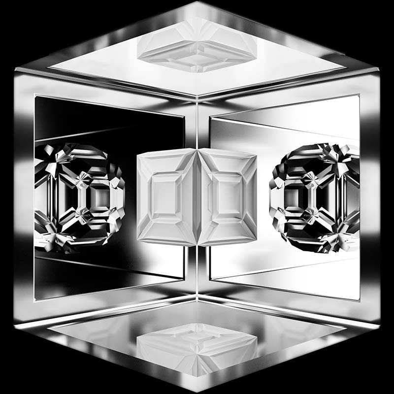
REFLECT
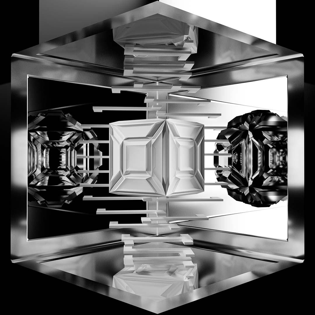
There is a lot of learning in the hindsight of any project. The reflection upon the process of a piece of work is what helps one grow. The repetition and mirroring of the cubes helps to reinforce these ideas as they show a recounting of the past rules.
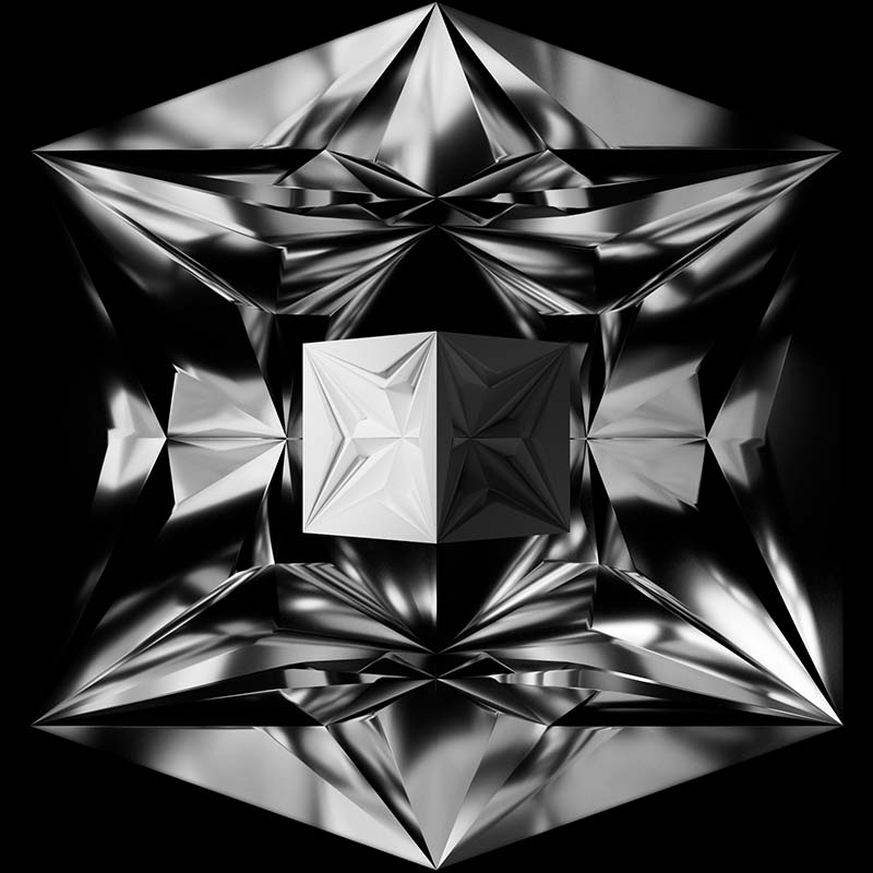
REMEMBER
Tied tightly with the idea of reflection, when one creates memories it becomes engrained in their soul. Through the process the cube in this scene morphs into a new form, yet still maintains a grounding pulse at its core.
Letting People Know
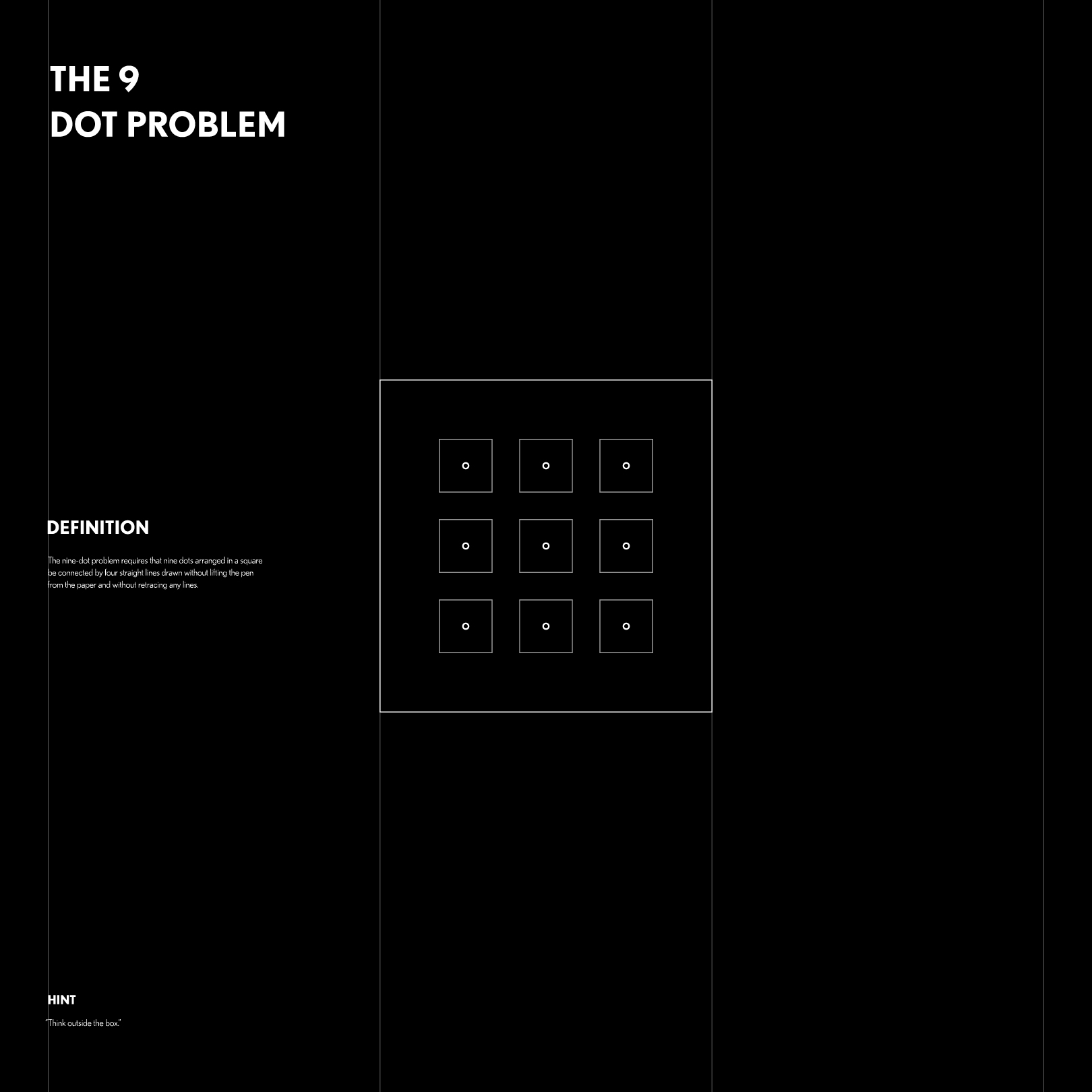
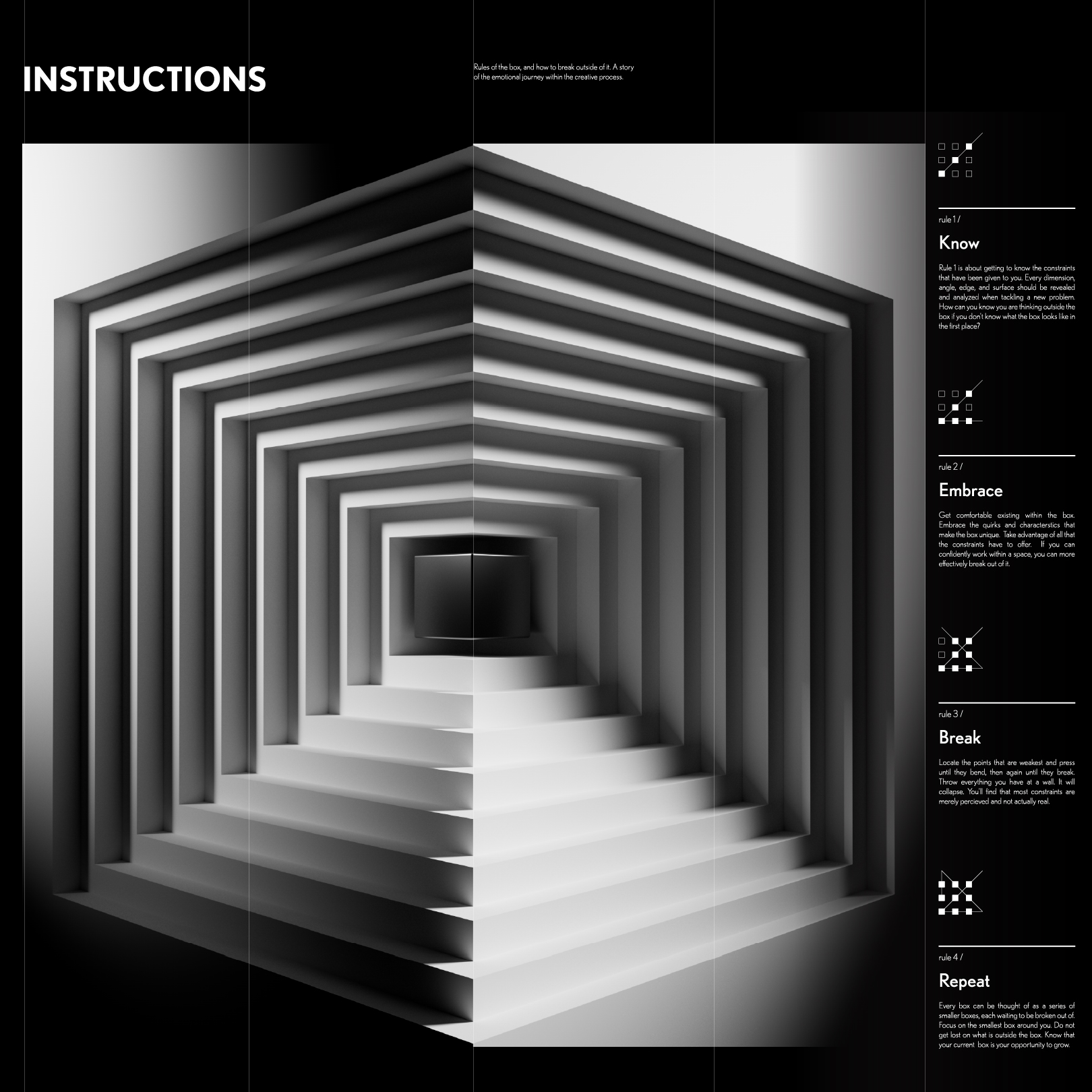
To help promote and explain the project at Imagine RIT (a campus wide tradeshow), I created a series of large-scale posters. Each one is a 2D representation of the rules and simplified to generate curiosity and intrigue. These 30in by 30in posters were hung around the room that the installation existed in.
"
Definition
The nine-dot problem requires that nine dots arranged in a square be connected by four straight lines drawn without lifting the pen from the paper and without retracing any lines.
"
1/ Rule 1 is about getting to know the constraints that have been given to you. Every Dimension, angle, edge, and surface should be revealed and analyzed when tackling a new problem. How can you know you are thinking outside the box if you don't know what the box looks like in the first place?
2/ Get comfortable existing within the box. Embrace the quirks and characteristics that make the box unique. Take advantage of all that the constraints have to offer. If you can confidently work within a space, you can more effectively break out of it.
3/ Locate the points that are weakest and press until they bend, then again until they break. Throw everything you have at a wall. It will collapse. You'll find that most constraints are merely perceived and not actually real.
4/ Every box can be thought of as a series of smaller boxes, each waiting to be broken out of. Focus on the smallest box around you. Do not get lost on what is outside the box. Know that your current box is your opportunity to grow.
"
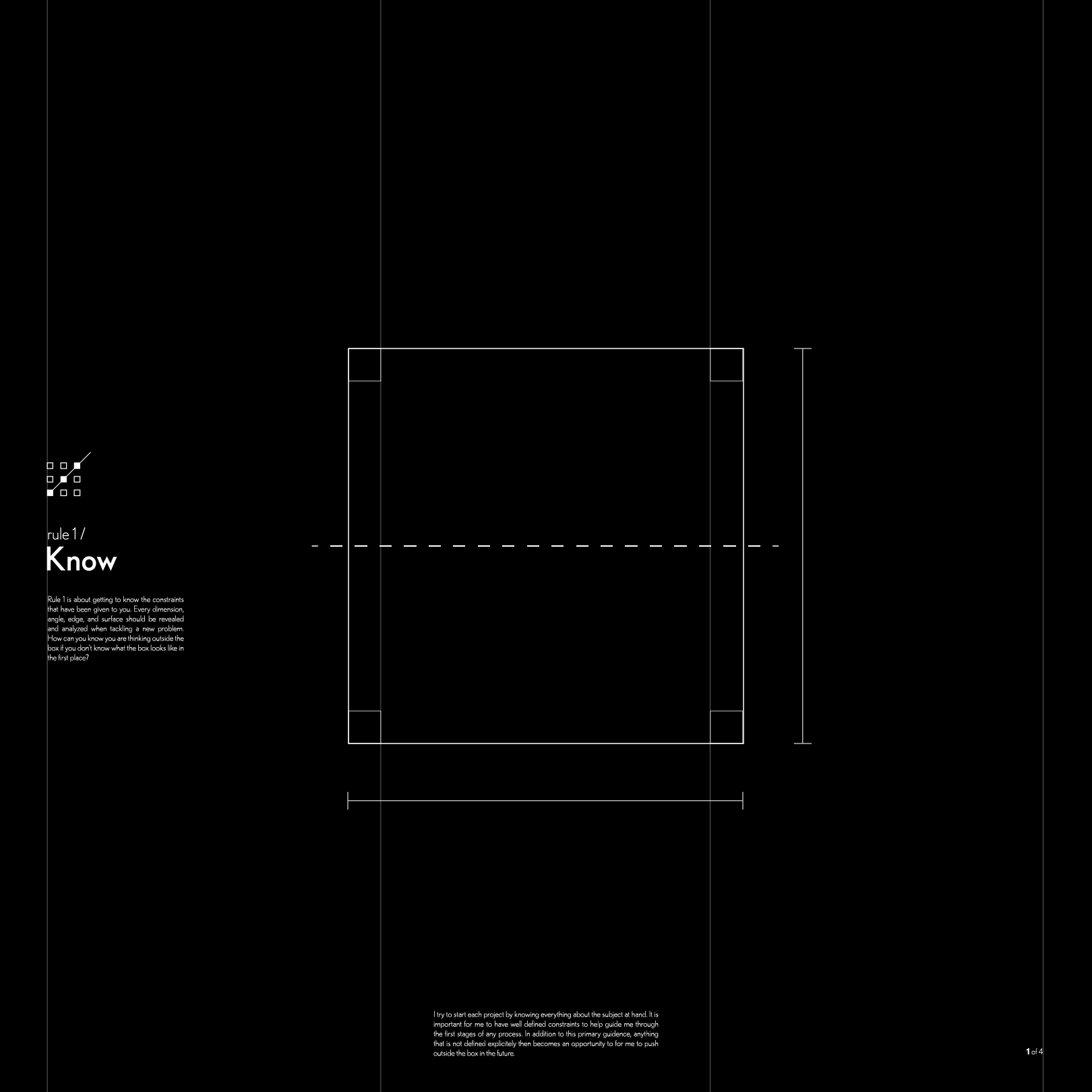
I try to start each project by knowing everything about the subject at hand. It is important for me to have well defined constraints to help guide me through the first stages of any process. In addition to this primary guidance, anything that is not defined explicitly then becomes an opportunity for me to push outside the box in the future.
"
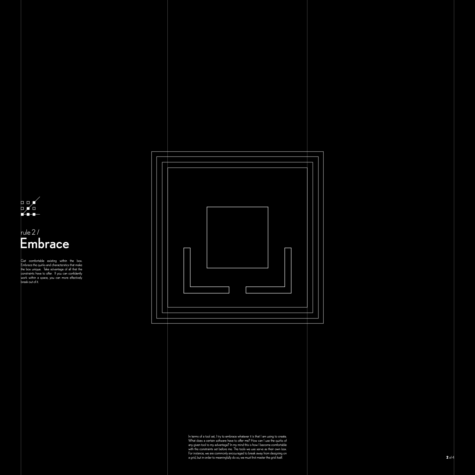
In terms of a tool set, I try to embrace whatever it is that I am using to create with. What does a certain software have to offer me? How can I use the quirks of any given tool to my advantage? In my mind, this is how I become comfortable with the constraints set before me. The tools we use serve as their own box. For instance, we are commonly encouraged to break away from designing on a grid, but in order to meaningfully do so, we must first master the grid itself.
"
It is at this point that the walls of the box start to collapse. A good piece of advice that I have received from many mentors along the way is that once you are comfortable with the design you are making, it's now a good time to throw thorns into it, twist it, and warp it. Doing this will expose the weakness in the construct of the box and allows me to focus the pressure necessary to break outside. It is this step that allows me to create truly unique solutions.
"
I sometimes feel it is impossible to get started or that the box is so big that I could never breach its borders. It's important to remember that every problem can be broken down into a series of smaller boxes. Each time I break away from one box, I can move on to the next slightly larger box. Every instance this occurs represents my growth as a designer and an individual.
Process
This project was done as a solo thesis project over the course of the 2022-2023 school year at the Rochester Institute of Technology. Though the artistic direction and visual design was my own, I couldn't have done it without some of my friends and colleagues who helped construct the set and create an amazing soundscape.
Creating the Experience
Giving Myself a Box
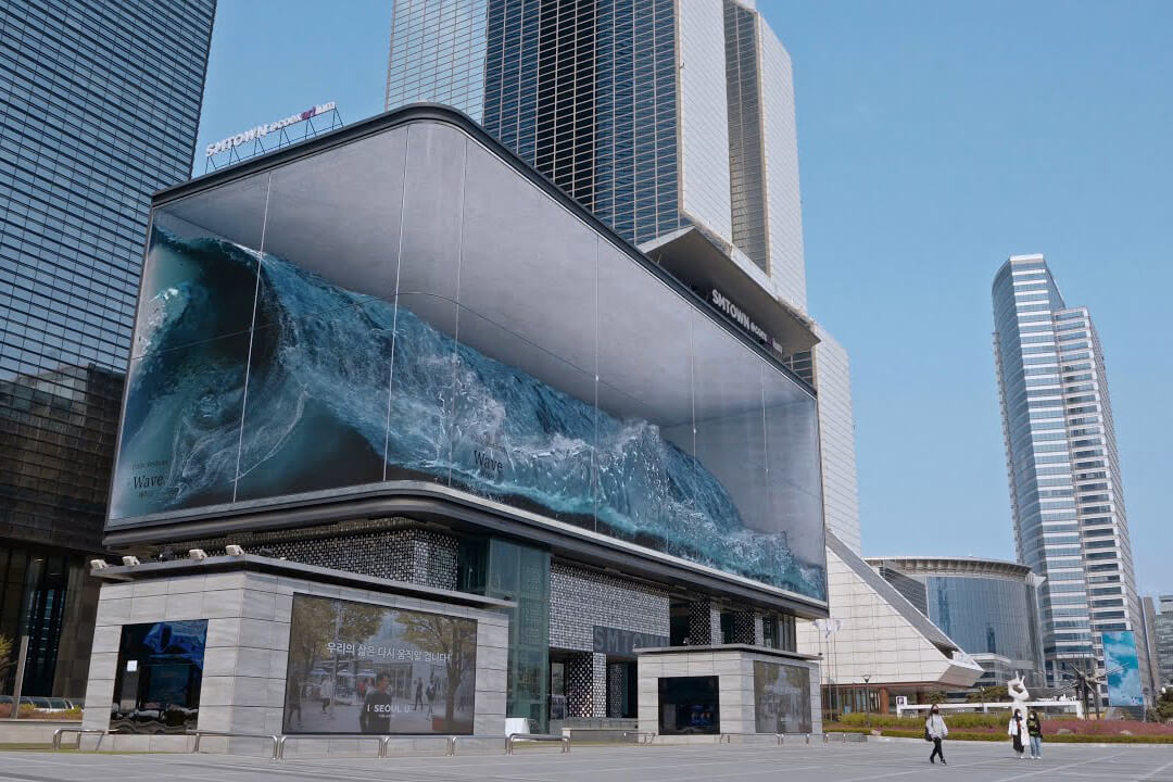
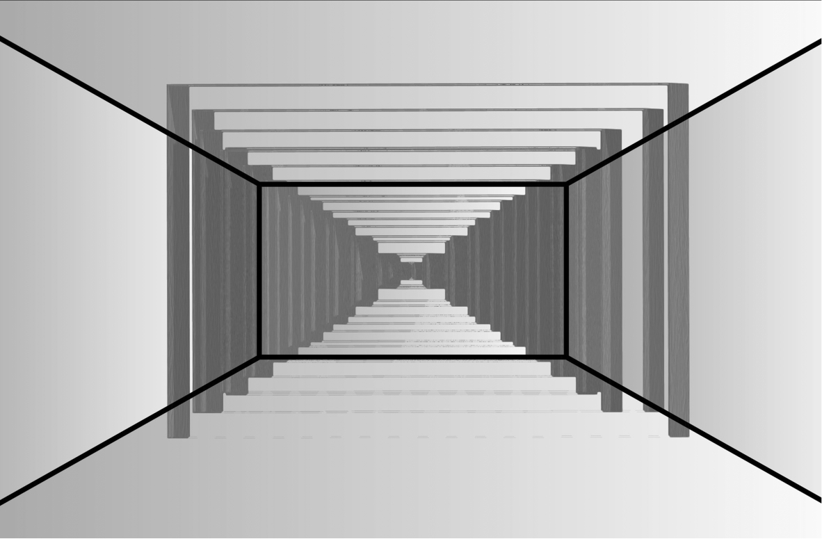
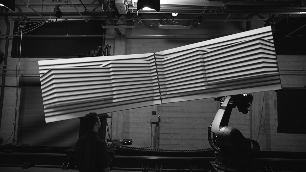
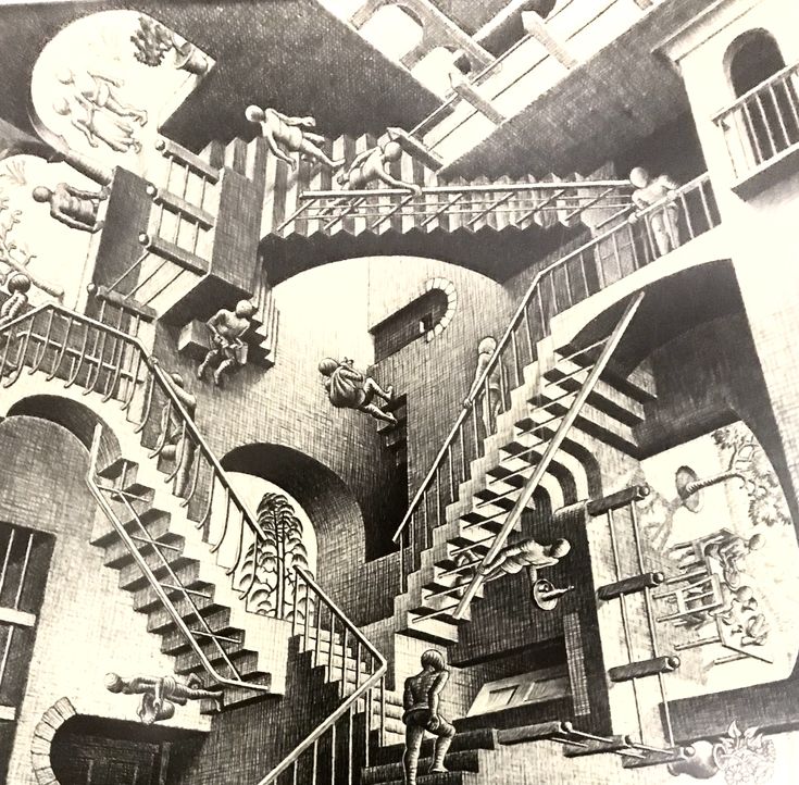
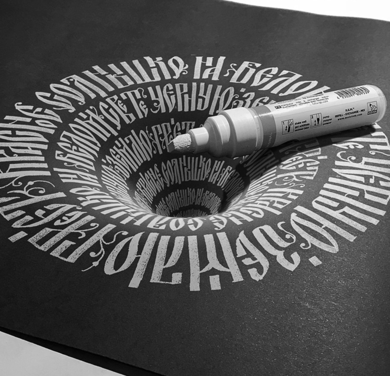
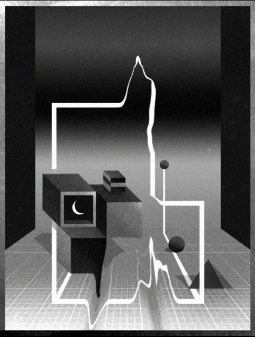
To convey the ideas of thinking outside the box, I knew I needed to break the current conventions of 2D screens in some way. I was drawn to the idea of optical illusions due to the way they bend people's visual perceptions. For the same reason anamorphic drawings and the idea of forced perspective called to me because of the mixing of the 2D and 3D planes.
In order to convey the ideas of thinking outside the box I knew I needed to break the current conventions of 2D screens in some way. I was drawn to the idea of optical illusions due to the way they bend people's visual perceptions. For the same reason anamorphic drawings and the idea of forced perspective called to me due to the mixing of the 2D and 3D planes.
Understanding the Box
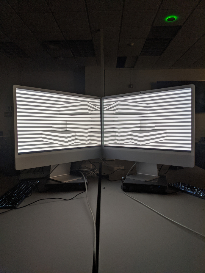
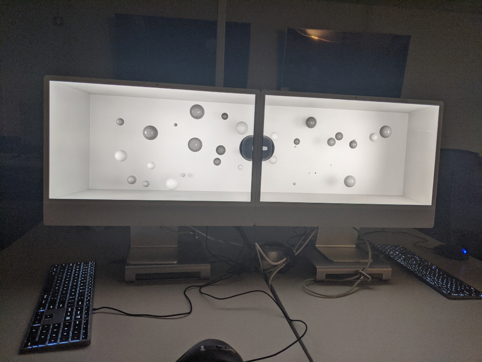
As this was my first foray into anamorphisms and forced perspective, I needed to understand everything about how they worked. I needed to know not only know how to make them but also how rigidly I needed to follow their rules. I started through the process of recreation, trying to emulate visuals I've seen before. Not only to figure out how they were made but the flexibility of the effects they created. My focus was on finding how to warp the perspective properly and seeing how to best sell the illusion.
Visual Style
The visual style was inspired to be greyscale by the many optical illusions I came across in my research. The anamorphisms I encountered seemed to be much more effective and flexible when in black and white. The contrast from light to dark is what creates the depth in an image and the best way to show light and dark happens to be in black and white.
In this example the black and white images seem to have much more depth to them and more effectively pop out of the screen.
Here, the color clouds the illusion, despite being a similar set up. Also of note is that this version is part of the ideation where I considered making this experience interactable, but seeing the nature of the visuals I created, I felt it would be better for the storytelling and more powerful not to.
Anamorphism/Forced Perspective
Anamorphism/Forced Perspective
The effect achieved in this piece was done by carefully warping images to counteract the perspective warping that would normally occur when we view something at an angle.
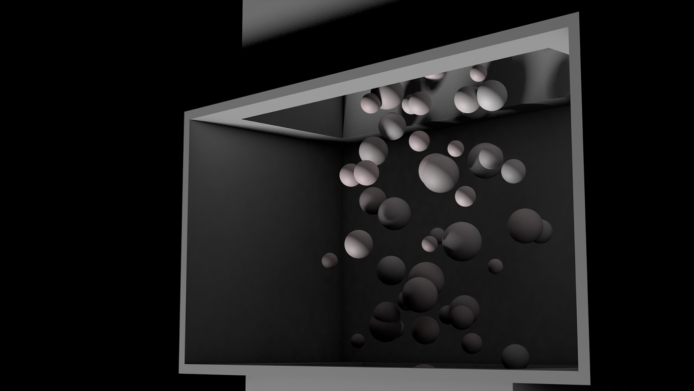
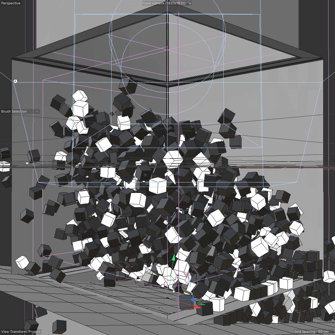
1: A normal 3D render taken out of Cinema
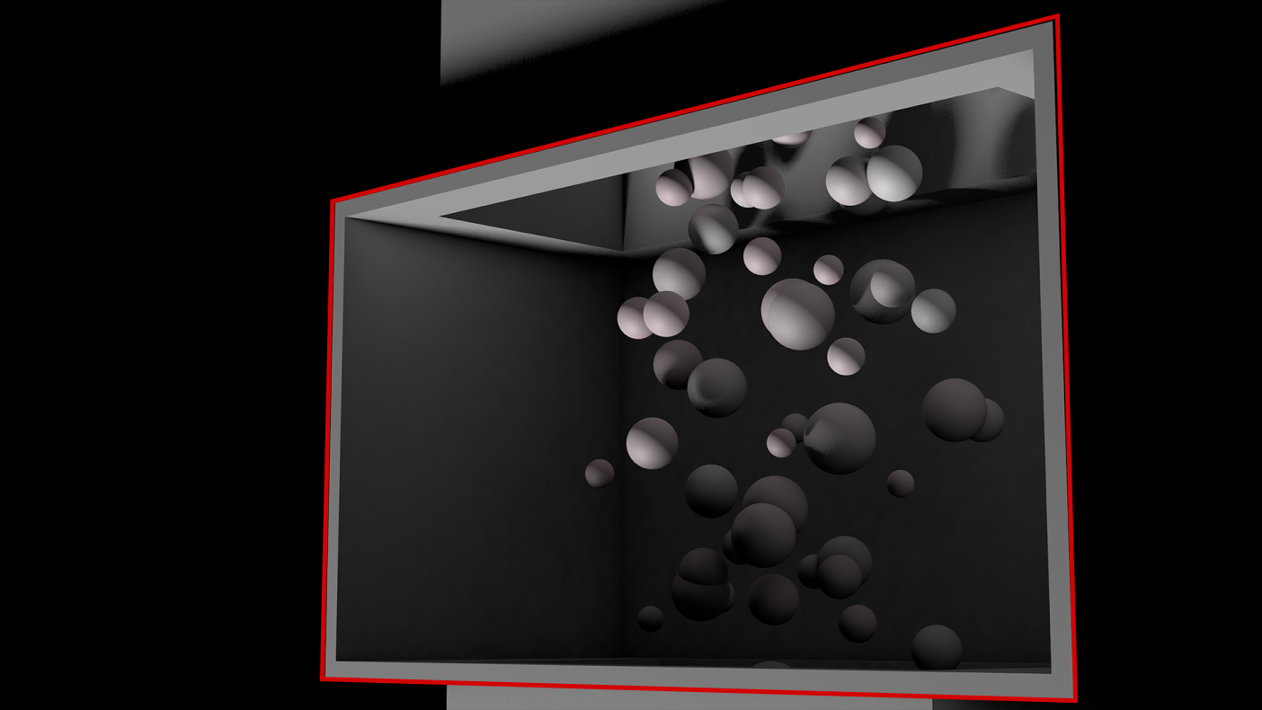
2: Masking out what you want to display on your screen.
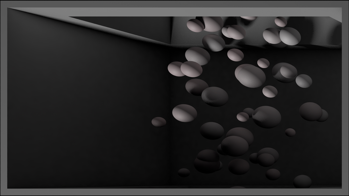
3: Warp it to be the same dimensions as the screen you'll be displaying it on.
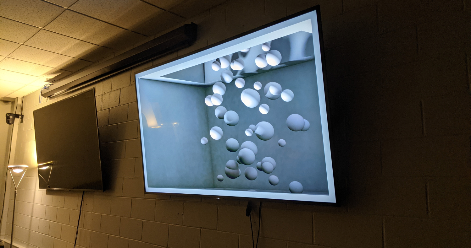
Result: an image that, if viewed at the same angle as the virtual camera, appears to have real depth to it.
Planning the Box
Using the nine dot problem as a conceptual guide, it felt like an obvious choice to make the stage a three dimensional box. In the initial concept, my plan was to construct a cube placed at 45° with the front two faces removed. I would project on the inside of the cube utilizing the top, bottom, left, and right faces to create the anamorphic effects.
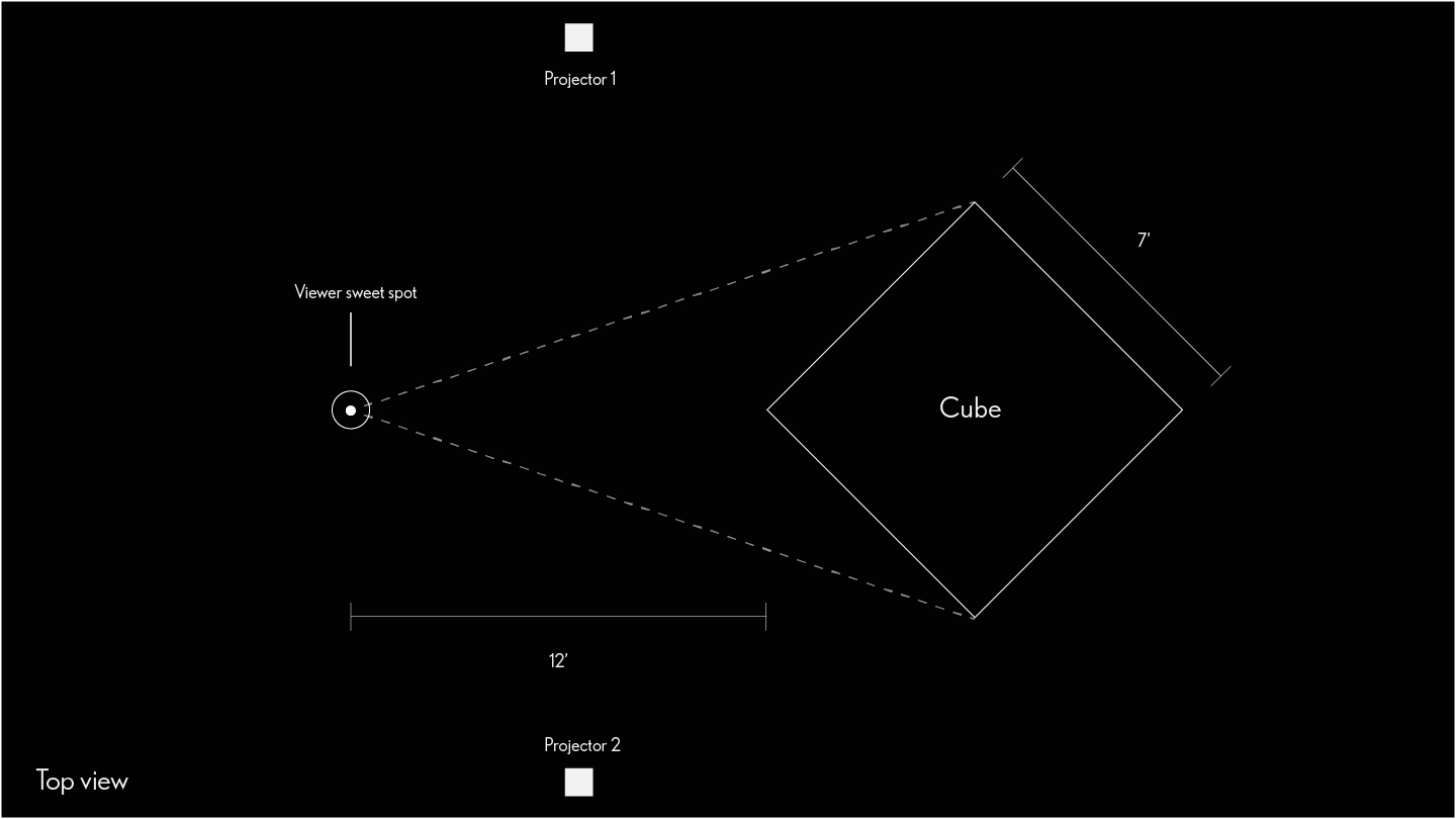
The viewer would stand in the center of the room about 12ft back from a 7ft cube that has been rotated on a 45° angle. Initially the front two faces of the cube would be removed and the projections would be cast on the inside of the cube.
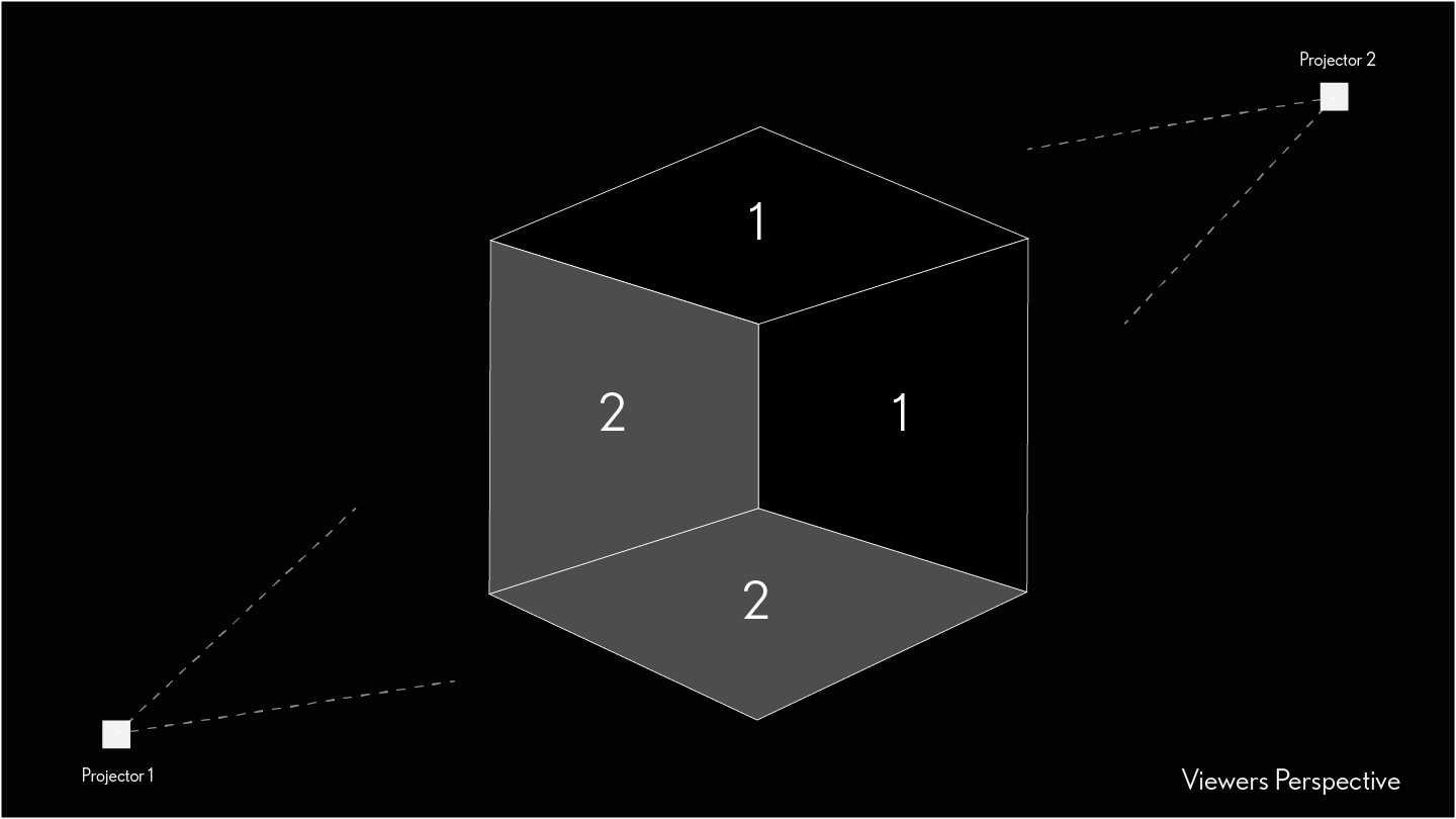
I had access to only two projectors. Because I needed to fill the whole cube my plan to minimize warping was to have one projector on the floor casting onto the top and right panels, and have the second projector mounted to the ceiling casting on the floor and left panels.
Testing
Testing
To test the setup, I built a smaller version of the cube out of posterboard and tested some of the simple visuals I had already started to develop.
To test the setup I built a smaller version of the cube out of posterboard and tested some of the simple visuals I had already started to develope
Inverting the Box
Despite the encouraging results I knew a few things had to change. One of my goals was to create visuals that were still intriguing even when not at the primary viewing location. One problem the four-panel set up caused was that the top and bottom got so warped that it was hard to see what was happening unless you were at the exact right angle. This, along with the fact that I could never seem to find the right projector position caused me to rethink my set up.
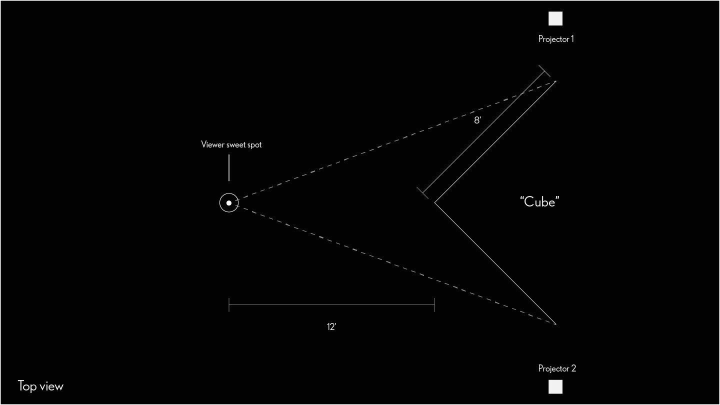
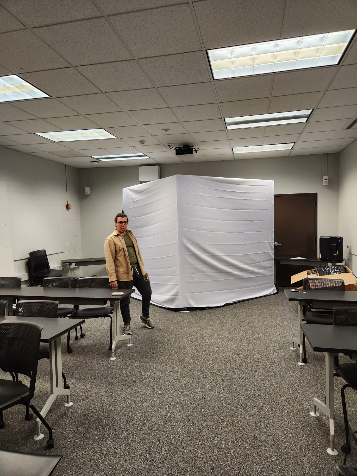
I inverted my old concept. Instead of projecting into the box, I would project on-to the outer two panels. I also increased the width of each panel to 8ft by 8ft. This gave me a number of advantages: It only required me to build two front facing panels as the rest would be concealed from view. This would also allow me to take up a larger portion of the audience's field of view.
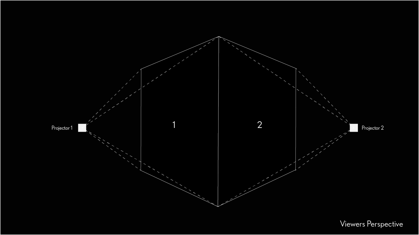
I also traded the projectors I was using for ultra short throws, not usually ideal for projection mapping but since I didn't have to worry about any shadows it worked. This allowed audience members to be able to wander the room, as well as approach the cube without disrupting the experience with their own shadow, creating a more immersive environment.
I also traded the projectors I was using for ultra short throws, not usually ideal for projection mapping but since I didnt have to worry about any shadows it worked. This allowed audience members to be able to wander the room, as well as approach the cube without disrupting the experience with their own shadow, creating a more immersive environement.
Building the Box
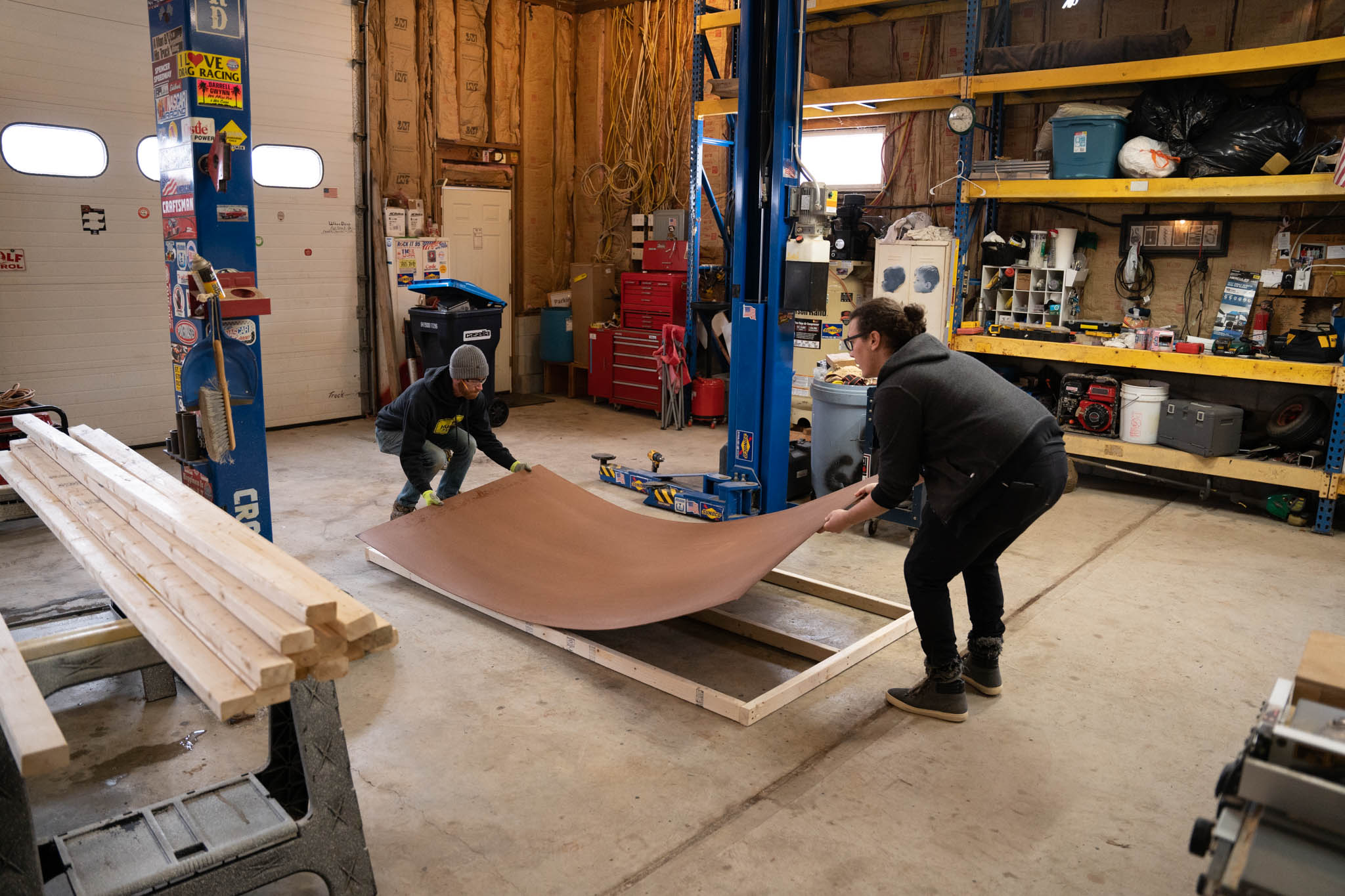
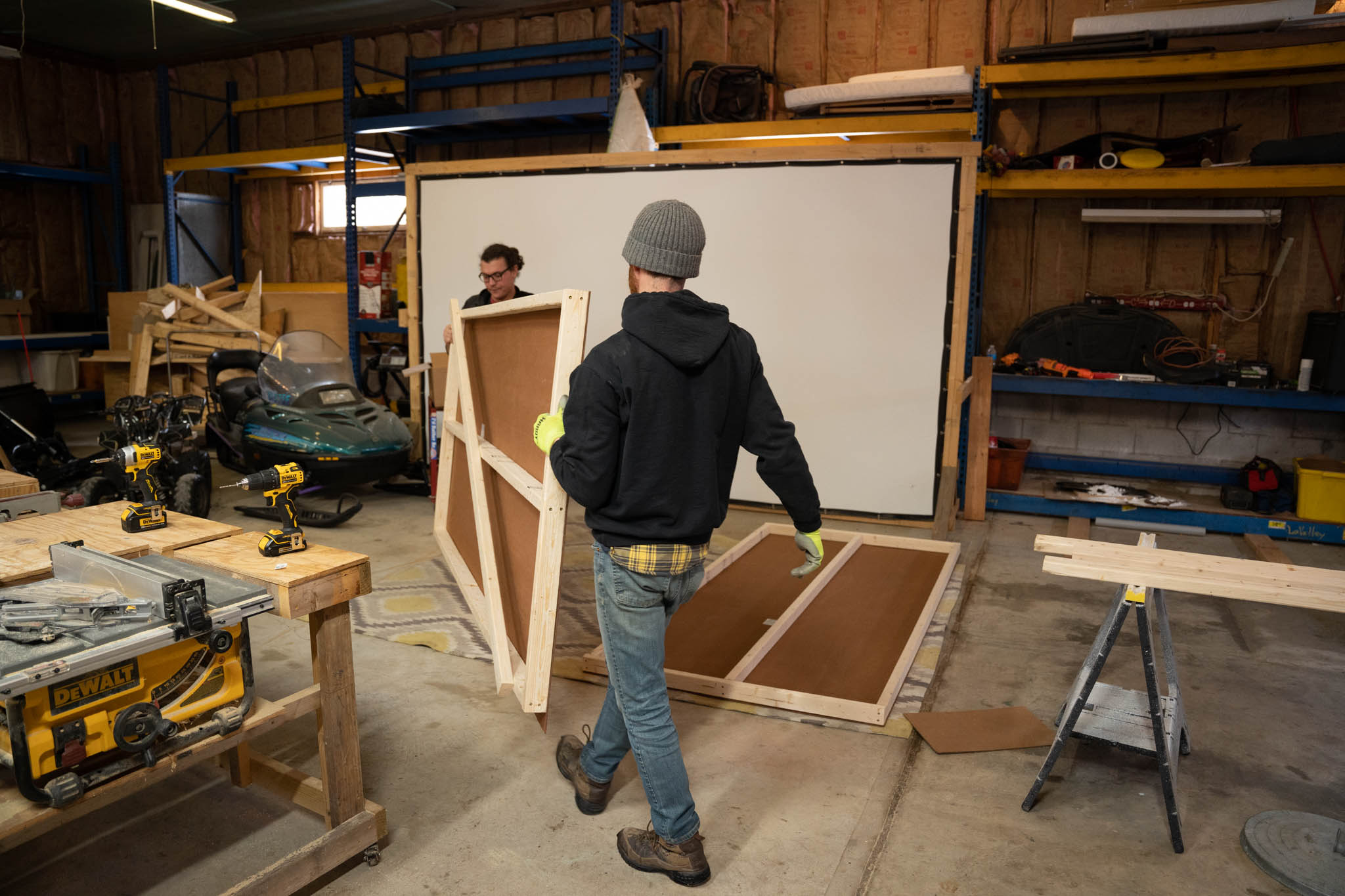
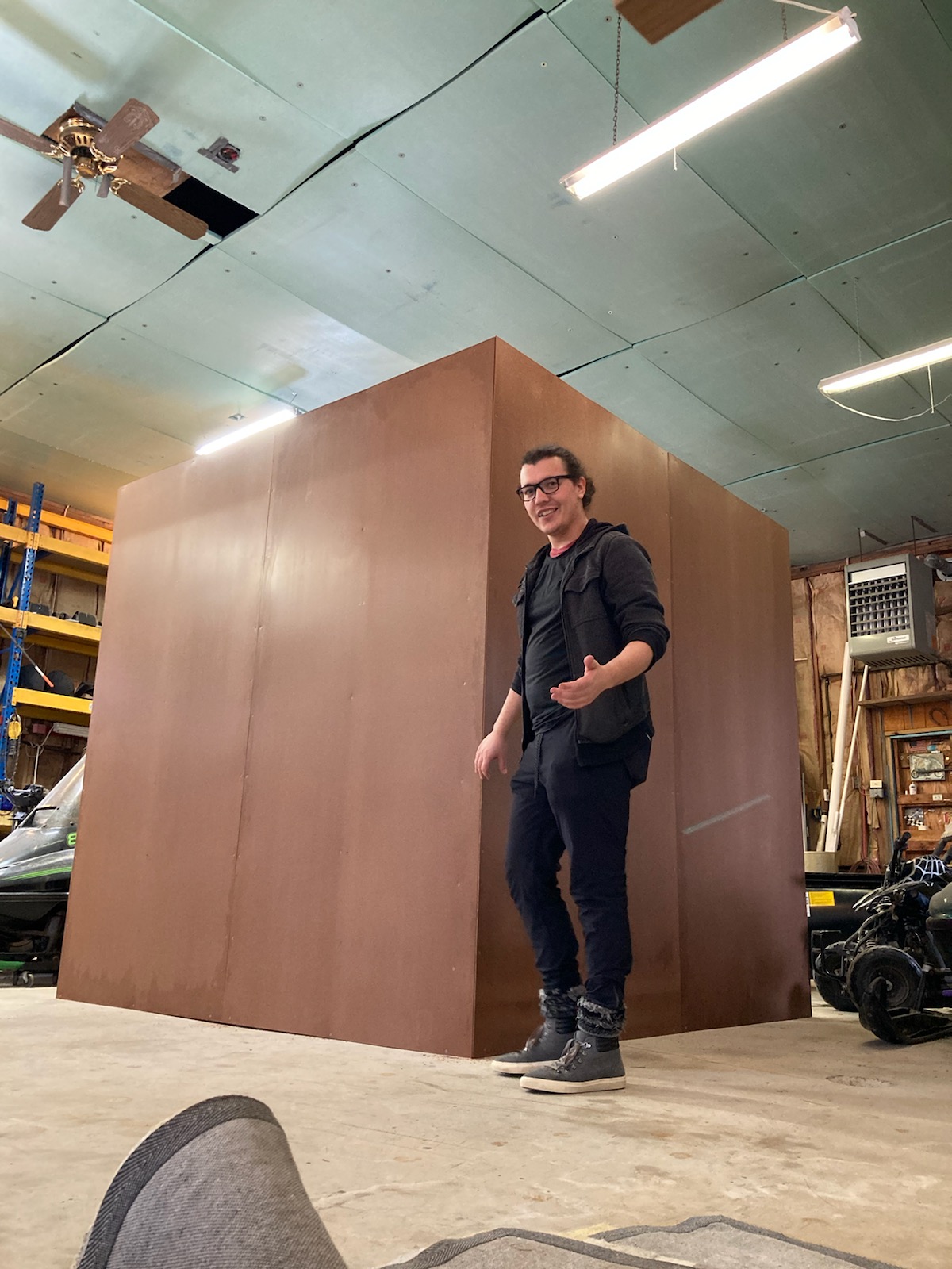
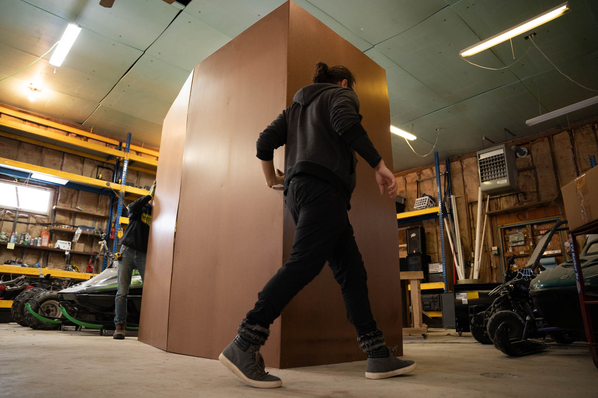
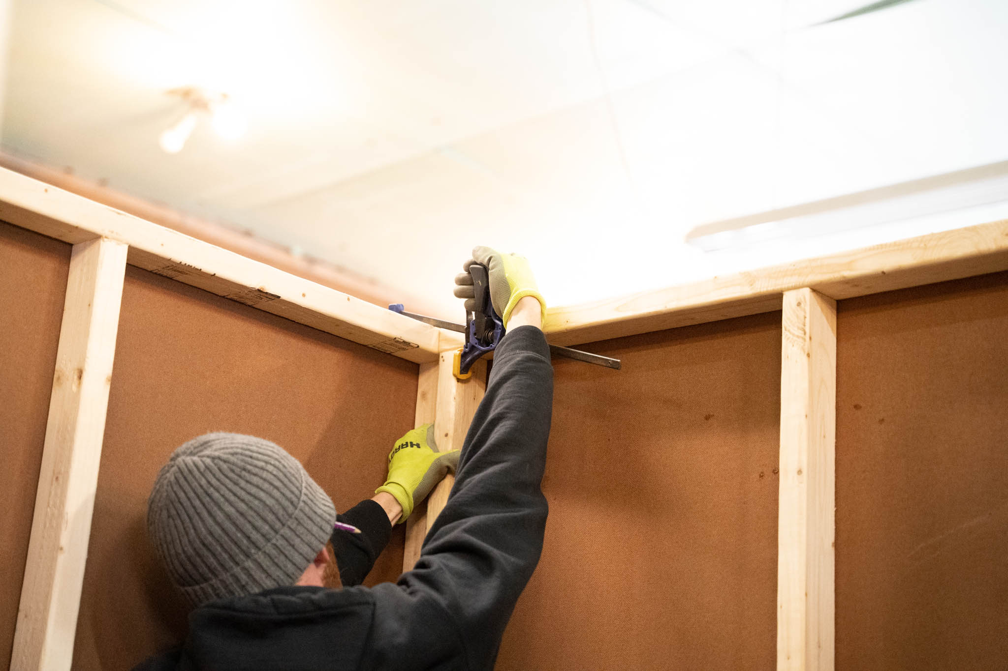
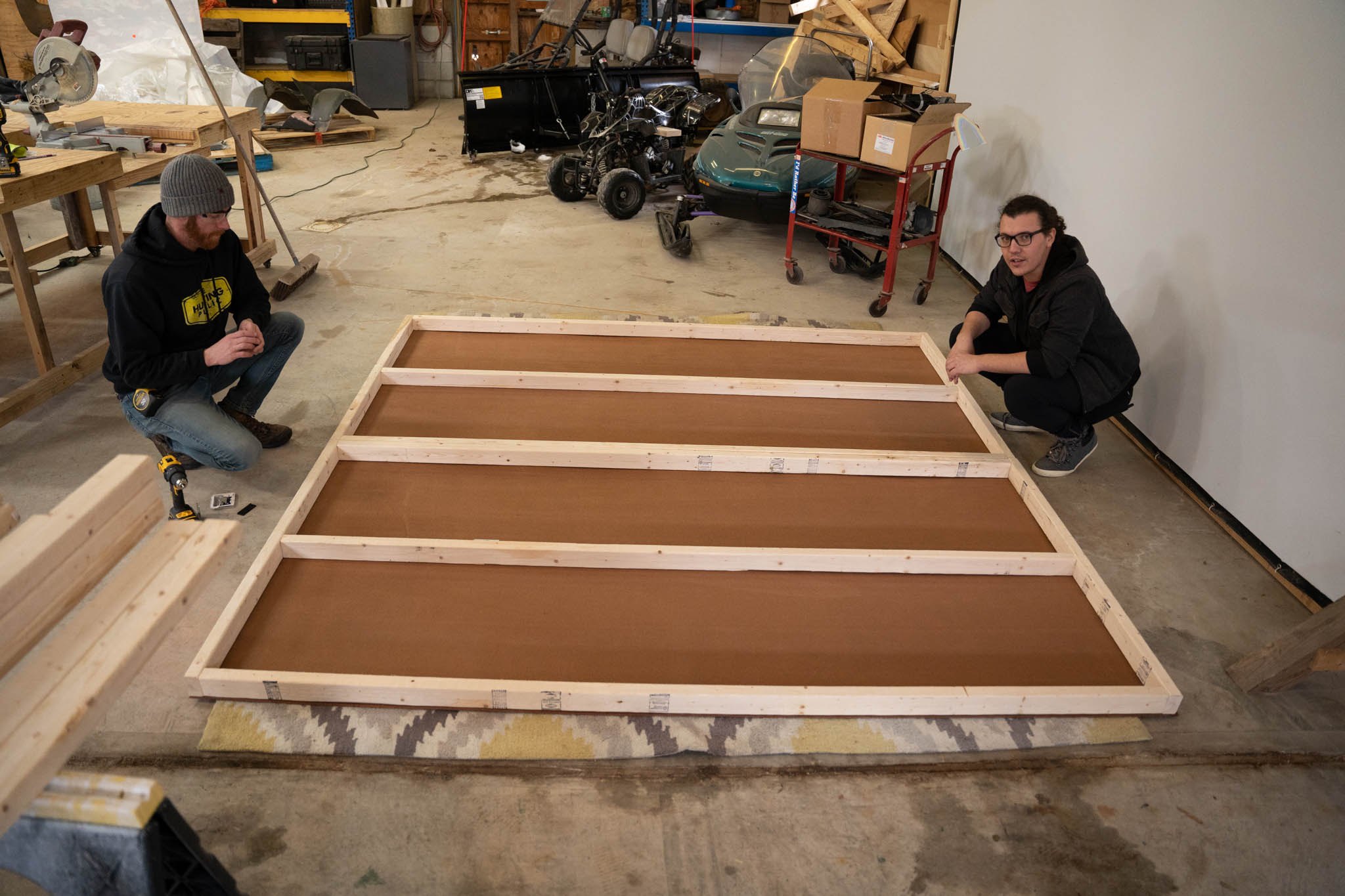
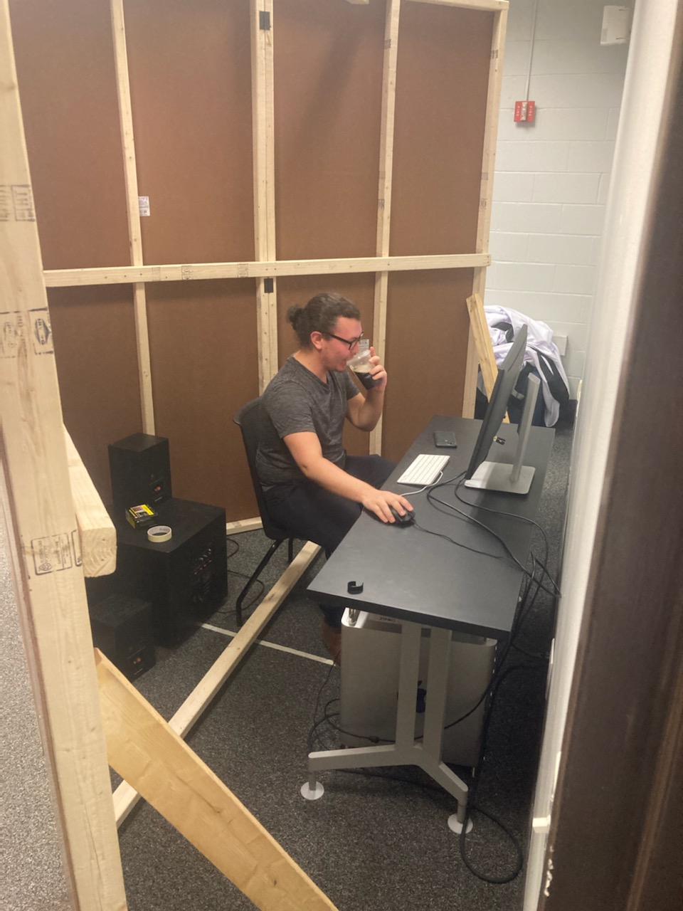
An 8ft by 8ft cube doesn't just fit through any door, and the room this would be set up in does not have a work shop. The panels were designed to be detachable and fold into 4ft by 8ft, boards. That gave me enough leeway to set up the installation where ever I needed to. For this, I grabbed a buddy who knew what a fair bit more than me about making a square frame.
Visualizing the Abstract
Visualizing the Abstract
First attempts
Anamorphism/Forced Perspective
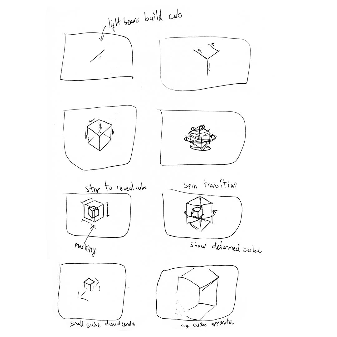
Excited to start, my first attempt at creating visuals was to blindly story board. I had no plan and it wasn't long until I was stumped. Instead of taking blind stabs in the dark I first needed to step back and create a strategy for generating visuals that represented these abstract rules.
Charting a Course
Anamorphism/Forced Perspective
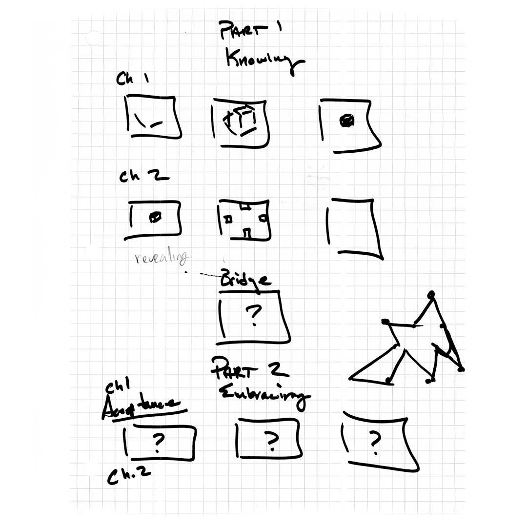
The break through for me occured when my professor drew a really bad sketch and said "Just make something." Through his guidance we came up with a strategy to chart out and define the over-arching story of the peice.
Finding the Pieces
Anamorphism/Forced Perspective
With the plan to break the story into multiple parts I used mind maps to begin creating more concrete visuals that could sum up to each rule.
Rule 1: Know
Anamorphism/Forced Perspective
Rule 2: Embrace
Anamorphism/Forced Perspective
Rule 3: Break
Anamorphism/Forced Perspective
Rule 4: Repeat (Rebuild)
Anamorphism/Forced Perspective
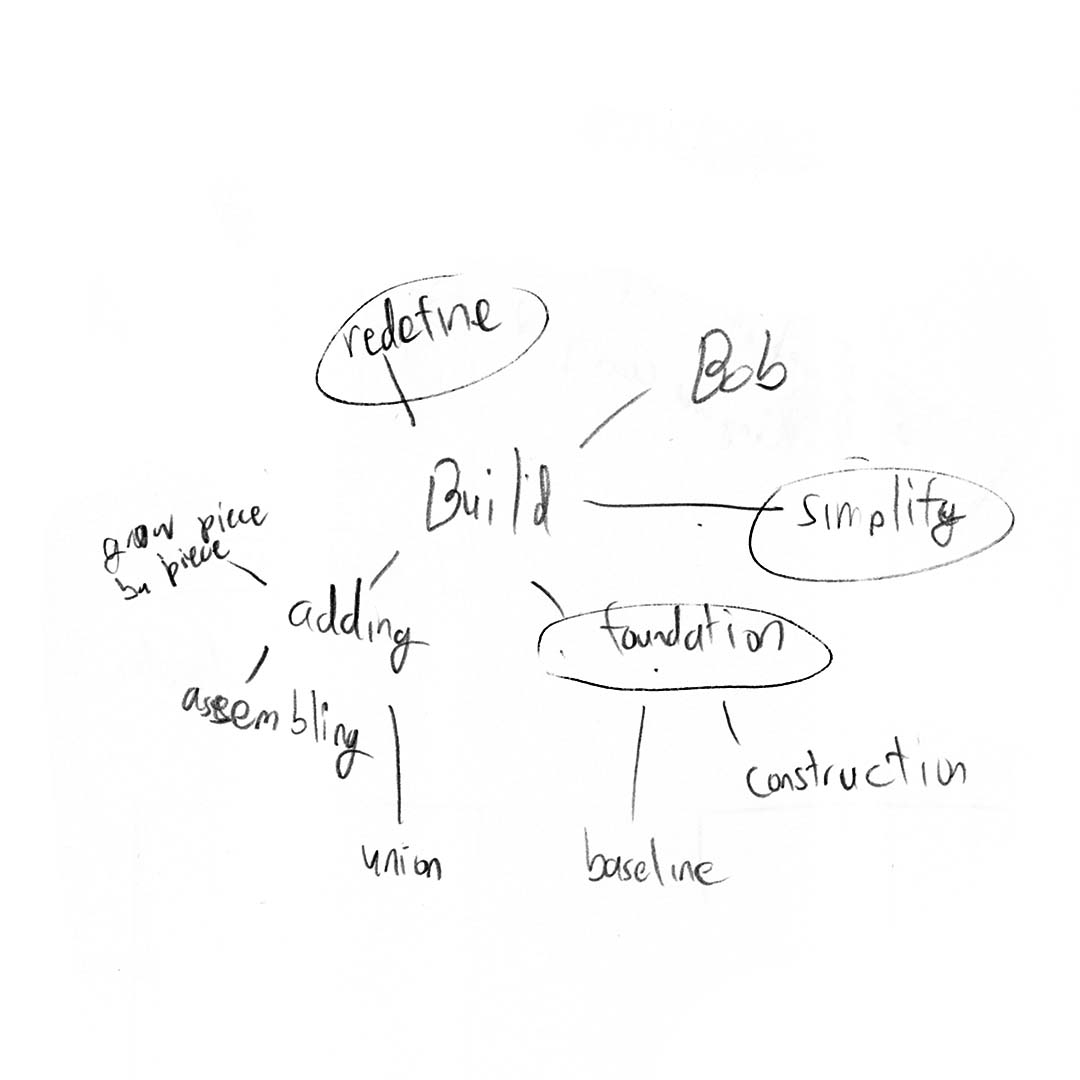
Initial Ideation
Anamorphism/Forced Perspective
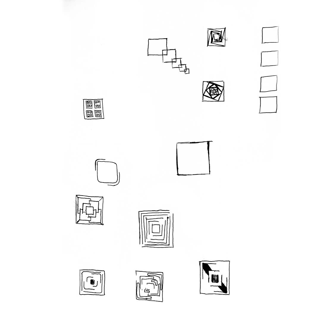
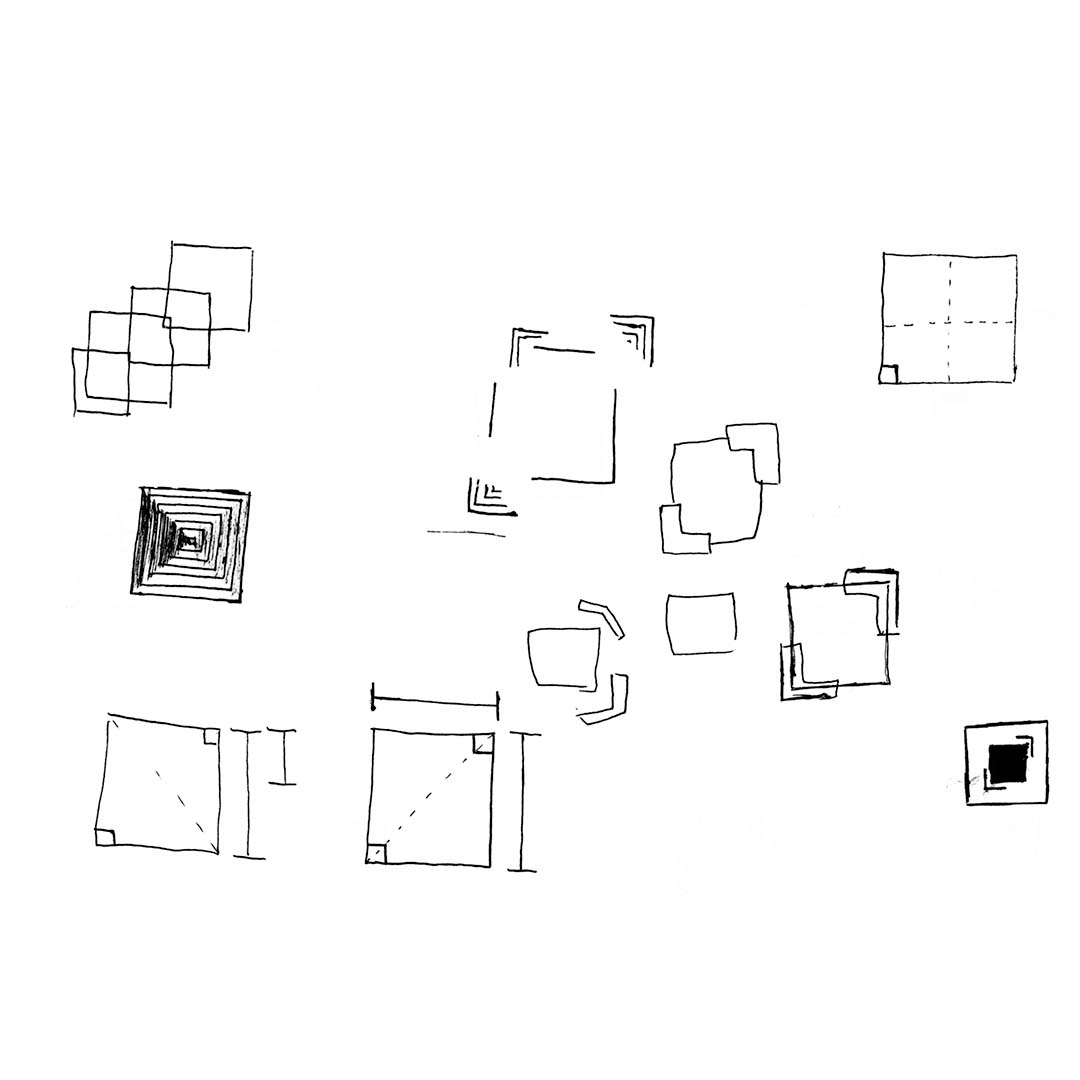
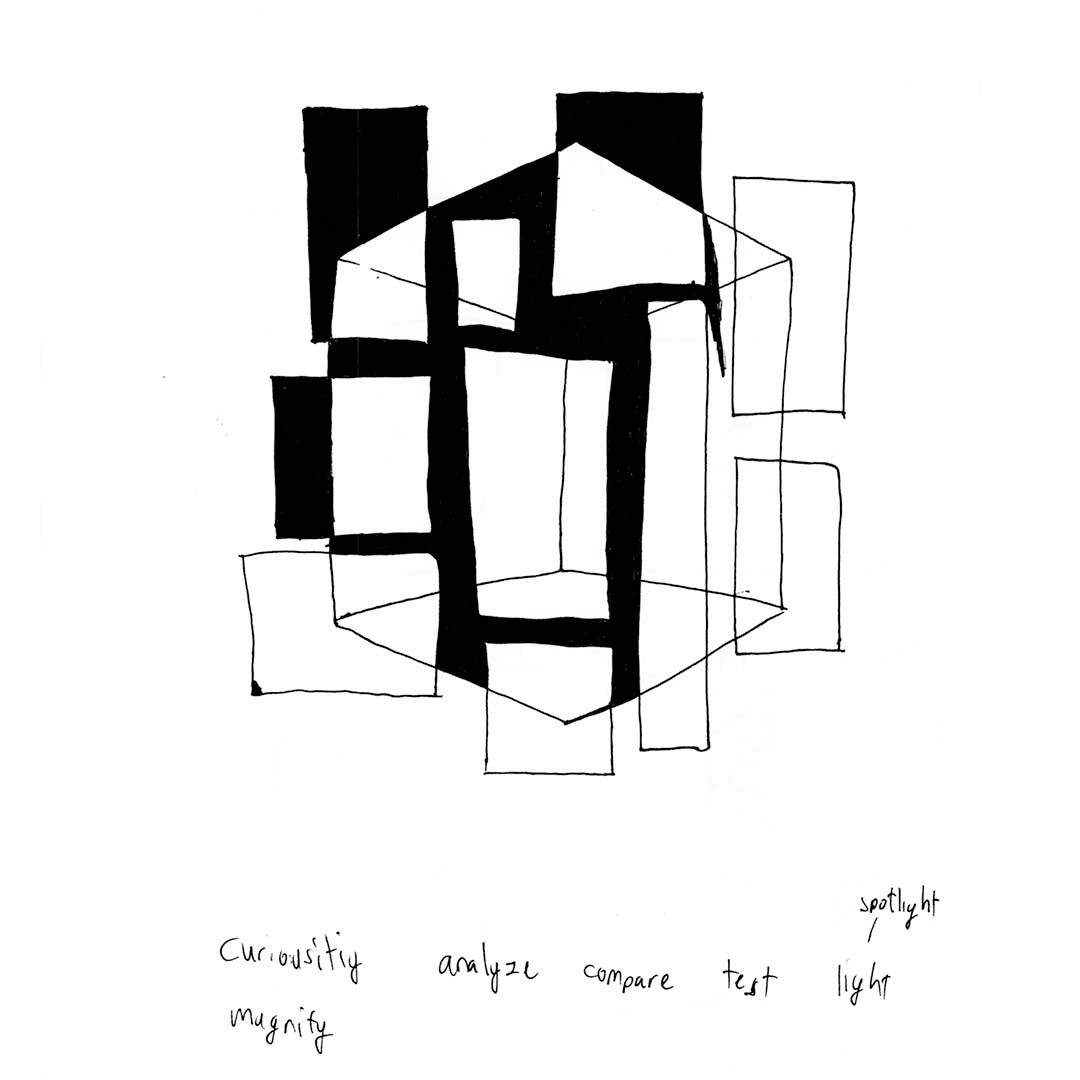
Many Many Renders
Visualizing the Abstract
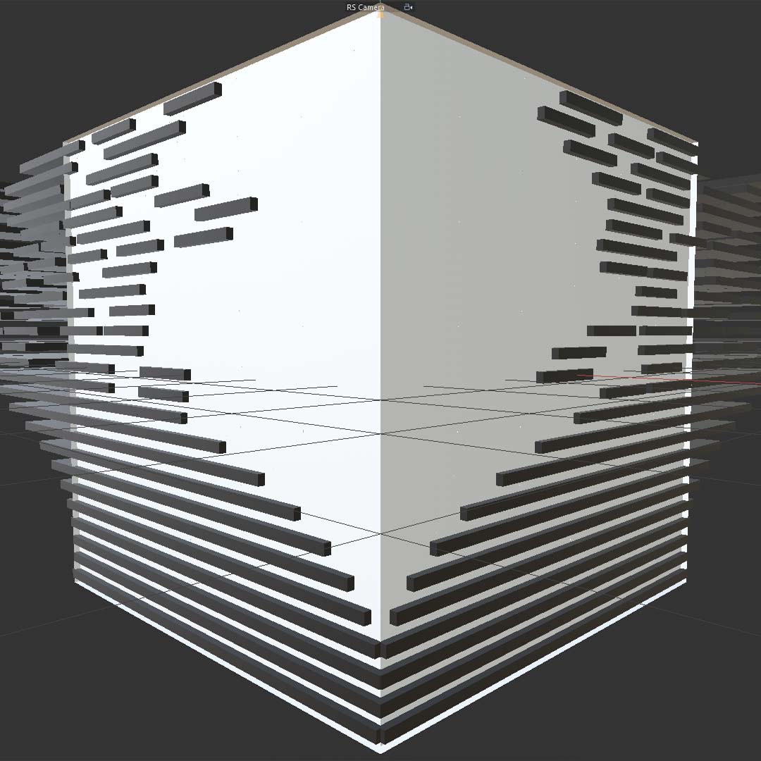
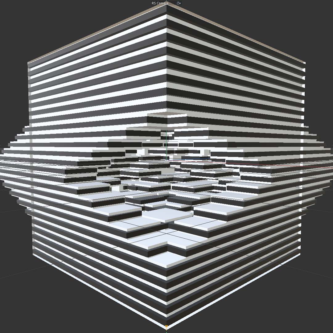
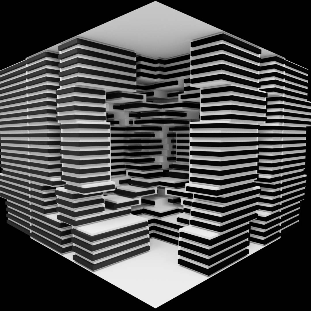
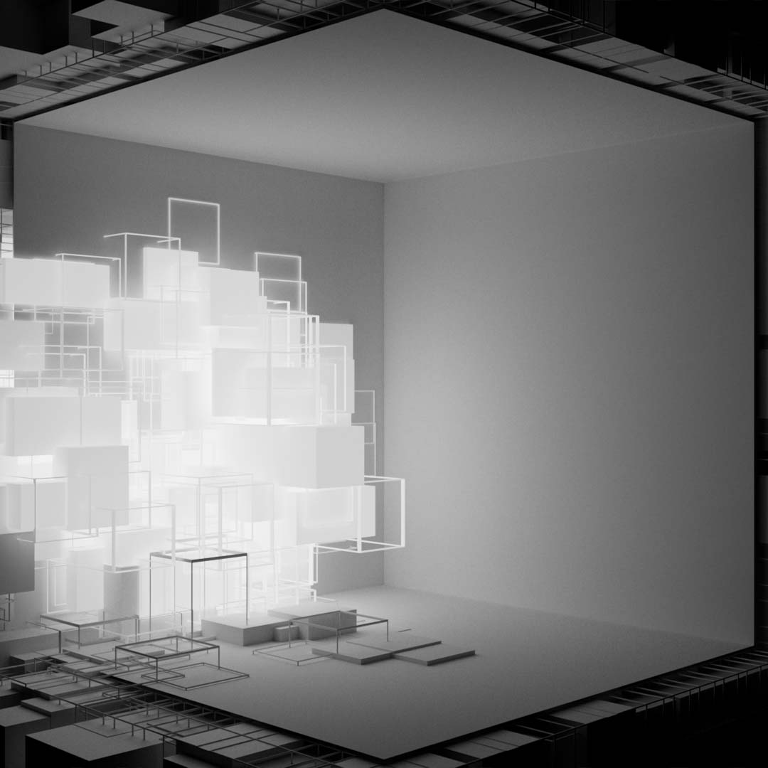
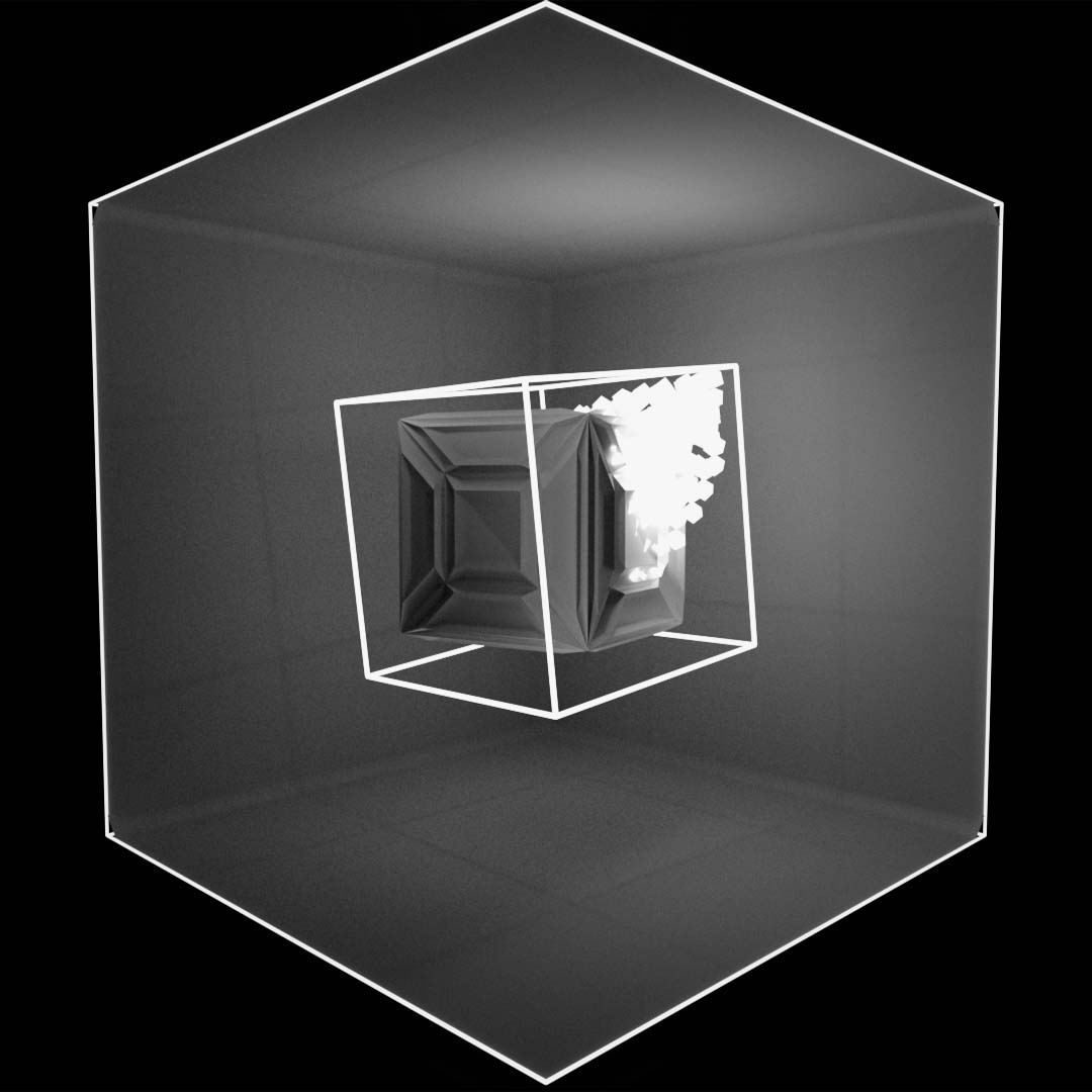
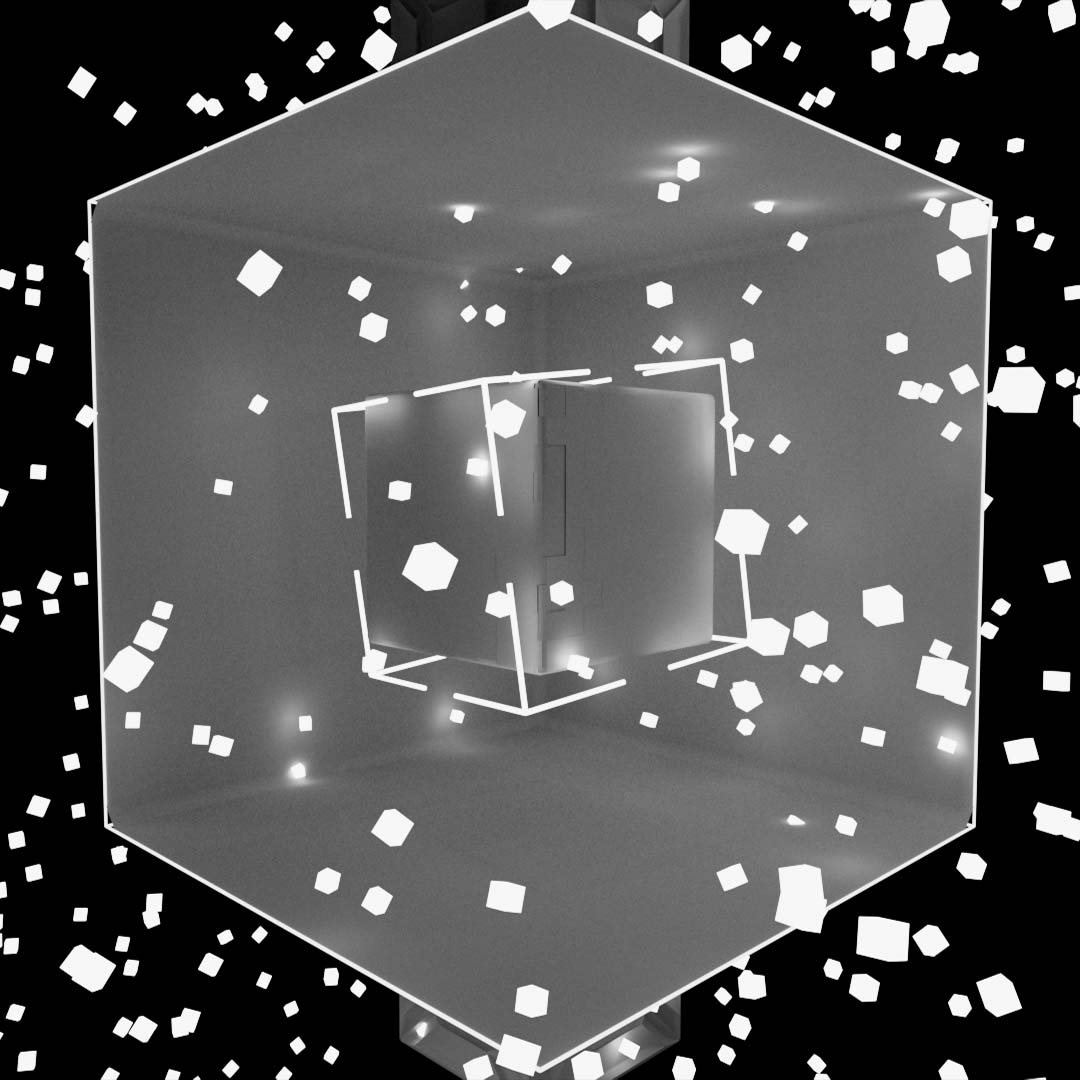
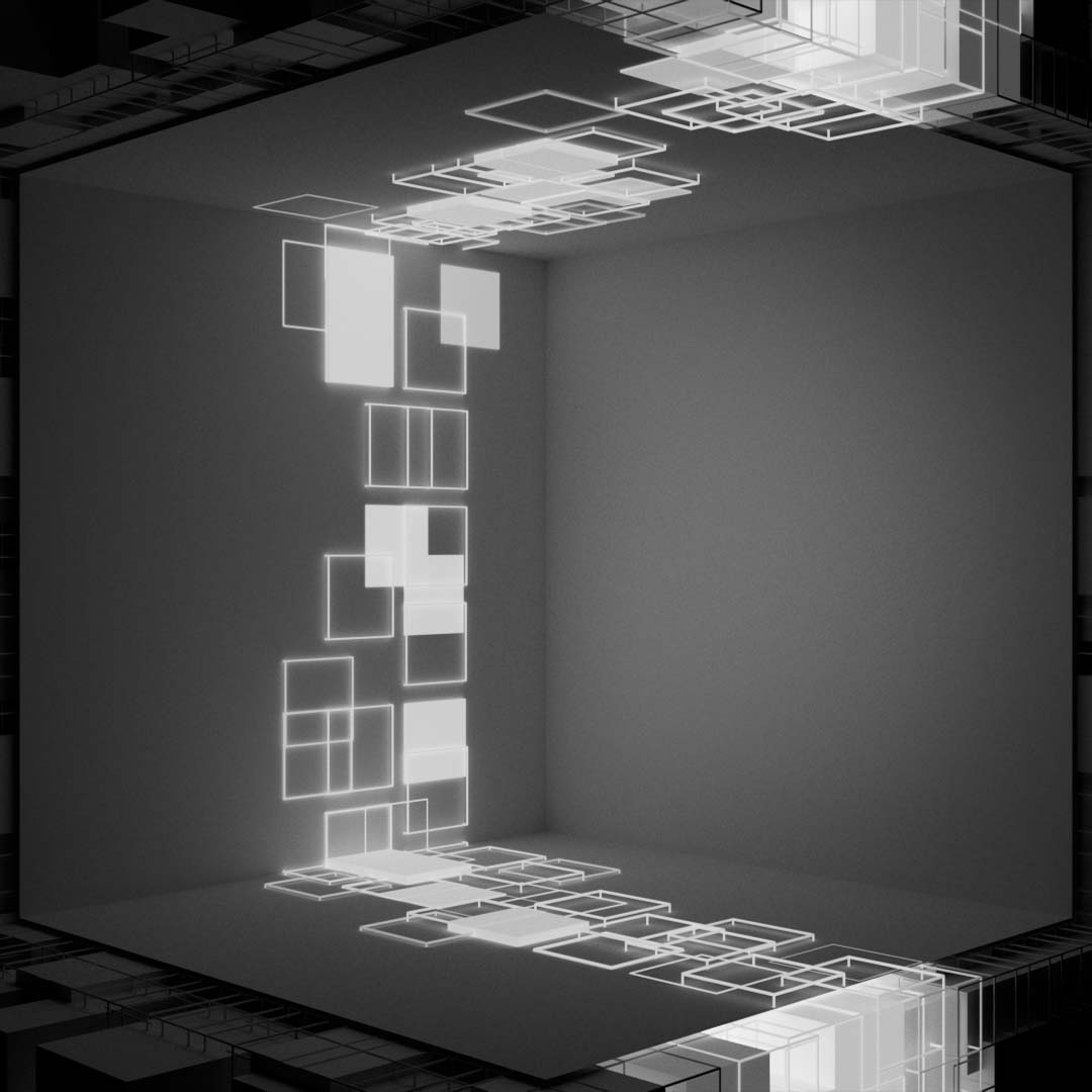
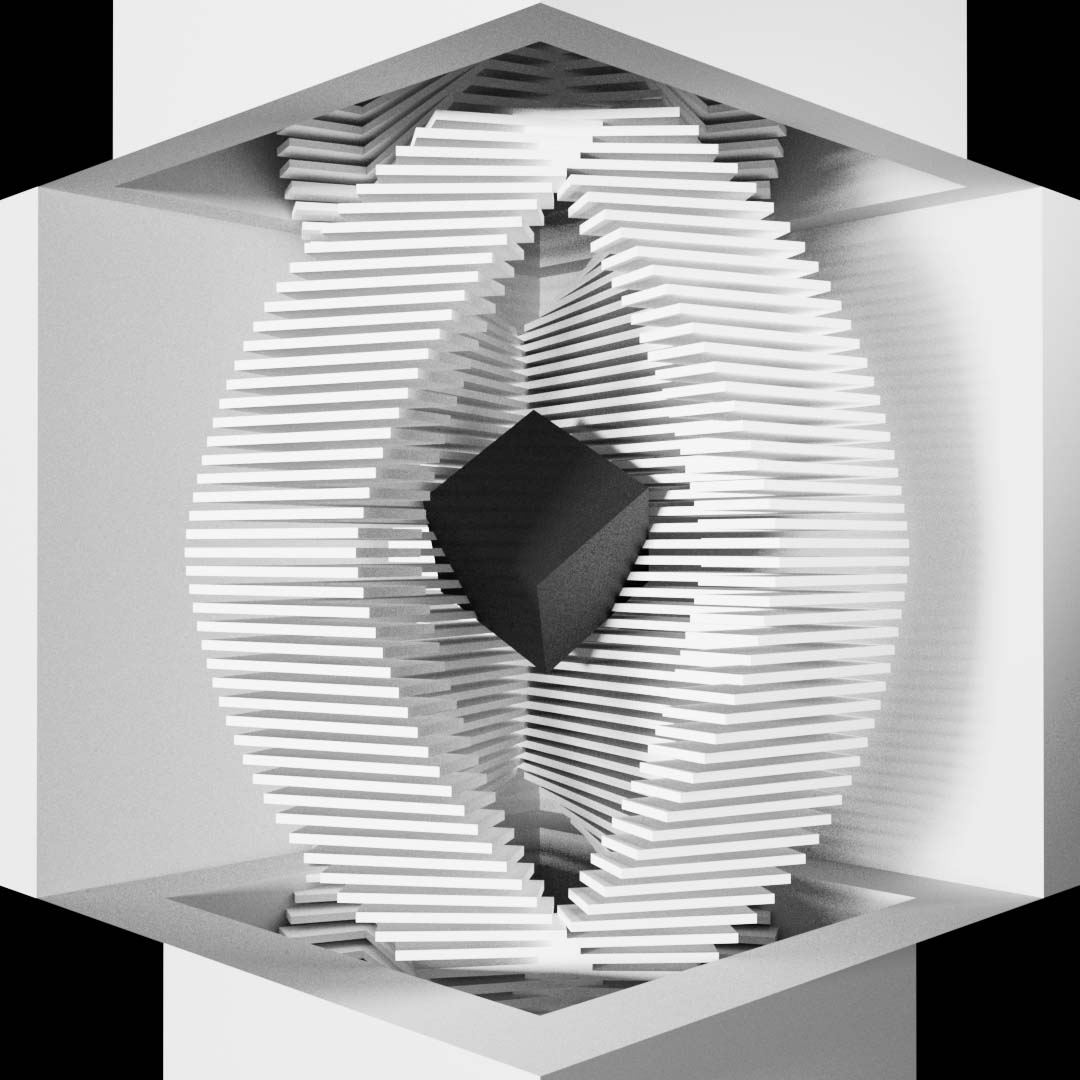
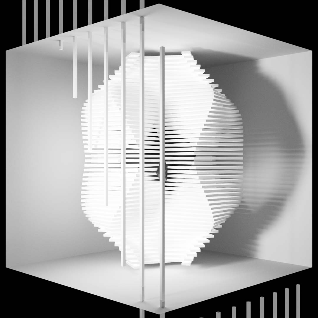
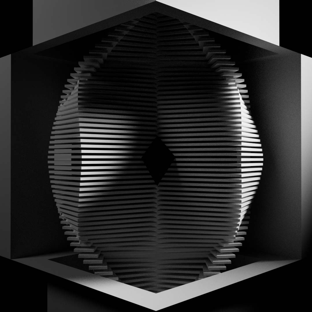
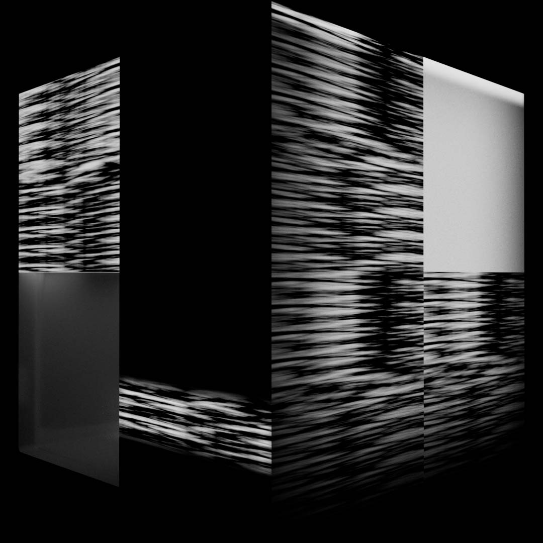
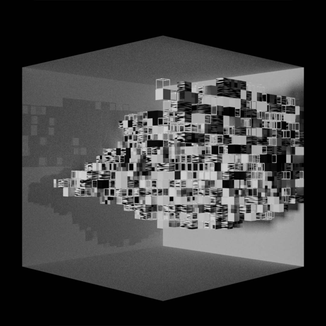
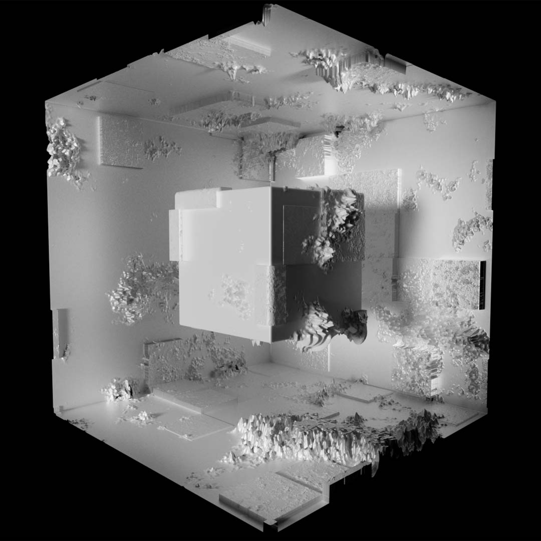
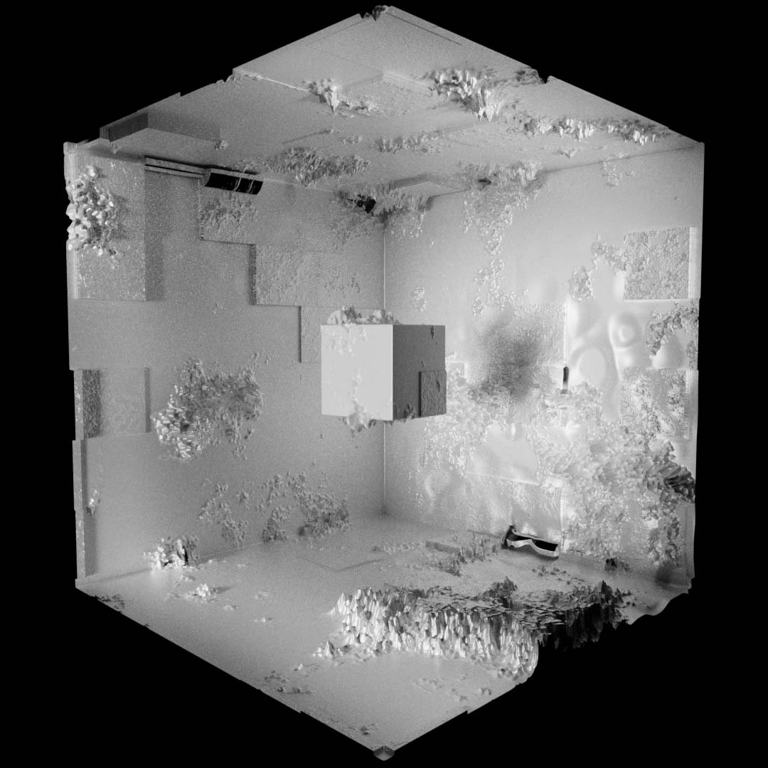
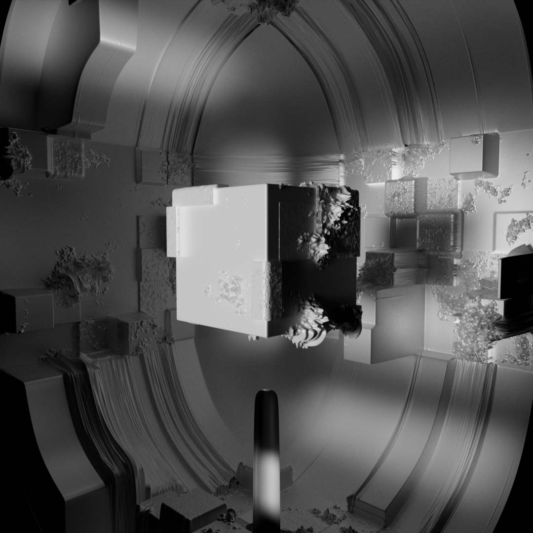
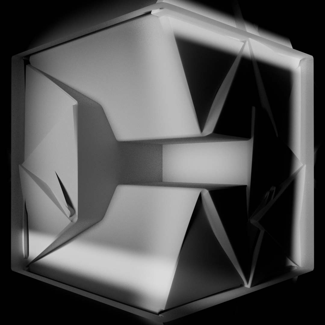
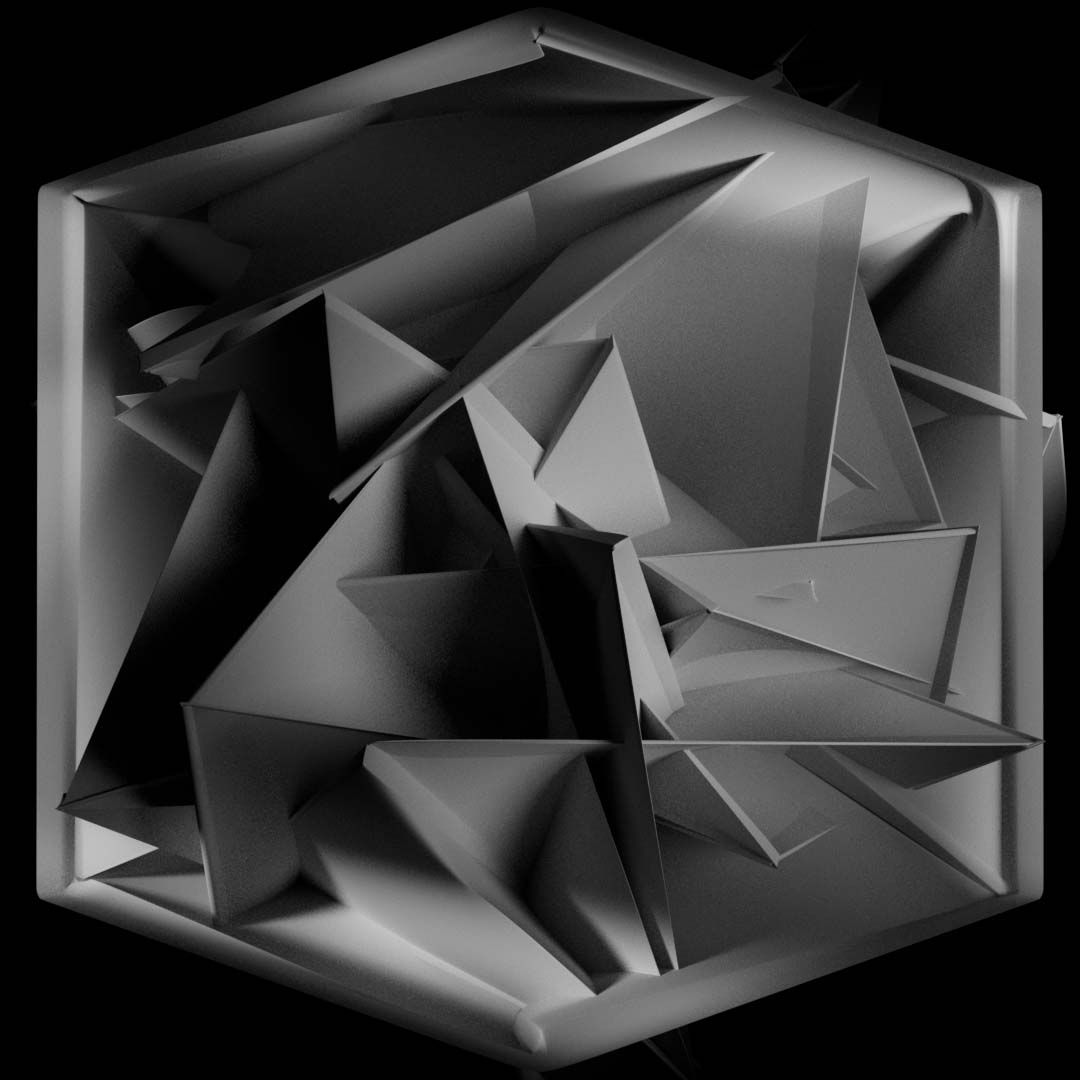
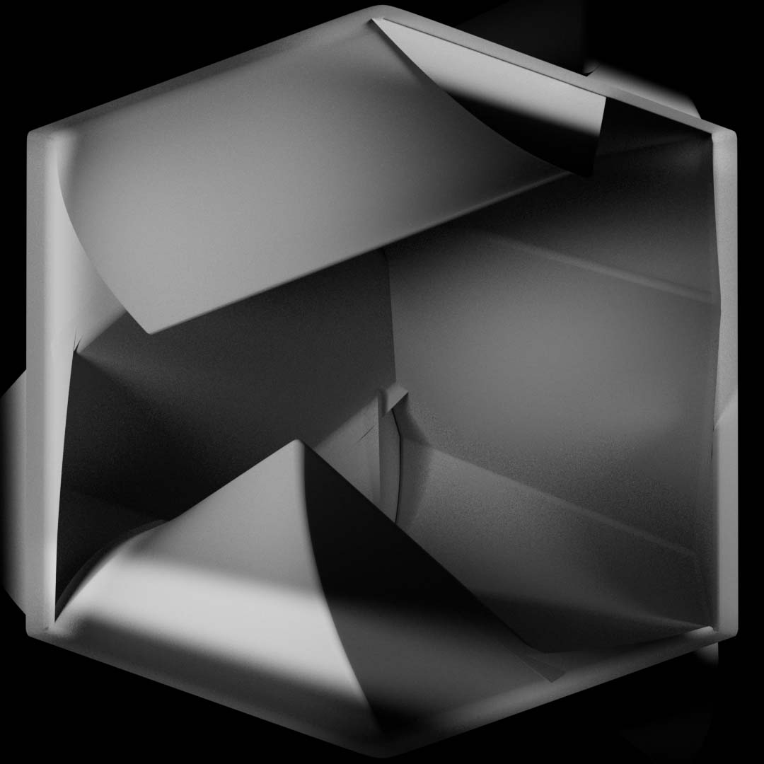
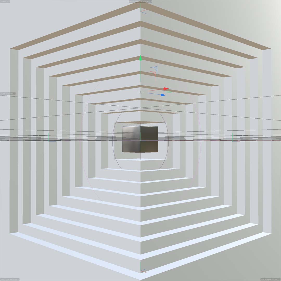
Many of the visuals came not necessarily from sketching ideas but from using the words I chose as a guide for experimentation within Cinema 4D. These are many of those experiments.
As I look up to the current great New-Media artists of today, This piece draws heavily from the ideas brought forth by works of art such as Gmunks “Box” and the various works of Rafik Anadol. These two artists serve as a constant source of inspiration for me and allow me to push myself further as a designer/artist. In a lot of ways I view this project as my own iteration on some of the concepts they have already explored.

Acknowledgements
Acknowledgements
Acknowledgements
As I look up to the current great New-Media artists of today, this piece draws heavily from the ideas brought forth by works of art such as Gmunks “Box” and the various works of Rafik Anadol. These two artists serve as a constant source of inspiration for me and allow me to push myself further as a designer/artist. In a lot of ways, I view this project as my own iteration on the concepts they have already explored.
As I look up to the current great New-Media artists of today, This piece draws heavily from the ideas brought forth by works of art such as Gmunks “Box” and the various works of Rafik Anadol. These two artists serve as a constant source of inspiration for me and allow me to push myself further as a designer/artist. In a lot of ways I view this project as my own iteration on some of the concepts they have already explored.
Credits
This project was a major undertaking for me personally and I couldn’t have done it without the support of friends and family. Special thank you to my thesis advisors, Adam Smith and Mike Strobert, for encouraging me to take this as far as I could.
Music and Sound Design - Joe Hagen
Set Construction - Russel Stiles
Videography - John Bechtold
Local person who knows projector settings - Mark Sagan
Projector cloth steamer and moral support - Ellen Morrisey
Contact
Portfolio: alancesvargas.design
Email: vargas.alances@gmail.com
