PROMPT
Ocean area occupies 80% of the total area of the earth. The ocean's health is directly related to the quality of human life. But humans live on land, and we don't always care about ocean environment.
PROBLEM
How to tell about ocean changed by human and publicize ocean knowledge in an interesting way to achieve the goal of protecting ocean?
SOLUTION

Create an organization called BLUE PEACE to show data on marine pollution visually.
Use videos and posters with sharing and interactive functions to present data intuitively on social media. Turn them into shapes and colors, something much more understandable visually.
IDENTITY
Blue peace logo is made up of a circle and three wavy lines. Blue peace publishes global ocean data, so the circles represent earth and the wavy lines represent ocean waves.
In dynamic version. Logo consists of three water shapes from the beginning.
RESEARCH
ELEMENTS OF MY DESIGN
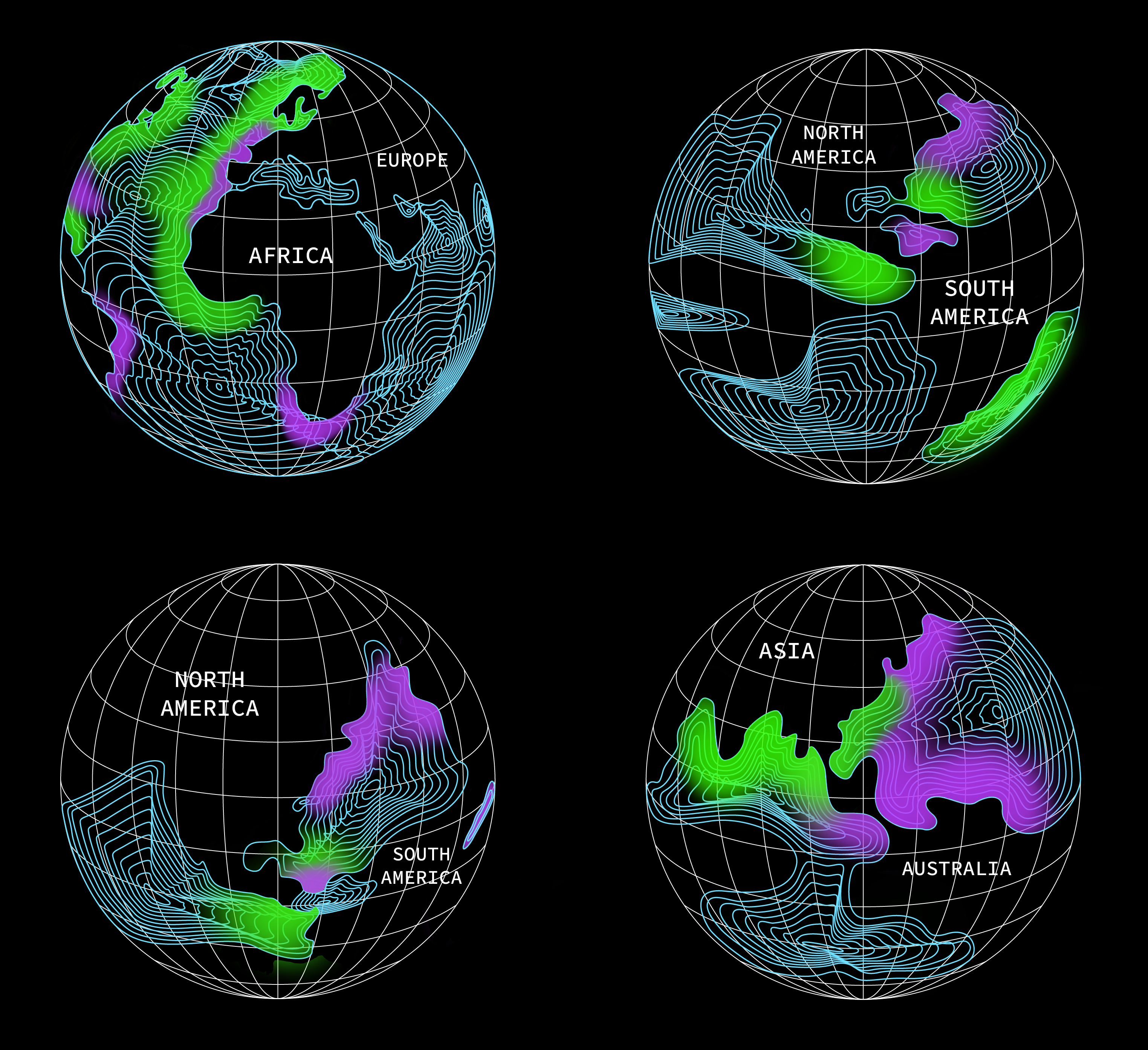
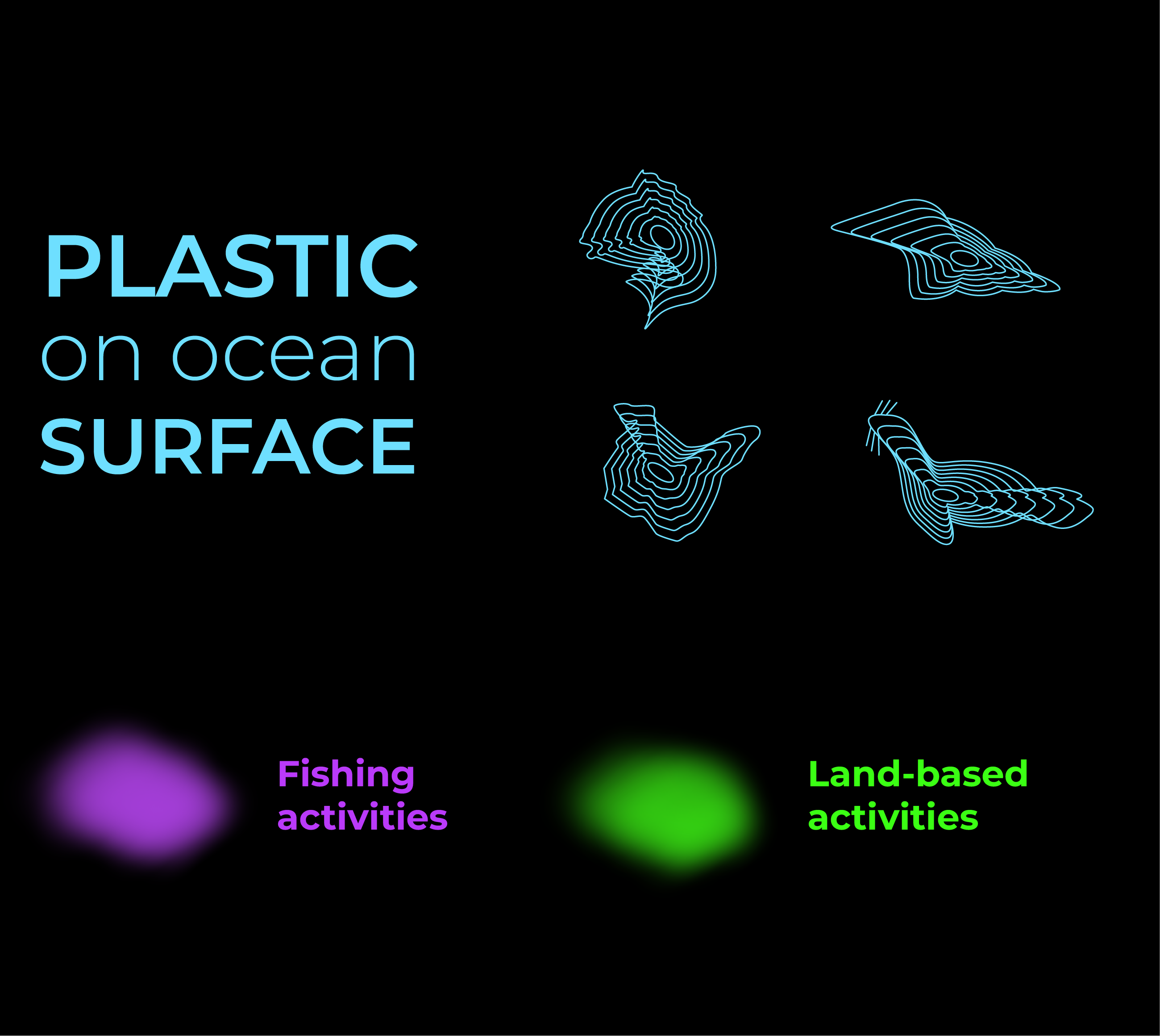
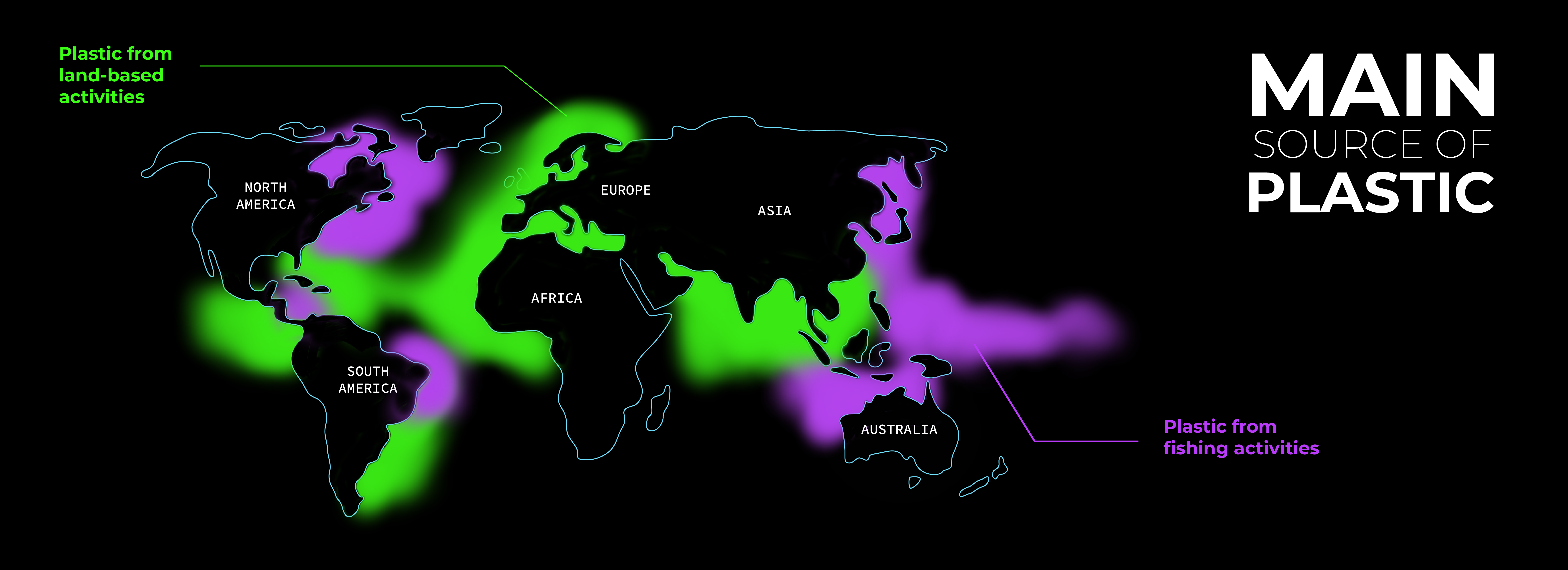
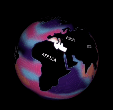
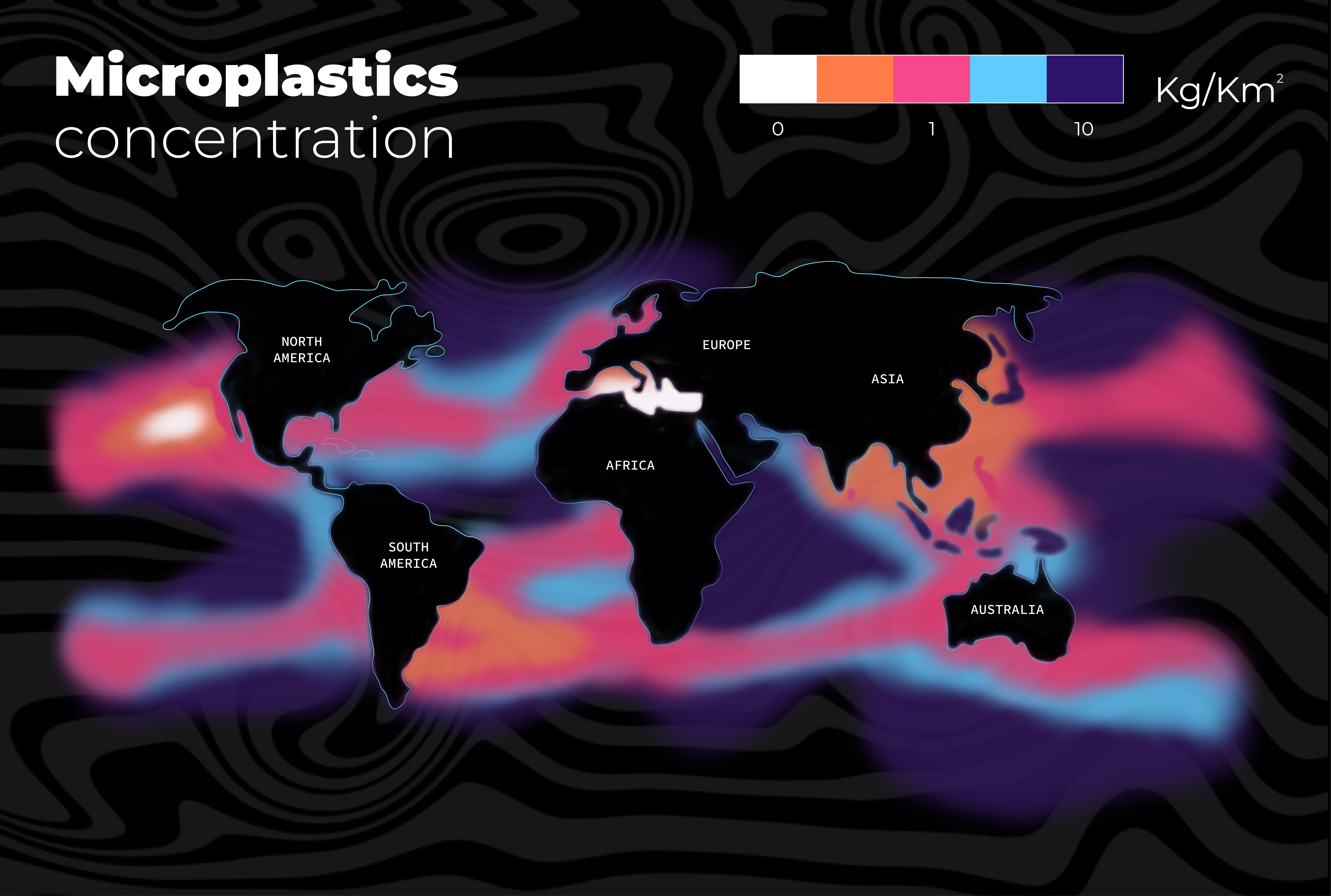
I use worldwide latitude shape to visualized data. The blue lines show the location of the plastic pollution, almost all of them on the ocean surface. In order to better match the theme, I designed the blue line into the shape of marine life. Based on the location, I use purple and green to represent the reason of this pollution. Purple means plastic from fishing activities, green means plastic from Land-based activities.
Why purple and green?
The visible light spectrum
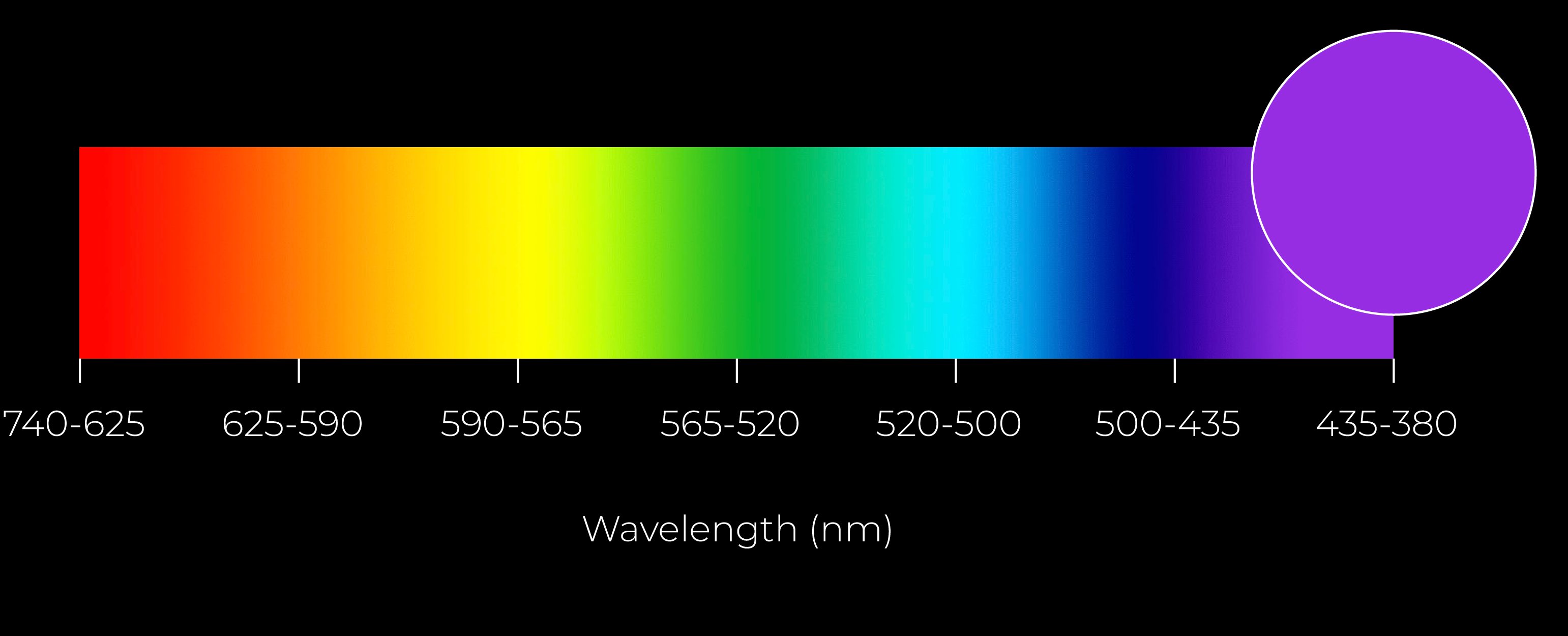
In the visible light spectrum, purple is the least intense and most easily overlooked color. Ocean pollution caused by overfishing is also one of the most easily forgotton items. So I want to use purple to represent plastic pollution through fishing. But I chose a very bright purple, even a little neon, to show this color clearly.
For green, it usually makes people think of environmental protection. But a lot of pollution comes from human activities on land. So I want to show it ironically.

TEXTURE
Add material to the fonts to show the flow of sea water.
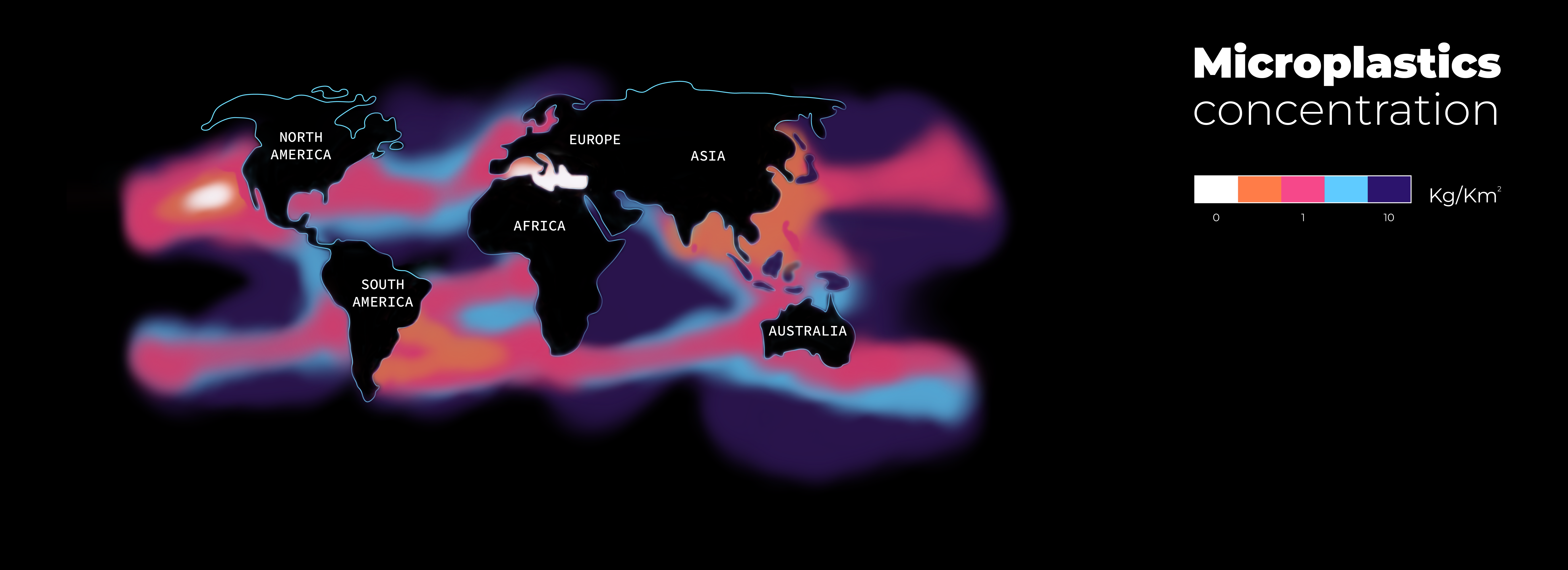
This part is about the concentration of plastic pollution. Based on the location of plastic pollution, I use different colors to indicate the concentration per square kilometer.
WORKS
These are my posters. When people pass by in a rush, I ensure that data can be visualized clearly and digested quickly.
SOCIAL MEDIA
Short videos that will appear on TikTok or Instagram. Use interesting visuals to get people's attention. People can touch to explore to see more content or share it with friends.

SOCIAL MEDIA
Short videos that will appear on TikTok or Instagram. Use interesting visuals to get people's attention. People can touch to explore to see more content or share it with friends.
These posters are also for increasing the visibility and publicity of an organization. I use some recurring design elements and colors and reorganize them. The main focus is on creating and implementing visually captivating signs to attract passersby's attention. These few posters can appear on the streets, on the web, and on mobile phones.
TYPOGRAPHY
Aa
Bb
Cc
Montserrat Bold
Montserrat Medium
Montserrat Light
ITERATION

Indicates the location of plastic pollution with random shapes that have no meaning and are irrelevant to the topic.
Change into the shape of marine life, and match the theme of protecting the ocean.

The layout makes it like a sponsor.
It has more hierarchy and more clarity.
The typography does not match the overall style, and lack of hierarchy.
Easier to understand.