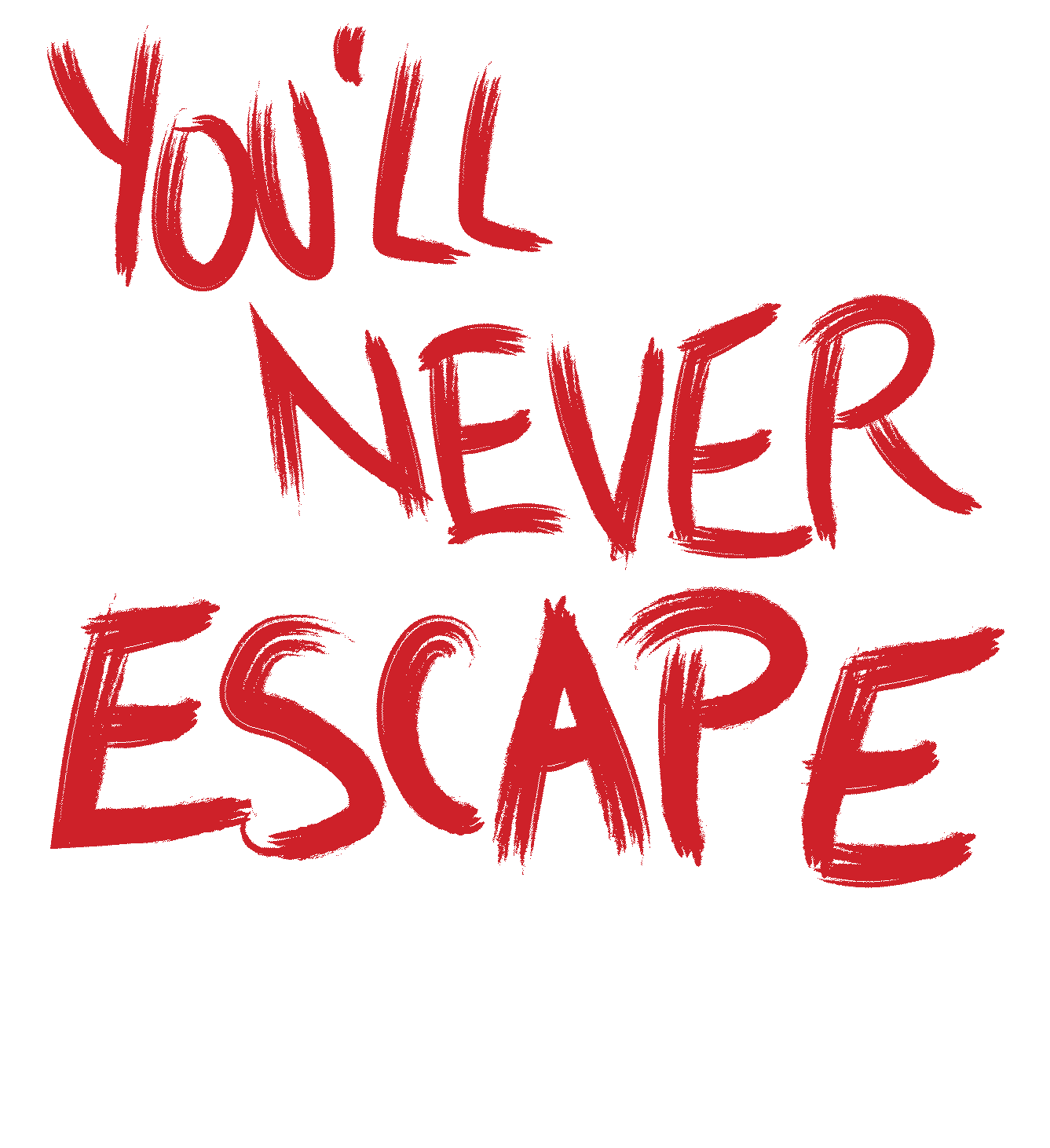
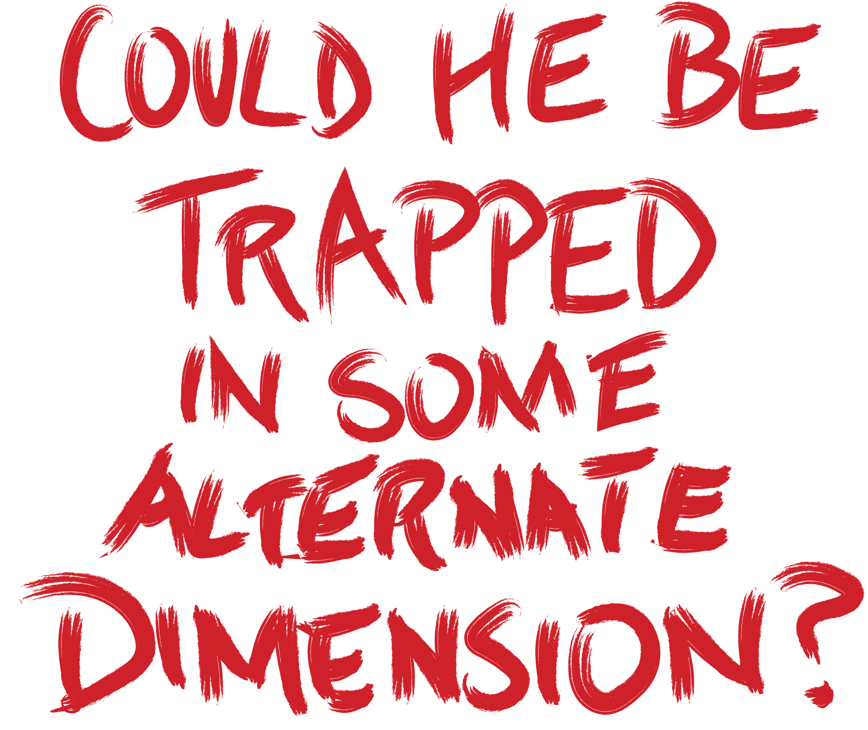
Prompt
How might we use design to influence urban exploration?
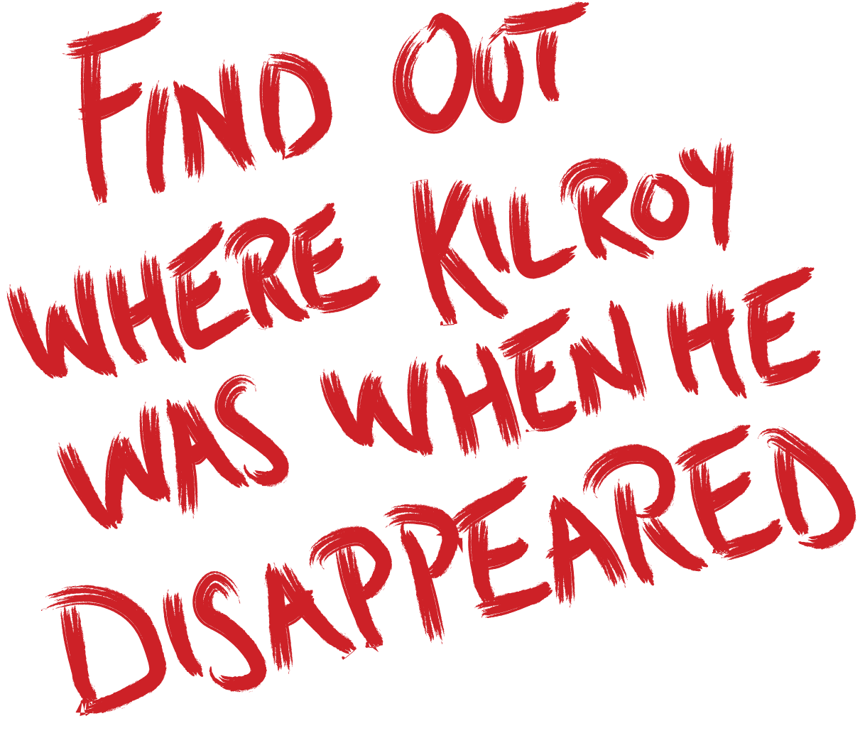
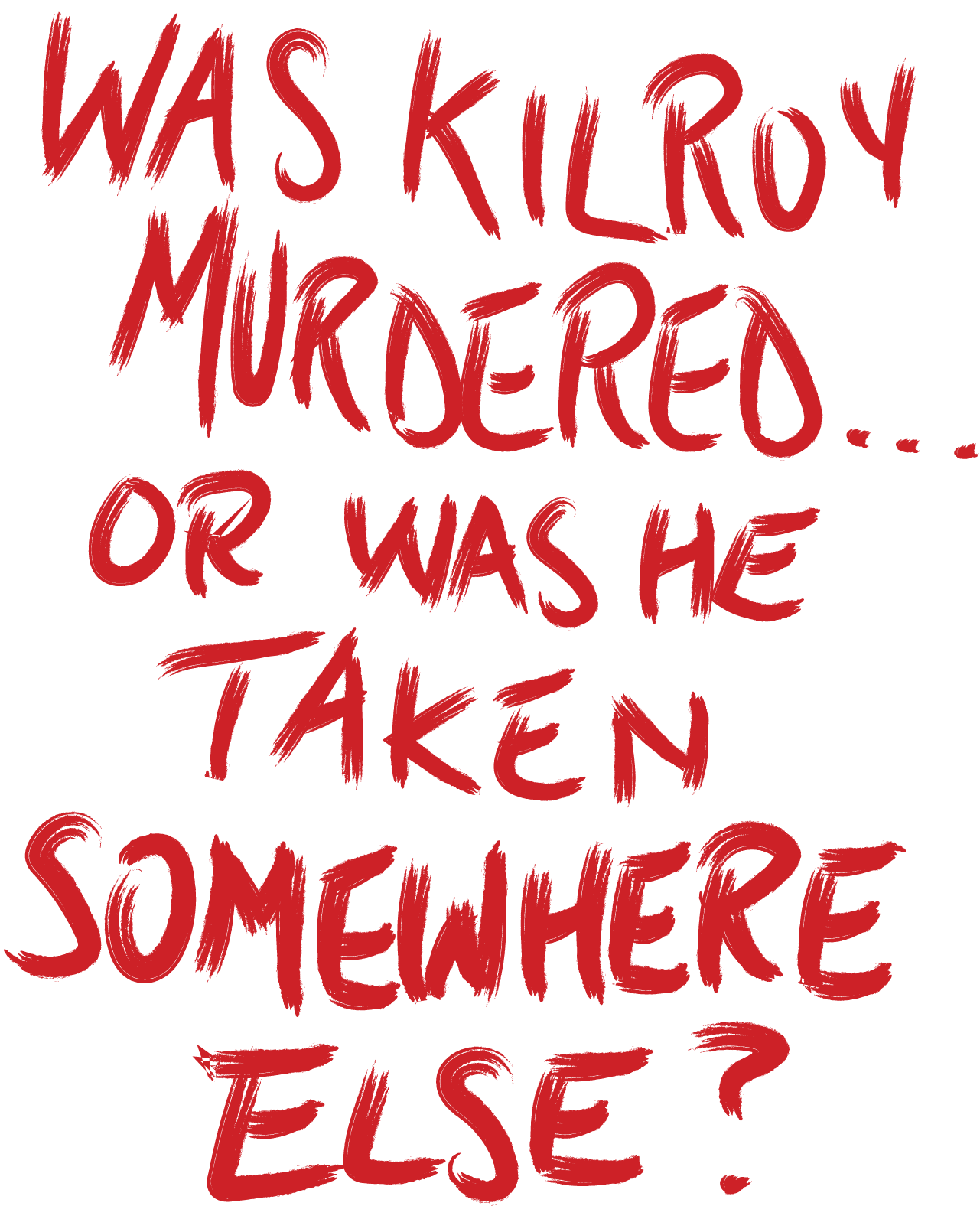
Problem
How might we use storytelling to enhance engagement with an environment?
Solution
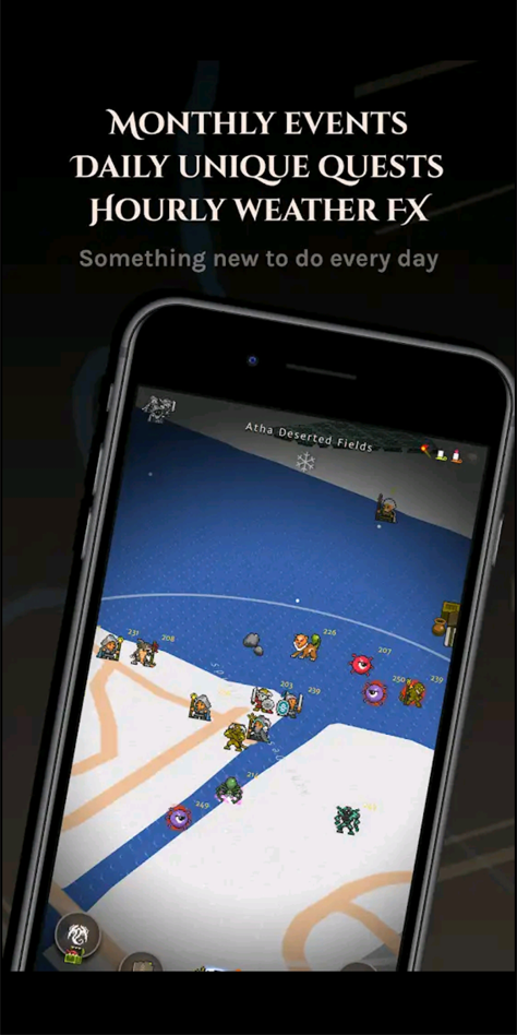
AR Mystery game: A user explores a cityscape through the lense of virtual storytelling, enhanced with discovery, transformation, and engagement.
AR stands for augmented reality, which is the integration of the real world with digital assets. In this project, AR takes the form of a mobile application, in which reality is viewed through the phone's camera, and augmented by a colored filter and motion graphics.

Discovery
Discovery is a two-fold sentiment in this game - discovering new locations, as well as clues about Kilroy's disappearance.
A nuance to this feature is that the user may uncover new clues or opportunities for engagement in a location only on a repeat visitation, or after triggering a certain event elsewhere in the game.
Example Walkthrough of Map
Clues
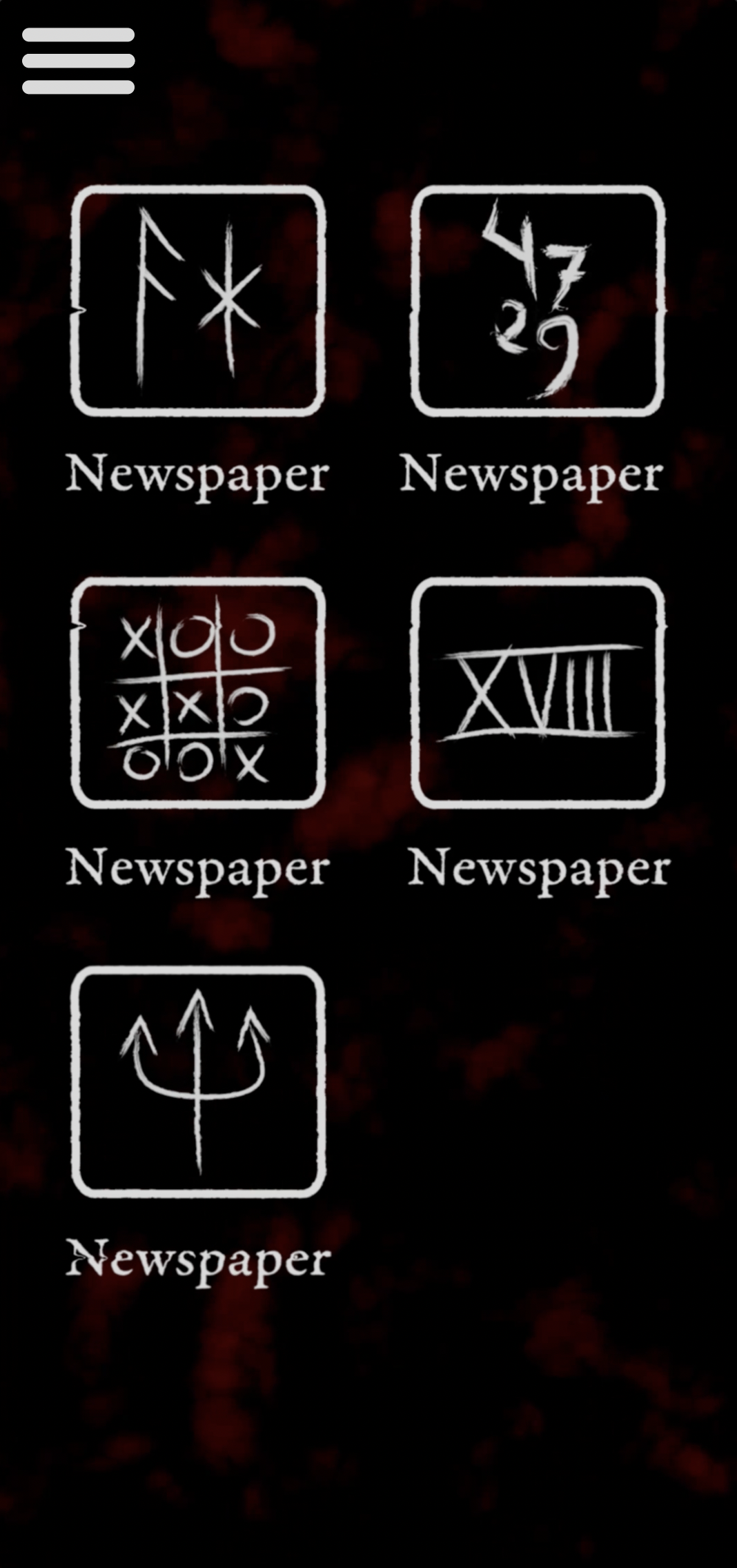
There are three types of clues - locks, keys, and freebies.
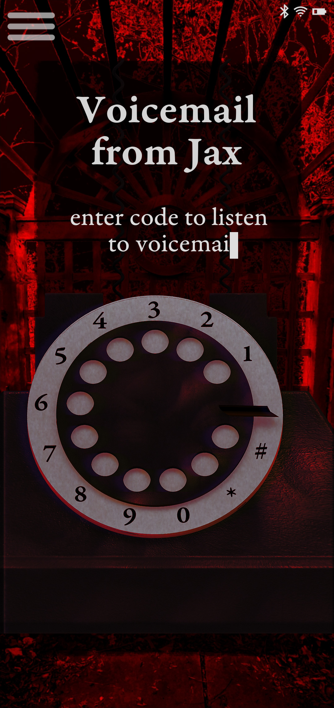
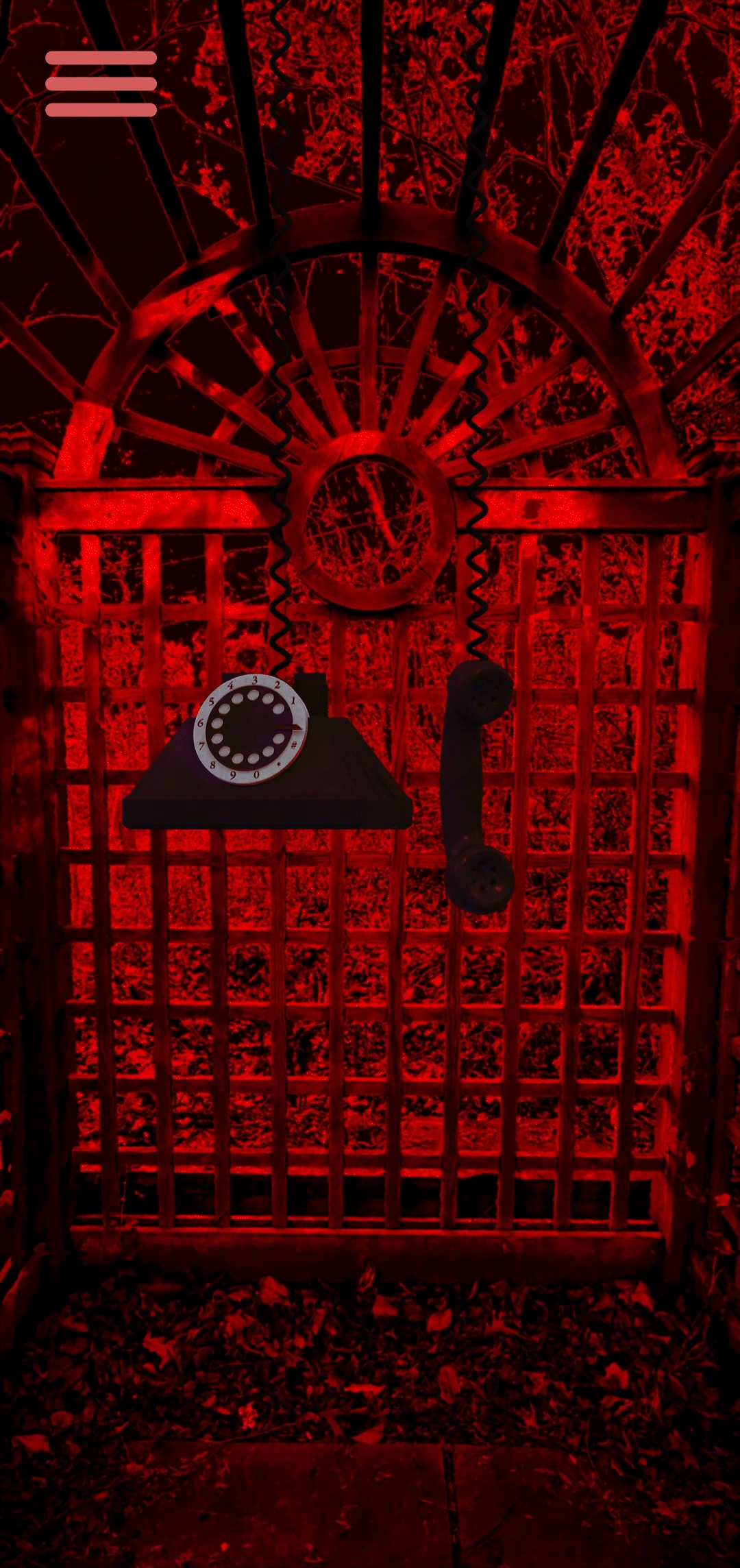
Locks are clues which may only be revealed if there is a specific input from the user, whether that is a code, pattern, or some other format.
The input required to reveal the information from a lock clue comes from a key clue.
Locks and keys are found in different locations, and it is up to the user to figure out which ones go together.
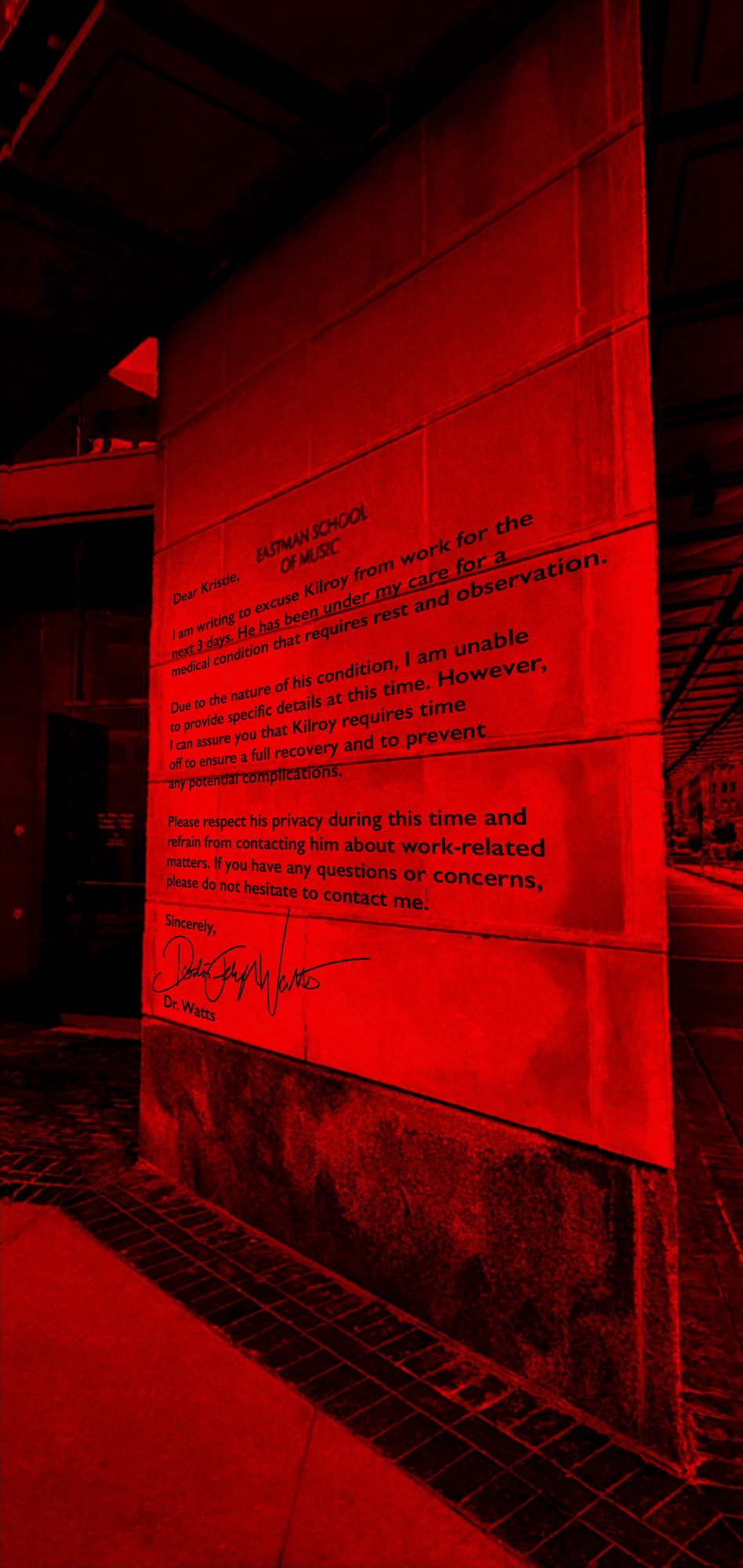
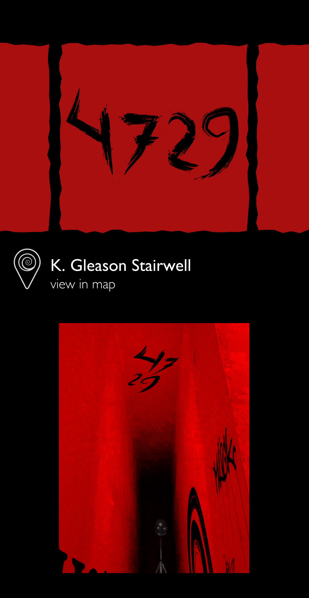
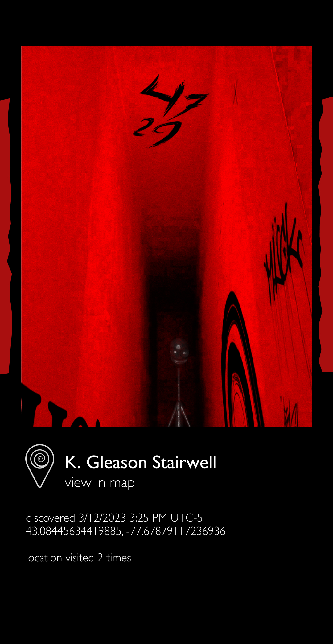
Freebies are clues which simply appear in the environment without any input necessary from the user, such as the images shown to the right.

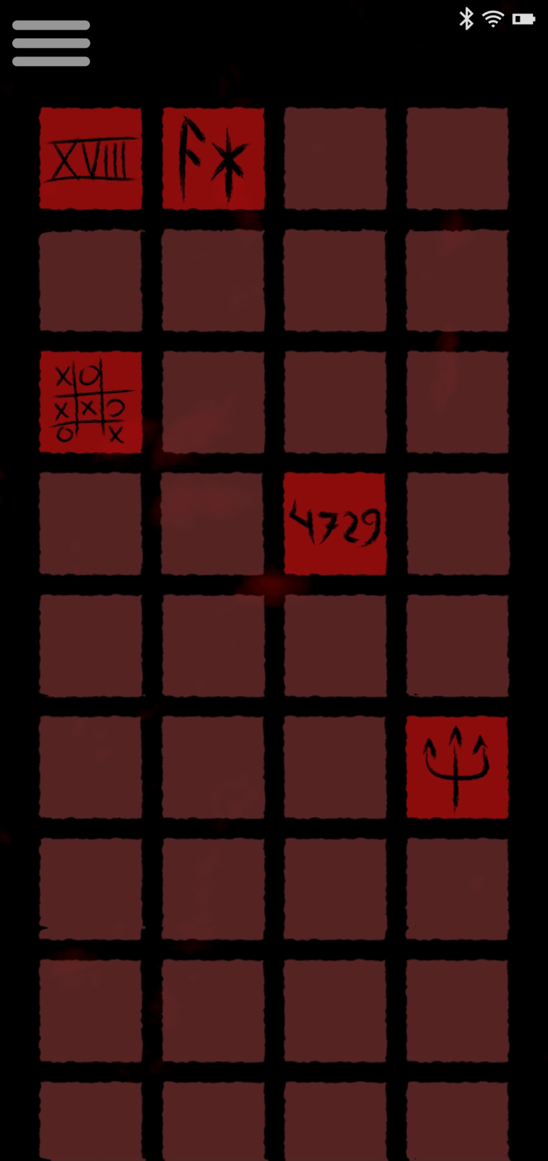
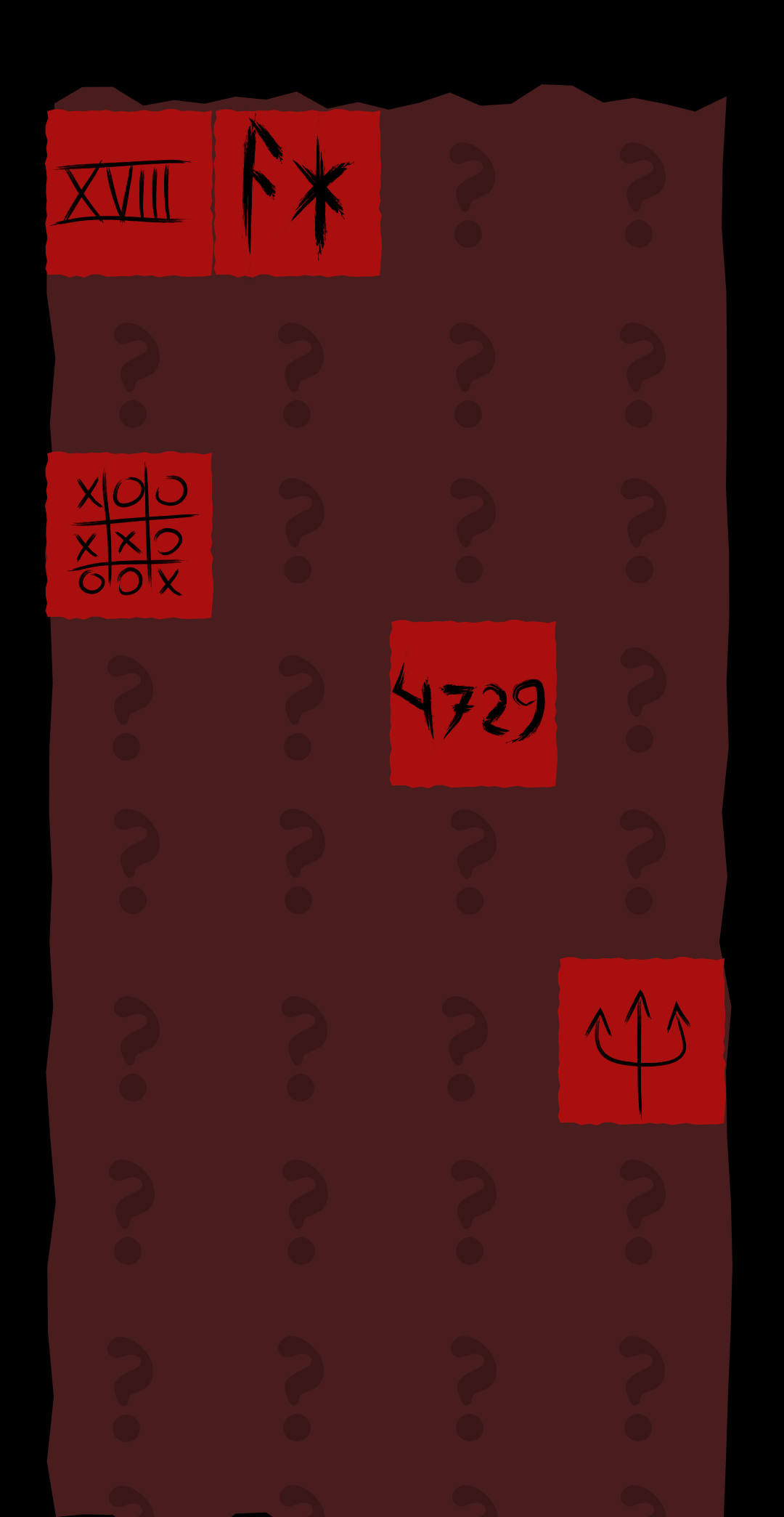
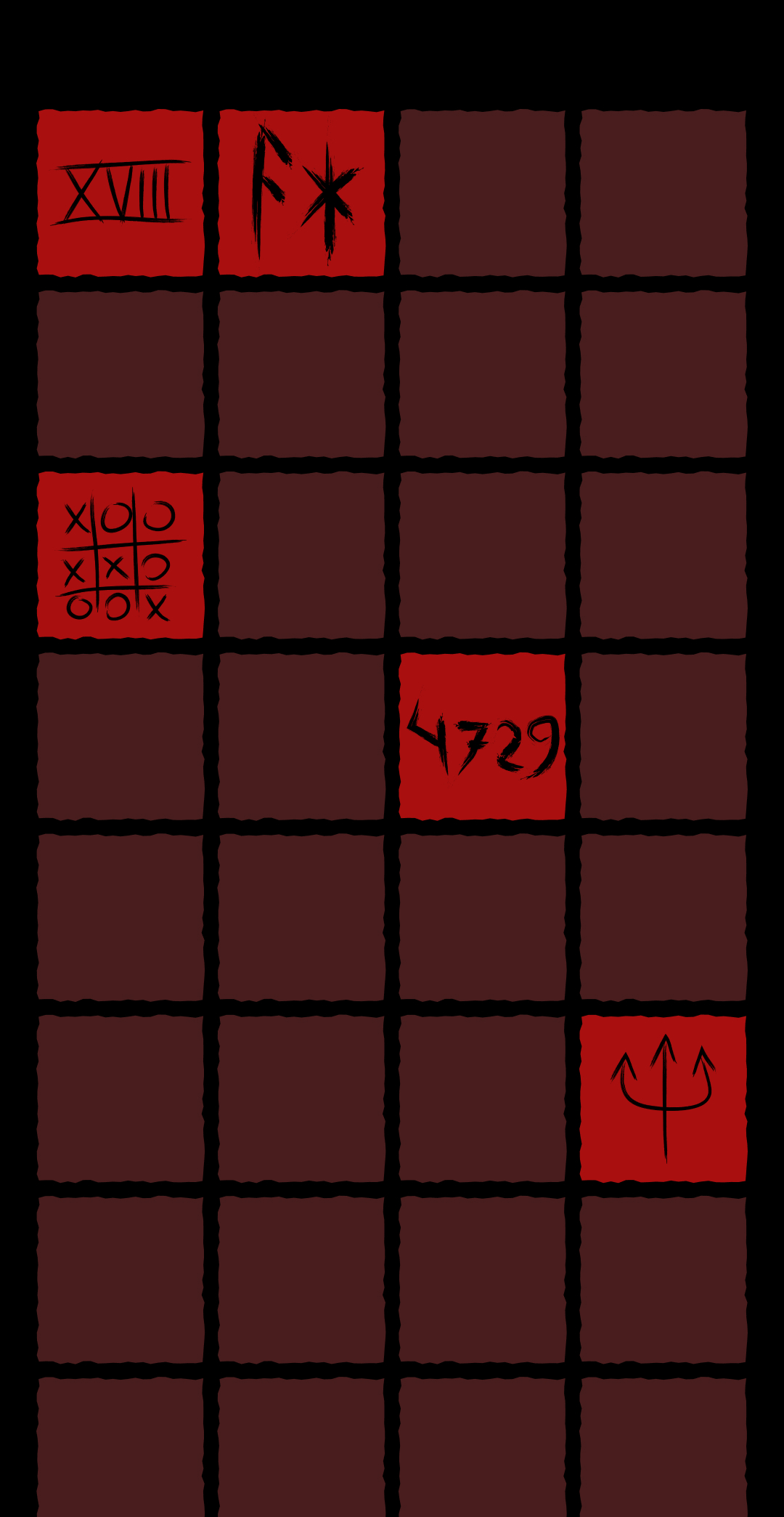
Inventory
Key clues are kept in the user's inventory, and can be accessed at any time. Any key clue that comes into the user's field of view is automatically saved to the inventory.
Example of a Lock Clue
Inventory
Key Clue accessed from Inventory
Lock Clue & Inventory Walkthrough
Key Clue Autosave Example
Transformation
Through the use of augmented reality, the environment of the user is completely transformed.
Using a red filter, moving typography which seems almost alive, and warping graphics, the user encounters their surroundings with a new lense of living, breathing horror.
The intention is to further dramatize the creepy elements by bringing them closer to the user's reality, creating an immersive experience.
![]](https://designed.cad.rit.edu/vcdthesis/wp-content/uploads/sites/9/2023/04/unnamed-file.png)
Typography
There are two types of typography present in guiding the user through the transformed environment - guiding type and narrative type.
The guiding type serves to help the user navigate toward certain places within their environment, and is set in Garamond. The words deform in a heartbeat pattern to entice the user.
The narrative type functions to tell the user more about the plot and can often be seen dripping or distorting in some other fashion.

Guiding Type Example
Narrative Type Example
Engagement
There are three main modes of engagement - the order in which the user chooses to unravel the story's content, interactivity with elements in the game, and piecing together lock-and-key clues.

Initial Ideation
Before things got spooky, this was the plan:
A geocaching adventure in which the user follows a map, or explores independently to discover locations which present QR codes. The QR codes will link to motion graphic reels that each contribute to a larger narrative. The reels would be relevant to the specific location.
The video to the right was the first example sketch I came up with for the project, just to see what it would look like to place text and images into an environment.
3D vs 2D Animation
Next up was a quick experiment to test out what a 'something is here' indicator could look like, rendered out with 3D (using Cinema4D) versus 2D animation (using Adobe AfterEffects).
2D animation seemed to be the winner, but that didn't stop me from continuing to experiment with 3D renders later in the process.
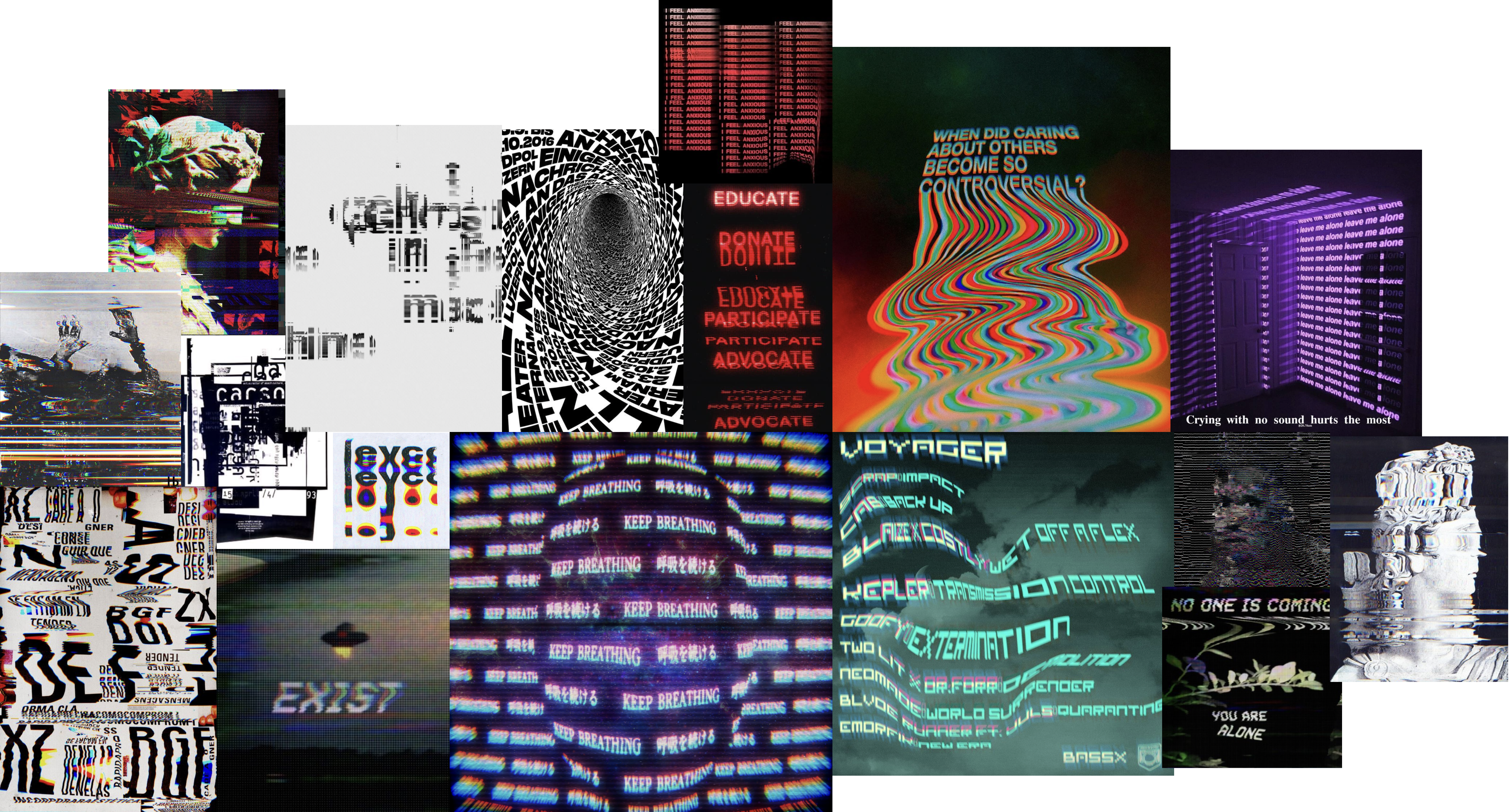
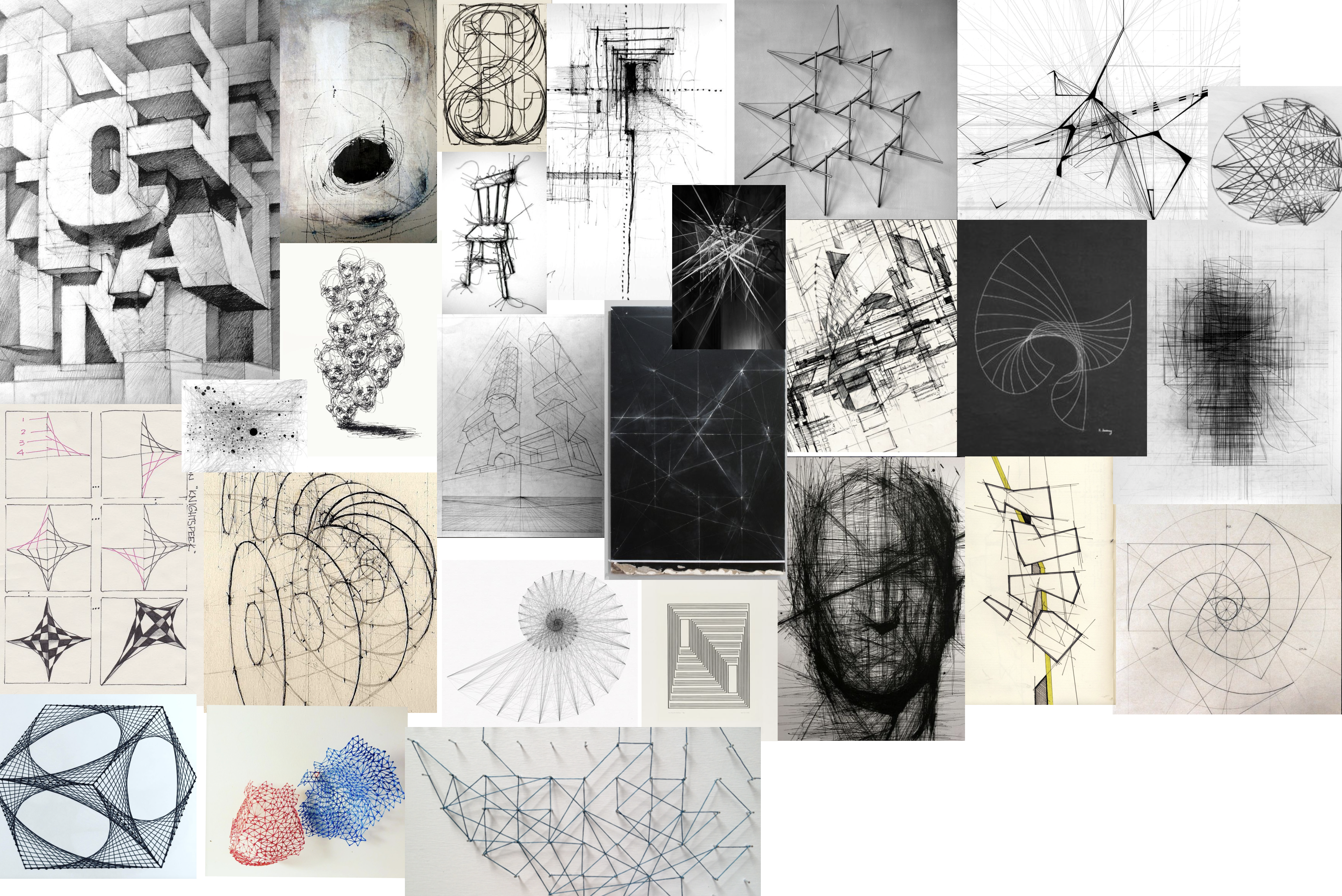
Moodboards
For the visual style & aesthetic direction, my first thoughts were to go with either a glitchy feel, or a more sketchy direction which played with depth.
I referenced the scribble moodboard when I started developing my first version of the map.
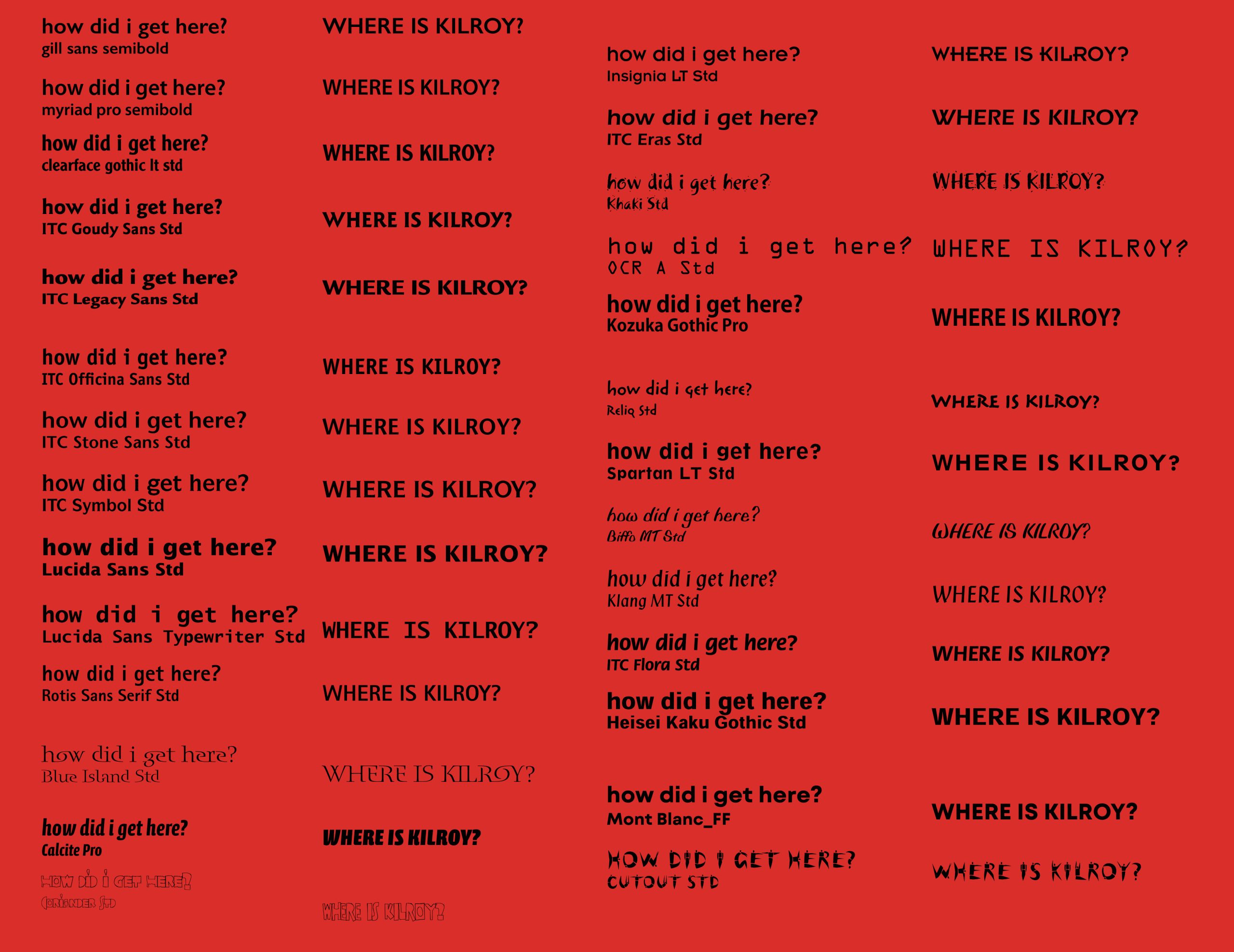
Typeface Exploration: Guiding
I first began exploring typefaces to use to help guide the user along their path. Considerations included legibility, boldness, and excitement.
Let's Get Spooky
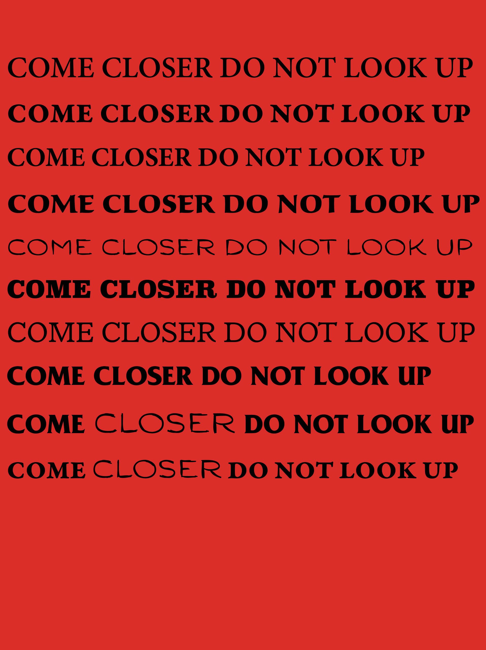
After creating my next moodboard with a more typographic focused direction, I began working on my next video sketch which was focused on using only type in the environment. The word I chose to place was 'Closer', at first for the sake of guiding the user, but the more I looked at what I was doing, the more it felt natural to head in a creepy / horror aesthetic direction.
I was thinking about how to bring more drama to the video, and in contemplating where I had seen drama working well in other media, I decided that saturating the environment in red would add an extra layer of intrigue.
Typeface Exploration: Narrative
In earlier phases of the project, I thought that I would use a separate typeface to showcase narrative moments in the game. I ended up choosing Heisei Kaku Gothic, with a mixed alphabet. I used weight W7 for vowels and weight W9 for consonants, to add some variety and a layer of creepiness.
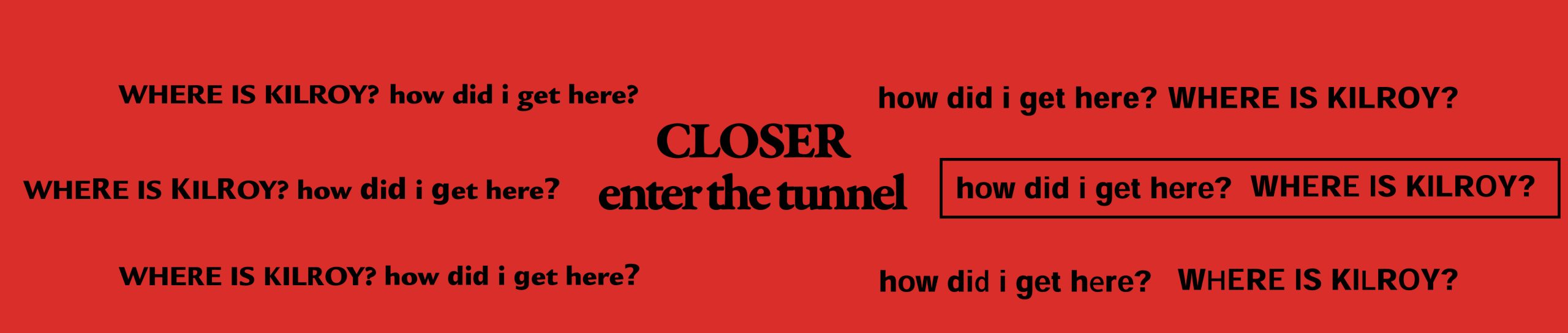
Narrative Typeface Testing
As I began to integrate the narrative typography into my videos, it became apparent that there was not enough clear distinction between the guiding and narrative type. I decided to solve this issue by returning to the concept of handwritten type design, this time using my actual handwriting instead of a handwritten style of typeface.
The distinction was much more clear and brought in the sketchy creepy vibe I was going for, without the issue of too much consistency and computerized appearance of many handwritten style typefaces.
Type Animation Exploration
I continued to experiment with different ways to treat the typography within the scene. At first I felt inclined towards switching the type out for a brief moment with a handwritten style of typeface, and then switched directions toward distorting the type. My best of the distortion patterns were breathing and heartbeat style, with heartbeat being the winner.


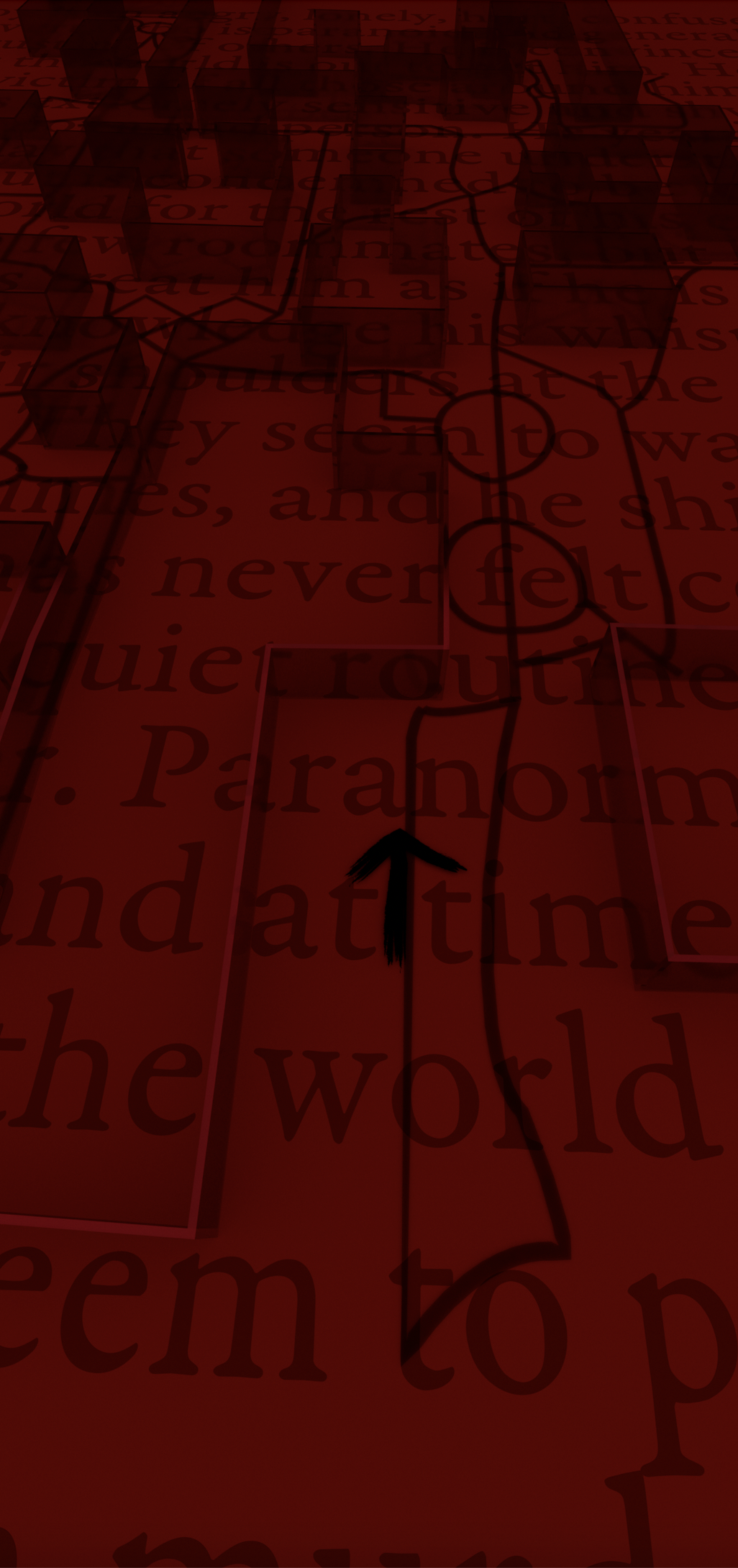
Map Version 1
My first version of the map referenced my scribble moodboard, as previously mentioned, and was developed when I was still considering using the flashing alternating typeface style within the project.
I started developing the map before I had honed in on the visual direction for the AR sequences, and therefore could use a refresh in order to better integrate with other aspects of the game.
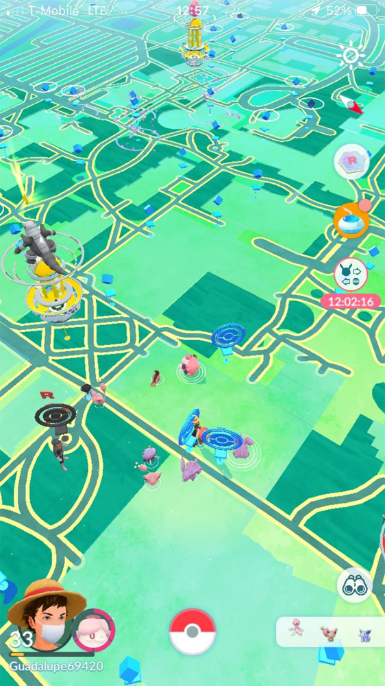
Map Visual Research
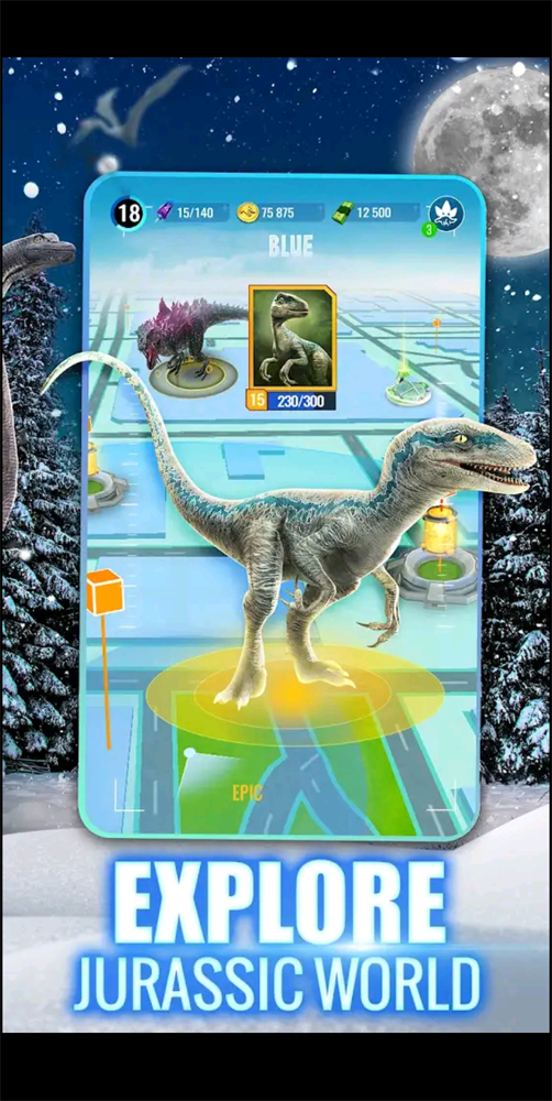
I did some research on how other location-based AR games were treating their maps before beginning my next iteration.
Visuals are from the following games (in order): PokemonGo, Orna: A Geo RPG, Pikmin Bloom, Ingress Prime, Zombies Run! 11, Jurassic World Alive, and Five Nights at Freddy's AR.

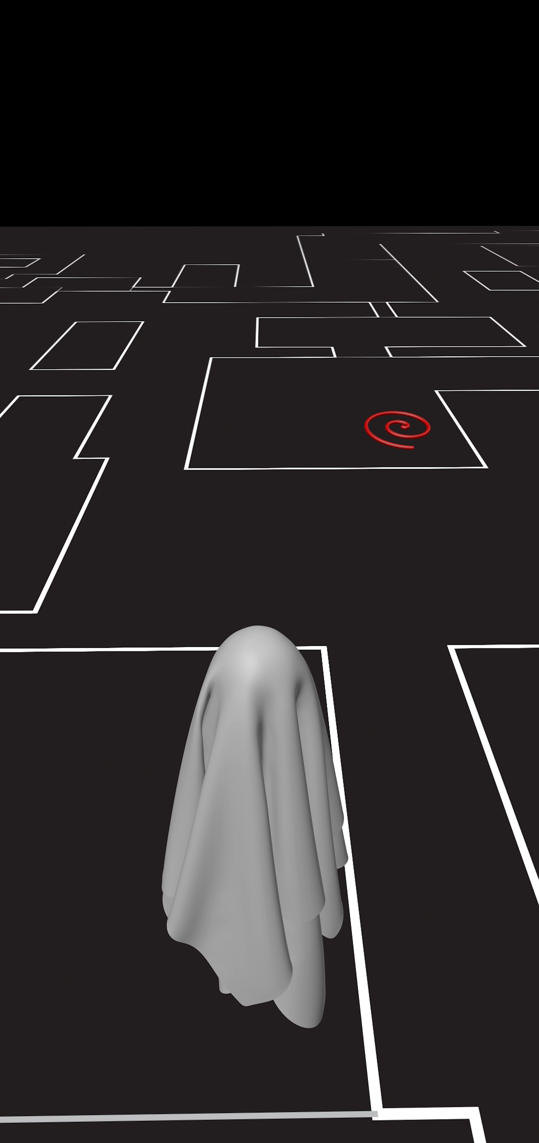
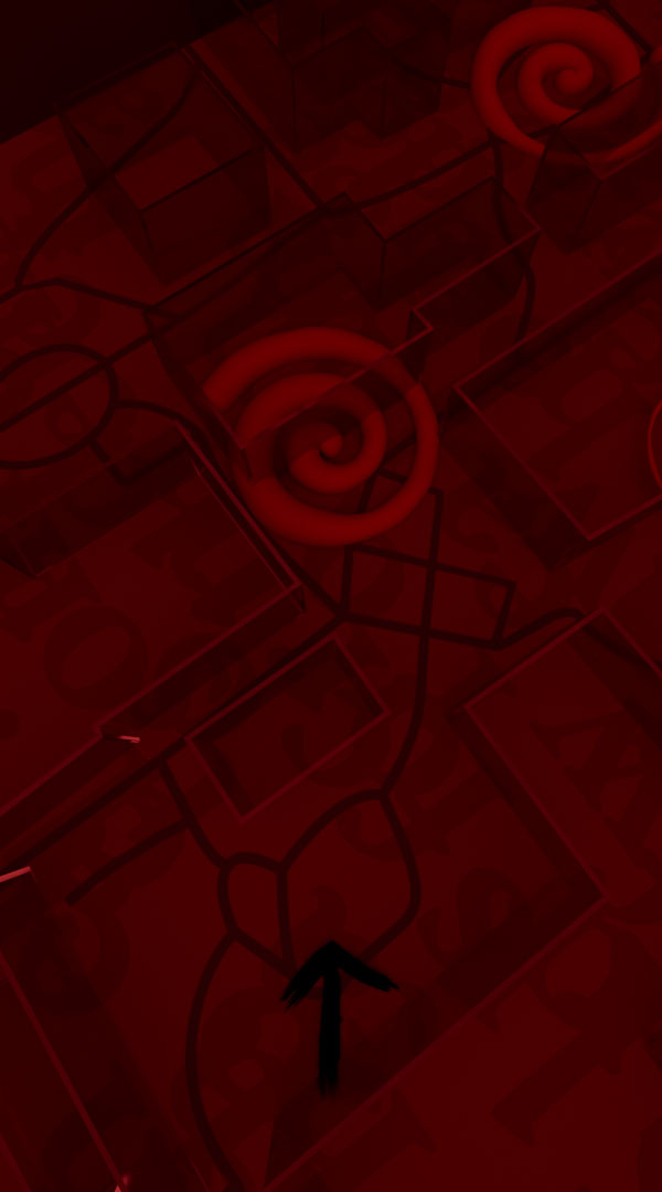
Map Version 2
After some visual research on how maps were treated in other AR games, I decided to try out a 3D animated map sequence using Cinema4D. I thought of making the avatar a ghost to go with the spooky theme, but it didn't quite fit thematically, and so I ended up discarding the idea.
This iteration felt closer to matching the style of the AR sequences, but not quite there yet.
Transition Exploration
I tested out a large variety of transition sequence ideas, for loading in a different part of the app, with these being the top three. I ended up going with the VHS style, as it seemed to be the most fitting for the aesthetic.


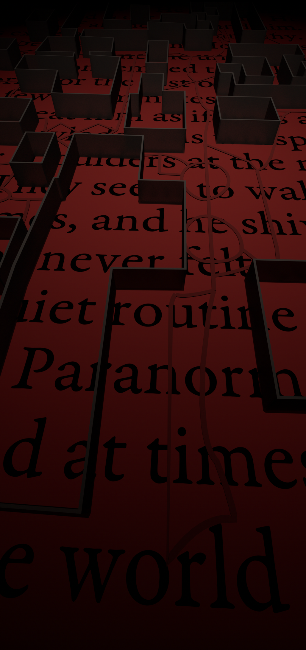
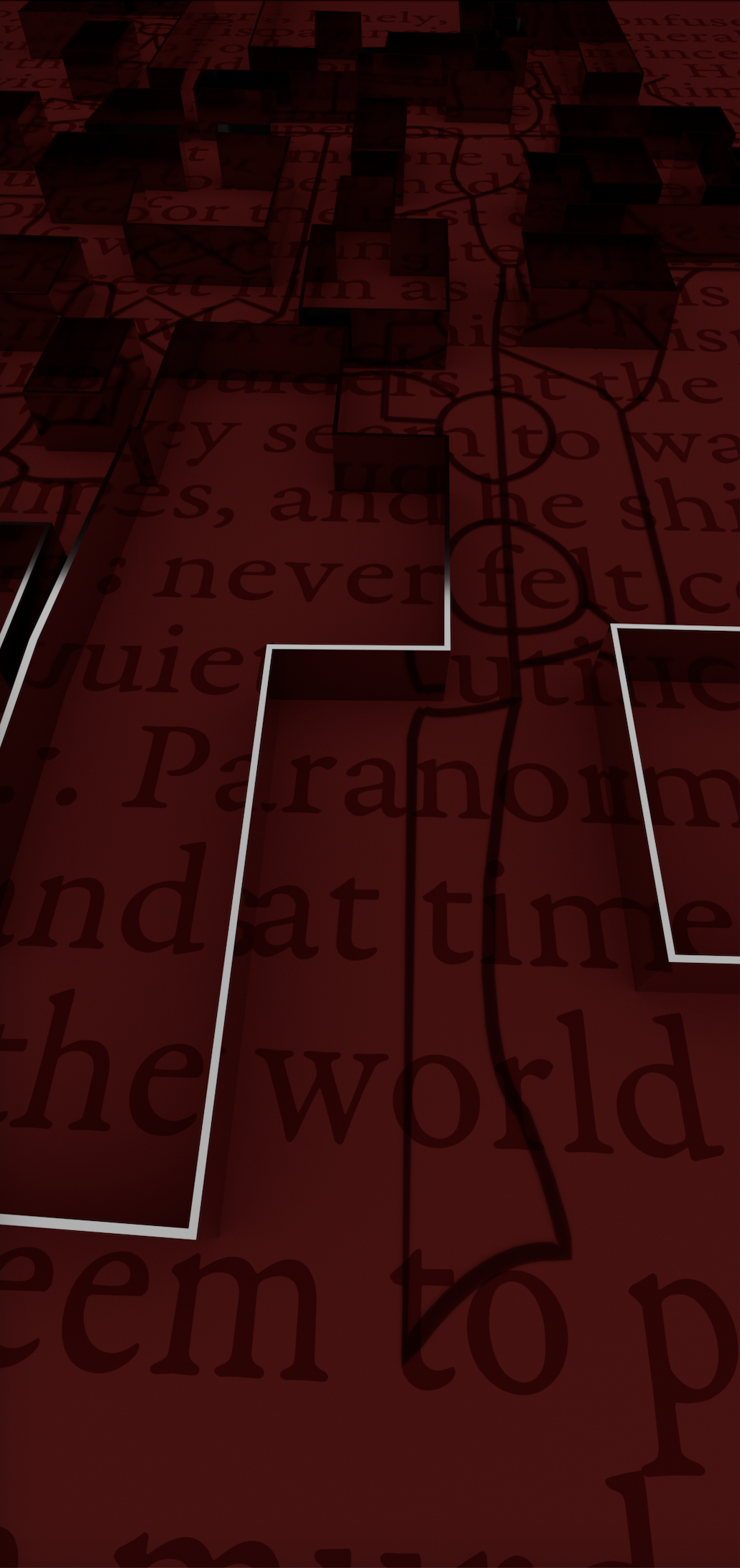
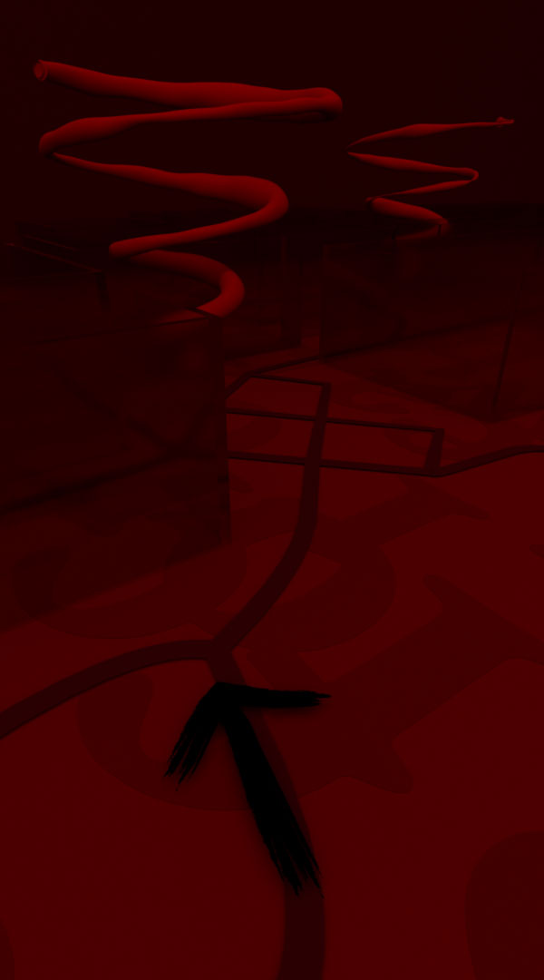
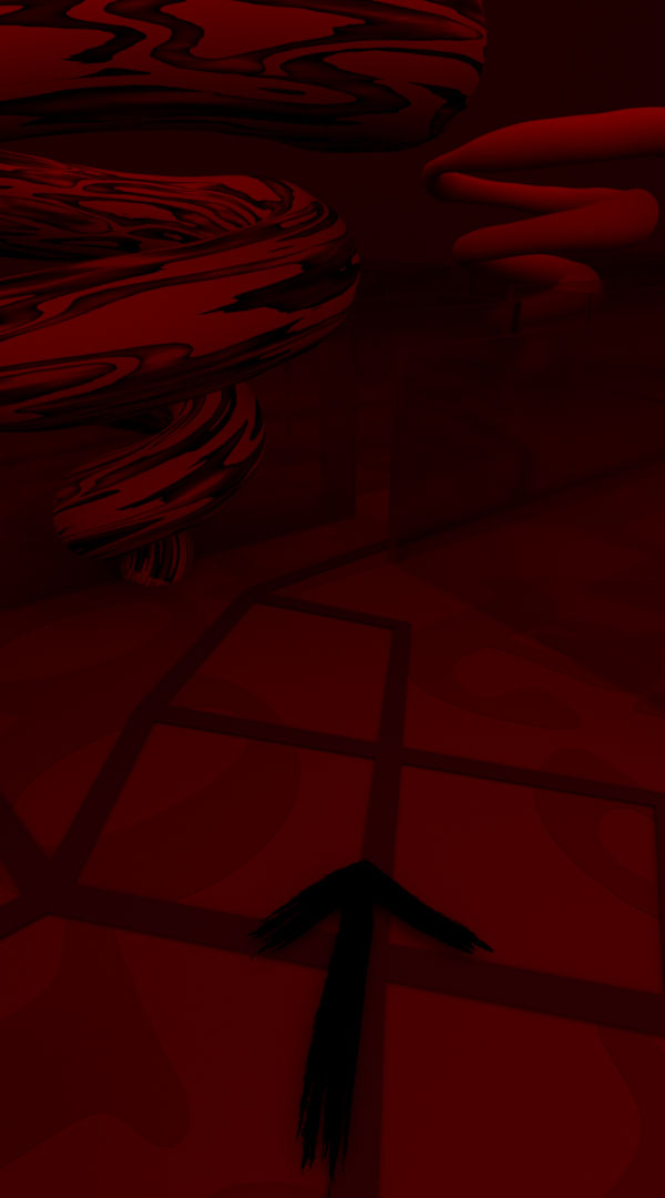
Map Version 3
In order to better integrate the map with the other visuals I had been creating, I decided it was necessary to base the map in red and incorporate typography into the design.
Some considerations throughout this process were the hierarchy levels of the type background element, buildings, paths, and arrow icon.
None of these images ended up as the final map design, but were necessary iterations before finalizing the design.
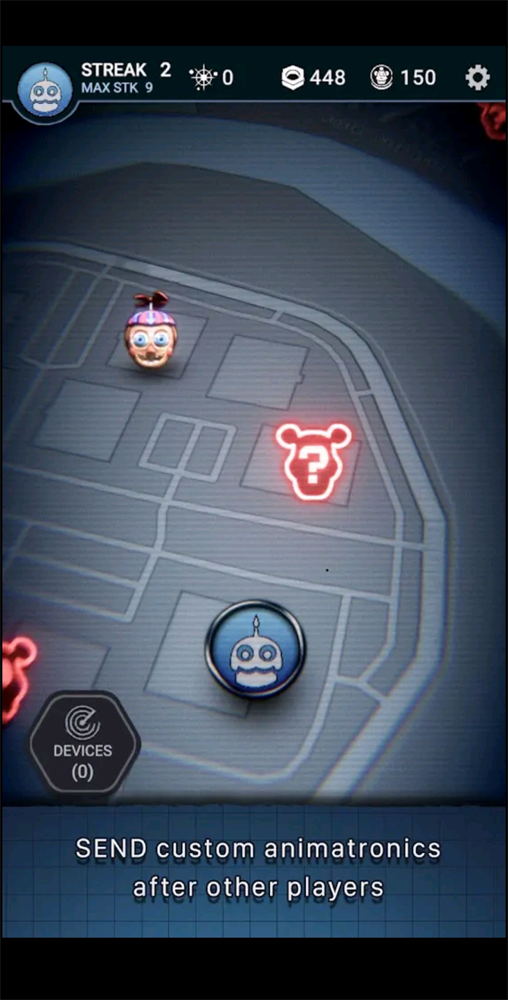
Finalized Map
In my final iteration of the map, I jumbled the text, so it would still be a consistent element across the project, without being a distraction for the user.
Spirals are also a consistent element, existing as location markers in the map, and as visual elements in the AR sequences. The spiral changes appearance when the user comes within a certain level of proximity with it, to indicate that there are visible AR elements nearby.
Bird's-Eye View
Point of View
POV - Location Nearby
Inventory Grid
I iterated many times on the Inventory, and again faced similar questions as with the map: how to best integrate the visual style with the AR sequences and Map design.
I determined a smaller grid made more sense for ease of searching inventory items. The question marks seemed an unnecessary visual element, with a difference in opacity of each item being enough to showcase which items had been found.
I initially thought to name each inventory item, but naming conventions posed an issue and I determined that the visuals spoke well enough on their own.
Early Iteration - Large Grid Format
Middle Iteration - One Grid Format
Final Iteration - Small Grid Format
Inventory Item
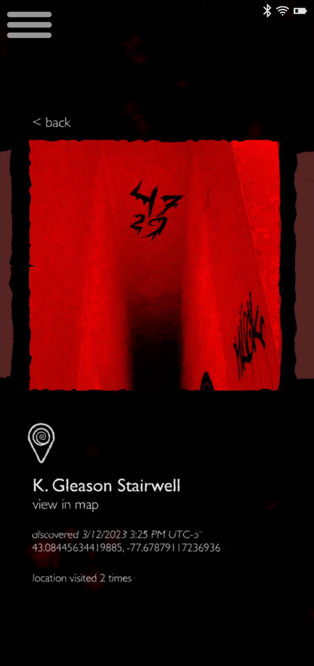
In considering what information was necessary to include for each item in the inventory, I first determined the location where it was discovered was most important.
I determined that the date the inventory item was first discovered would be helpful for jogging the memory of the user as to the context of the discovery.
Lastly, I deemed it necessary to note how many times the location was visited, to account for a nuance of the game in which some clues may only appear on a repeat visit.
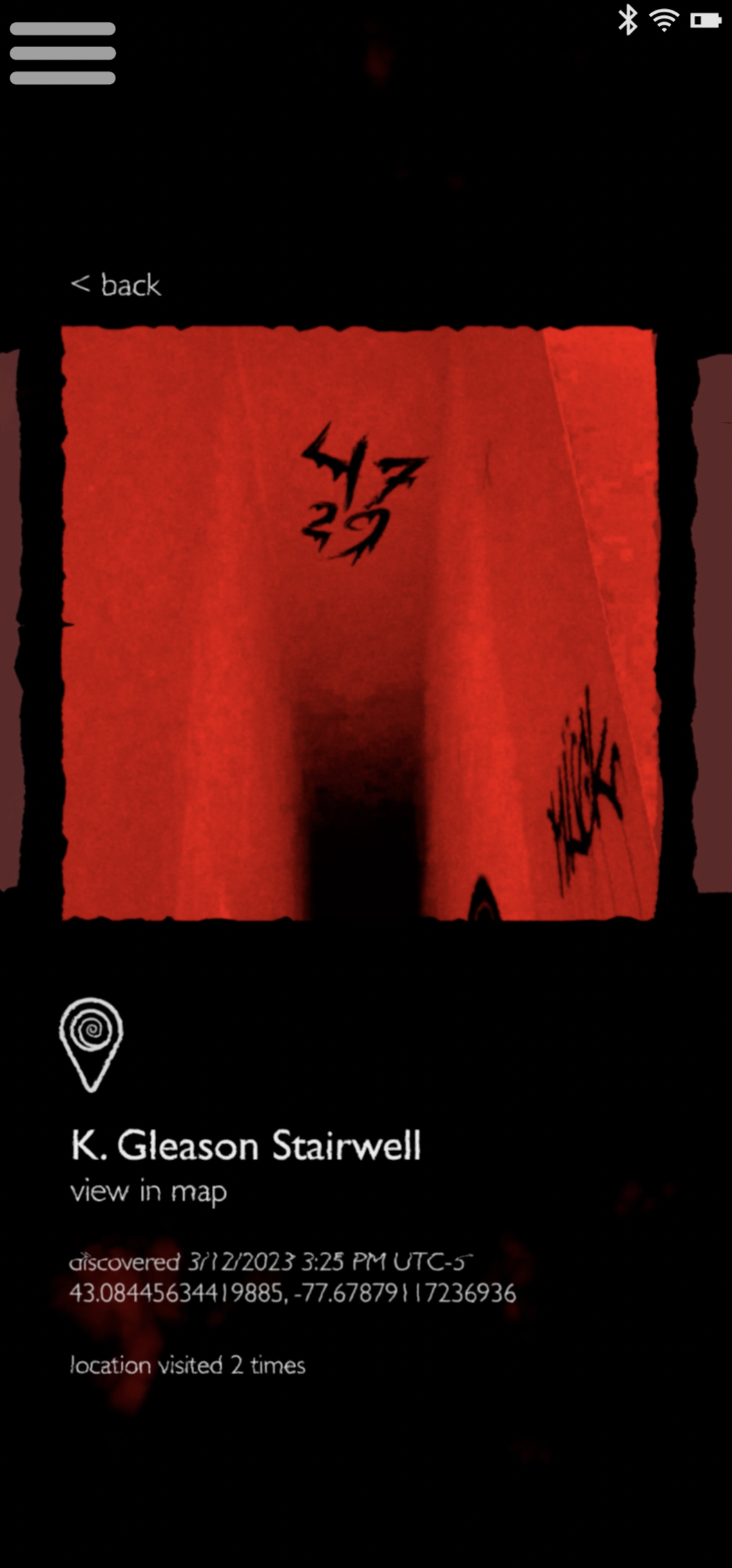
Early Iteration - Graphic + Image
Middle Iteration - Image as Graphic + Description
Final Iteration - Improved Spacing & Scaling
Icons
Some of the considerations for icons were rounded vs pointed edges and corners, including dimensional depth or not, and level of stylization.
The Inventory icon was the hardest to design, as many options were either unclear or could be mistaken for something else.
AR Mode
Inventory
Map
Interaction Indication
Creating a visual cue that the phone / rotary could be interacted with proved to be quite a challenge. I experimented with quite a few different methods, including Adobe AfterEffects Particular and Cinema4D Insydium XParticles.
None of the iterations shown ended up as the final method, but the final solution was derived from the first gif shown to the left.


Adobe AfterEffects Motion Graphics
Cinema4D Insydium X-Particles
Adobe AfterEffects Particular
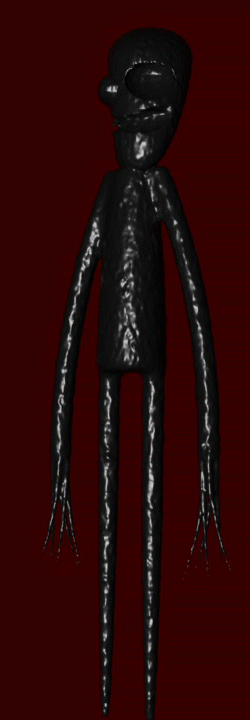
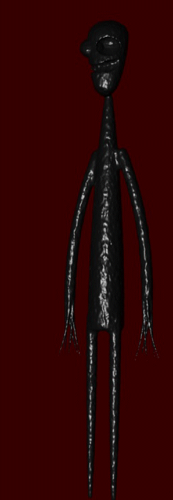
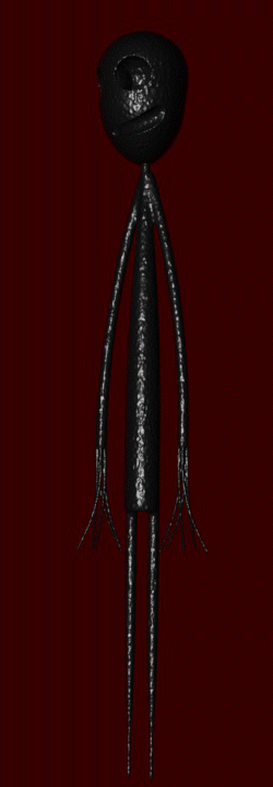
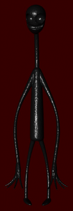
3D Figure Exploration
In an early version of one of the AR sequences, I had an ominous figure waiting for the user at the end of a narrow hall. The stick figure model was a stand-in, but served to envision jump scare possibilities.
3D Figure Moodboard
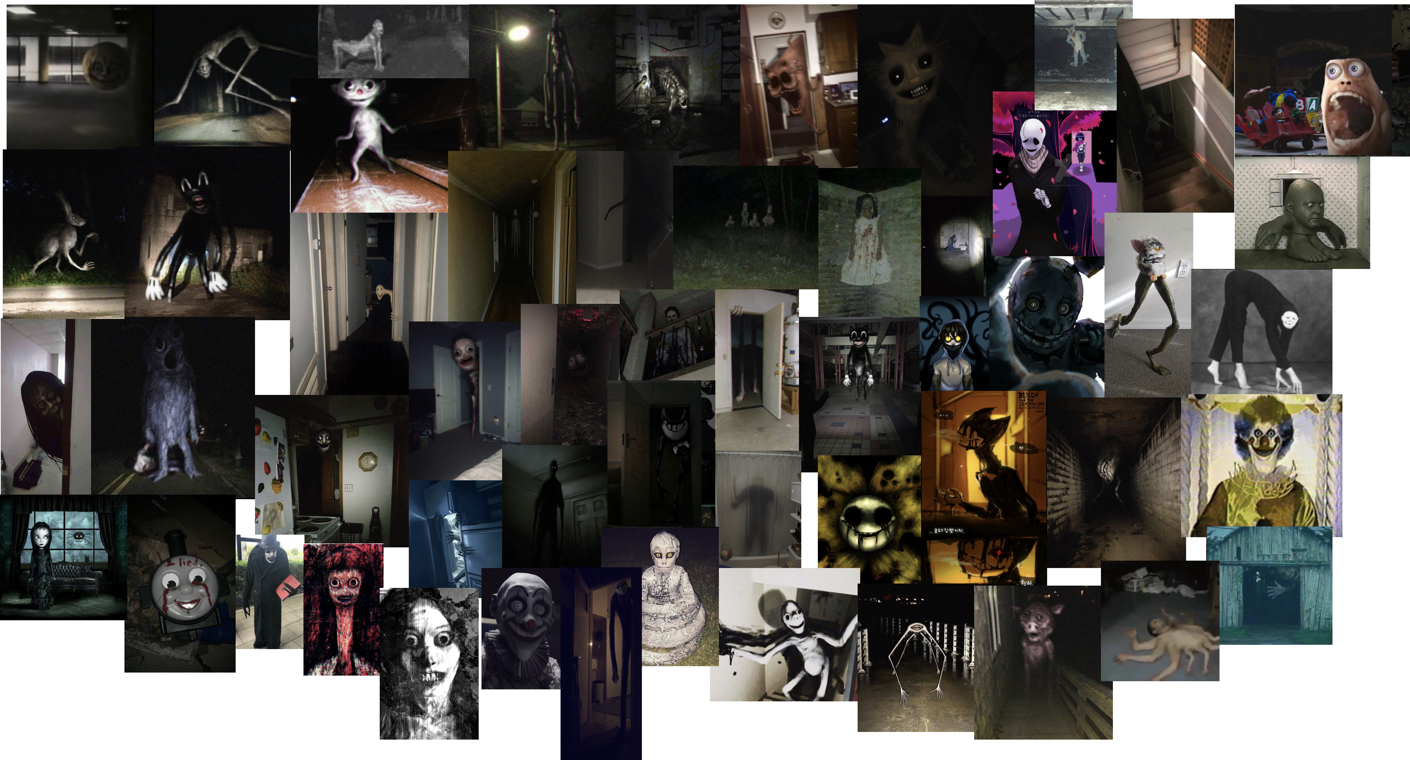
In attempting to understand what visual features placed a figure in the uncanny valley, I made the most terrifying moodboard I have ever created.
3D Figure Iteration
I iterated upon the design of the ambiguous, ominous figure many times. I felt I was successful in modeling something you would not want to approach if you saw it at the end of a long, narrow hallway.
Giving the figure unnatural proportions, a looming head and backwards bending fingers seemed to fit the creepy factor I was pursuing.
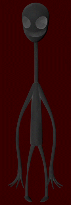
Scare Test
While the figure was certainly creepy, looming at the end of the hallway, compositing and rendering posed many issues. The figure did not integrate well enough with the footage, and did not contribute enough purpose to the game to continue pushing in that direction.
Generating the content was fun, but it was valuable to understand when it was time to let go of an aspect of the project that was simply not working.
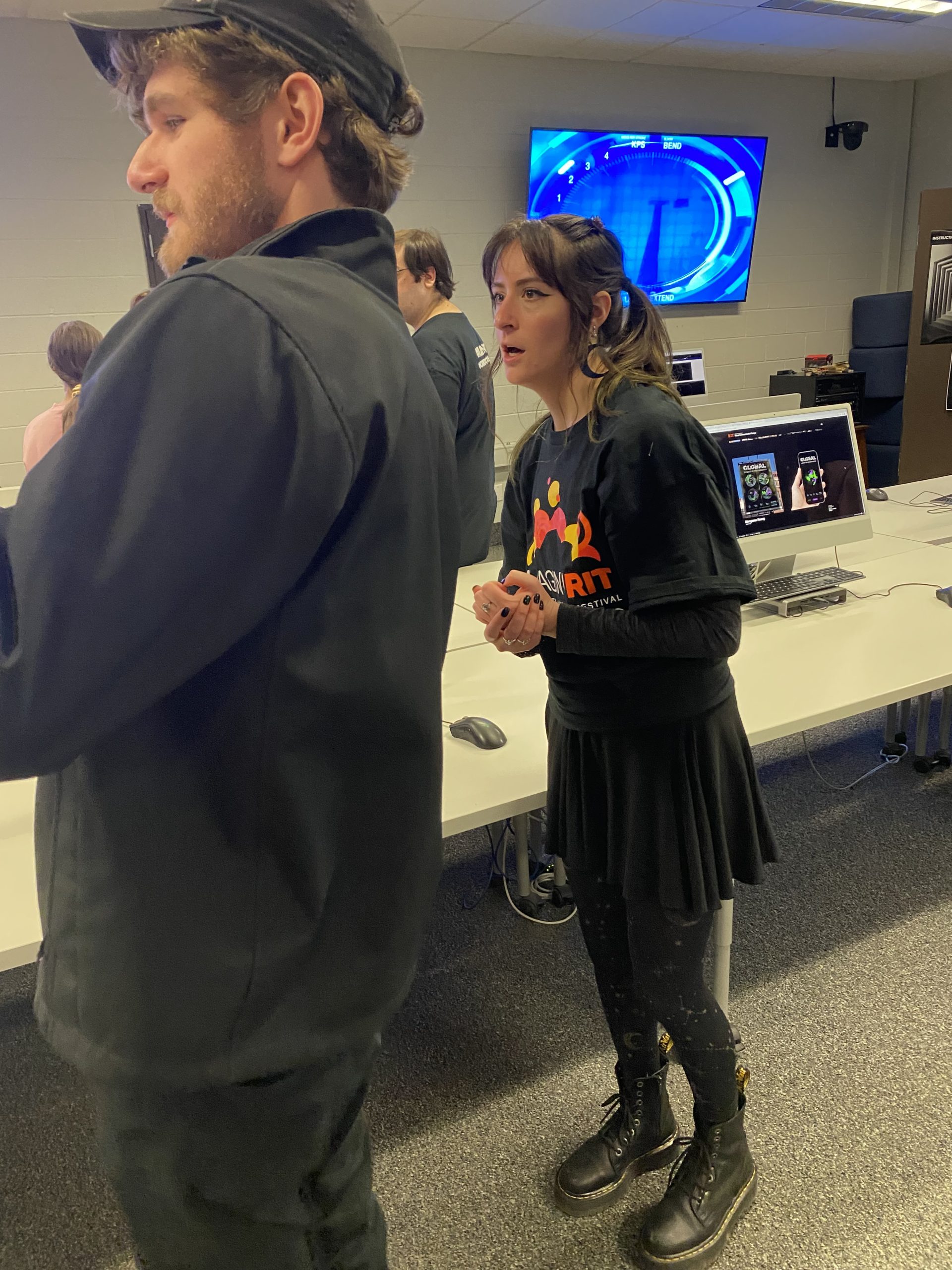
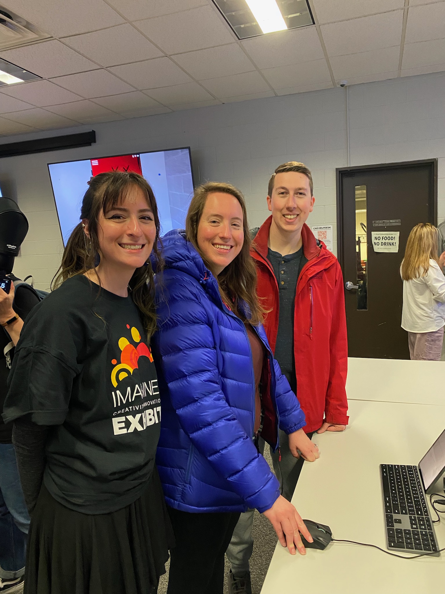
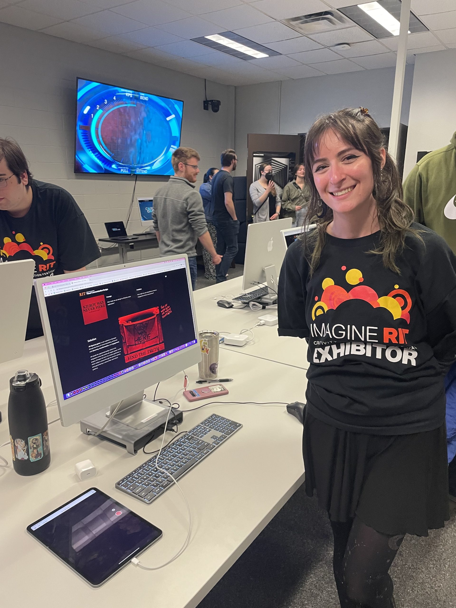
Imagine RIT Presentation
I presented this project at Imagine RIT 2023. I had a large TV screen playing all of my videos on a loop, and a computer displaying this website.
Much to my delight, many of the visitors were very excited and were inquiring if the game would be available for play any time soon.
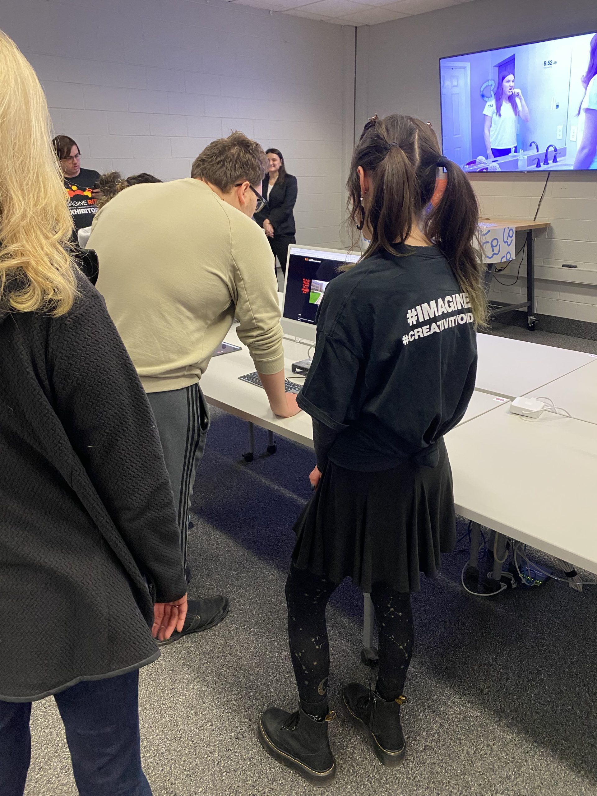
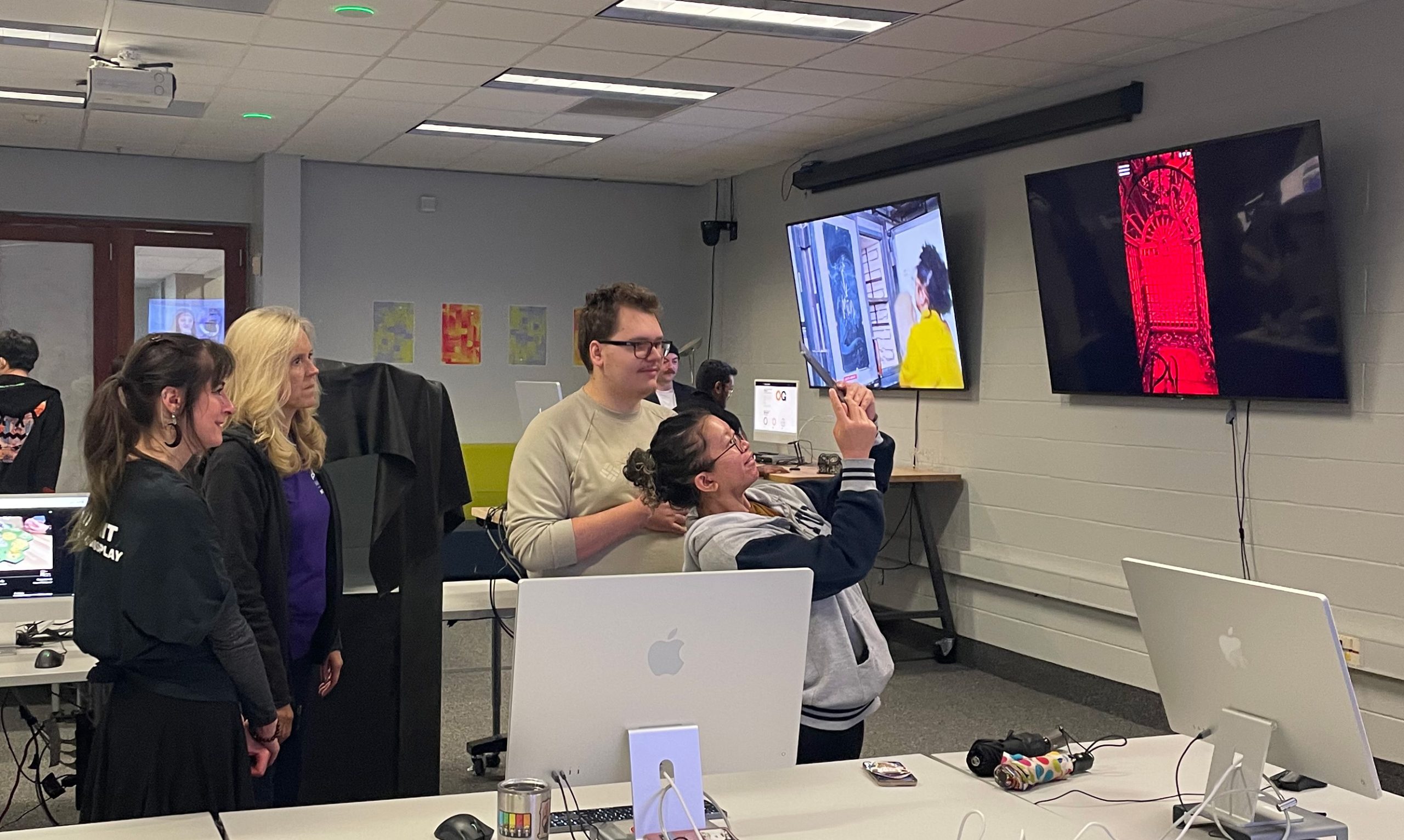
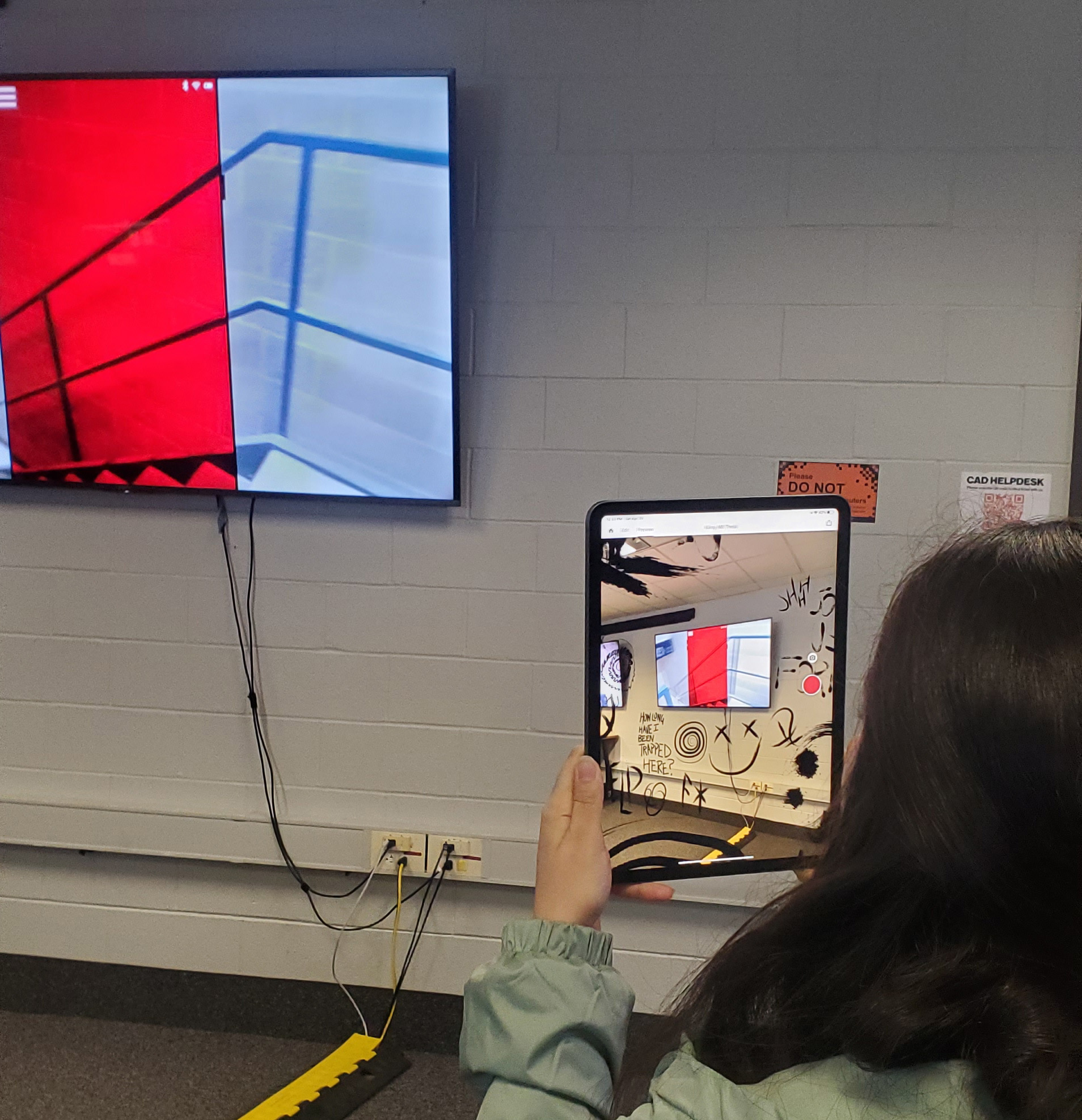
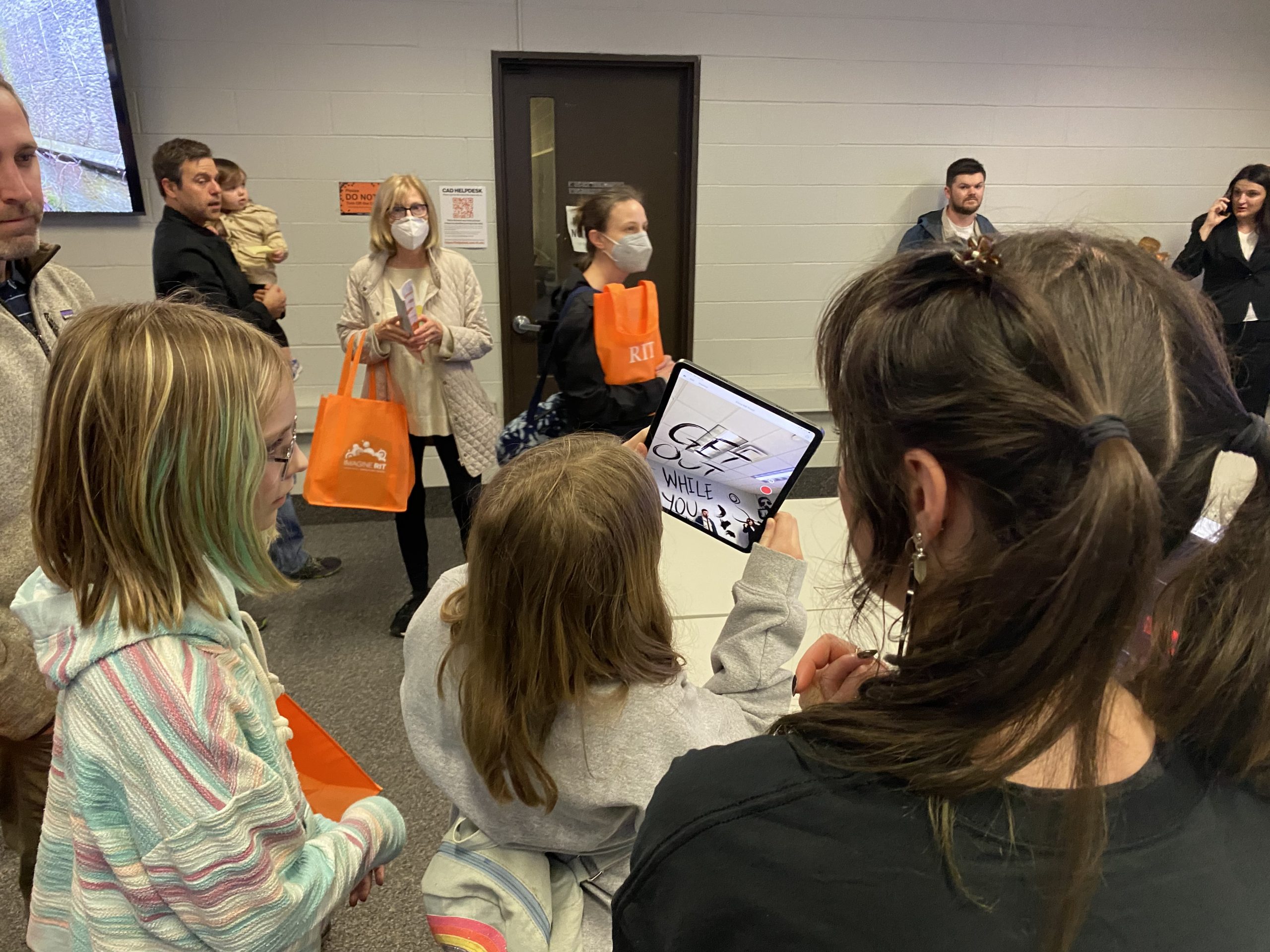
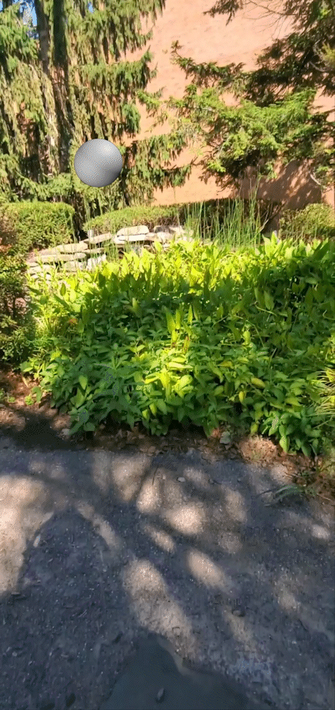
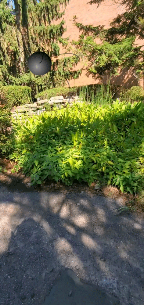
AR Simulation
To add a level of engagement and interactivity to my project display at Imagine RIT, I set up Adobe Aero to project graphics from the game onto the walls, ceiling and floor near my exhibit.
Some limitations of the software were that I could not apply a red filter, or include gifs, so all of the images were static. For these reasons, it was not a completely accurate simulation of what the game would look like if played. Despite this, it was really fun and fascinating for the users to engage with, especially for children and those who had not used AR before.